Arc is an iOS, Android and desktop browser that provides a fresh take on the browsing experience . It reads across multiple websites and gives you a direct, sourced answer, while still letting you open and browse the actual pages. This critique goes through the app in the order a user actually experiences it: onboarding, searching, summarizing, and a few smaller interactions.
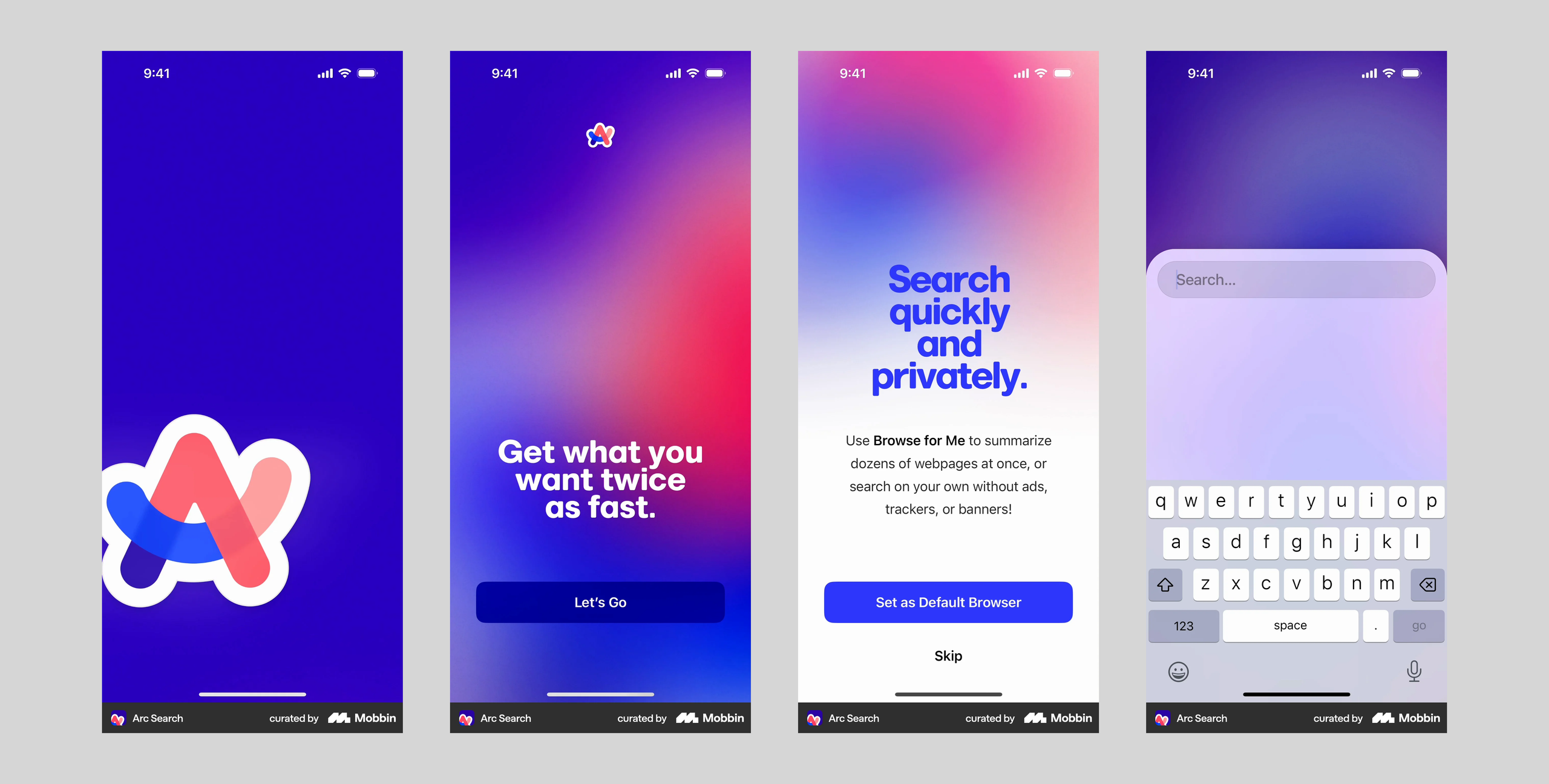
Arc’s onboarding has a polished enough UI to create an immediate positive visceral reaction, the fast, gut-level response, separate from whether a product actually works well once you’re using it.
The Search Experience
The first screen only has a “+” button, a weak signifier on its own. Most people’s conceptual model of search is a magnifying glass, built from years of Google and Safari, so “+” doesn’t map to “start searching” the way a search icon would. That’s where the gulf of execution could break down, but it doesn’t, because the search field slides up automatically the second the app opens, a stronger signifier than the icon that closes the gap before you have to think about it. After a use or two, “+” settles into your system image as “new tab,” not “search,” so the weak signifier stops mattering.
Scrolling through results, the search bar slides out of view, and scrolling back up brings it back immediately. This tracks a behavioral pattern people already have without thinking: scrolling down means “looking for something new,” scrolling up means “done, and ready to act again.” Reading scroll direction this way keeps the gulf of execution short, since the control shows up right when it’s needed instead of sitting on screen as clutter.
Summarising a Search Result
Pinching a page folds it into a summary, a good mapping: the “shrinking” motion mirrors what’s happening, a long page condensed into a short one. The fold animation and the “Reading 8 web pages” loading screen after it are clear feedback that closes the gulf of evaluation, confirming the gesture registered and worked as expected.
The problem is discoverability. Nothing on screen signals this gesture exists, and using it again depends entirely on memory, asking knowledge in the head to do a job a small cue could handle instead. I initially thought “browse for me” solved this, since it’s discoverable and works on recognition over recall, but it only works on past searches, not a page seen for the first time. There’s a second issue too: since pinching isn’t tied to a specific context, it’s easy to trigger by accident while scrolling, an action-based slip, a correct general behavior executing the wrong specific action.
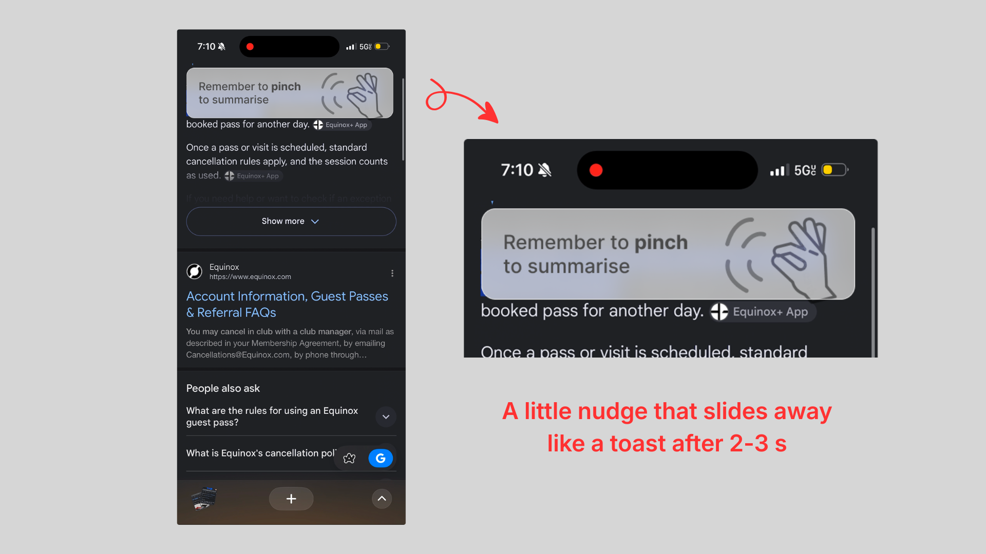
Solution : a dismissible nudge
A good fix would be a brief, dismissible prompt (“pinch to summarize this page”) the first few times a summary-worthy page loads, near the top and out of the way of the content, fading out after a few seconds or one successful pinch. That puts the signifier into the world instead of memory, without leaving a permanent element behind.
Moving Between Searches
Small chevrons on the search bar modal move you between the current and past searches, and swiping does the same. When a user swipes in left/right direction from one edge of the screen, the page slides in the direction of the swipe, and the chevrons on the search slider stand in as a signifier for that gesture even if you never swipe, a clean natural mapping with real-time feedback and no label needed.
Tab Thumbnails
The small window-shaped squares in the bottom corner are signifiers on their own, their shape telling you the app affords multiple open tabs. What’s missing is a count, so there’s no way to tell at a glance how many are open.
Solution: numbers upfront
A numeric badge or indicator next to the tab icon, a commonly seen pattern, would fix this by working with an existing conceptual model rather than a new one.
Switching from another browser
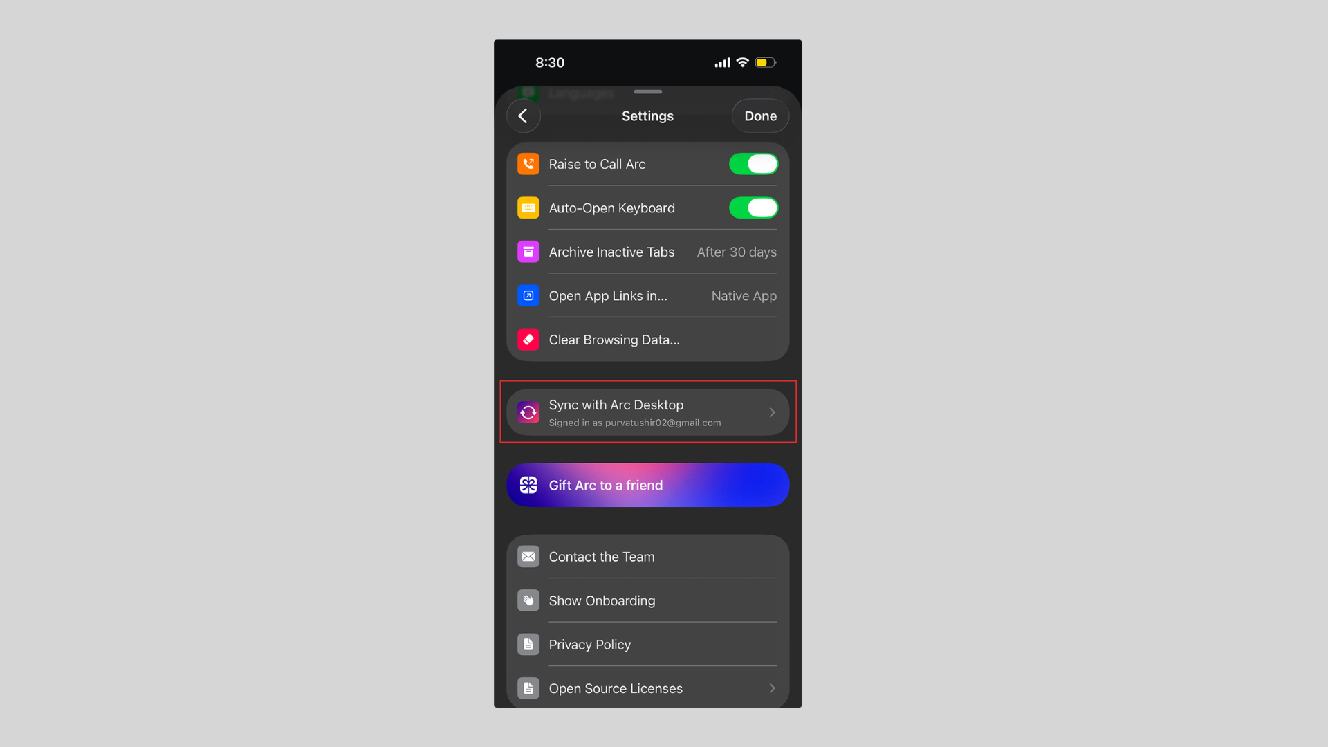
Arc syncing bookmarks and tabs from your old browser answers the legacy problem: staying stuck with an old tool just because switching means losing what’s already built up in it.
Looked at as a whole, Arc gets more right than wrong. Its strongest moments all come from putting knowledge into the world instead of asking users to remember it: the auto-opening search field and the scroll-aware bar both close the gulf of execution before a user has to think, and the loading feedback state closes the gulf of evaluation just as fast. Where it slips is discoverability. The pinch gesture and the missing tab count both lean on long term memory or guesswork instead of a clear signifier, which is a design gap, not a user error. The fixes needed are small and specific rather than a redesign, which says more about how close the app already is to getting this right than about anything fundamentally broken in it.