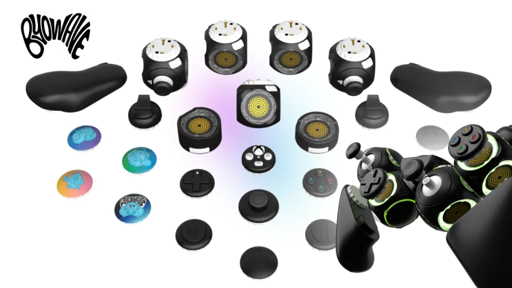
Design Critiques

What makes some designs good and others bad? Why do some designs work while others don’t? Posts in this category offer thoughtful design critiques of modern digital interfaces, with commentary inspired by Don Norman’s “The Design of Everyday Things.”

Assistive Technology: The Daytech Wi-Fi Smart Wireless Caregiver Pager System

The Daytech Smart Caregiver Pager System helps the elderly, people with seizure disorders and people with chronic illnesses. It mostly follows the social and functional models by reducing social barriers within the household and by relying on innovative technology to eliminate limitations. It consists of a wearable call button that users press when they need assistance and a receiver that alerts caregivers of their needs. 

Assistive Technology: The Daytech Wi-Fi Smart Wireless Caregiver Pager System Read More »

Design Critiques: Amazon Kindle ( iOS App )

Amazon Kindle is an app that allows readers access to a variety of digital content, including options such as books, magazines, and even newspapers. With syncing across devices, allowing users to pick up where they just were on any device as long as the account remains the same. However, the home page has sections that can be improved upon in order to enhance the user experience.

Design Critiques: Amazon Kindle ( iOS App ) Read More »

Design Critique: Adidas Running (iOS App)

Adidas Running is a fitness tracker that logs workouts, maps routes, and records performance data such as pace, calories, and distance. With adaptive training plans, progress tracking, and social features like community groups and challenges, it supports beginners and experienced athletes in setting goals, staying motivated, and advancing their fitness journeys. Home Screen and Start

Design Critique: Adidas Running (iOS App) Read More »