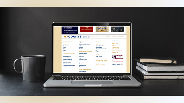
Design Critiques

What makes some designs good and others bad? Why do some designs work while others don’t? Posts in this category offer thoughtful design critiques of modern digital interfaces, with commentary inspired by Don Norman’s “The Design of Everyday Things.”

Design Critique: Twitter (iOS Mobile Application)

by Julia Ahmad – September 13, 2022 “Good design is actually a lot harder to notice than poor design, in part because good designs fit our needs so well that the design is invisible, serving us without drawing attention to itself. Bad design, on the other hand, screams out its inadequacies, making itself very noticeable.”

Design Critique: Twitter (iOS Mobile Application) Read More »

Assistive Technology: Birdsong in Japanese Train Stations

Introduction: While waiting for your train to arrive in Japan, you may notice bird chirping across the station. This birdsong is meant to be an audio guide to point the visually impaired towards the ticket gates and exits. Depending on the direction of the escalators, a different type of birdsong is being played – one

Assistive Technology: Birdsong in Japanese Train Stations Read More »

Assistive Technology: MagnusCards (iOS App)

“MagnusCards is an innovative mobile app designed to assist autistic and neurodiverse people to gain independence in activities of daily living via step-by-step guides and positive reinforcement. Each collectible Card Deck combines proven educational methods, visual instruction, personal assistance from Magnus, and realistic scenarios to support inclusive and empowered living.” MagnusCards MagnusCards is a mobile

Assistive Technology: MagnusCards (iOS App) Read More »