Assistive Technology: MagnusCards (iOS App)
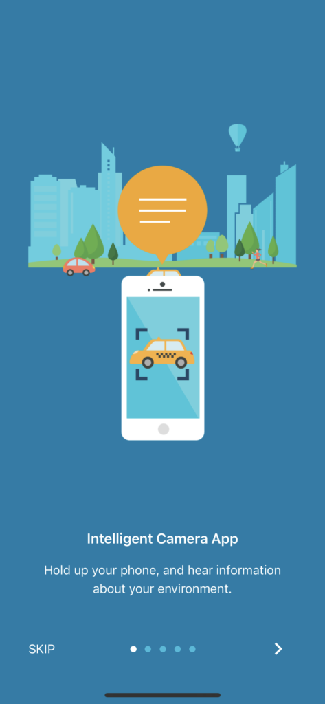
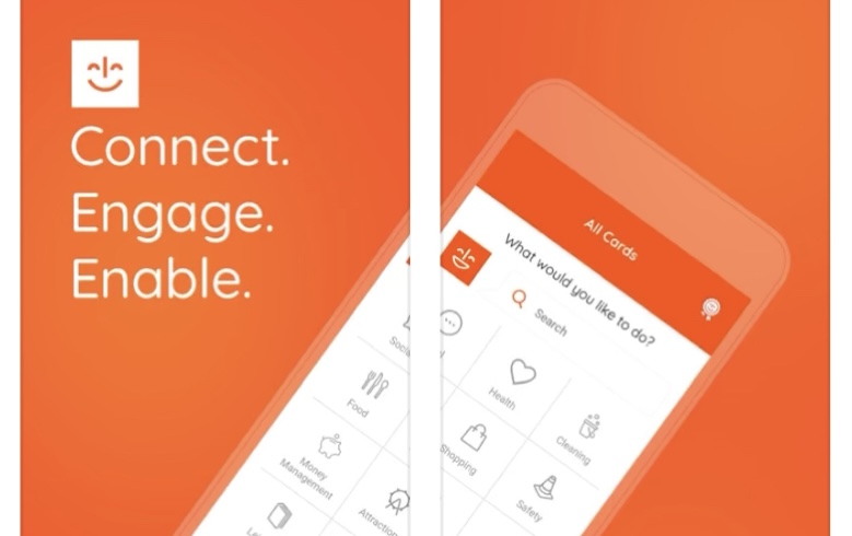
“MagnusCards is an innovative mobile app designed to assist autistic and neurodiverse people to gain independence in activities of daily living via step-by-step guides and positive reinforcement. Each collectible Card Deck combines proven educational methods, visual instruction, personal assistance from Magnus, and realistic scenarios to support inclusive and empowered living.” MagnusCards MagnusCards is a mobile […]
Assistive Technology: MagnusCards (iOS App) Read More »