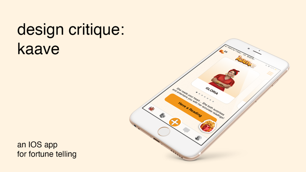
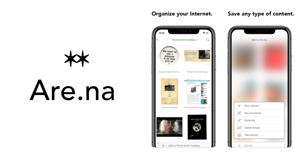
Design Critiques

What makes some designs good and others bad? Why do some designs work while others don’t? Posts in this category offer thoughtful design critiques of modern digital interfaces, with commentary inspired by Don Norman’s “The Design of Everyday Things.”

Design Critique: Lyft (iOS App)

Introduction: Lyft is a transportation company that provides users with online ride-hailing services through a mobile application. The application matches on-demand riders with drivers and also allows payments through the app. Lyft operates in approximately 300 U.S. cities and provides over 1 million riders per day. Critique 1: Home Screen When opening the Lyft app, […]

Design Critique: Lyft (iOS App) Read More »

Design Critique: Sephora Skincare & Beauty App

Introduction Sephora is a multinational online and in-store makeup, skincare, fragrance, and beauty services, retailer. Upon opening the Sephora mobile application, a user is presented with options to either view latest skincare and beauty deals, to begin shopping or exploring products, to receive product recommendations, to search for specific products, or to navigate for additional features.

Design Critique: Sephora Skincare & Beauty App Read More »

Design Critique: Uncharted 4 Traversal

“Uncharted 4: A Thief’s End” is one of seven games of the Uncharted series, which is an action-adventure third-person shooter platform video game created and developed by Naughty Dog. This critique takes a closer look at how Uncharted 4 makes use of Don Normans Design Principles and uses them to lead the player through the game, specifically one of

Design Critique: Uncharted 4 Traversal Read More »