Design Critique: NJ Transit (App)
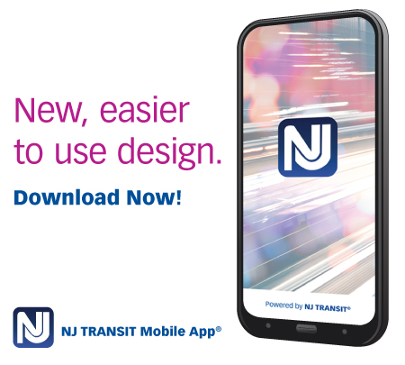
Background The NJ Transit App is transportation application meant to aid commuters and tourists travelingbetween New Jersey and New York via NJ Transit’s buses, Path Train, or Light Rail. It allows users to buy tickets, look up arrival and departure times, as well as create travel plan. The application’s objective is to make commuting easy […]
Design Critique: NJ Transit (App) Read More »