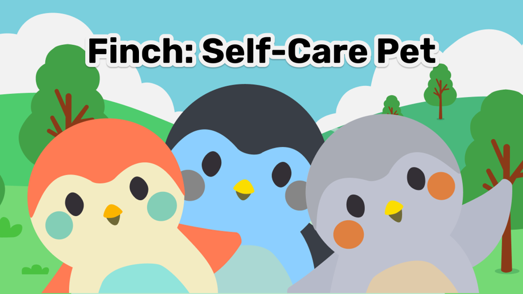
Design Critiques

What makes some designs good and others bad? Why do some designs work while others don’t? Posts in this category offer thoughtful design critiques of modern digital interfaces, with commentary inspired by Don Norman’s “The Design of Everyday Things.”

A person holding a smartphone displaying the Stellarium app, showing constellations against a starry night sky. Large white text on the left reads “Design Critique: Stellarium.

Design Critique: Stellarium (iOS App)

Stellarium is a mobile planetarium app that allows users to explore the night sky in real time. By pointing their device upward, they can identify stars, planets, and constellations through a realistic visualization. The experience feels immersive and inspiring, but certain design choices introduce challenges around discoverability and ease of use, particularly for beginners. Onboarding

Design Critique: Stellarium (iOS App) Read More »

Hand holding a smartphone displaying the Flo app home screen, showing period tracking information on a pink gradient background, with the Flo logo on the left.

Design Critique: Flo (iOS App)

Flo is a menstrual cycle–tracking app that helps users monitor periods, ovulation, or pregnancy. It also offers resources on menstruation, pregnancy, mental-health and sexual wellness, along with symptom logging. This critique reviews Flo through concepts from Design of Everyday Things and How Artifacts Afford, focusing on the experience of a user tracking their period. Onboarding

Design Critique: Flo (iOS App) Read More »

An image of cute kittens playing in a Japanese garden yard.

Design Critique: Kitty Collector

This critique explores the Kitty Collector app, launched in 2014, which appears outdated compared to 2025’s small gaming apps. Despite its age, the developers (Hit Point Co. Ltd.) have effectively addressed key design elements, reflecting Japan’s emphasis on user experience. The app is crafted with the mental model of cat lovers in mind, avoiding the hook of prolonged screen time, a challenge even for small game apps today.

Design Critique: Kitty Collector Read More »

Design Critique: The Chase Mobile App

Introduction Chase is one of the largest banks in the United States, serving millions of customers through its online and mobile banking services. Having personally used the app for everyday banking, I have noticed both strengths and shortcomings in its usability. Using Don Norman’s concepts from The Design of Everyday Things, I will analyze a

Design Critique: The Chase Mobile App Read More »