Design Critiques

What makes some designs good and others bad? Why do some designs work while others don’t? Posts in this category offer thoughtful design critiques of modern digital interfaces, with commentary inspired by Don Norman’s “The Design of Everyday Things.”

Voiceitt (Cover)

Assistive Technology: Voiceitt

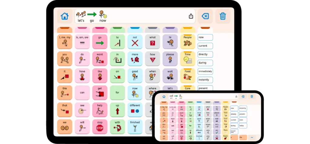
Voiceitt is a voice-enabled experience for individuals with non-standard speech: people with disabilities, aging voices and accented speakers. It uses voice recognition technology based on AI to enable people with speech disabilities to communicate using their own voice. The technology adapts by learning the unique speech patterns of each user to provide real-time transcription and synthesized speech output.

Assistive Technology: Voiceitt Read More »

Design Critique:Doordash(Android App)

DoorDash is a versatile food delivery application enabling users to explore and order from local restaurants based on their geographical location. Beyond its primary service, DoorDash extends its offerings to include grocery and various convenience item deliveries in select regions, enhancing its utility and convenience for users. Log in Page The login page(figure 1.1) of

Design Critique:Doordash(Android App) Read More »

Design Critique: Zocdoc (iOS App)

Zocdoc is a healthcare appointment scheduling platform, that plays a role in connecting users with healthcare providers seamlessly. It helps users identify and schedule in-person or telemedicine appointments for health or dental services. Additionally, the portal serves as a rating and comparison database for doctors and dentists. Let’s explore Zocdoc’s interface through the lens of

Design Critique: Zocdoc (iOS App) Read More »

Design Critique: Resy (iOS App)

Introduction Resy is a digital platform that allows users to seamlessly reserve tables at restaurants or tickets to events/experiences. The platform provides restaurant details, menu highlights, images, and user ratings – all of which enhance the reservation experience. This article critiques the Resy App using the principles mentioned in Don Norman’s “The Design of Everyday

Design Critique: Resy (iOS App) Read More »

Otter_Feature Image

Design Critique: Otter.ai (iOS App)

Introduction Otter.ai is an AI-powered productivity tool that assists in real-time speech-to-text transcription across various scenarios, such as lectures, meetings, interviews, and everyday voice conversations. It accommodates the user needs of reading live transcriptions, generating key points summaries, or synching team meeting notes. Usability Issues No.1 1.1 Task: Add photo to the note 1.2 Problem

Design Critique: Otter.ai (iOS App) Read More »

Design Critique: Instacart (iOS App)

Introduction Instacart is an online platform for convenient delivery or pickup from local retailers, offering a diverse range of fresh groceries and household items. The platform provides a time-saving solution for online ordering. In this case study, I focus on the experience within the Instacart iOS App by analyzing the experience of browsing and selecting

Design Critique: Instacart (iOS App) Read More »