Soma: Creating an AI enabled embodied stress management system

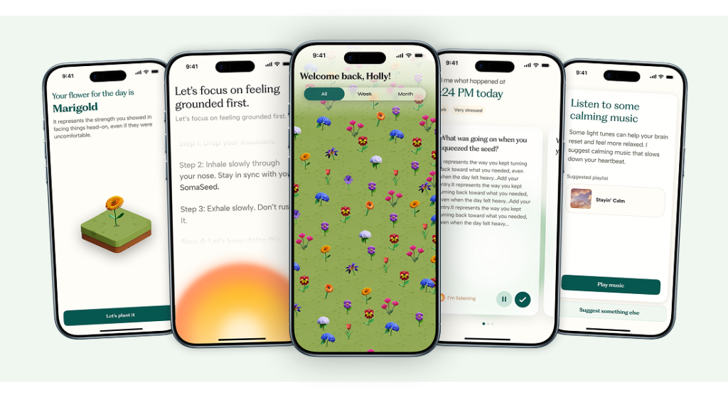
INTRODUCTION Existing digital wellbeing tools tend to reduce stress to something measurable and optimizable, overlooking its embodied, emotional, and temporal nature. Research on rituals also shows how repeated, intentional practices shape attention, create meaning, and confer a perception of continuity in everyday life. As part of the UX Design for AI class at Pratt, we […]

Soma: Creating an AI enabled embodied stress management system Read More »

Open Lab Case Study

Overview This project focused on auditing and redesigning the mobile and desktop versions of CUNY Open Lab’s directory pages. This involved applying WCAG 2.2 accessibility standard level AA to increase keyboard and screen reader compatibility across all five pages. Problem Statement & Accessibility Challenges Open Lab is an open education resource created by and for

Open Lab Case Study Read More »

Elevating Clarity and Confidence: Improving Discoverability and Usability in GT’s AI Authoring Tools

Team: Matt, Anvita, Uraiba, Myra Abstract Gutenberg Technologies (GT) is expanding its suite of AI-powered content creation tools, yet early user testing revealed significant usability challenges that limited users’ ability to discover, understand, and trust these features. As part of a four-person UX research team, I investigated how educational content creators interacted with GT’s “Edit

Elevating Clarity and Confidence: Improving Discoverability and Usability in GT’s AI Authoring Tools Read More »

Discovering Gutenberg Technology’s AI Tools

Within eight weeks, my team and I uncovered four severe usability and discoverability problems within Gutenberg Technology’s AI tools utilizing several research methods like eye-tracking studies, retrospective think-alouds, and SUS scores. Overall, the AI tools suffer from low discoverability and a lack of systemic clarity, negatively impacting the overall experience of the platform. Along with the insights, we provided excellent recommendations that will alleviate some of the main pain points that we found.

Discovering Gutenberg Technology’s AI Tools Read More »

Banner for a Pokémon Shuffle design critique blog, featuring the Pokémon Shuffle logo with colorful letters, popular Pokémon characters in the background, and the text 'Design Critique' in bold white font.

Design Critique: Pokémon Shuffle (Mobile App)

Introduction Pokémon Shuffle is a mobile puzzle game where players line up Pokémon icons to battle opponents and progress through levels. It blends casual match-three gameplay with RPG elements like team optimization and collecting Pokémon. The game succeeds in keeping players engaged, but its registration, onboarding, and interface design also reveal notable usability challenges. Registration

Design Critique: Pokémon Shuffle (Mobile App) Read More »

Design Critique: CapCut (Mac App)

Introduction CapCut for Mac is a desktop video editor that aims to make video editing fast and approachable while offering a broad set of features. The experience is sleek and simple, but some design choices create friction around onboarding, visibility, sharing and error recovery especially for new users. Getting Started: Registration & Onboarding
 Right away,

Design Critique: CapCut (Mac App) Read More »

Design Critique: Feeld

INTRO Feeld is a dating and social discovery app designed for people interested in exploring alternative relationship models, including ethical non-monogamy, polyamory, and kink. Unlike traditional dating apps, it emphasizes openness, inclusivity, and curiosity, allowing singles and couples to connect with others who share similar values around relationships and intimacy.  Due to the nature of

Design Critique: Feeld Read More »

Mockup of the Planta app onboarding screen with a green ‘Get Started With Planta’ button, plant care notification, and design critique title with leaf logo

Design Critique: Planta (iOS App)

Picture having a caretaker who knows when your plant needs water, soil, or care when sick. That’s the essence Planta aimed to offer with schedules, reminders, guides, identification, and a light meter. This critique takes a beginner’s view, focusing on adding plants, reminders, and the homepage, using ideas from Don Norman and Jenny Davis. Onboarding

Design Critique: Planta (iOS App) Read More »