design critique

Cover image

Design Critique: OpenTable – Diner’s End

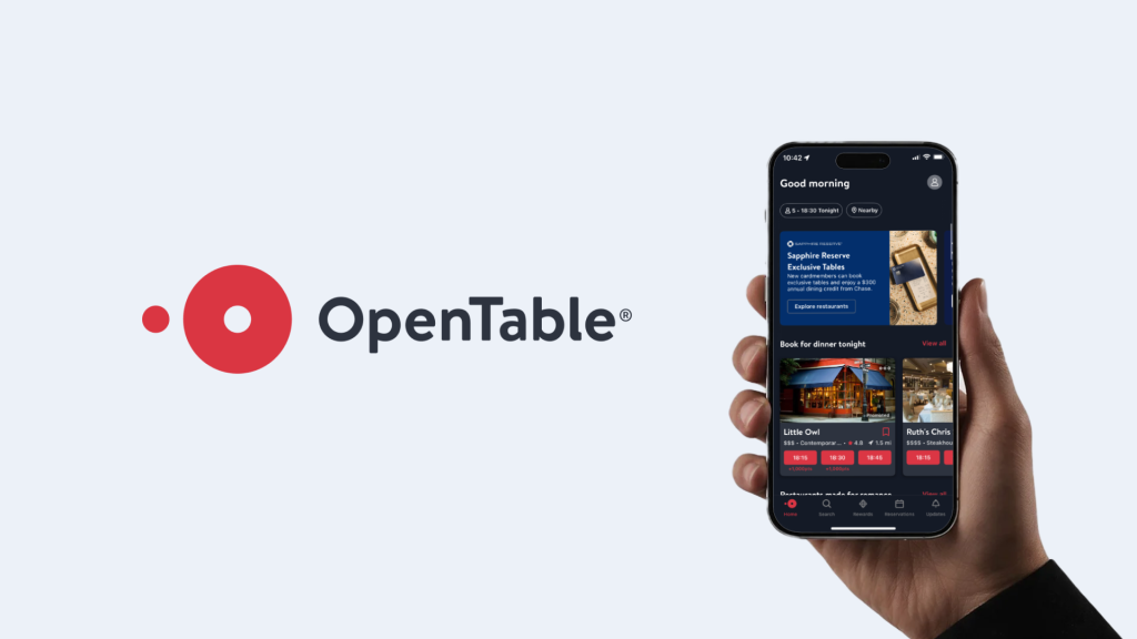
OpenTable is a dining reservation app that allows users to explore local restaurants and make reservations with ease and better communication. It provides both diners and restaurants with an open communication platform that replaces the traditional, messy reservation process with a streamlined, informative network. Signing-in: Onboarding The sign-in pages (figure 1-3) utilized the classic phone […]

Design Critique: OpenTable – Diner’s End Read More »

Design Critique: Pikmin Bloom (iPhone App) - Cover Image

Design Critique: Pikmin Bloom (iPhone App)

Pikmin Bloom is a free augmented reality (AR) mobile app developed by Niantic and Nintendo. By implementing gamification strategies, it encourages players to walk more, explore their surroundings, and foster healthy habits. Although Pikmin Bloom demonstrates the power of gamification, it still suffers from several usability friction points that disrupt the Seven Stages of Action.

Design Critique: Pikmin Bloom (iPhone App) Read More »

Banner for a Pokémon Shuffle design critique blog, featuring the Pokémon Shuffle logo with colorful letters, popular Pokémon characters in the background, and the text 'Design Critique' in bold white font.

Design Critique: Pokémon Shuffle (Mobile App)

Introduction Pokémon Shuffle is a mobile puzzle game where players line up Pokémon icons to battle opponents and progress through levels. It blends casual match-three gameplay with RPG elements like team optimization and collecting Pokémon. The game succeeds in keeping players engaged, but its registration, onboarding, and interface design also reveal notable usability challenges. Registration

Design Critique: Pokémon Shuffle (Mobile App) Read More »

Design Critique: CapCut (Mac App)

Introduction CapCut for Mac is a desktop video editor that aims to make video editing fast and approachable while offering a broad set of features. The experience is sleek and simple, but some design choices create friction around onboarding, visibility, sharing and error recovery especially for new users. Getting Started: Registration & Onboarding
 Right away,

Design Critique: CapCut (Mac App) Read More »

Design critique: Hume AI’s Hero Section

Hume AI is a text-to-speech (TTS) product whose primary selling point is its advanced emotional intelligence (EI). Emotion is, after all, the most powerful tool of voice—amplifying meaning, tone, and impact in text. Since achieving natural-sounding TTS has become largely a solved problem, the differences between products in basic voice quality are shrinking (or just

Design critique: Hume AI’s Hero Section Read More »

A person holding a smartphone displaying the Stellarium app, showing constellations against a starry night sky. Large white text on the left reads “Design Critique: Stellarium.

Design Critique: Stellarium (iOS App)

Stellarium is a mobile planetarium app that allows users to explore the night sky in real time. By pointing their device upward, they can identify stars, planets, and constellations through a realistic visualization. The experience feels immersive and inspiring, but certain design choices introduce challenges around discoverability and ease of use, particularly for beginners. Onboarding

Design Critique: Stellarium (iOS App) Read More »

Hand holding a smartphone displaying the Flo app home screen, showing period tracking information on a pink gradient background, with the Flo logo on the left.

Design Critique: Flo (iOS App)

Flo is a menstrual cycle–tracking app that helps users monitor periods, ovulation, or pregnancy. It also offers resources on menstruation, pregnancy, mental-health and sexual wellness, along with symptom logging. This critique reviews Flo through concepts from Design of Everyday Things and How Artifacts Afford, focusing on the experience of a user tracking their period. Onboarding

Design Critique: Flo (iOS App) Read More »