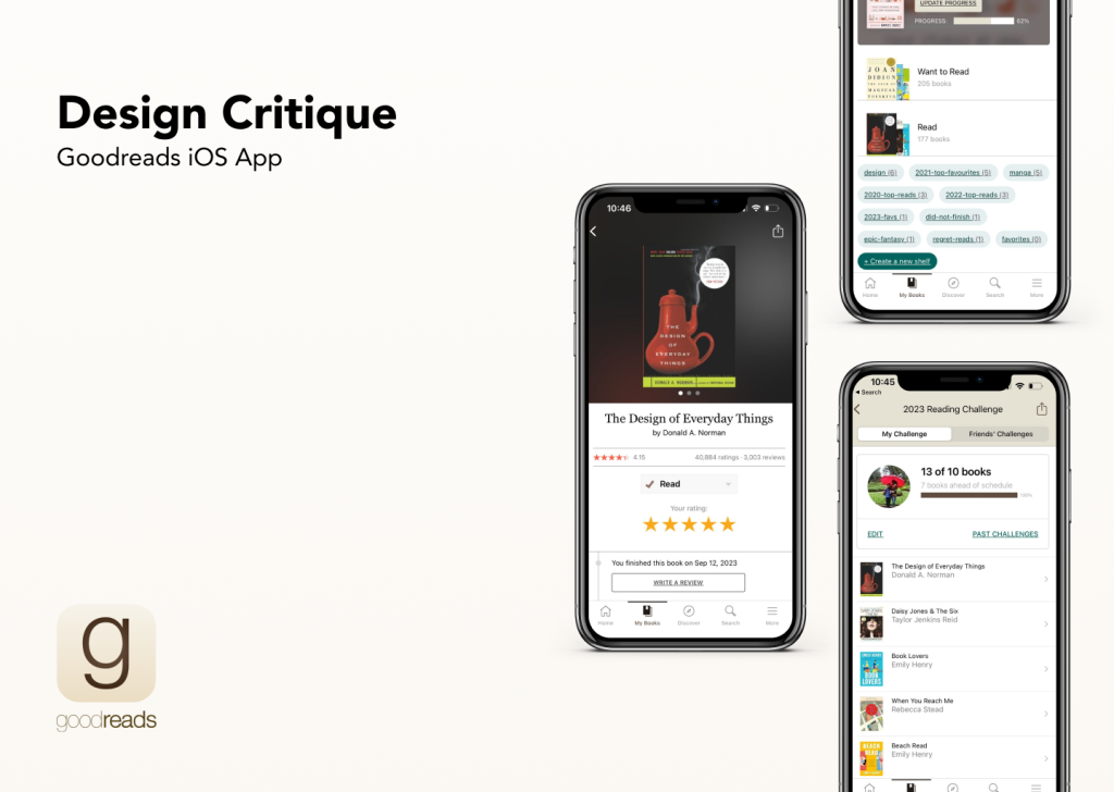
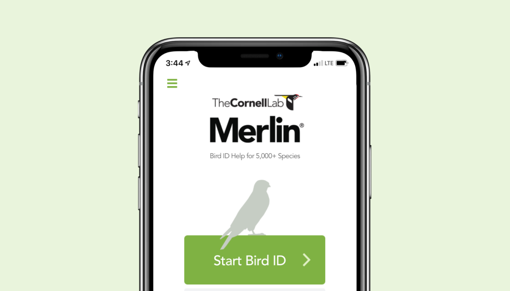
DON NORMAN

Design Critique: The Target App (iPhone app) 

Introduction The Target app is an e-commerce site representing Target, a long-standing retail establishment based in North America. It contains features aiding both online and in-store shopping, such as order and pick-up scheduling, home delivery options, a barcode scanner and more. This post critiques the app in accordance with principles and concepts outlined in Don […]

Design Critique: The Target App (iPhone app)  Read More »

A flightpath drawn over a hazy landscape implies travel enabled by the kayak app.

Design Critique: Kayak (Android App)

The Kayak Android mobile app provides an easy way to find flights, hotel stays, and rental car services. Kayak excels at creating a clear conceptual model of how to set up and run a search, but not of the entire scope of the app’s features. A streamlined interface may also be a trade-off for invitations to human error. It is interesting to note that Kayak was one of the earliest exemplars of creating more usable graphical interfaces for travel booking, but now may be extending its feature list too far.

Design Critique: Kayak (Android App) Read More »

Design Critique: Co-Star (iPhone App)

Co-Star is a popular astrology app for Gen Z (18-25 in the US) iPhone users, for it’s ability to provide easy to digest birth charts, advice for the day based on your planet transits, and a social aspect to compare and contrast charts with your added friends. (It should be noted that these daily horoscopes have been criticized for promoting negativity in users in the past.)

Design Critique: Co-Star (iPhone App) Read More »

Design Critique: Coursera (Web Version)

Among all of the online education website, I’ve tried several and even they’re focus on different trajectory, the one that hooks me and motivate me to complete is Coursera which delivering a very “flow” experience. User-centered design employs empathy and in turn increases satisfaction of the end-users. This design critique will be using Norman theories from “The Design of Everyday Things” to analyze the good and bad designs Coursera utilizes.

Design Critique: Coursera (Web Version) Read More »