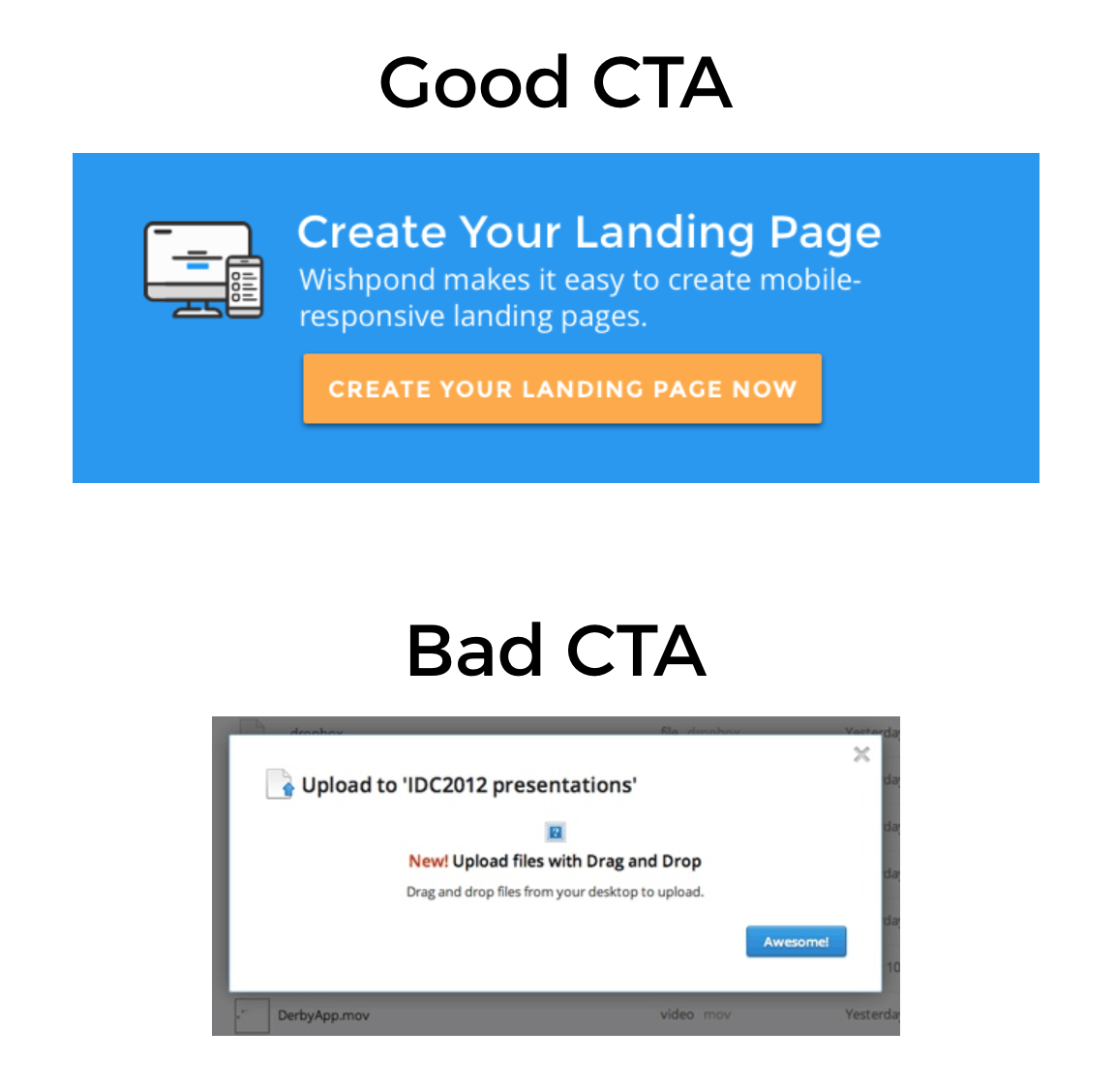
What is Call-To-Action?
→ Call-to-Action is a simple marketing term used to describe a graphic/text/button that prompts the user to take a DESIRED* action.
DESIRED* -> Desired by the Marketing & Content Team

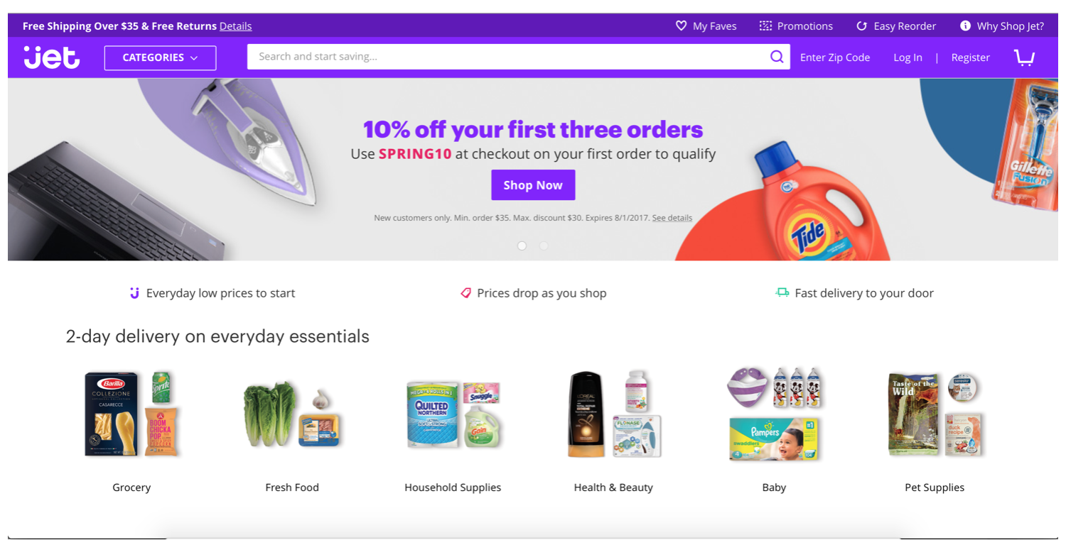
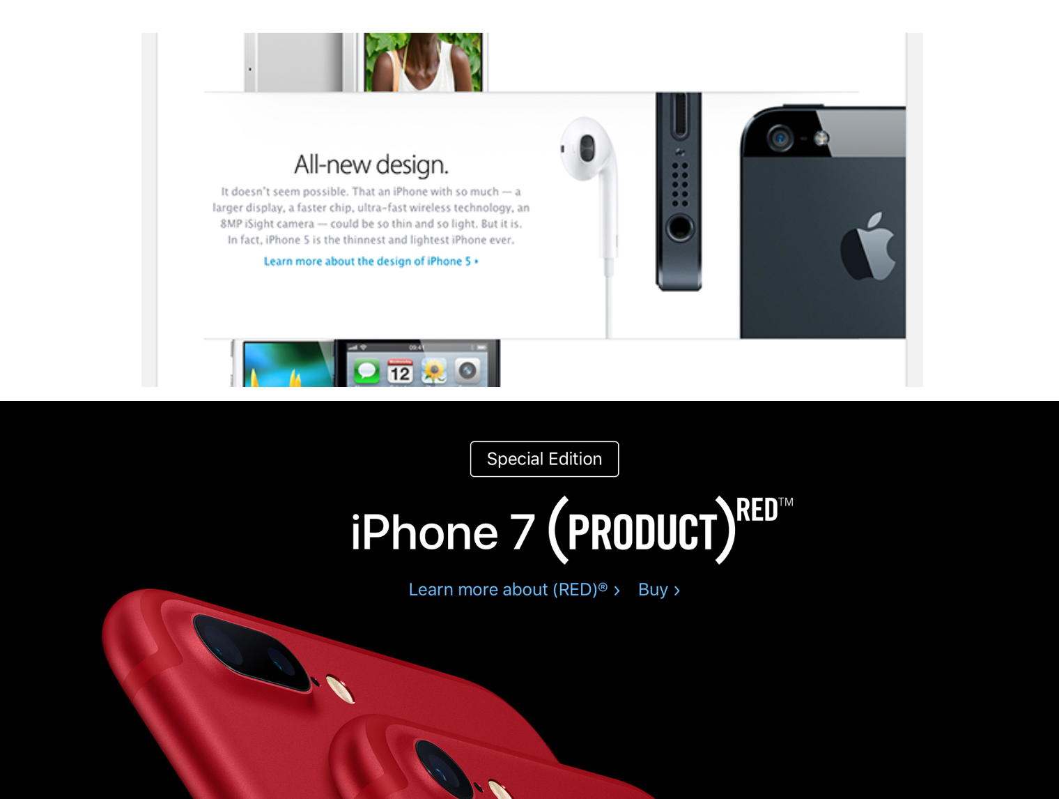
Where is it seen?

How to create the Perfect CTA?
Maintain a Clear Hierarchy
→ Let the important ones stand out. Give appropriate weightage.
→ Make it easy to understand with/without the supporting text.
→ Should make sense in isolation and explain whatever it links to.
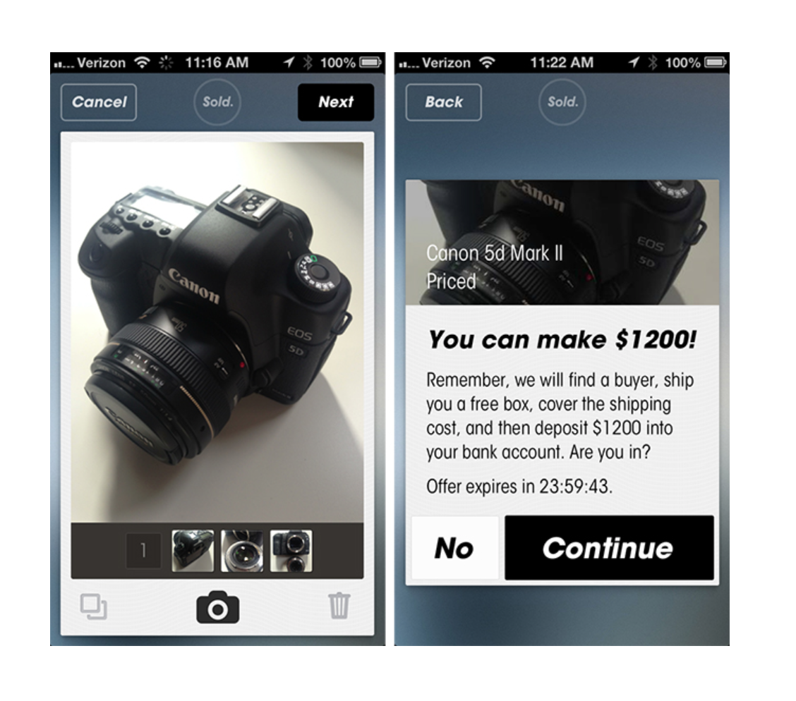
Communicate Value & Be Clear
→ Copyrighting for the web is a real art, and writing the perfect CTA is a huge challenge.
→ Never let the question arise from the visitor – “What’s in it for me?”
→ It should be clear in visibility.

The Gentle Art of Persuasion
→ Simple words can increase the sense of urgency & immediacy.
→ Strong Action Verbs like Register Now!, Watch the Video, Learn More, Compare, etc.
The Secondary Nudge
→ A secondary line of text copy, positioned near the CTA can support your primary message. It can be used to answer the user’s concerns about a service/feature/benefit that will in-turn increase conversion percentage.
Icons Do HELP!
→ Icons can enhance a CTA by communicating a bit of extra information.
For example: A right arrow can increase urgency and imply a positive forward movement. A left arrow implies going back or undo. A padlock implies safety or security.
NEVER Disappoint the user!!
→ Once the user has acted on your CTA, make sure you deliver what you promised them and carry it through, otherwise you’ll lose them fast!
Test, Measure & Refine
→ The only way to understand your audience is by testing different design and word combinations.
→ Test techniques by A/B Testing & Multi iterative Testing.
References -https://www.realadventure.co.uk/crm-life/ten-tips-for-successful-calls-to-action/