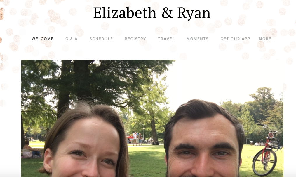
Weddings are highly sensory, emotional experiences, loaded with expectations. My niece got married on Sept. 8 in front of a small group of friends and family who were gathered together by phone calls, texts, US Postal invitations, email follow ups and a website. The website, Elizabeth & Ryan (Figures 1,2), a sub-site of withjoy.com, conveys the couple’s sensitivity to their needs of its guests along with the couple’s desire to host an inexpensive, low-maintenance wedding that is also a memorable celebration.
Informed and Insightful
No formal constituent interviews were performed, however, the couple did conduct informal interviews (with friends and relatives) as well as some observation (attending nuptials of close friends in the same locale) , which then informed their website.The couple wanted a simple affair that they could plan themselves while working full-time. The website reflects that objective and provides an easy interaction experience, helping guests without bogging down the couple with multiple individual emails and calls.
Practical Considerations
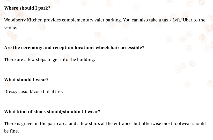
The majority of guests were under age 30, yet, the couple was aware of the needs of various constituents. As you can see in Figure 3, the couple includes information on wheelchair access, which might be useful for older guests along with information about footwear, so that guests wearing heels can make the best choice. The footwear information is so specific, it seems to be the result of conversations with people who have been to weddings and wished for better venue recon.
Offline Messages
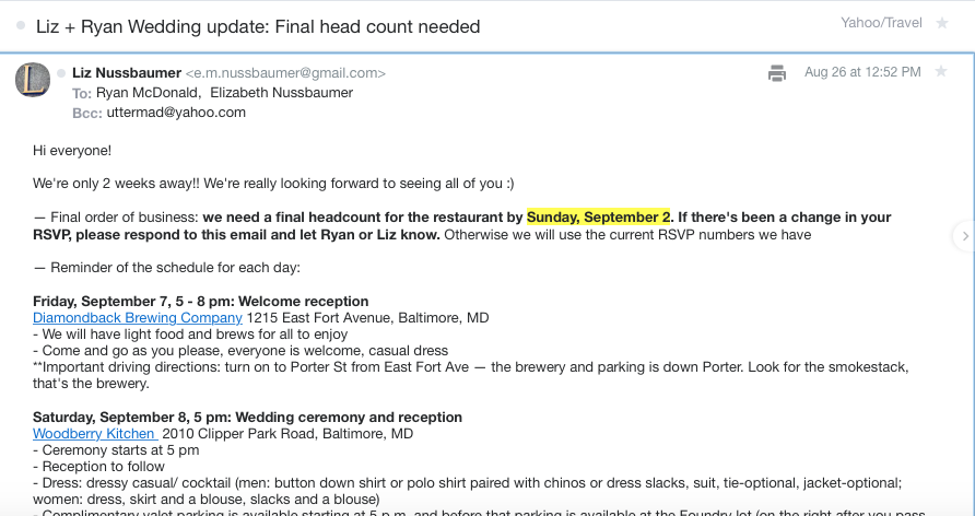
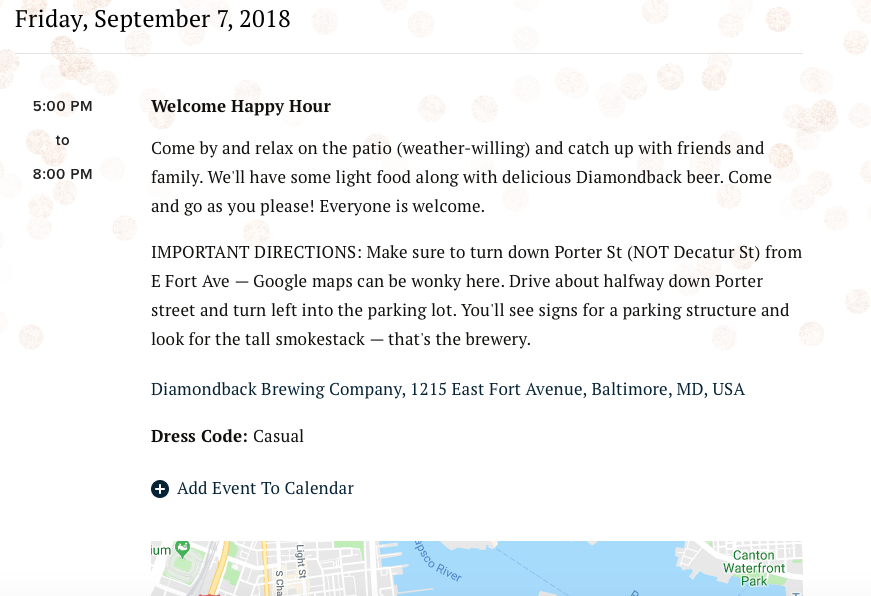
Sometimes it’s one’s closest friends and family who pay the least attention to important information. The couple recognized that constantly repeating information would create angst for themselves, so they frequently put themselves in the shoes of their guests, knowing they’d ignore a certain amount of information and require updates.The bride created and sent a series of emails. Figure 4 is a good example, showing a small update and providing all the information that is also on the website (Figure 5).
Room for Improvement
In so many ways the couple’s careful consideration of the needs of their guests was evident. There is room for improvement (though most users hope the opportunity doesn’t present). Every guest has a personal relationship with the bride or groom. As they milled around before the ceremony, it was clear that many didn’t know much about the other half. The couple could have made better use of the “Moments” section and even added an “About” section (Figure 6).