
INTRODUCTION:
Babbel is a language learning Application available for both online and mobile platforms. Developed by Lesson Nine GmbH in tandem with a team of language learning experts the app encourages development of over 14 different languages with 10-15 minute “bite sized” lessons that increase in difficulty as you progress through the program. The developers claim through user confidence, comprehension, and retention their app is proving itself as one of the most effective learning apps on the market.
It peaked my interest initially as a tool that addresses my own yearning for acquiring a new language, and how designers of the platform addressed usability as an essential component of what helps (or hinders) our cognition of new things (ie. If it is clear and simple to use it will not distract from lessons and tutorials).
CRITIQUE 1:
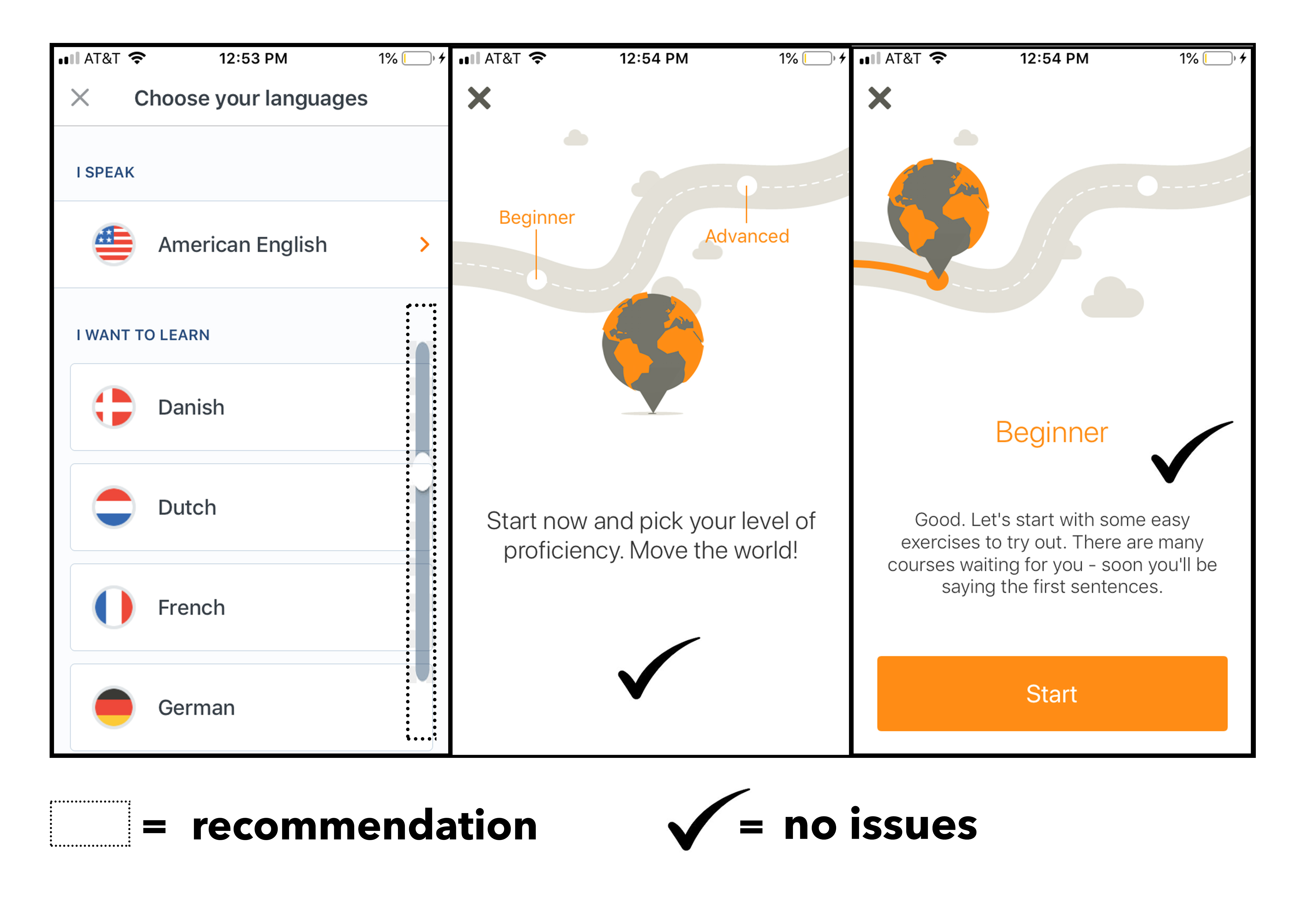
Figure. 1
The introductory processes within the app were very consistent and easy to navigate as a whole. The initial interface gave clear directives on the type of language I read, and speak during day to day activities with signifiers via an arrow telling me more options are available if click the icon. In the “I want to learn” section of the setup I could see a potential pitfall in the lack of a visible signifier (my recommendation is a scrolling emblem but it could also be options near the bottom loading slightly off the page like in Figure 2.) to let me know the existence of more language options if I pan my finger downward rather than the four which appear initially. I found the second and third stage rather ingenious as a combination of Don Norman’s natural mapping design principle, and the use of implicit iconography as roadways, pathways, point a to point b metaphors are cross-cultural. I knew placing my finger in beginner, advanced, or space between would situate me in a suitable spot within the program.
CRITIQUE 2:
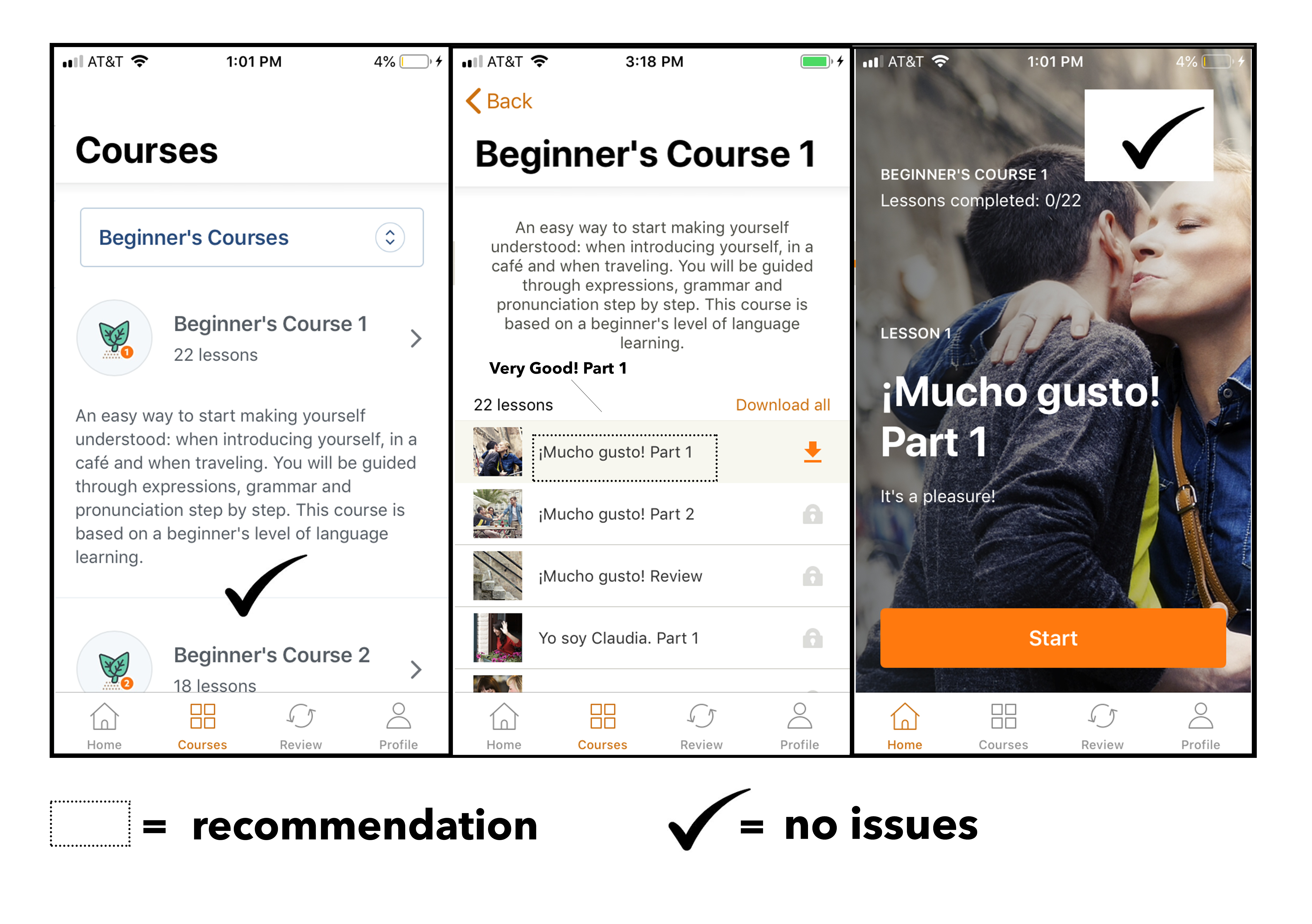
Figure 2.
In the main hub of the program are diagrams with each course selection, its parts, and the lessons completed clearly labeled and divided chronologically through numeric ordering. The top navigation bar (labeled beginners courses) allowed the user to search through all the learning pathways to select a more appropriate path if their selection from the previous mapping proved to be unfit. A small snag can be seen in the second pane of Figure 2. which labels lessons in the language you are trying to learn; a potential breeding ground for knowledge-based mistakes. In other words, my obvious incomplete knowledge of a language I’m unfamiliar with is a confusing standard for labeling a reference or index. I can surmise the approach is intended to indoctrinate me into becoming more familiar with seeing the language but as a design quality could lead to action-based or memory lapsed-slips or problems recalling, selecting, and retrieving the lesson I want. I would change them to the users native or most familiar language but keep the very familiar checklist format. I did appreciate the the lock icon actively illustrating, and hindering the selection of a lesson I hadn’t paid for. This cultural constraint (ie. lock shape to most cultures means off limits) paired with the immediate feedback from a pop-up declaring “you do not have a subscription” (for those who would try anyway) means there is an intentional block from something rather than a system error.
CRITIQUE 3:
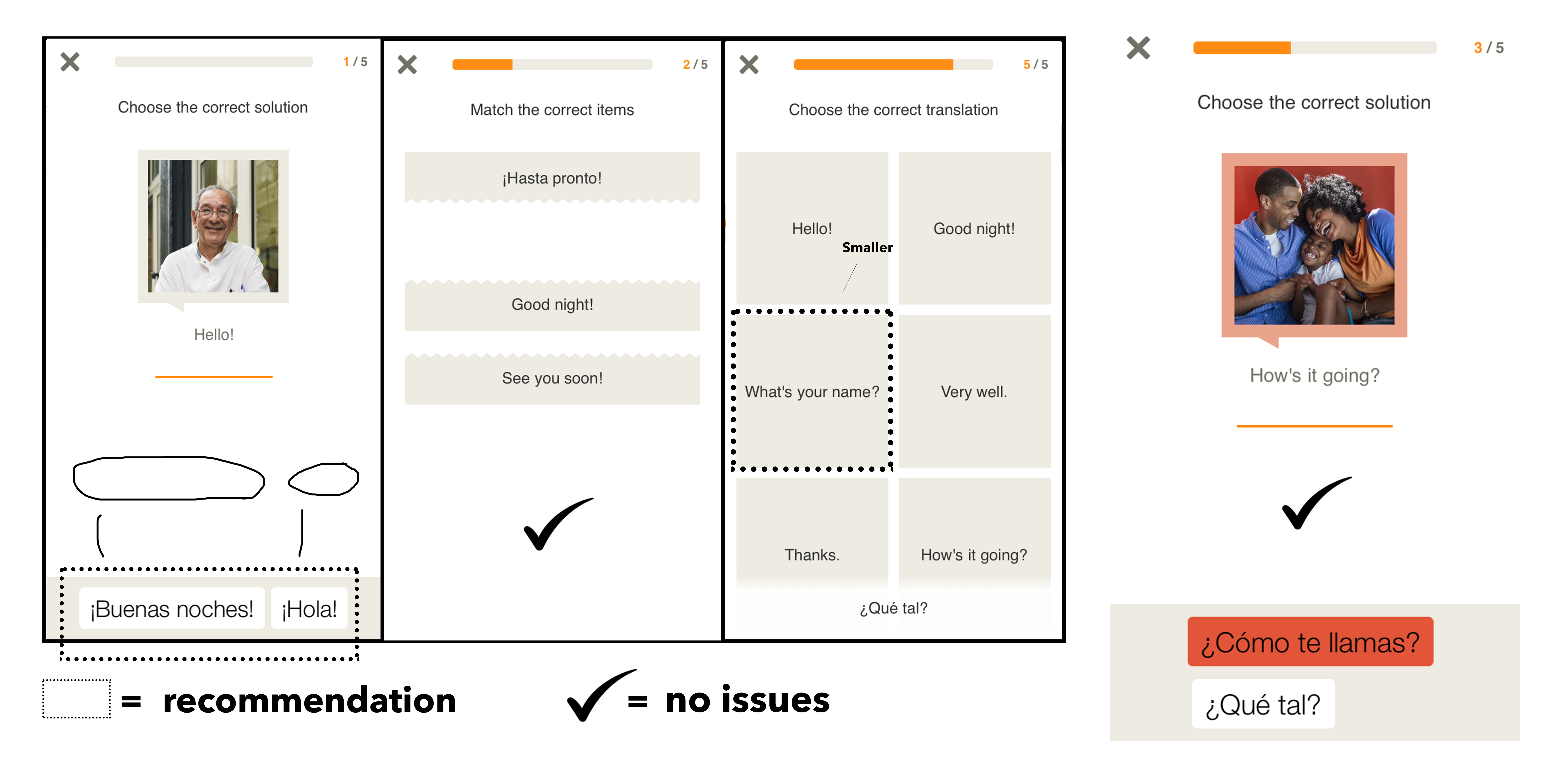
Figure 3.
The lessons relied on a series of carefully designed word games, and puzzles. I found them to be pretty straight-forward with clear buttons and jigsaw shapes most users would have a conceptual model for. A good example is the second pane of Figure 3. which used corresponding perforated edges to clue the user into the fact that one must go with the other to make a whole (followed by animation which shows it as well). My design critique however had much to do with composition of elements. It is unnecessary work for a viewer to traverse to the bottom for two buttons (pane 1 Figure 3.) or for the bottom word to obscure/cutoff the shapes you need to select (pane 3 Figure 3.). I enjoyed the consistency of color, font, shapes, and operations however, and the clear prominence of icon enlargement upon selection. A bonus was clear error messages (fourth pane Figure 3.) signified by color changes and shaking when a wrong choice was made. I found these to be efficient behavioral cues ( ie. wont do that again).