Client
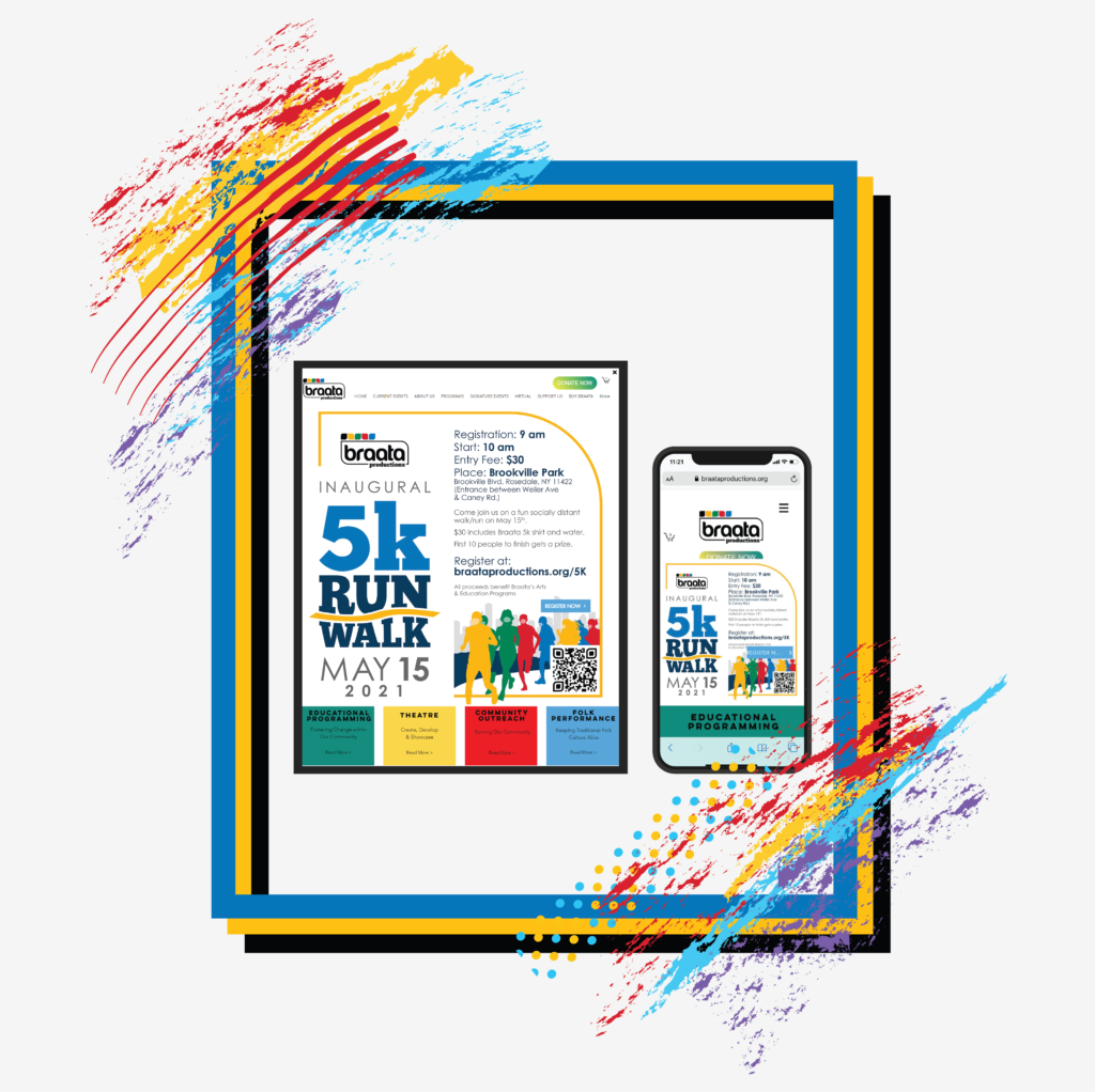
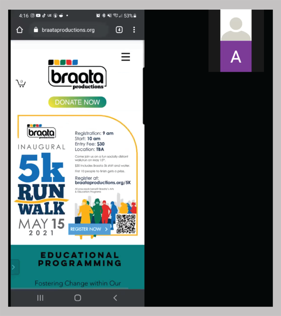
Braata Productions was founded in 2009 to promote Caribbean folk culture, music movement, stories, artists, and theatre within New York City. Braata Productions’ projects and programs have served over 350 artists, directors, designers, and technicians who benefited from projects such as The Braata Folk Singers, “Project BE,” Braata Theatre Workshop, and The Braata Award.
About
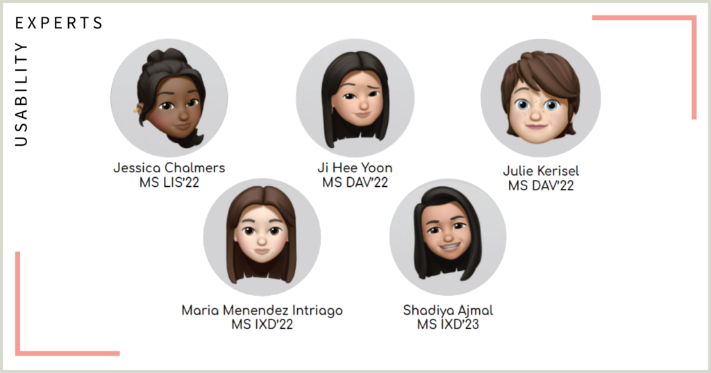
A team of five usability experts conducted moderated remote user testing to evaluate Braata Productions’ website and examined the results to provide recommendations for improvement.
Goal
The main aim of the usability test is to increase the reach and engagement on the website and provide its users pertinent information about Braata and the Caribbean culture. Some key goals included attracting more audience to the website, designing an interface that will incentivize users to have longer sessions, and displaying information in a meaningful and organized manner.
Process

Client Meeting
The client’s primary focus was on improving the usability of the website since engagement for virtual events was put into focus during the pandemic and increased site traffic.
Test Plan
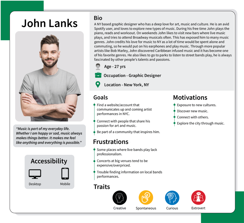
Through analysis of interviews with the client and Google Analytics data, we identified the target audience for the user tests as the following two groups
Tasks
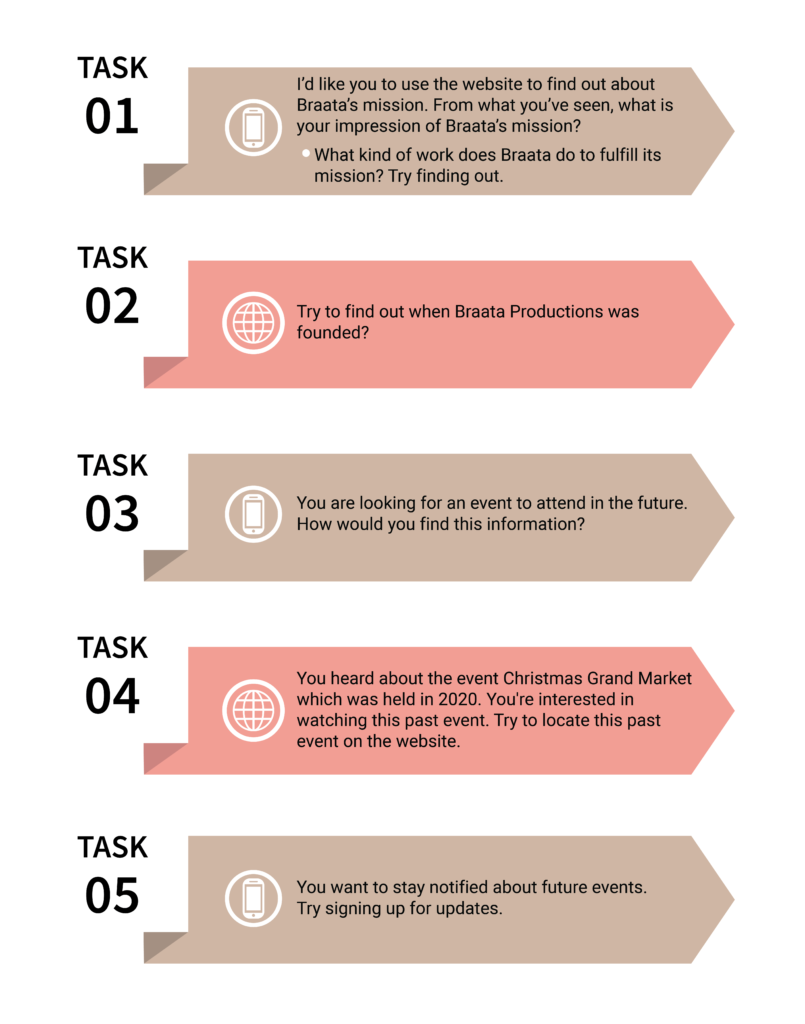
We developed tasks to create a standardized moderated usability test environment. The usability tests included five tasks to evaluate different areas of the site and determine whether or not its structure effectively communicates the mission and work of Braata and engages users.
User Testing
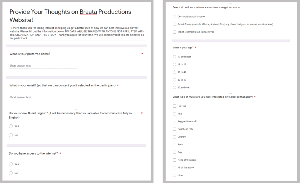
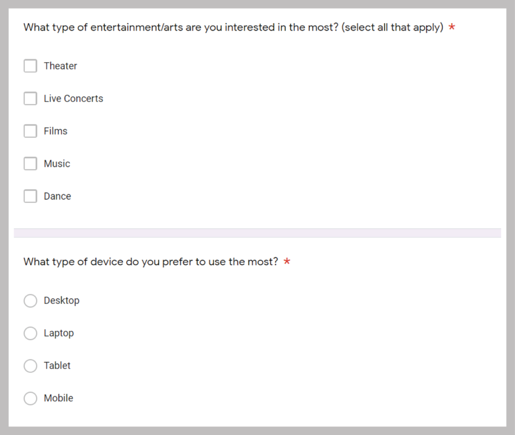
To ensure we recruit participants that fit the target audience, we sent out an email that consists of primary screening topics with questions around the user’s age, interest in Caribbean culture, and experience in Caribbean arts to capture the desired audience.
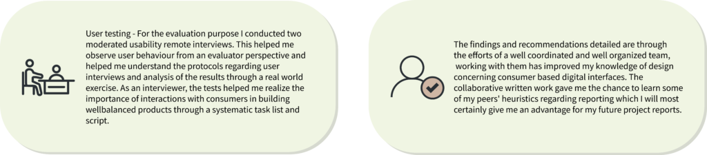
All usability tests were conducted virtually via Zoom. A total of 10 participants partook in the usability tests. We conducted a total number of 10 usability testing sessions with each evaluator testing two users – one of the users used a desktop interface and the other a mobile interface. Each session lasted around 30 minutes. Participants were asked to share their screen and talk through their entire process as they navigate the website. We provided minimal guidance to participants around completing the task to reduce bias and genuinely understand user behavior.
We recorded insights after getting the verbal consent from each user test conducted and gathered to finalize the analysis and develop actionable recommendations that best fit Braata Productions’ goals.
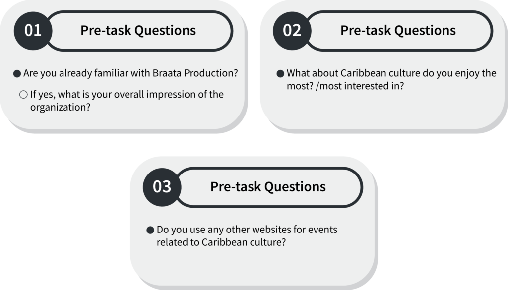
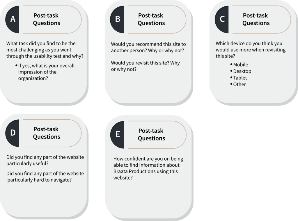
We also asked a few pre-task questions and post-task questions that assessed their overall experience with the test and their final thoughts and emotions around the website.
Brainstorm Session
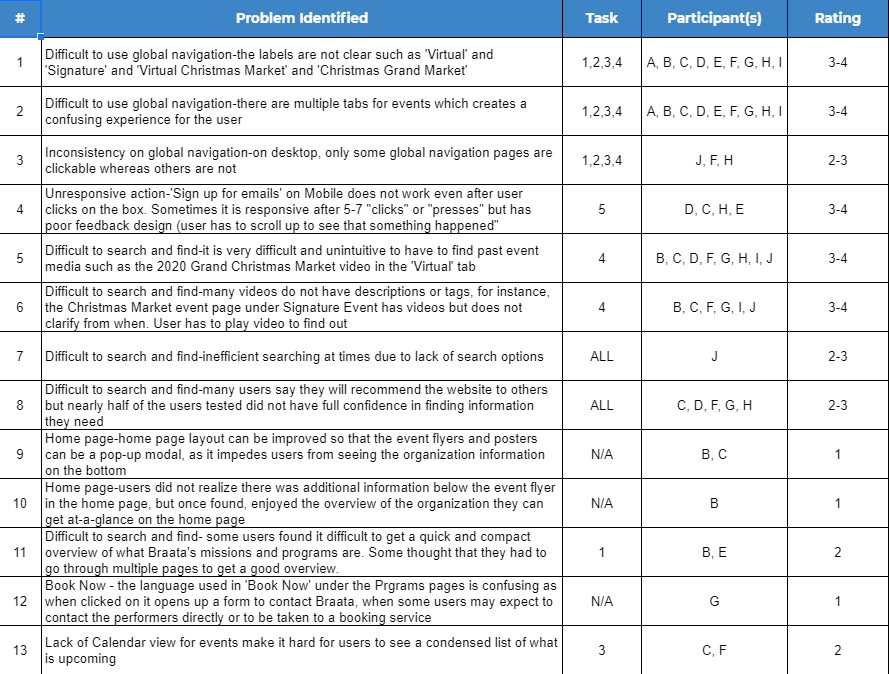
After analyzing the moderated usability testing evaluations, we condensed 50 problems into a total of 13 problems. Aside from issues raised by users while performing the main tasks, the post-task questionnaire also indicated that users had the most difficulty navigating the website only using the global navigation bar and finding information about events (future and past).
Findings
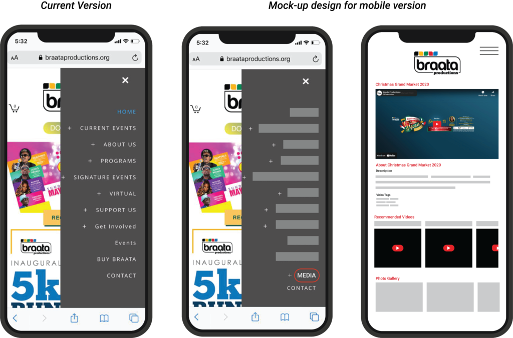
Finding 1: Navigation Menu Contains Duplicate Content and Ambiguous Terms
User A quote, “It’s just weird that the tabs don’t lend itself for me to think I would find that there, maybe if they put Past events or Past shows on the website, it was difficult to find because it just says virtual. Virtual can mean anything like social media, a whole many things. Should be more specific”
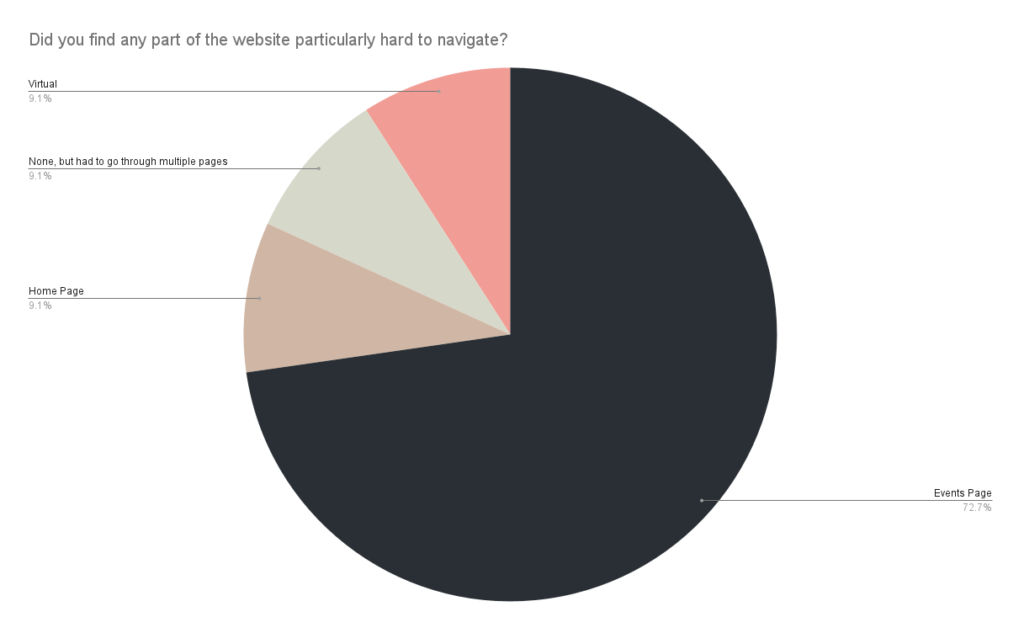
The graph indicates 72.7% difficulty in task 3 and task 4. This means that the user was confused navigating the global menu.
Therefore, we concluded:
- Presence of several pages or menu options with related information or purposes
- Confusion stemming from names and title tabs of the menu
- Lack of clarity as to which functions are clickable
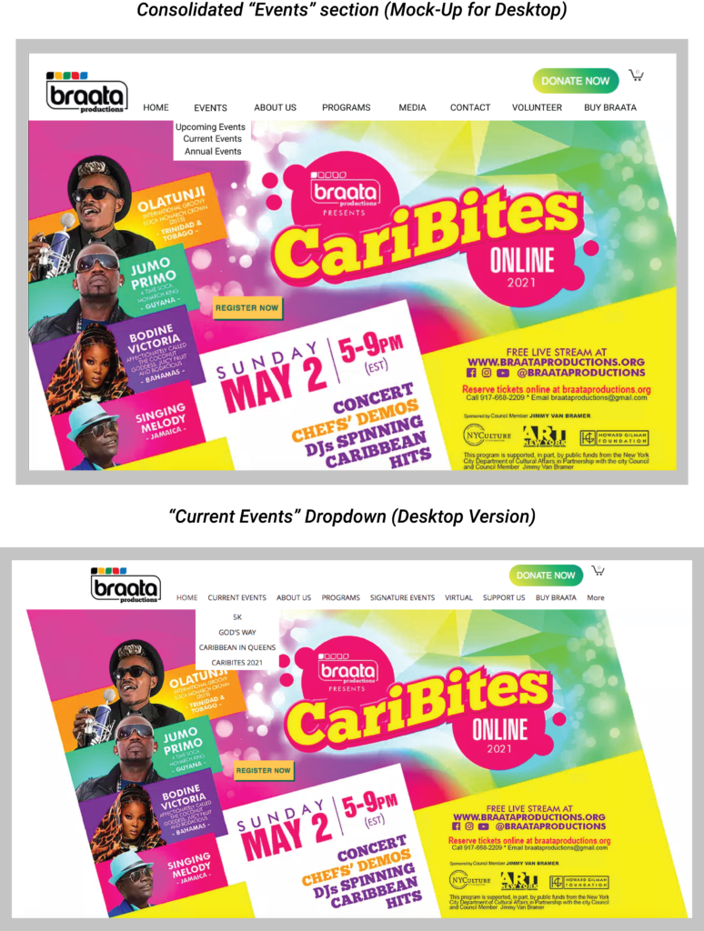
Recommendation 1:
Consolidate and Clarify the Main Menu & Implement Consist Responsiveness Throughout the Site
- Consolidate repeated options
- Clarify name pages
- Implement consistent responsiveness on the desktop webpage
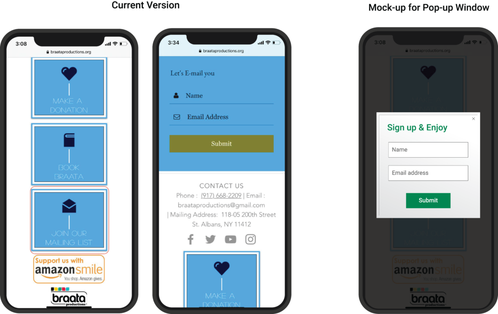
Finding 2: Unresponsive and Sign-up form lacks feedback on mobile
User D quote “I am clicking on ‘join our mailing list’ but it’s taking me here , not sure if i need to sign in somewhere”
Users found that the fifth task presented poor feedback design with the “Join our Mailing List” feature. Furthermore, the mobile “Join our mailing list” button was not responsive. Users had to click on the sign-up button several times for the sign-up information section to appear.
RECOMMENDATION 2:
Add a Pop-Up Window for “Join Our Mailing List”
Evaluators recommend having an instant pop-up window appear when the user clicks on the “Join Our Mailing List” button. This window should have the required input fields asking for the users’ details to sign up. The message requires details such as the name of the user and email address. This recommendation would give a sense of control back to the user and allow the website’s seamless usability. It will also help in improving the responsiveness of the sign-up button.
Finding 3: Unorganized Media Content
User B quote, “There is nothing that mentions specifically that video is in YouTube or something. It’s just there”
The third main problem area revolved around task 4, finding the “Grand Christmas Market” event video in 2020. 70% of the participants identified the task as the most challenging regardless of the device they used. Evaluators discovered that users had problems locating where video content would be on the website as there were no clear navigation pages for media. The only other recognizable source of video content was the YouTube logo in the website footer. One of the users even suggested creating a separate media page where it will be easier to look and search for any existing videos.
RECOMMENDATION 3:
Create a Separate Page for Media Content and Add Clear Descriptions for Each Post
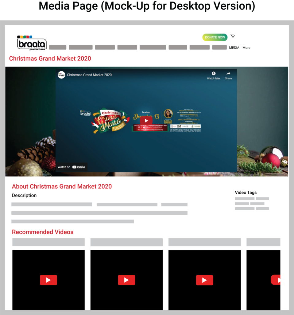
The main goal of the website is to attract users and retain user engagement. We believe one of the methods would be to have easy access to their media, their past events so that users get a glimpse of what the organization does. Users could easily direct themselves to the page to expect that they will find information about past events (e.g., videos, photo galleries, etc.). any video and images should be labeled appropriately and have descriptions, keywords, and tags so that users can easily search for the content.
Finding 4: Hard to Search Directly for Specific Information
100% of user testers felt it was challenging to search efficiently for information given by the specified tasks, including when users had to find a video of the Christmas Grand Market held in 2020. The users looked in “Current Events” and “Signature Events” but were still unable to find the video. Each of the users clicked on different navigation bar tabs until they found the video under the “Virtual” option of the menu.
RECOMMENDATION 4:
Add a Search Bar
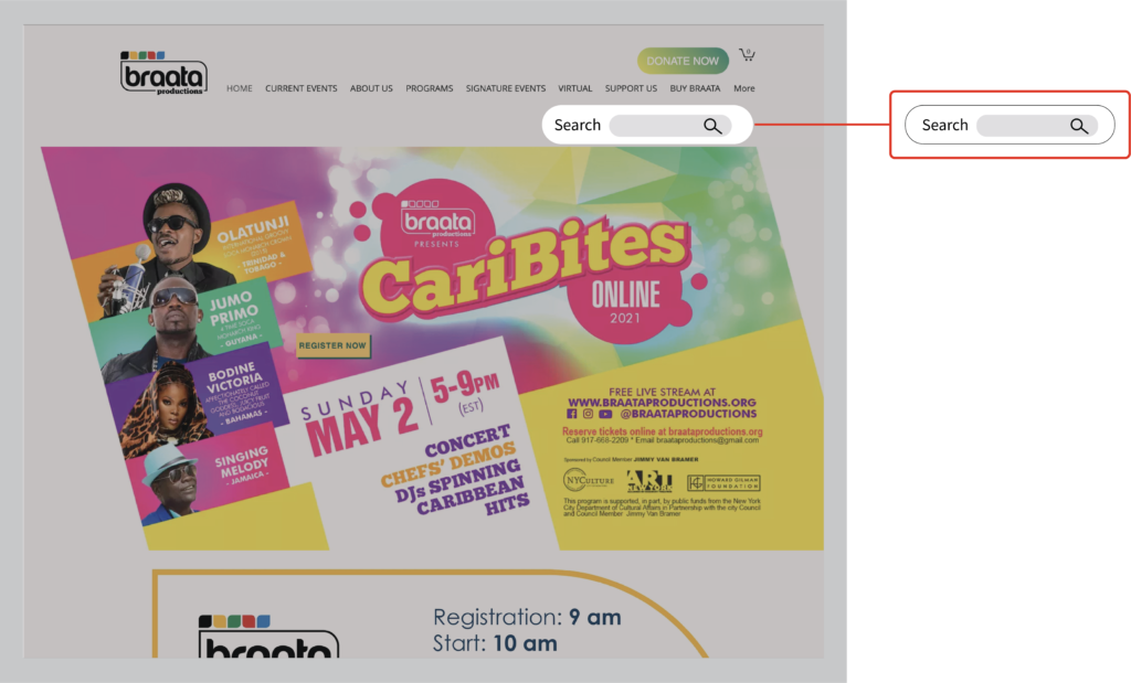
In solving this problem, all evaluators recommend adding a search bar navigation on the website to make it easier for users to find specific content. It will help in limiting the confusion and frustration that the users may experience when looking for information. It will make the process quick as some users mentioned they usually look for information to find quickly and don’t expect to spend a lot of time searching for information that should be readily available.
Final Report
As a group, we created a detailed report on the testing process and the final results. The report can be viewed here.
The results were also presented in a 10-minute presentation. Our team gave an overview of our usability data and evaluations. The presentation can be found here.
Conclusion
The user testing process provided a good insight into the features lacking finesse from a product design perspective. The website was built on a lot of dispersed information which requires some organization and clear clarification for users to traverse the website without inhibition. The test results showed issues in the placement of linked data in the website like the main menu and media content as well as weak feedback when interacting with some buttons meant for subscription services and consolidation like the “Join our Mailing list” feature. Our recommendations were formulated in order to improve these features without taking away from the ultimate purpose of the website in terms of spreading awareness and enhancing user experience.
Learnings and Takeaways
What’s Next?
My next steps would involve keeping a track of this project’s future to understand the product design process beyond tests. The implementation of these recommendations should yield some changes in the website’s user engagement. If it were to change, monitoring the numbers through applicable metrics would help create a feedback process to help with the testing process, since in real-life scenarios, digital products require iterations of the design process. Key factors derived from monitoring the engagements could be indicators of whether the website could achieve the expected goals of spreading awareness about Caribbean culture and the Braata organization.