
Introduction
Apple music is Apple’s native music subscription-based streaming service that aims to help users discover new music and listen to music that they already know and love. The app is a modern replacement to Apple’s iconic iTunes system and marks their shift in focus from enabling music purchasing to streaming from a large music library.
Library (General)
Discoverability
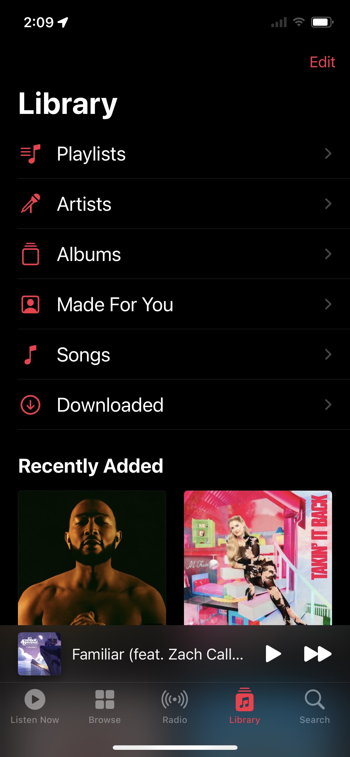
The library is a familiar concept for all music lovers – there is a central place where one can go to retrieve their saved music. Historically, this would be a record case or cassette holder, in more recent history it might be a flash drive or iTunes music library. Regardless, the mental model exists for users that music is saved in and retrieved from a library.
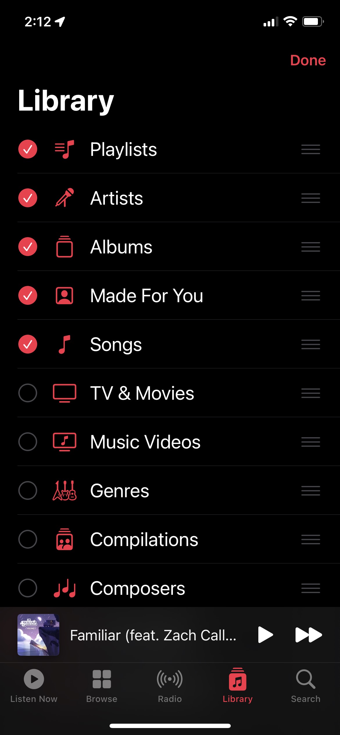
Apple has a standard library display which can be configured to a users liking by clicking the ‘Edit’ button in the top-right corner of the page. Again, this matches the mental model of a library as typically most users like to organize their music in some way, whether alphabetically or by genre. There are a variety of library organization options that users can choose to display or hide – the circles and checkmarks serve as both affordances and signifiers. Tapping the circle affords selection, while the checkmark and open circles signifies that the action was possible. There is immediate feedback once one exits the edit pane as the selected organizational options (e.g. Playlists, Genre, Composer) are either displayed or hidden.
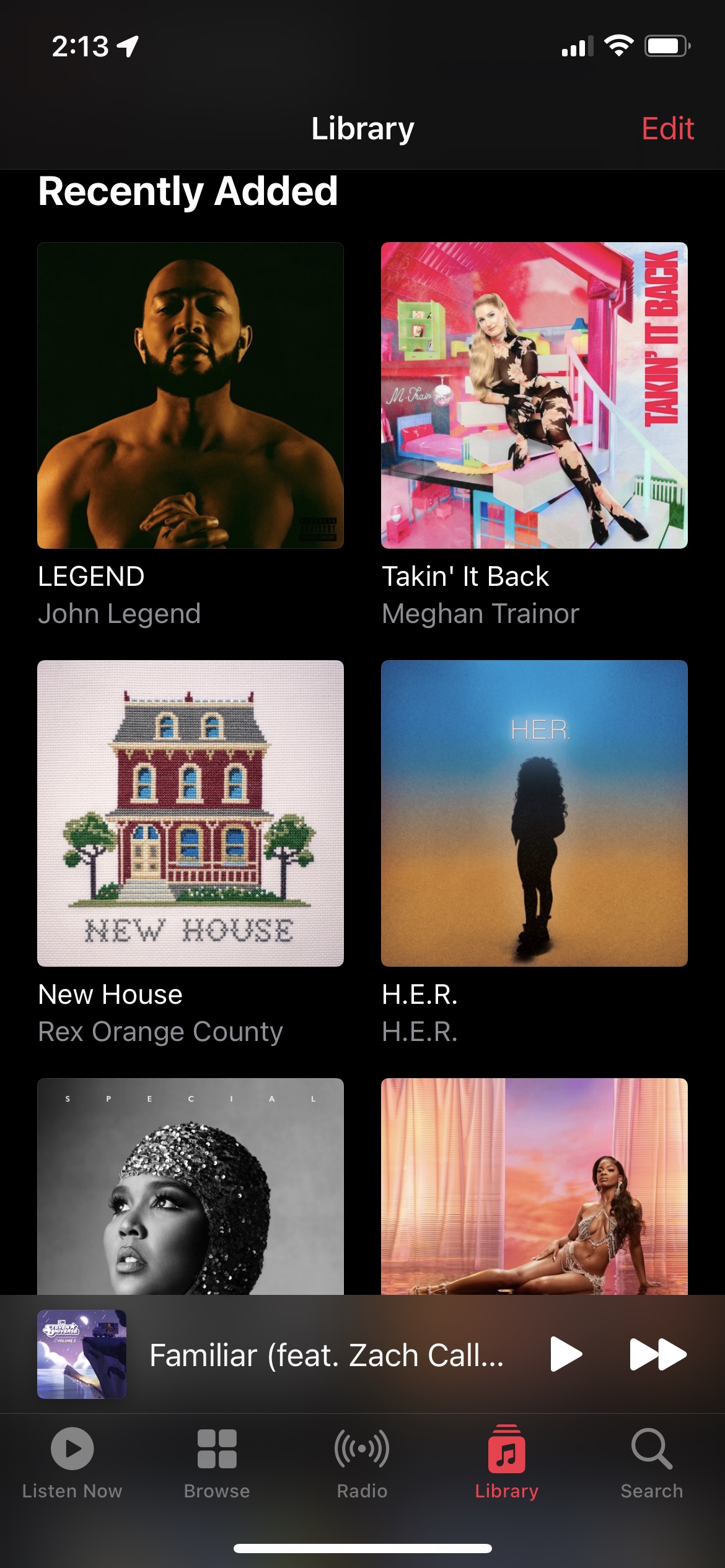
The Recently Added section of the library is standard, and acknowledges that users often want to re-listen to music that they’ve discovered recently. WIth the combination of time based sorting of songs based on date of library addition and the visual indicator of the album, retrieval from long-term memory is simplified as users can more quickly recognize music that they’ve listened to previously but may have not committed to memory. The library overall supports memory retrieval in that it acknowledges that one can enjoy a song without necessarily remembering every detail. The library is designed to help users find their way back to music they discovered and enjoyed in the moment.
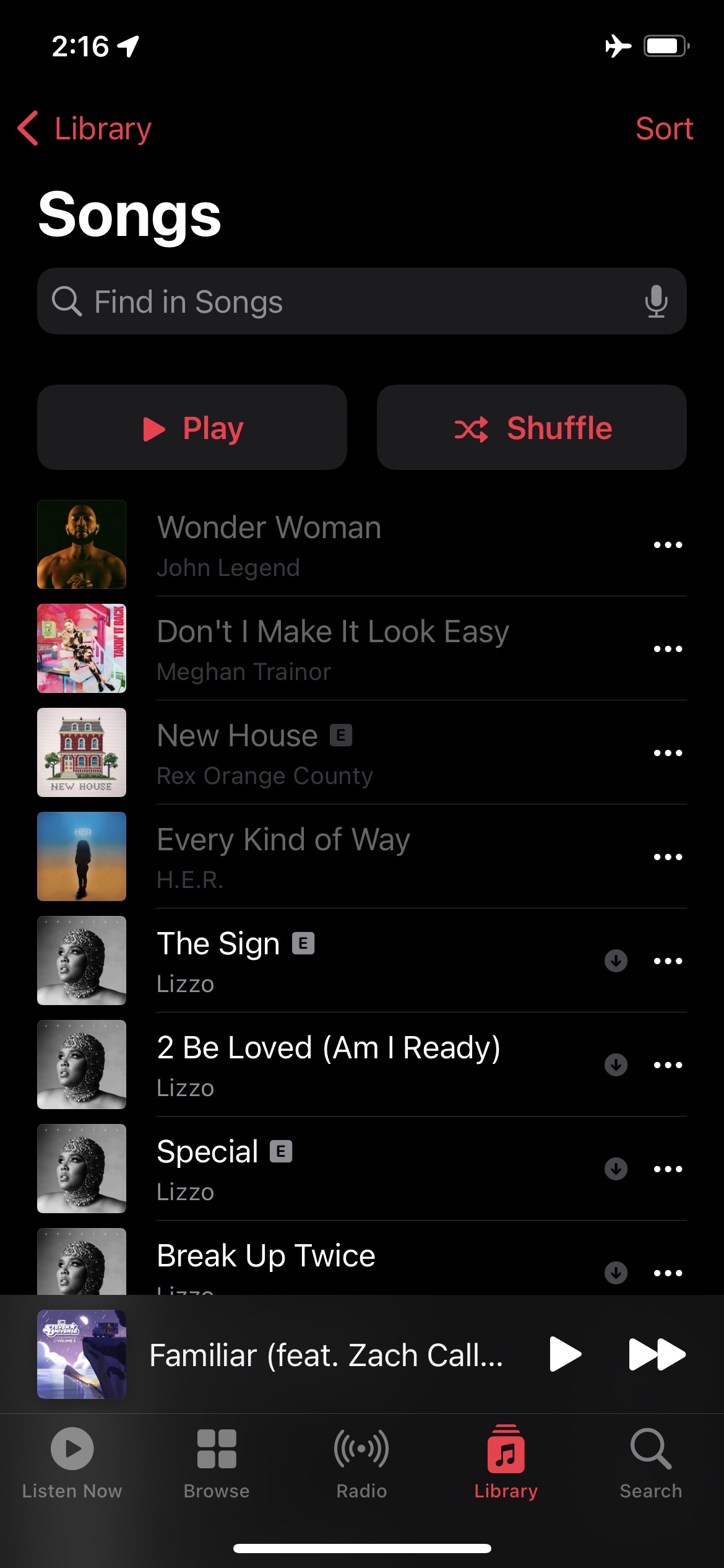
Library (Songs)

The songs breakout within the Library tab provides the most granular way of looking at one’s music library, song-by-song. There is a small thumbnail of the album artwork on the left-hand side of the song details that makes albums quickly visually identifiable. Song title is noted in clear header copy, and the artist is noted as a sub-header, readable albeit less prominent. A small ‘download’ icon is also used to signify whether or not music is available offline. At the top of the screen, there are buttons for play and shuffle. The play and shuffle buttons respectively afford the playing and shuffling of songs in the library. The icons on the buttons and clear labels help to further signify the action that will occur upon interacting with the buttons. Finally, the top-right corner ‘Sort’ button allows users to organize the list of songs in the manner they see fit.
Once music is playing there is an ever-present banner that enables users to control the actively playing music, regardless of what screen the user navigates to. This banner approach represents effective human centered design because above all, Apple Music is used for people to listen to music. Enabling the user to do this intuitively and easily from every screen addresses a core design need.
Constraints
*Insert greyed out library photo and error message
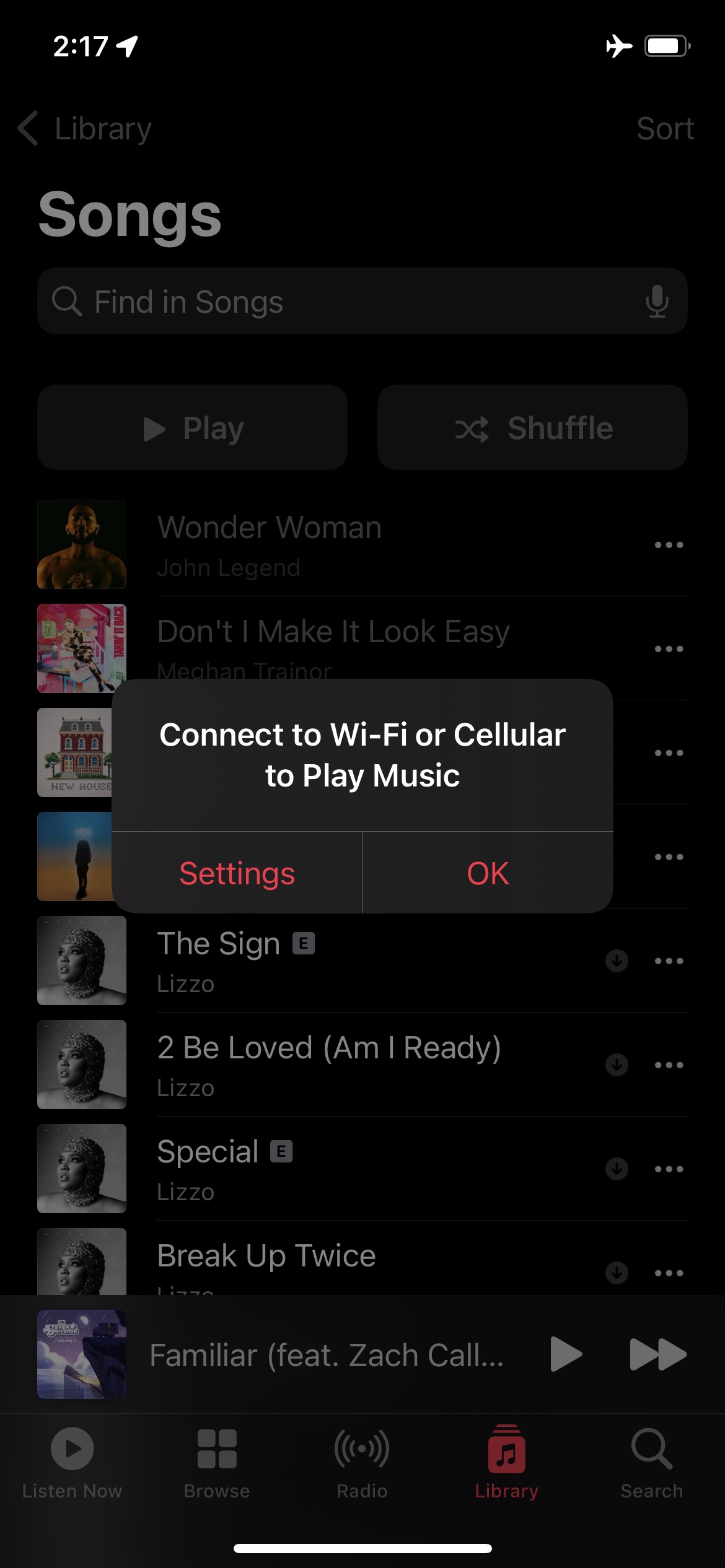
Since Apple Music is primarily a music streaming platform, it is necessary to have constraints for when internet (and therefore, streaming) is unavailable. When a device is no longer connected to the internet, any music that has not been pre-downloaded to the device is no longer selectable and instead grayed out. It is still visible in the library, but the copy is faded relative to the downloaded music. Furthermore, if one attempts to click on a grayed out song, they receive an error message indicating that a Wi-Fi or Cellular connection is required to Play Music. A user then has the option to acknowledge the error, or address their connection issues in their phone settings. This constitutes effective design as the functional limitation of streaming non-downloaded music is clearly displayed while providing clear instructions on how to remedy if a user attempts to follow their usual usage pattern.
Music Queue
The Queue / Play Next feature enables users to add music to a queue and curate a real-time playlist of the songs they want to hear next. This feature transcends the mental model of listening to a CD or Record as the user has access to any record or CD within their digital streaming library – song choice is not limited to one specific album. However, in the absence of this limitation it is very easy to lose track of what song will play next.
Signifiers
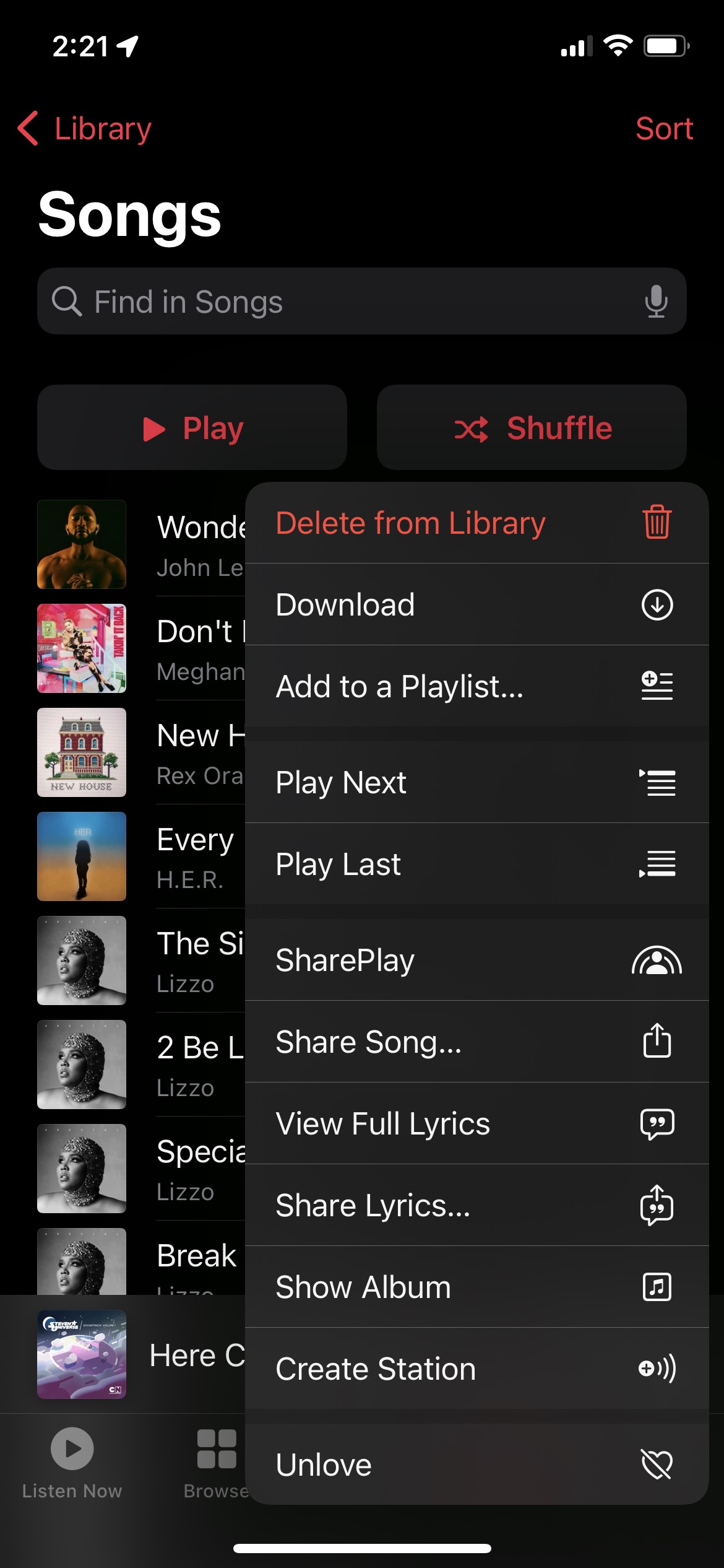
Apple uses signifiers effectively to promote effective queue management on the first try. When one clicks the ‘…’ next to a song, multiple actions appear, including ‘play next’ and ‘play last.’ These actions have a slight separation from the other which helps to indicate that they are a pair. The labels are in plain speak and can be interpreted at face value – clicking play next queues a song to play next, play last queues a song to play last. The labels are accompanied by two icons that indicate an item being added to the top or bottom of a list respectively. These icons are very similar to the overall queue icon and make it clear where the specific song is going.
Mappings
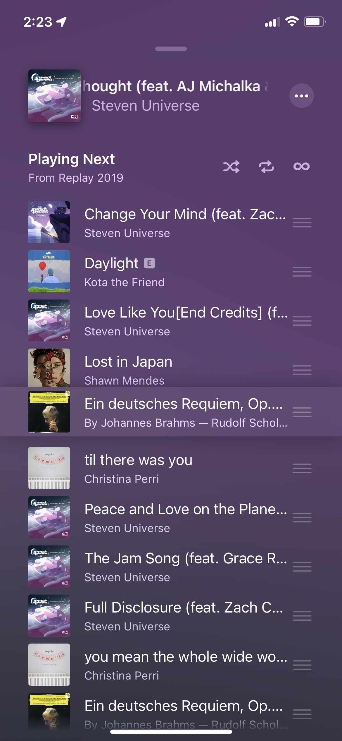
While navigating the full queue list, Apple Music uses effective mappings to help users achieve their desired end result of sorting the queue. Sometimes, a user doesn’t want to just play a song next or last, they have a specific intention for where that song should be placed in the queue. The three horizontal lines next to the song name signify that songs can be tapped and dragged to be reordered. The intuitive mapping comes through with the queue organization feature – dragging a song up moves it up in the queue, and dragging a song down moves it later in the queue. A user literally orders their music in the sequence in which they would like it to play.
Error Prevention
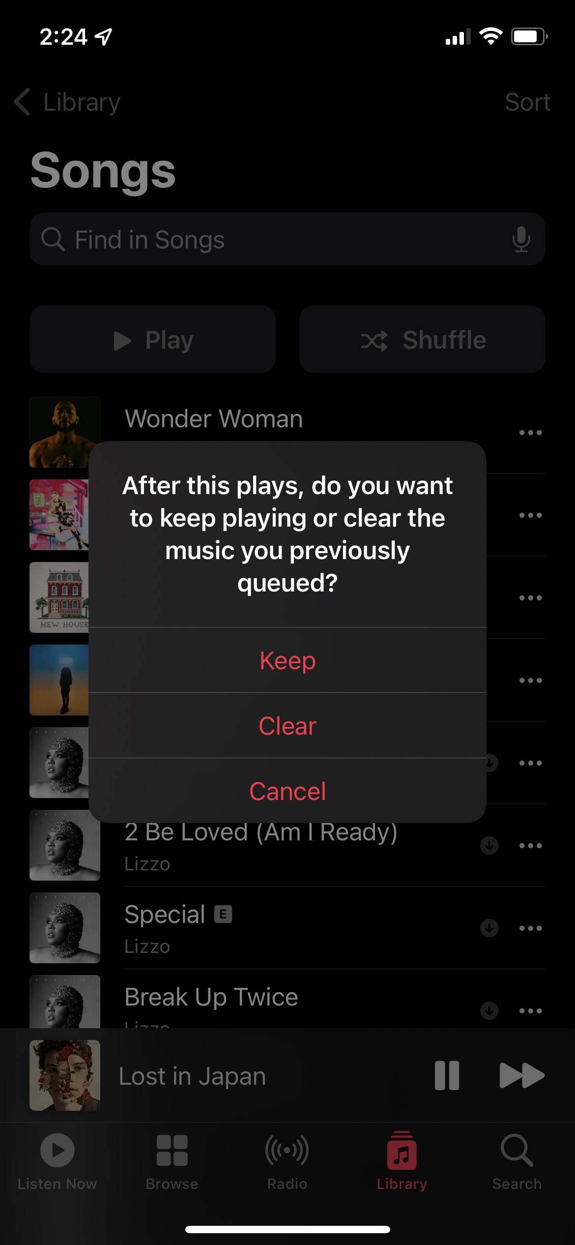
The Play Next feature demonstrates effective error prevention within the app. When I attempt to change songs, I receive a prompt that gives me the opportunity to undo (cancel) my action of altering the queue, or alternatively confirm my decision. Within the confirmation message, I have the opportunity to maintain the queue after the new song plays or clear it completely. To design this feature so effectively, it feels that Human Centered Design must have been used to identify that users are not simply interested in queueing songs – they want to be able to manage their queue and understand the current status.
Conclusion
Apple Music is an elegant music streaming solution with high learnability potential for end users. While I do not have many criticisms in my design critique, I do think a guided walkthrough would be worthwhile for novice users, especially those who are less comfortable with streamlining platforms. SOme of the functionality (e.g. long-press, drag) are largely invisible to users unless they discover them accidentally or are familiar with haptic touch. More users can experience ease and delight if they are aware of the full functionality of the Apple Music iOS app.