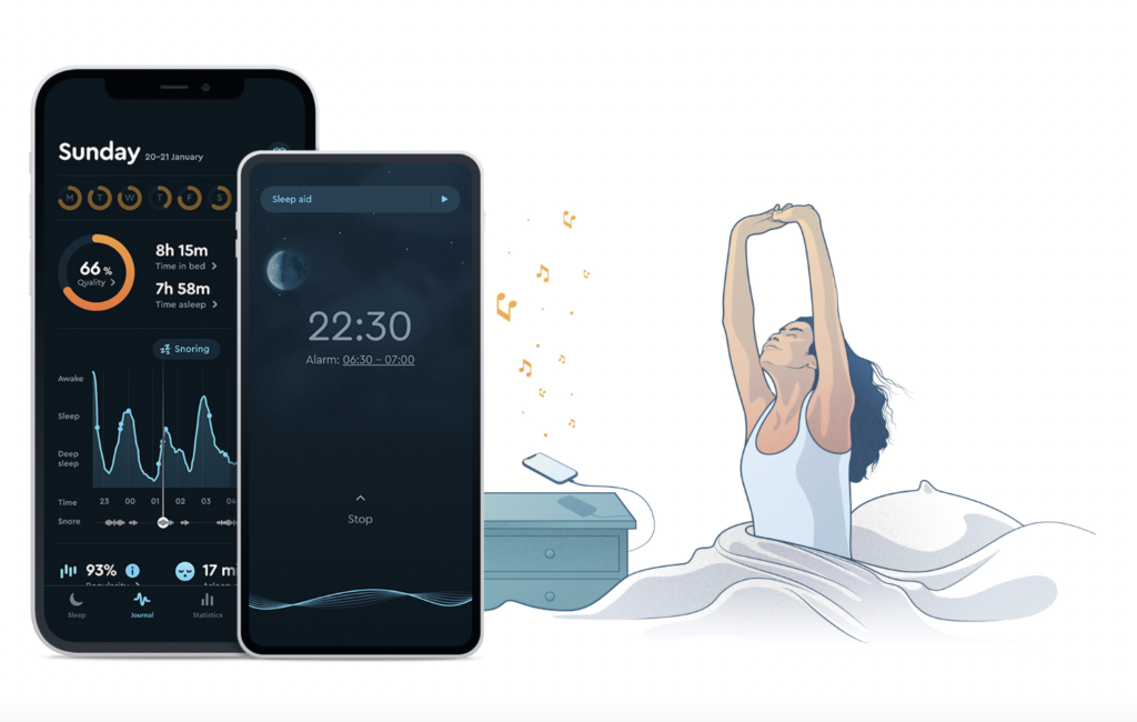
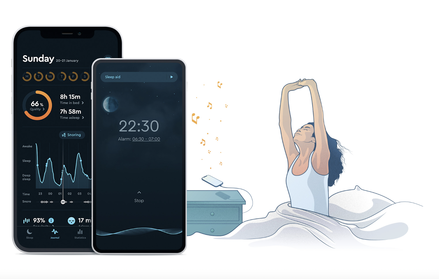
Sleep Cycle is a sleep tracking app and alarm system. By analyzing your sleep, the app will wake you at an ideal time in your sleep cycle, allowing you to wake more easily and naturally. The app also provides additional information about your sleep patterns and support for better sleep.
The App
Sleep Cycle has five main menu tabs located in a navigation bar at the bottom of the screen: Sleep, Programs, Journal, Statistics, and Profile.

Sleep is the interface for the alarm system.

Programs is a selection of audio recordings to help with issues such as stress, relaxation, and better sleep.
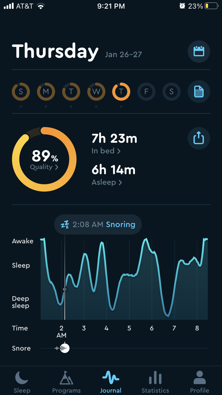
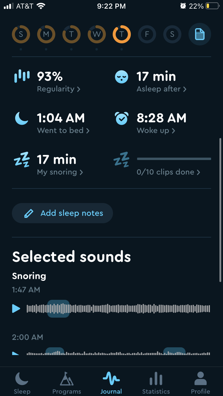
Journal is for data about individual nights of sleep.
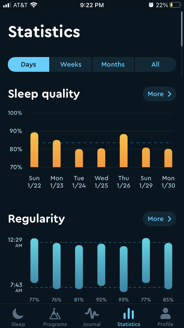
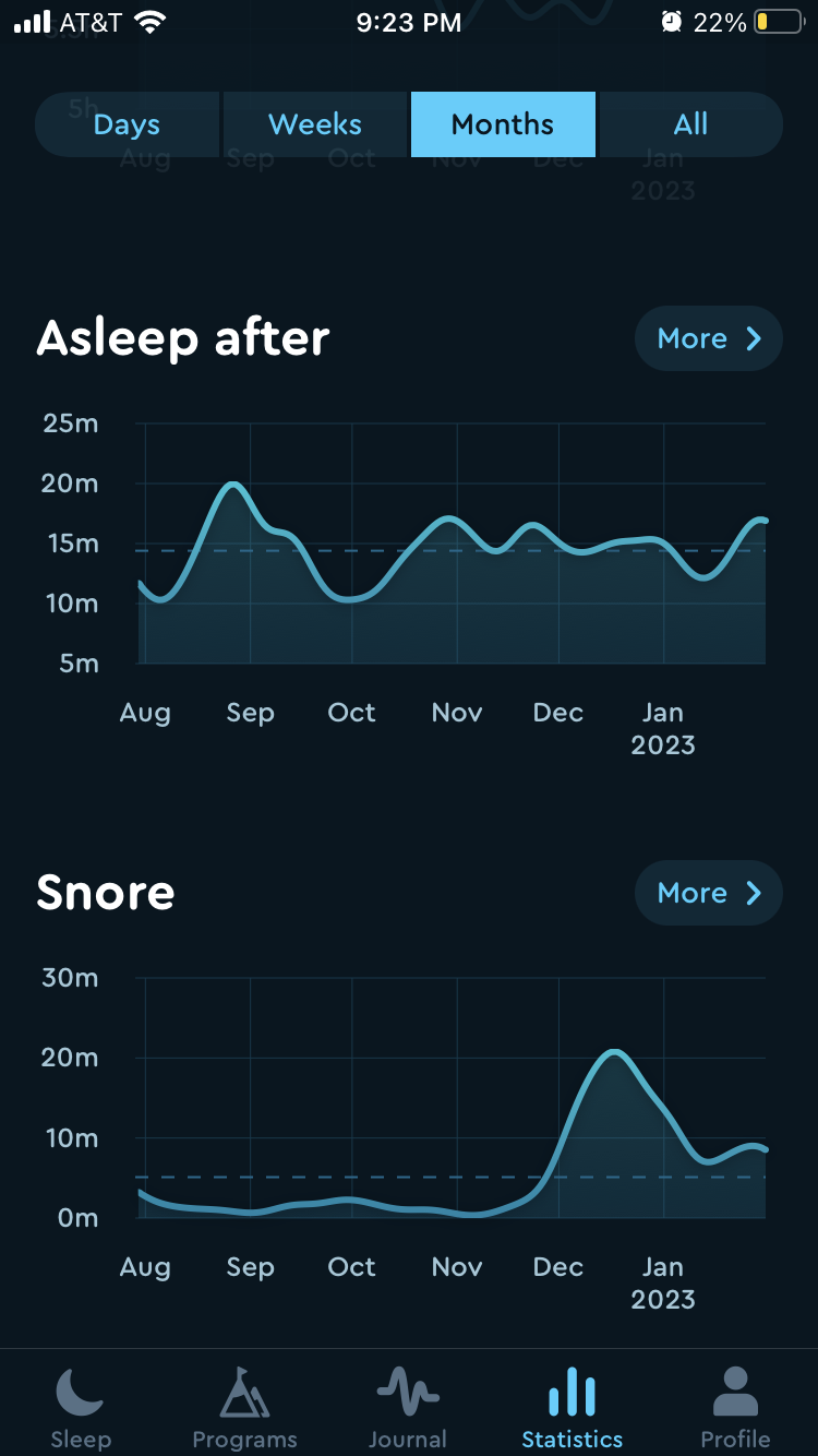
Statistics looks at sleep trends over time. The final tab, Profile, is where all the users personal information and preferences are stored.
Sleep Tab
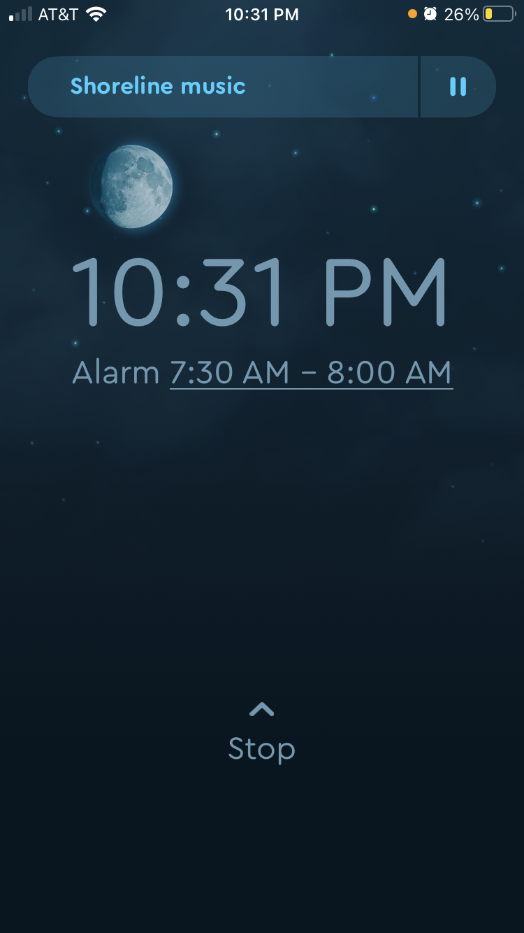
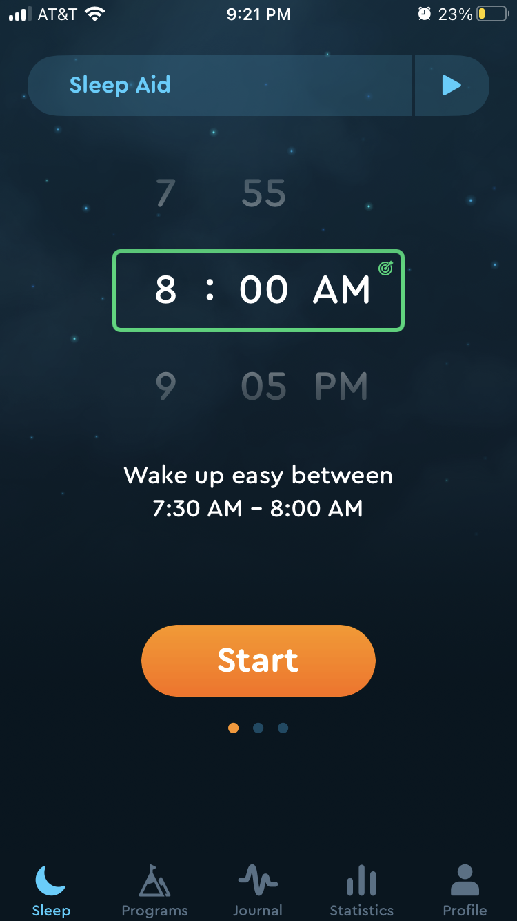
When you open the app, the home screen is the Sleep tab. The page is designed to streamline turning on the alarm at night and will be preset to the user’s wake up time. This is knowledge in the world, allowing the user to turn on their alarm without thinking about the time. This also reduces the chances of error, like making a slip and setting the time to PM instead of AM. The “start” button is clearly mapped and discoverable as it is distinctively button shaped and highlighted in a bright orange that contrasts the dark background. The screen will change once you have pressed the start button, providing immediate feedback that confirms to the user that the alarm is turned on. The user has to simply open the app, press start, and go to sleep. The experience of setting the alarm is very smooth and the current setup works well.
The numbers above and below the set alarm time are designed to create an illusion that fits into the conceptual model of a wheel, signifying an affordance that allows you to scroll up and down to change the time. For users that need to change the alarm time, the wheel acts as clear mapping that will guide them to changing the time.
A Glitch in the System

For a split second when users first open the app, the screen will look like the glitch image above before loading completely. The menu of icons at the bottom is what the menu used to be. Users who predate the navigation bar update who want to navigate to the Journal tab will see the icon and, following a visceral response, press it. However, they will have navigated to the Programs tab, as the new navigation bar has placed the Program in the Journal tabs old location. The old navigation bar is visible long enough to misdirect users into selecting the wrong location for the Journal tab. While this is most confusing to older users, it will also be confusing to new users. Operating on the assumption that the appearance of the old navigation bar on opening is a mistake, this brief glimpse should be eliminated entirely.
A Better Navigation Bar
The glitch also highlights issues in the design of the new navigation bar. For seasoned users it is confusing that the Journal tab icon has moved. It is likely that the developers chose to put the new Programs tab icon in this location as a constraint that would guide users to the Programs tab and force them to discover the new content. However, users that are not interested in the new offerings may find it frustrating that they keep finding themselves in the Programs tab on error when they wish to be in the Journal tab.
Users using the most basic functionality of the app are unlikely to interact with the Programs tab, so it would make more sense for the Journal tab to remain where it was as the mapping is not just skeuomorphic, but logical. The most used tabs should be the most discoverable. Assuming a natural mapping of reading left to right, based on cultural constraints, this would mean placing the tabs in order of most used to least from left to right. Legacy users who have only ever interacted with the Sleep, Journal and Statistics tab are more likely to continue to only interact with these tabs, and users sticking to basic functions are likely to do the same, so these would be the most used tabs.
The addition of the Programs tab may present as a case of featuritis. By placing it further to the right on the navigation bar, this will allow the user to easily find the new feature, without frustrating them when they are trying to navigate to the Journal tab. Having the Profile tab furthest to the right is still logical mapping as this follows cultural conventions, it is common in apps for profile icons or tabs to be placed on the right. It is more common for the profile icon to be at the top of the screen, but as the navigation bar is placed at the bottom of the screen, in this instance it is a logical constraint to also have the Profile icon on the bottom navigation bar.