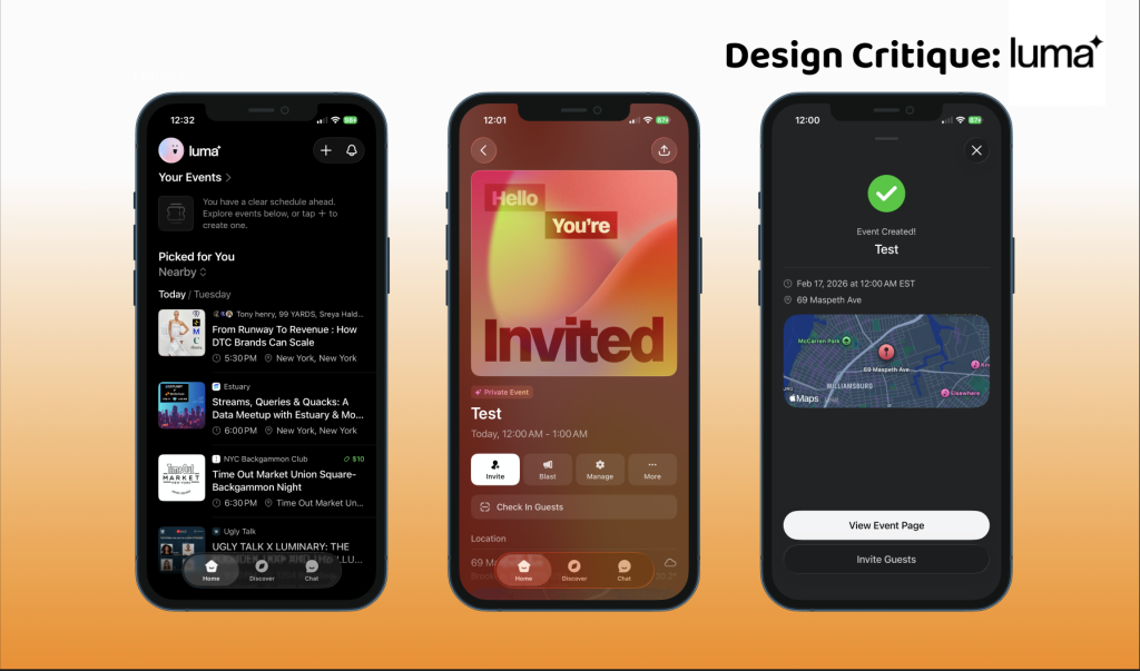
Design Critiques

What makes some designs good and others bad? Why do some designs work while others don’t? Posts in this category offer thoughtful design critiques of modern digital interfaces, with commentary inspired by Don Norman’s “The Design of Everyday Things.”

Nibble app interface displayed on smartphone against purple gradient background

Design Critique: Nibble (Android App)

Nibble is a microlearning app offering short, interactive lessons across topics ranging from math to art, designed to help users learn more in manageable, bite-sized sessions. This critique examines the journey of a young, full-time professional with limited free time who uses Nibble to replace doomscrolling with meaningful learning. Drawing on Don Norman’s The Design of Everyday Things and Jenny Davis’s How Artifacts Afford, this analysis explores how the app’s design enables the user’s goal of building a daily learning habit within a hectic routine.

Design Critique: Nibble (Android App) Read More »

Design Critique: Strava

Strava is a performance centered fitness tracking app that transforms physical activity into measurable data rather than only recording workouts, it structures exercise around metrics, competition and visible improvement charts. For runners and cyclists who are motivated by progress tracking, personal records and social comparison this app provides a clear system for documenting effort and

Design Critique: Strava Read More »

Design Critique: WEBTOON (iOS App)

WEBTOON is a mobile-first serialized comic platform built around vertical scrolling storytelling. Its original conceptual model resembled a digital library of episodic stories updated weekly. Today, the system image presented to users is far more complex. It blends characteristics of: a streaming platform (ranks, trending), a social media feed (comments, algorithmic recommendations), a freemium game

Design Critique: WEBTOON (iOS App) Read More »

Design Critique: Endel (iOS app)

Endel is an AI-powered sound wellness app that creates generative soundscapes designed to help users focus, relax, and sleep. Unlike a static playlist, Endel’s “Endel Pacific” engine blends music in real-time, aiming to make the audio endless and never repeats exactly. Using Don Normans, Design of Every Day Things and chapters of How Artifacts Affords, this critique aims to explore how Endel’s design guides and confuses the users in their quest to focus.

Design Critique: Endel (iOS app) Read More »

Design Critique: Are.na (iOS App)

Are.na is a visual bookmarking and knowledge-curation platform that lets users collect images, links, text, and files into organized “channels.” It’s built for researchers, creatives, and thinkers who want a distraction-free alternative to Pinterest or Notion — without ads, algorithms, or social noise. Meet Maya Maya is a 26-year-old graduate student in landscape architecture. She

Design Critique: Are.na (iOS App) Read More »

Citymapper App

Design Critique: Citymapper (iOS App)

Citymapper is a mobile navigation app which helps users navigate across a city using public transportation, walking, cycling all the other travel modes that the city has to offer. It combines real-time transit data, accessibility-aware routing and advance trip planning features. The app reduces uncertainty and cognitive effort for the user in their navigation.

Design Critique: Citymapper (iOS App) Read More »