Airbnb.com, booking.com, homeaway.com, and many other vacation rental websites have expanded the universe of what is available to travellers and what travellers expect on vacation.
User experience and how users interact with a booking website and the vacation experience means that homeowners wanting to earn passive income need to be aware of who their users are and what they want. They don’t have to go overboard, but a sense of harmony must prevail in the transition from interacting with the web experience to interacting with the vacation experience. It’s an area that could benefit from the use of personas. Homeowners can identify key interaction moments and design them with personas in mind.
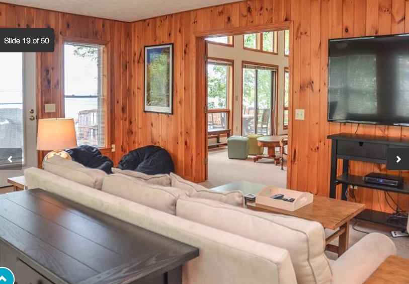
From the images posted on Fingerlakespremierproperties.com of the expansive space to its lux description, it’s clear the owner of this vacation house wanted his or her guests to enjoy their stay.

Guests in Every Size
There’s much to enjoy that the owner delivers on. It’s also apparent, the owner gave a lot of thought to his or her guests. Making sure that the beds are Leeza brand with organic cotton bedding, kayaks for quiet enjoyment on the lake, a fully-equipped kitchen that would please family cook or gourmet chef.
Providing Help
It’s in the kitchen, that it becomes clear that the owner seems to have engaged the idea of personas – making his or her potential renter as real as possible.
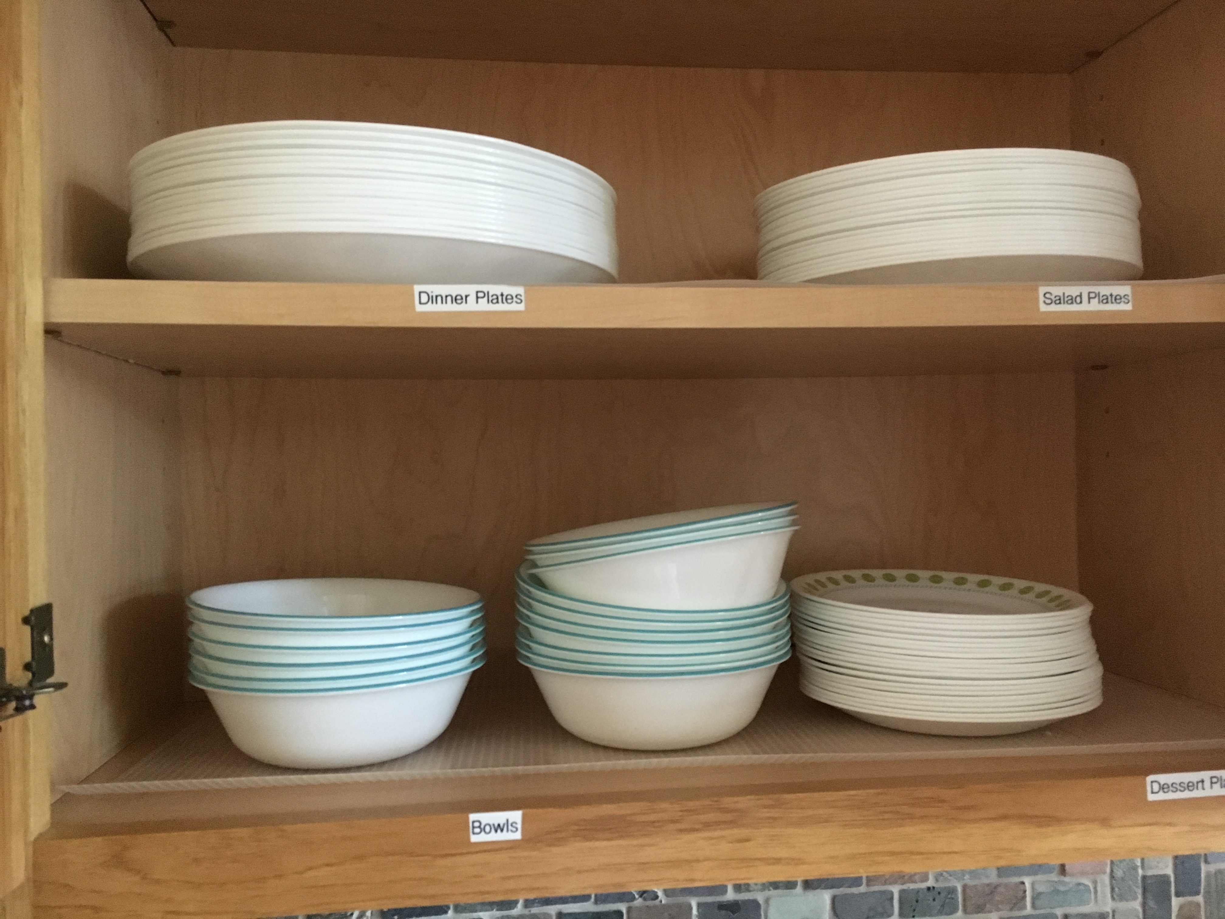
In the kitchen, and throughout the house, the owner has left instructions or identifiers to help the renter. These instructions range from the very simple (Figures 1 and 2) to the complex.
Adding Complexity
The instructions vary in complexity, exposing a sense that the owner used an “elastic” persona (Cooper, Reimann, Cronin, Noessel), creating a user-composite of various experiences and backgrounds (Figures 3-5).
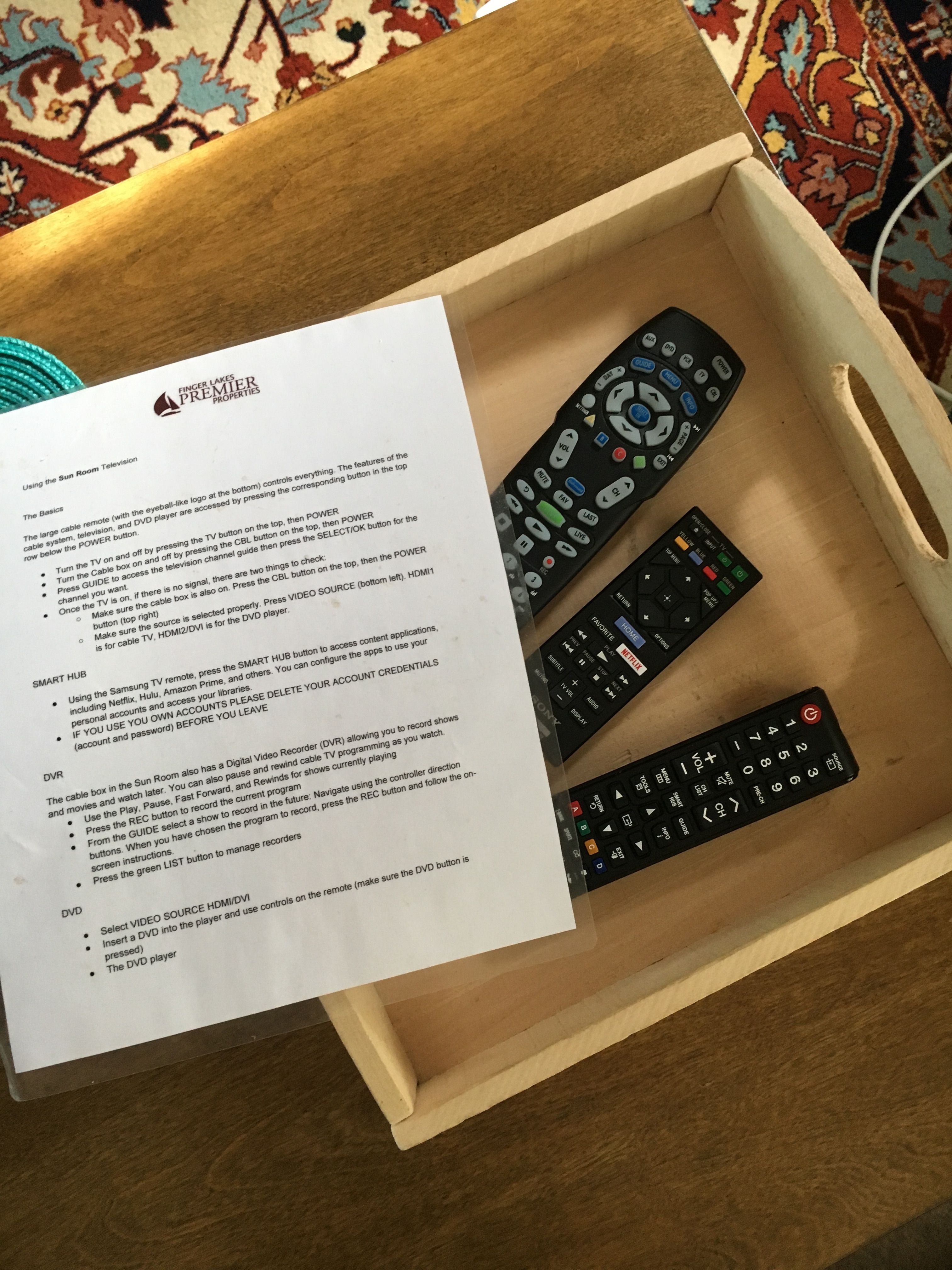
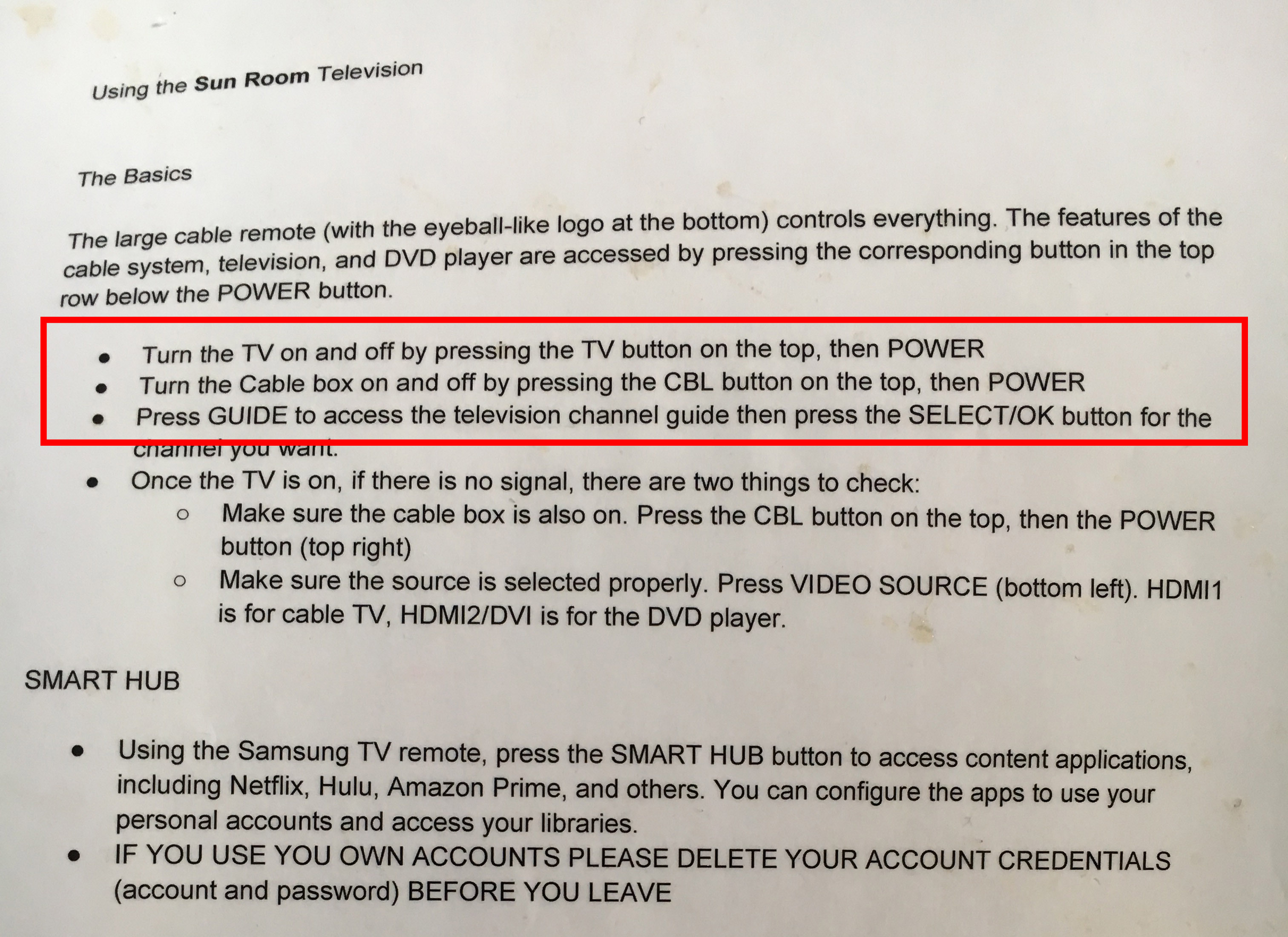
The instructions for the television are likely not very useful to the persona who has rented the house for the lake views, nearness to the Finger Lakes Wine Trail, or kayaking. That person may well want to watch TV, but probably isn’t expecting a full-page of instructions, including trouble-shooting.
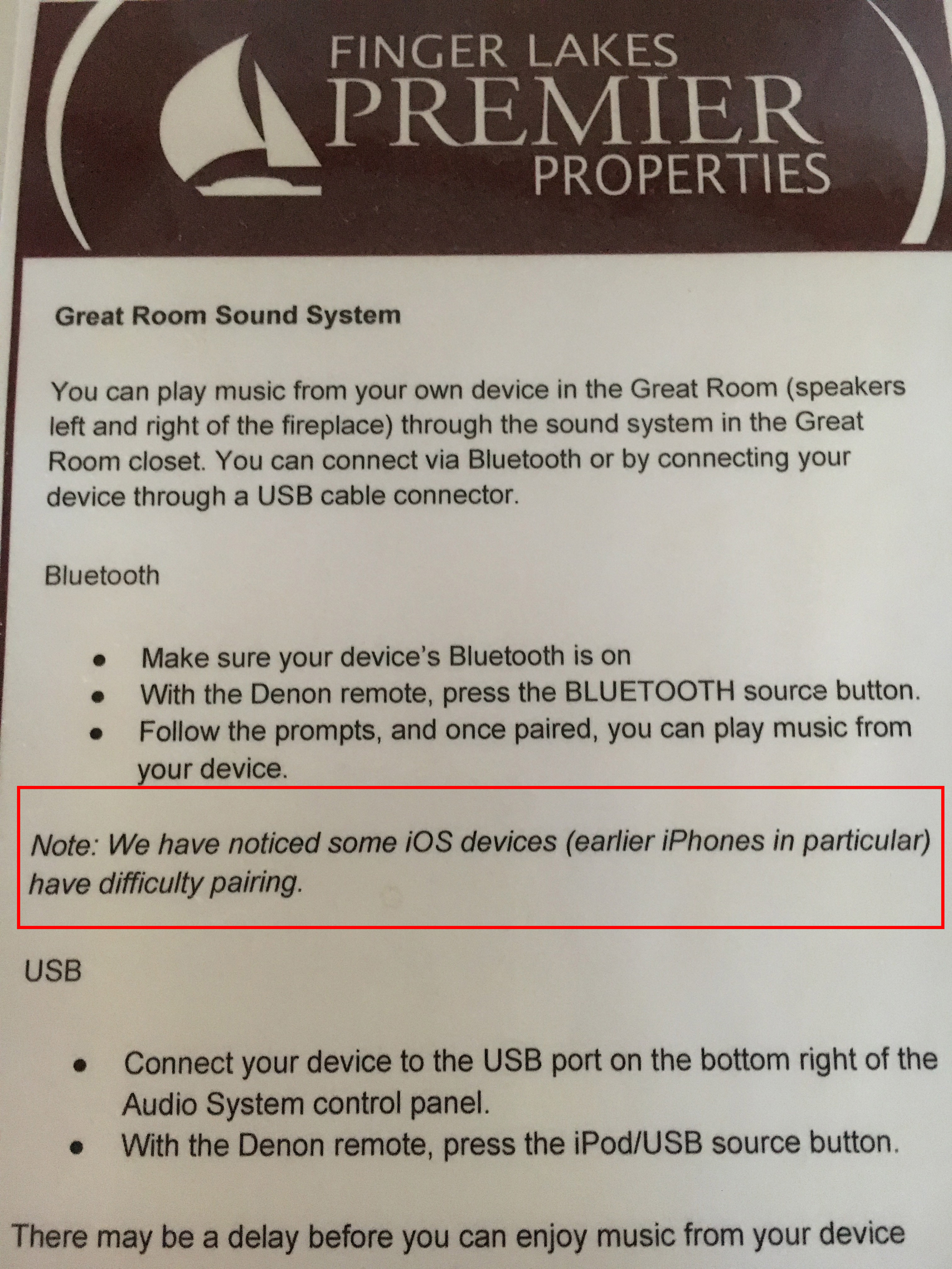
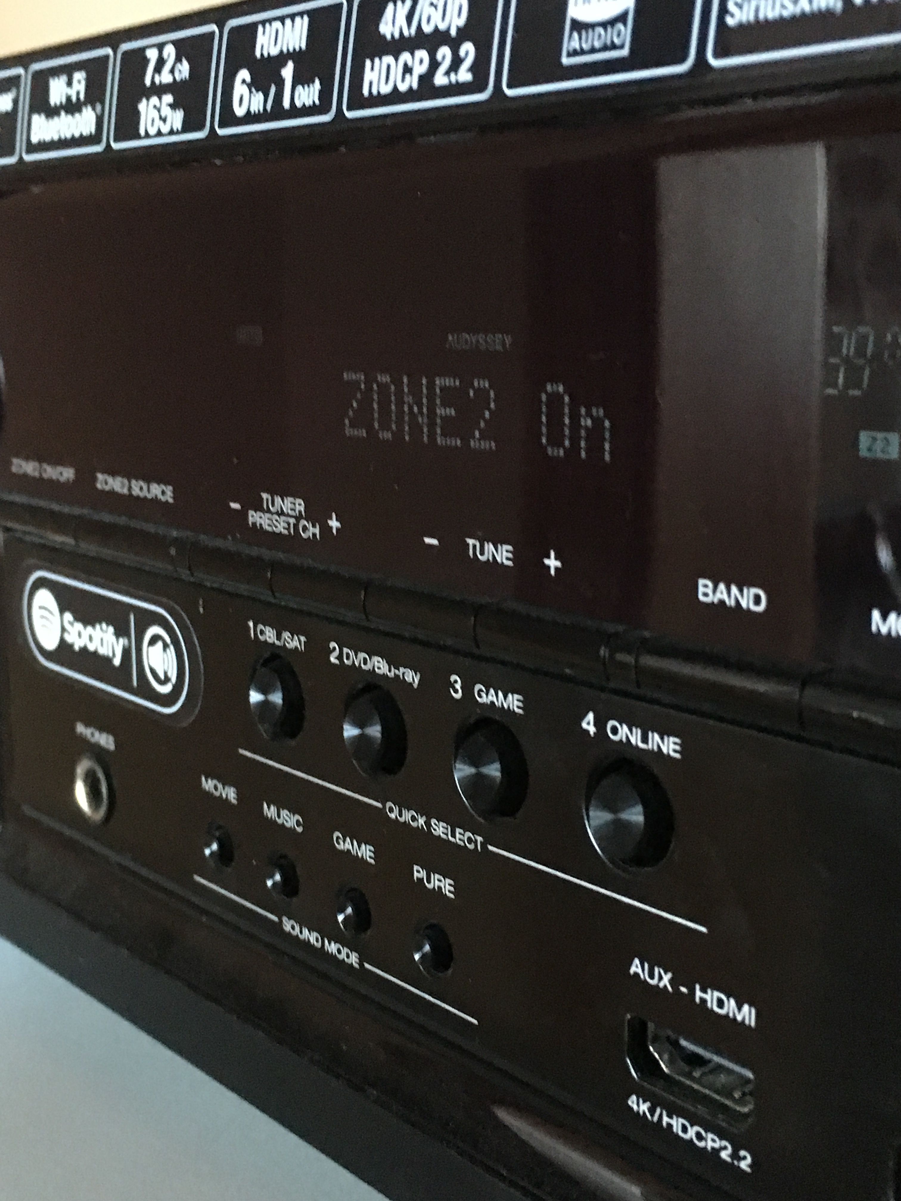
The sound system is an excellent example of “self-referential design” (Cooper) that results when the designer thinks he or she represents the user. The owner has made available a sound system that allows guests to listen to their music . But if the guest is not a sound-system savvy geek, it’s difficult to make sound occur. The owner seems to have used himself or herself as the persona here (Figure 6 and 7). If there’s a failure to connect, the owner suggests the renter’s device is at fault. Interaction expert Donald Norman advocates that the blame should lie with the machine and its designer not the user.
Recommendations
It’s a big house, so even though it’s not optimal to design with several detailed personas in mind (Cooper), it’s possible to accommodate a range of users without alienating them.
In the case of the television, the owner might consider a very simple hotel-style TV set up that presents a familiar mental model.
- The house boasts a television in every bedroom. Those televisions could be configured for the persona who demands a state-of-the-art entertainment experience. The bedroom televisions are appropriate as the house – indicated by the kitchen instructions – is intended for low-tech enjoyment as the primary user.
A similar approach can be applied to the sound system. However, only one major sound system is necessary, so other options will need to be explored.
- One thought might be to offer fewer device options similar to those offered by Bose systems or Samsung’s wireless audio collection.
Cooper, Alan; Reimann, Robert; Cronin, David; Noessel, Chris "About Face: The Essentials of Interaction Design." Wiley, 2014.

Norman, Donald, "The Design of Everyday Things." Perseus Books Group. Revised & Expanded Edition, 2013.
