In the Fall of 2019, five usability researchers worked with administrative staff in the Communications and Marketing department at Pratt Institute as staff prepared to roll out a digital asset management system to the broader Pratt community. Our clients were David Frisco, Director of Creative Services, Erica Dagley Galea, Project Manager, and a small team of graduate assistants.
(A link to the full report provided to the client can be found here)
In our initial client meeting, we learned that the intended audience for this tool was to be administrative staff creating physical and digital content such as marketing brochures, posters, and social media posts. Pratt students have access to the system as well.
As we discussed the digital asset management system with our clients further, it quickly became evident that there were two types of issues that they wanted to address. First, they understood that the overall organization of the tool—file naming conventions and workflow of filters—affected user understandability of the website and how it worked. Secondly, the language used to describe components of the website did not map to the intended audience’s understanding of the tool and what they could gain from it.
While discussing problems, however, our client made it clear that they were hosting this digital asset management system with a proprietary host called Picture Park. Therefore, the proprietary nature of the software, along with admitted limited web development expertise on their end, posed several constraints regarding what changes were actually possible.

Our initial client meeting was productive, informative, and most of all, useful. Our team decided first to research other Picture Park clients, as well as commercial, but functionally similar websites such as Flickr, ShutterShock, and Pinterest, in order to ground our research in platform conventions.
We then assembled tasks for our “superusers” (a group of Pratt members supplied by our client) in order to assess the usability of the digital asset management system. We framed each of our three tasks to get our users to interact with the filters to find certain types of images, and bookended each task with a prompt to download images, either individually or en masse.
With our tasks ready, edited, and double-edited for clarity, we began conducting our tests. Each of our nine participants was asked to complete a pre- and post-test questionnaire. We used this quantitative data to gain a demographic understanding of our audience. Further, our participants were encouraged to think aloud as they completed our tasks. Our intention was that each test should not take any longer than 10 minutes, and we indicated as much to our users before meeting.
Data collected from our questionnaires, along with notes from our in-person user tests framed the findings and recommendations of our report, which can be found here.
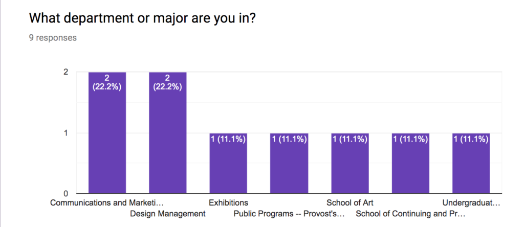
Data gathered from our questionnaires indicated users with a variety of backgrounds.

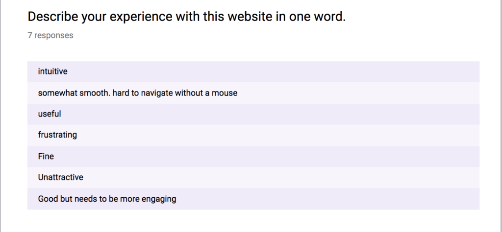
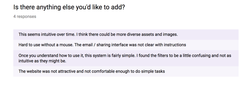
Our post-test questionnaire revealed meaningful findings as well.


Overall, our described a learning curve to understanding the website. Digital asset management tools and commercial websites like it are familiar to users, so while there is little need for explanation regarding the why of the tool, our users generally needed a how to. Our users enjoyed the tool, and emphasized their excitement to use it when it launches, however the trend we noticed was an element of confusion as our users first began working with the tool.
Our recommendations were therefore taken from the trending problems we noticed, then further refined by what was possible in the Picture Park platform. Our suggestions address changing cosmetic components of the website, such as increasing title font size, renaming filters, and having a file naming schema.
We believe that, even with constraints of a proprietary software, these recommendations will increase user understandability of the platform and reduce user frustration.
As an addenda, our client followed up asking for clarification regarding our research methodology—in particular examples from the Picture Park platform of an expanded preview. I provided a link to user testimonials as well as screenshots from pages that indicated that our recommendations were possible.
