Design Critique: TikTok (IOS App)
TikTok is a social media platform that has become a sensation on the internet. Launched in 2016, it enables users to create, share, and discover lightning-quick videos that showcase their creativity, humor, and passion. Its user-friendly layout and personalized content recommendations have quickly become one of the most popular platforms for individuals to express themselves creatively. TikTok provides an easy-to-use format for people to produce exciting visuals that grab attention and spark conversations among its massive user base. The platform dances across multiple genres, such as comedy, fashion, makeup, artistry, and challenges, so there’s something for everyone, whether it’s a creative outlet or a convenient way to connect with others.
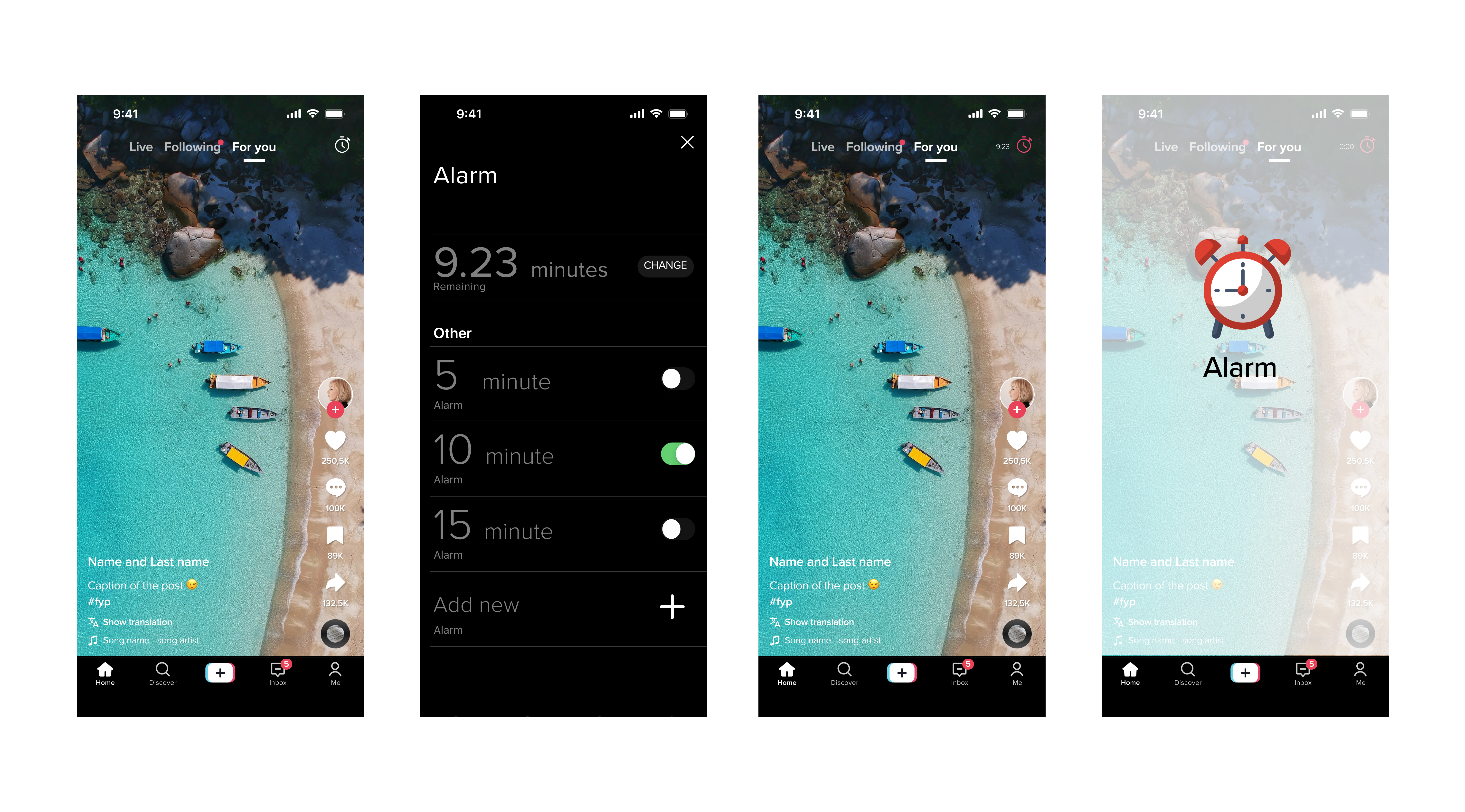
This post will evaluate TikTok’s IOS application by Nielson Norman’s principles and suggest improvements. Nielson Norman knows caring for the user’s well-being is the key to creating a positive and meaningful user interface. As TikTok’s infamous infinity scroll continues to be one of its most attractive characteristics, it is also important to note how it can compromise a user’s mental health. The never-ending stream of content often leads people away from essential tasks and keeps us scrolling for long durations of time. A solution to help combat this feature is a timer that begins counting down as soon as the scroll initiates. While this improvement may temporarily disrupt a user’s enjoyment of TikTok, Nielson Norman would likely agree that it is essential to prioritize the well-being of the users above all else.
Interface
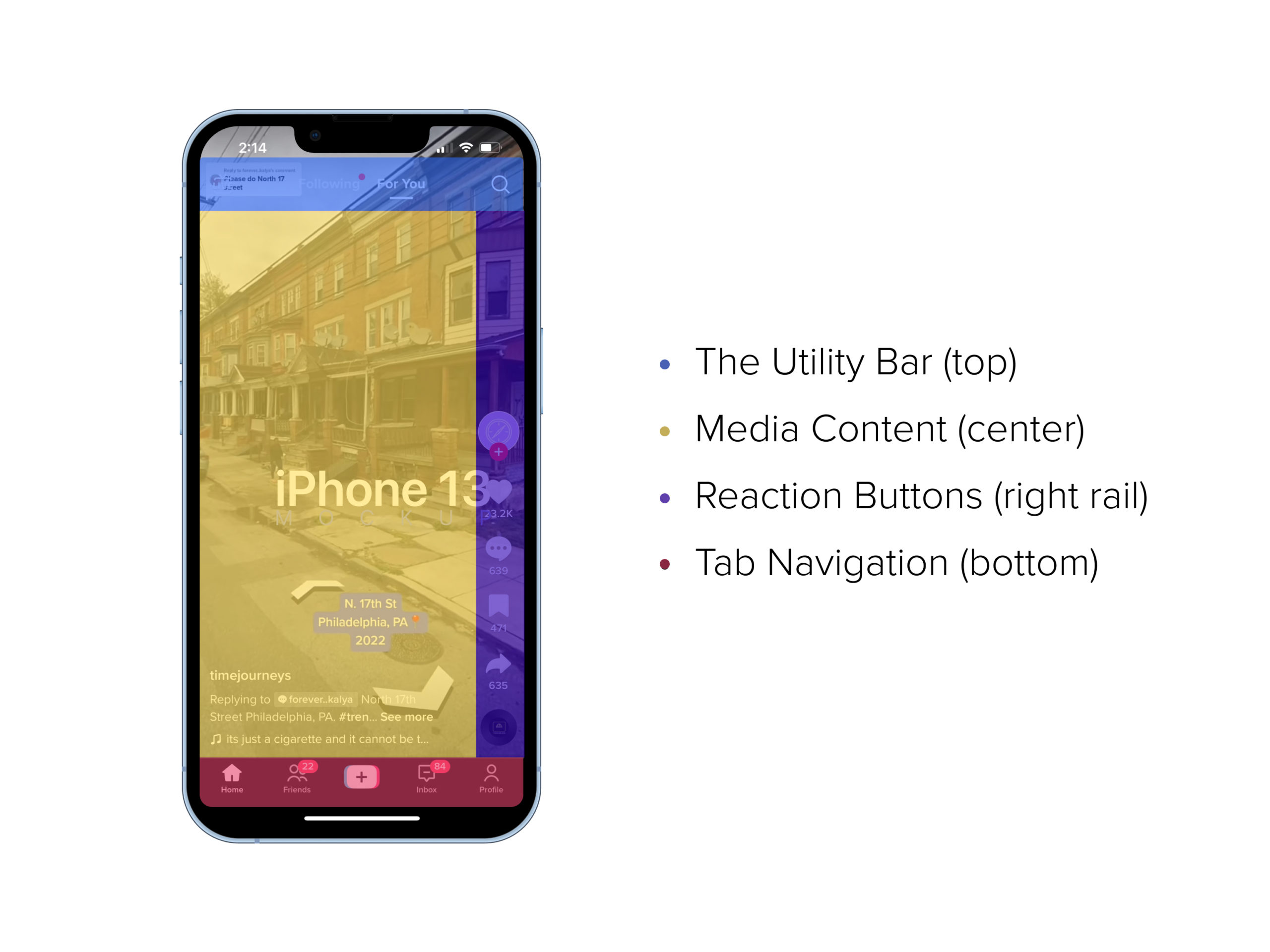
The application divides into four separate spatial areas, each with unique features and functionality. The four areas are:

Globally, the application exhibits Knowledge of the World through its usage of conventional iconography and provides labels on each button with visual cues known as signifiers to create an intuitive and user-friendly design. The affordances enabled by TikTok are unmistakable because of these visual signals. This results in the application’s successful discoverability of primary functionality; however, secondary controls, such as profile views and personalized settings, could be more transparent.
Utility Bar

It holds the key to maximizing a user’s experience. The top area offers quick access to different media streams, with its global Search of user-generated videos, personalized, curated content through the “For You” tab, filtered media to followed accounts in the “Following” tab, and the Live stream represented by a television overlayed with the word ‘Live’ on it – full of live spikes of energy.
The dynamic use of color to signify active and de-active states is smart and clever. Users are informed when their view selection has been registered by assigning each tab a high-contrast color palette. This feedback implementation is a good example of simple changes improving user confidence and experience. Color does more than distinguish objects or space; it helps reinforce a humanistic touchpoint for successful results.
The device frame is an essential consideration because it can be a physical constraint to the utility navigation. There is no indication that more content is accessible by swiping in the right and left directions other than tapping the Following and For You tabs. A notification message (feedback) displays on the screen as confirmation of the content type. If users are unaware that more content is available than what initially appears on the screen, their engagement with the newsfeed can be limited.
TikTok follows a classic newsfeed layout through conventional newsfeed-like behavior observed on social media applications. Through Knowledge in the Head about media streams, users have learned to expect that there will be more to uncover and explore with a downward swipe. Still, specific indicators are missing that help to inform the user that more information may be accessed by swiping in opposite directions rather than tapping on the labels. Users learn through trial and error about the swiping directions to navigate applications like TikTok or Instagram, which follow this same approach.
This type of navigation has become naturalized for modern mobile applications as it provides an alternative avenue for accessing new content without being limited by the device frame constraint.
Additional signs, such as arrow keys or page dots, may be unnecessary because swipes trigger contextual actions that are a legacy standard. Still, the phone’s frame is a physical limitation, and users may need help finding the content they can easily see with proper navigation design cues. Currently, interfaces are congested and full of features that it becomes hazardous to add more functionalities to enclosed screen spaces.
Media Content
TikTok provides its users with an intuitive experience for users familiar with media that contributes to Knowledge of the World. Its conventional play and pause buttons are easy to use, facilitated by tapping the corresponding areas of the screen. This streamlined process allows users to watch a desired video without hassle, allowing quick movement from one video to the next. The Play button signals the beginning of an experience, and the pause suspends time, as reflected in the video’s timeline above the bottom tab navigation.
Reaction Buttons

TikTok’s reaction buttons are an excellent example of well-designed affordances. Through subtle changes in iconography and screen overlays, user interactions become more intuitive and enjoyable because of the visual feedback. Users can quickly assess and interact by streamlining reactions into automated symbols and featuring them alongside each post. Overall, TikTok’s incorporation of reaction buttons demonstrates an effective deployment of affordance and signifier principles that enhances the user experience.
Tab Navigation
TikTok does well with mapping with its tab navigation at the bottom of the screen, enabling users to shuttle across different application pages effortlessly through their thumb’s agility by tapping on this spatial area known as an affordance. For example, a user will tap Home to return to the Home screen, whereas selecting profile will direct a user to their profile. Each navigation button displays an icon with labels that serve as an excellent example of a signifier. The tab bar remains visible across the different pages of the application.
Screen Time
Screen time has been a growing issue recently due to the infinity scroll on numerous applications. It can negatively affect people’s physical, mental, and social well-being. To help protect users from spending excessive amounts of time on TikTok’s application, their settings for screen time can be more easily accessible. Presently, navigating through screens to adjust settings can be daunting and time-consuming, demanding a minimum of four screens and six taps. An effective proposal to make screen time more user-friendly is to re-organize the application’s navigation, including a clear time icon similar to alarm applications. This way, when tapped, users can easily access an overlay with accurate time settings to help limit their overall screen time – preventing any further deterioration of their well-being.
