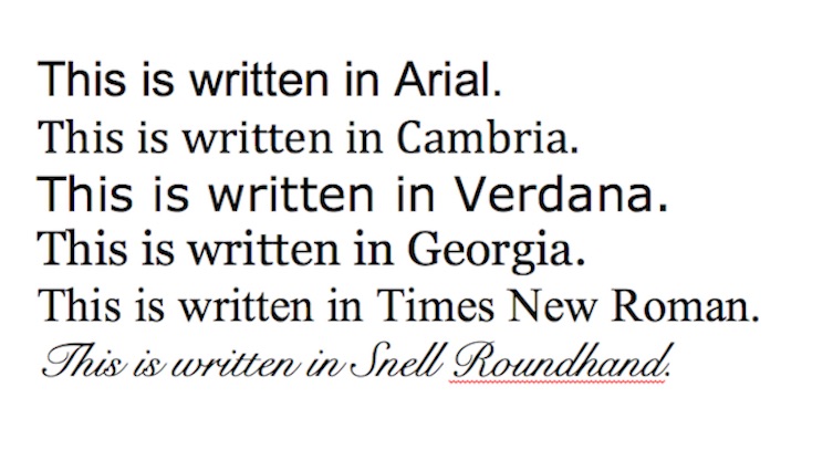
Dyslexia-friendly fonts are typographies that can increase the legibility of written materials for people with dyslexia to read and comprehend better. Dyslexia-friendly fonts can be specially designed with thicker bottoms and different shapes. Some common sans serif fonts from our daily usage, such as Arial, Calibri, and Open Sans, can also be considered as dyslexia-friendly (British Dyslexia Association).
According to the Yale Center for Dyslexia and Creativity, “Dyslexia is an unexpected difficulty in reading for an individual who has the intelligence to be a much better reader.” People with dyslexia often experience difficulties in reading, spelling, writing, and speaking daily, and this is common among 20% of the population, which makes dyslexia the most common neuro-cognitive disorder (Yale Center for Dyslexia and Creativity).
As dyslexia is so common and affects independent living constantly, having fonts that can change into a more legible format is needed, especially when digital technology enables us to customize written materials. Therefore, having dyslexia-friendly fonts available on written materials is important for people with dyslexia, which demonstrates fonts’ utility. Dyslexia-friendly fonts are not only accessible to people with dyslexia, but also to people with brain injury, other learning disabilities, and maybe even language learners who need more time to recognize new words.
In this article, I will further evaluate the accessibility of dyslexia-friendly fonts from the social model and the functional solution model.
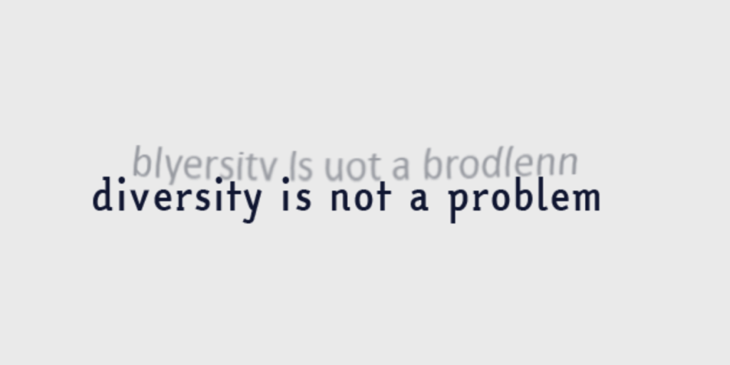
Dyslexia-friendly fonts align with the social model of disability because using these fonts could remove the reading barriers for people with dyslexia. Dyslexia-friendly fonts usually have more space between letters, making them look less crowded than other fonts. Therefore, people can see the word more clearly and comprehend it more easily. The idea of designing and providing dyslexia-friendly fonts is to try to solve the problem by altering the external space into a more desirable environment, which aligns with the core of the social model of disability that people are the problem to solve. It is the inaccessible environment that creates barriers for people. By changing the shape, space, and weight of the fonts, dyslexia-friendly fonts enable users with disabilities to complete tasks as others.
The accessibility of dyslexia-friendly fonts can also be explained from the functional solution model, in that intentionally designed fonts assist people with dyslexia to read and understand the content quickly. Based on the study conducted by Martelli et al. (2009), They found that abnormal crowding slows down reading speed among Italian people with dyslexia. Building upon this finding, an Italian company named EasyReading designed a dyslexia-friendly font to enhance reading by increasing the space between letters (EasyReading). According to Bachmann & Mengheri (2018), students who read in EasyReading fonts performed statistically and clinically better than those who read in Times New Roman in the reading tests, suggesting that this font could benefit all users. EasyReading’s success demonstrates that applying new font design could help some users overcome the reading limitations in their lives, aligning with the core of the functional solution model that new design and technology can eliminate the limitations to assist people in completing tasks.

Dyslexia-friendly fonts are wildly usable because they can be applied in many contexts in our lives to provide accessibility for others. For example, EasyReading is not only recommended by the Italian Dyslexia Association (2022), but also used in books (Truglio, 2023), university campaign (Truglio, 2023), and even in the all-inclusive map app that helps people find tasty food and wine in Italy (Truglio, 2022).
In summary, dyslexia-friendly fonts embody utility, usability, and accessibility. These fonts also demonstrate that the external environment could be more accessible to people with disabilities, and our current design and technology can assist them in removing the barrier.
Resources
Bachmann, C., & Mengheri, L. (2018). Dyslexia and fonts: Is a specific font useful?. Brain sciences, 8(5), 89.https://doi.org/10.3390%2Fbrainsci8050089
British Dyslexia Association. (n.d.). Dyslexia friendly style guide. https://www.bdadyslexia.org.uk/advice/employers/creating-a-dyslexia-friendly-workplace/dyslexia-friendly-style-guide
Compensatory instrument for readers with dyslexia. facilitating font for all. #SLD #DesignForAll. EasyReading. (n.d.). https://www.easyreading.it/en/
Dyslexia FAQ. Yale Dyslexia. (n.d.). http://dyslexia.yale.edu/dyslexia/dyslexia-faq/
Easyreading, I. (2022, July 18). Andrea Delogu and Italian Dyslexia Association chose the EasyReading/dyslexia friendly for the high readability edition of the book “Contrappasso.” EasyReading. https://www.easyreading.it/en/2022/07/18/andrea-delogu-and-italian-dyslexia-association-chose-the-easyreading-dyslexia-friendly-for-the-high-readability-edition-of-the-book-contrappasso/
Martelli, M., Di Filippo, G., Spinelli, D., & Zoccolotti, P. (2009). Crowding, reading, and developmental dyslexia. Journal of vision, 9(4), 14-14. https://doi.org/10.1167/9.4.14
Truglio, N. (2022, February 18). The all-inclusive app “visit distretto del novese” has been enriched with taste by the new food and wine section. EasyReading. https://www.easyreading.it/en/2022/02/18/the-all-inclusive-app-visit-distretto-del-novese-has-been-enriched-with-taste-by-the-new-food-and-wine-section/
Truglio, N. (2023a, June 6). The University of Macerata uses our font EasyReading® dyslexia friendly. EasyReading. https://www.easyreading.it/en/2023/06/06/the-university-of-macerata-uses-our-font-easyreading-dyslexia-friendly/
Truglio, N. (2023b, July 12). The Explorer’s charts of Venaria Royal Palace. with EasyReading® The New Illustrated Guide for Children is highly readable for everyone. EasyReading. https://www.easyreading.it/en/2023/07/12/the-explorers-charts-of-venaria-royal-palace-with-easyreading-the-new-illustrated-guide-for-children-is-highly-readable-for-everyone/