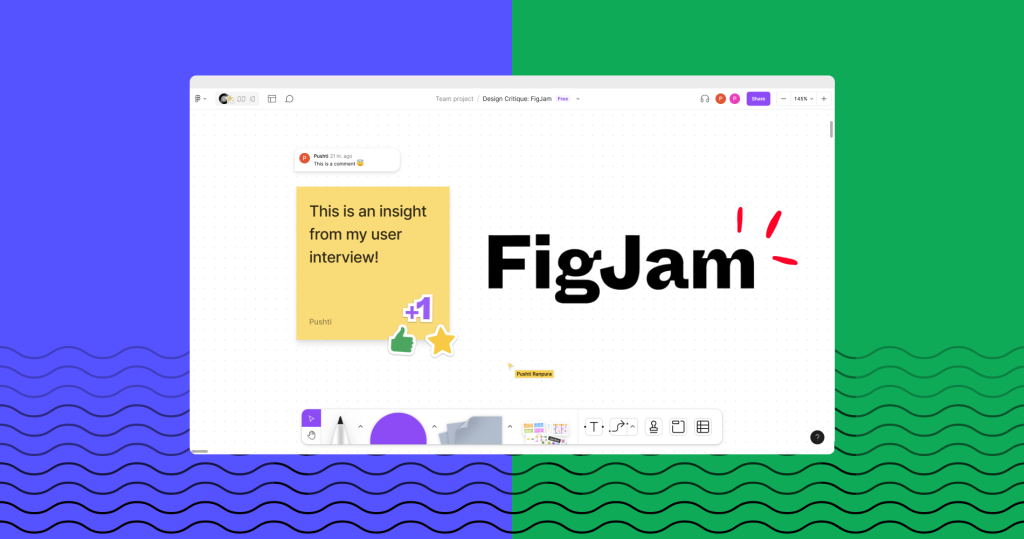
FigJam is an online collaborative tool which can be used for anything from brainstorming to build including diagramming, strategy and planning. It empowers teams to express their ideas visually and make things together in real-time. FigJam has fun elements like adding stickers, dot voting, leaving voice messages, etc that makes collaboration more engaging and personalized.
Using the toolbar
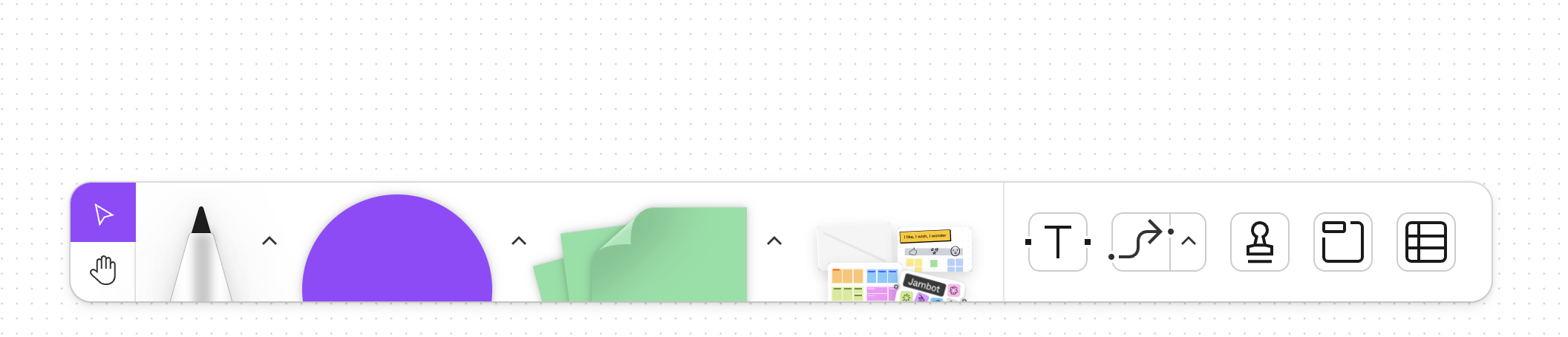
The toolbar affords adding objects on the board and the icons and illustrations of the tools act as signifiers that show the types of tools and objects available to the user. The toolbar follows the concept of knowledge in the world by using the icons and illustrations for the tools that look life-like. This creates a perfect system image for the users, making them effectively select the right tools.
When you select a particular tool, immediate feedback is provided. On hovering over the tool, the tool shifts up and a label appears above it. On clicking the tool, the cursor icon switches to the appropriate representation of the selected tool. The combination of both these interactions indicates the proper selection of that specific tool. However, in order to add the object on the board, you need to click and drag the object on the board which may not be intuitive as there is a lack of a signifier that affords the clicking and dragging option.

The lack of explicit buttons for ‘delete’, ‘redo’ and ‘undo’ actions on the screen prevent the easy discoverability. These actions are possible with keyboard shortcuts which may be new knowledge for users, especially who lack experience with such design tools. This creates a gulf of execution when users want to remove objects or undo/redo their actions. This gulf can be bridged by placing a signifier of a ‘dustbin’, ‘forward arrow’ and ‘backward arrow’ to indicate the delete, redo and undo actions respectively.
Creating a temporary message
The function of dropping a temporary message to your teammates has poor understandability as there is a lack of enough knowledge in the world to inform the users about the correct usage of the feature. The visibility of a text message is constrained in that it disappears after a few seconds without any appropriate feedback which creates a gulf of evaluation. This might also lead to difficulty in the behavioral level of processing. However, this gulf can be filled by adding a countdown referencing how long the message will be available for viewing.

Additionally, the placement of this ‘temporary message’ feature inside the ‘Stamps’ section makes its discoverability very low. This is because there is no association or correlation of messages with stamps. A solution to that would be to rethink the placement of this feature by adding a button on the top bar with the appropriate signifier of an icon with ‘chat bubble with a timer’ on the top bar to indicate the temporary nature of the message.
Adding comments
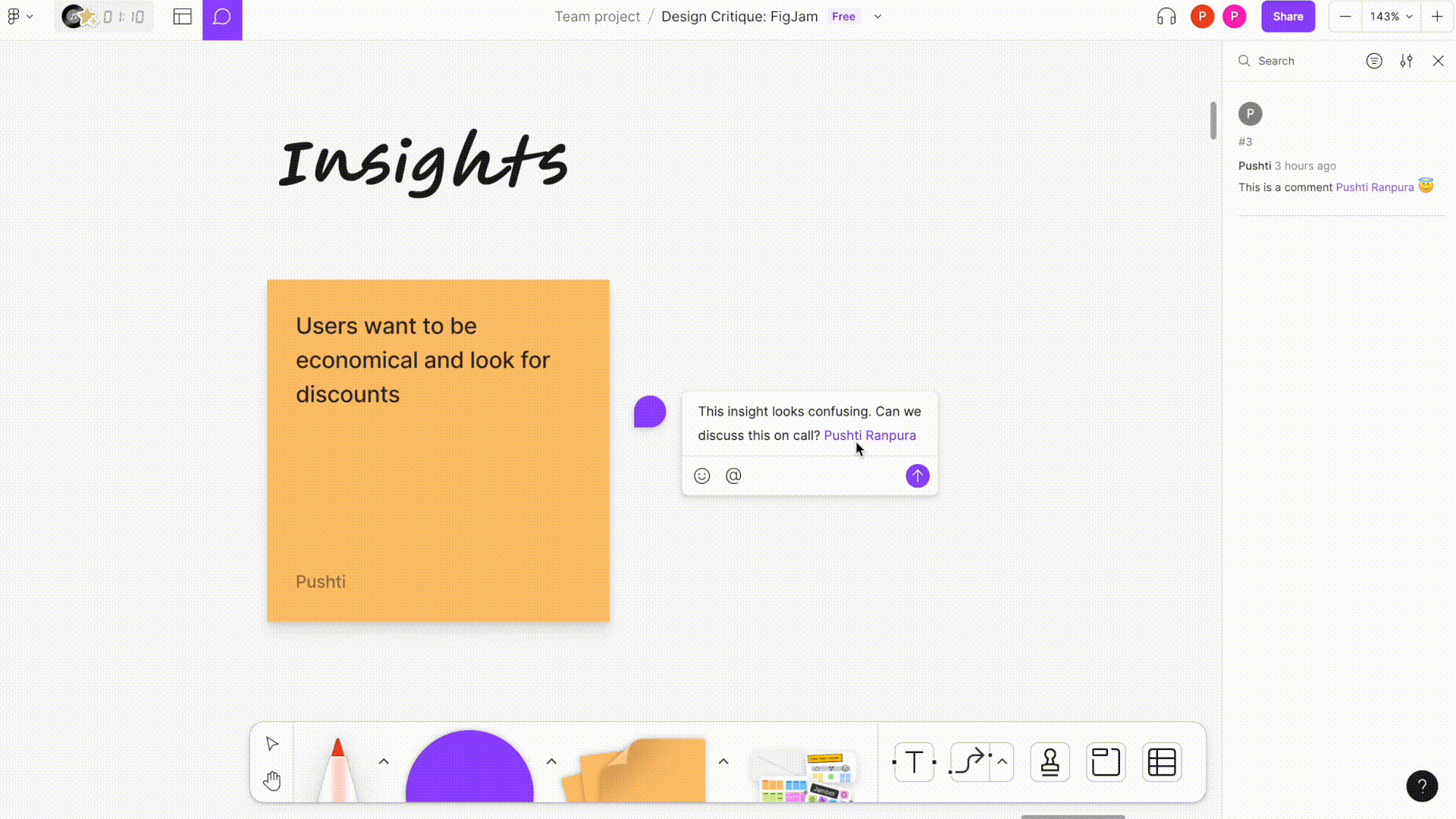
The comment function, being a very ubiquitous means of collaboration, is easily discoverable on the top bar. A red dot on the comment icon acts as a signifier which tells you that a new comment has been posted by someone. The ‘red’ color particularly draws your attention to it, indicating that an action is needed.
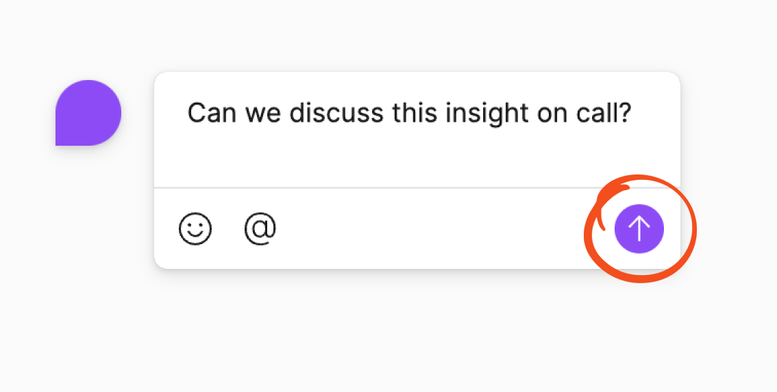
When creating a comment, the comment box affords the comments to be written. However, the ‘up arrow’ does not accurately signify that the comment can be submitted. A better signifier could be a button with the label ‘post’ to clearly denote what the button will do.
In the process of writing a new comment, there are no explicit and easily identifiable ways to abandon the comment which leads to a gulf of execution. When the user tries to click out of the comment box to discard the comment (which has not been posted), the comment window vibrates sideways providing feedback suggesting that an invalid action is taken. However, it fails to show how to rectify this mistake. A solution to this would be to add a signifier using ‘X’ close button on top left corner of the box to indicate this the action of commenting can be abandoned anytime before the comment is posted.