
INTRODUCTION:
Skyscanner is a leading online platform renowned for simplifying travel planning and making it hassle-free for globetrotters around the world. The Skyscanner mobile application complements their online platform, providing users with a convenient way to plan and manage their journeys using their smartphones and tablets. In this analysis, we’ll delve into the Skyscanner app, exploring its design through the lens of Don Norman’s principles from “The Design of Everyday Things – DOET” of Design and the stages of action.
While Skyscanner has garnered a reputation for offering cost-effective and high-quality services among travelers, my exploration of their mobile application unveiled several noteworthy issues that require immediate attention to enhance the overall user experience.
CONFUSION IN THE SELECTION OF NUMBER OF PASSENGERS
CONCEPTUAL MODELS:
Skyscanner provides users with the opportunity to engage with the system’s conceptual model through the use of straightforward icons, such as reversible, cross symbol, and down arrow (indicating a drop-down menu). While the application starts-off with a well-developed design, it falls short in certain areas such as the absence of on-boarding and navigation tour. To optimize this further with more concept based models it should incorporate on-boarding experiences with guidance and navigation. Hence it could benefit from implying some of the conceptual model standards prepared by Don Norman’s design principles.
SIGNIFIERS:
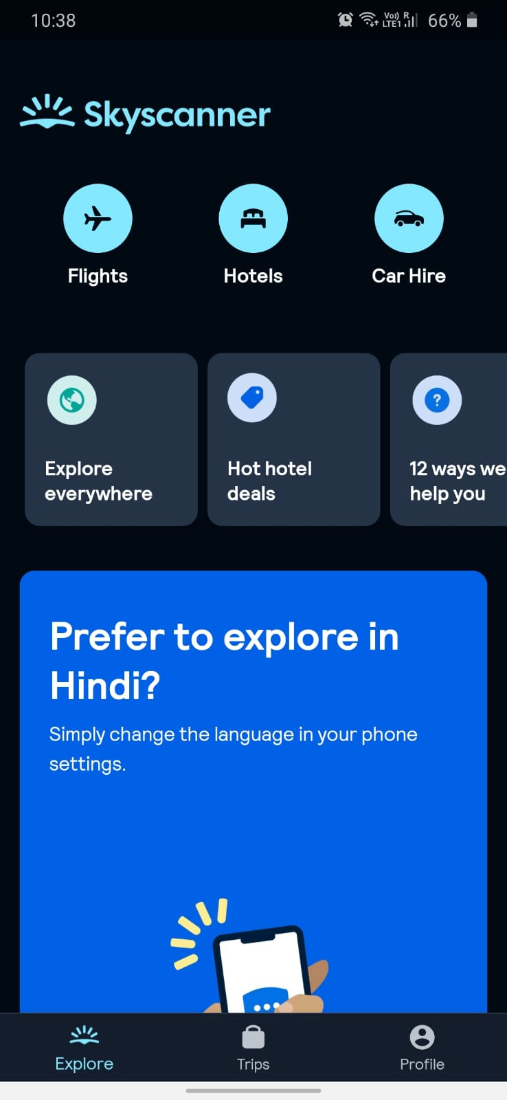
This app’s home screen is basically the explore screen. It just displays 3 options namely “flights”, “hotels” and “Car hire”. Once we click on flights, this is the screen obtained.

VISIBILITY:
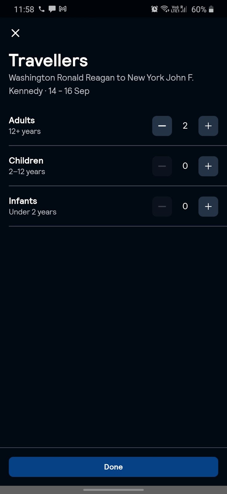
The Visibility in the number of passenger selections is very small and is ambiguous at first glance. it feels like these icons are for gender/age categories i.e. Male, Female, Children. Signifiers are not clearly indicated and sized right, as in where to add passengers. The signifier for adding the number of passengers does not follow normal ways that we’ve been used to as the “knowledge in the world”. Another issue the users might encounter is sorting and filtering when the filters occupy the whole screen and don’t let you see the flight details too. This icon reduces the overall discoverability and creates confusion while trying to switch between the flight information and filters, which are 2 different screens.
SOLUTION:
Next, the application needs to increase the icon sizes and make the interface a bit wide spread and use appropriate signifiers ( like a + and a – button on either side of the number of passengers to increase/decrease the number) and to indicate specific actions.
CONSTRAINT:
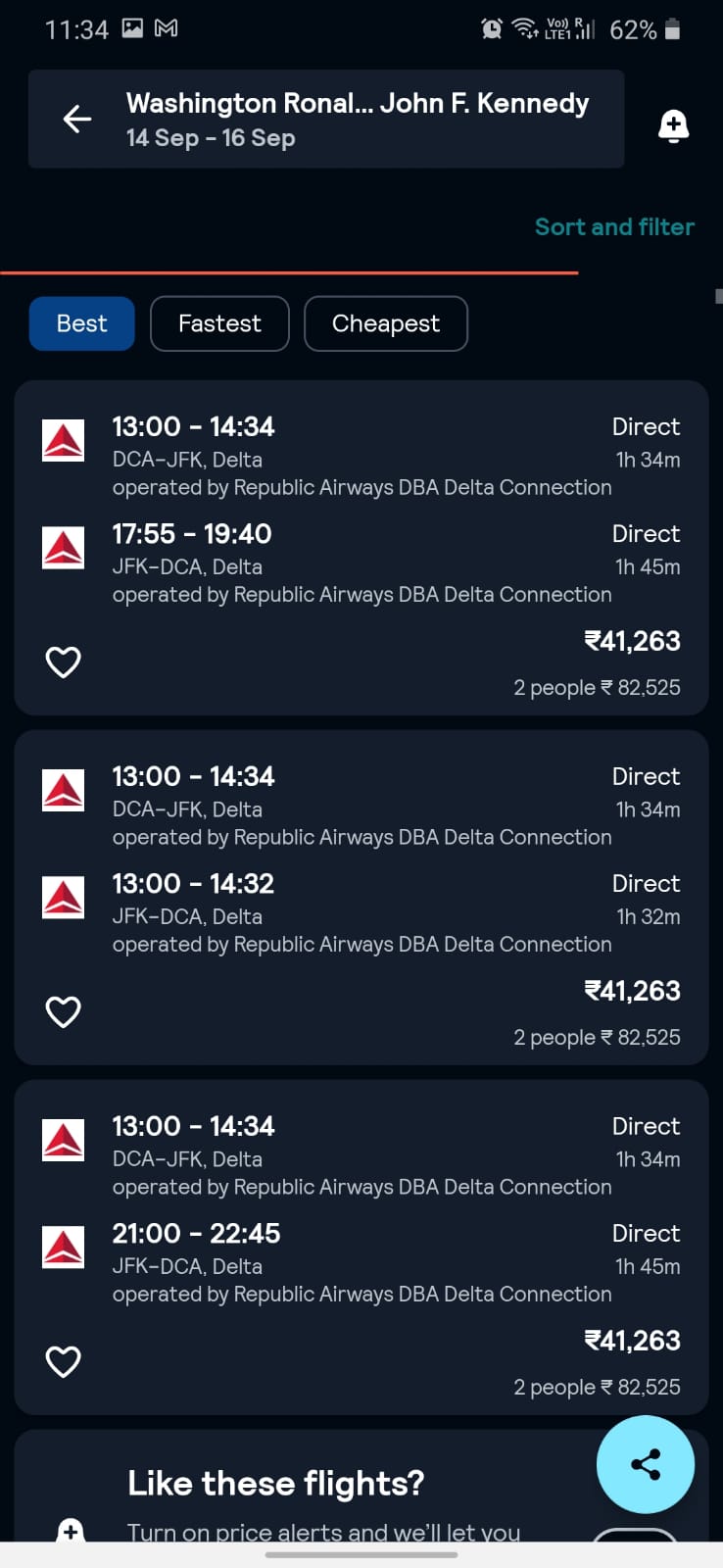
The trip booking application’s home screen lacks a conspicuously placed search bar, a fundamental “Constraint” [from Don Norman’s principles in design]. Conventionally, users anticipate the ability to commence their search promptly upon landing on the home screen, to enter the destination/create itinerary. However, the only options available are Flights, hotels and car rentals. There is no flexibility to search, or club all/some of the services to get a connective itinerary. This redundant step within the interface not only introduces confusion but also disrupts the application’s intuitive user flow, and it becomes tough to keep track and book services separately. There is good mapping within each individual service (with all the icons like back arrow, cross etc. – doing their job), but inter-relation mapping of the 3 services are missing – to connect the 3 services to one another, as whoever uses flight may most probably have the need to book a cab or a hotel.)
A significant constraint within this mobile application is its limited ability to deliver a comprehensive mobile app experience. Instead of allowing users full accessibility to complete tasks within the application itself, it frequently redirects them to third-party webpages or the official Skyscanner website. This limitation inhibits users from fully leveraging the mobile application platform for actions that are ideally suited to be executed within the app, rather than being redirected to external web pages.
So, a solution here can be Inter-mapping. The fact that once the flight is booked, the application can detect the time of arrival and ask if it can lead the user to a page where they can book cabs – the time of which the app auto-sets based on time of arrival (changeable); but, map the services together.
To also enhance the Constraint principles within this application, there should be inter-relation between the 3 services. Also, primarily, the home screen should prominently feature a search bar, and Constraints to provide users with immediate access to initiate their travel queries. Streamlining the selection process post-category selection, be it flights or hotels, by eliminating superfluous layers (like the filter page – with unnecessary filters), would simplify the user journey and augment overall usability in accordance with Don Norman’s design principles.
FEEDBACK:
Skyscanner’s user interface poses challenges in abiding to Don Norman’s design principles, particularly in terms of feedback provision. Despite extensive experimentation with user inputs, the application has weak feedback at various critical points, such as confirming successful addition of passenger information, and just takes the user back to the home page. This deficiency hinders the application’s ability to guide users effectively and create a user-friendly and intuitive interface.
MAPPING:
In this application, the inclusion of basic icons serves as a valuable aid for users in both navigation and comprehension of various functions. For instance, on the homepage, categories like ‘Flight,’ ‘Hotels,’ and ‘Car Hire’ are accompanied by corresponding icons – a plane, a bed, and a car design, respectively. These universally recognizable symbols leverage users’ existing knowledge (knowledge of the world) to enhance understanding and streamline interaction with the application. These icons and symbols map their interaction upon clicking to the respective predicted pages, hence satisfying Don Norman’s principles on Mapping.

However, the homepage’s numerous large signifiers (for Explore everywhere, hot deals, 12 ways we can help you) with detailed descriptions could be streamlined for efficiency by using more concise and intuitive icons or images (without using words), but can lead the user to the same conclusion and next set of screens, improving the user experience.
CONSISTENCY:


The application doesn’t have the flow in the consistency, as each of the options (Flights, Hotels, and Car Hires) has different unclear visual hierarchy, font sizes, margins, paddings and color combinations. Each screen also has a different search bar design, which is supposed to be constant throughout the app. In terms of Don Norman’s consistency principle, it could be improved for users to make better use of the interface.
A VISUAL DESIGN PROBLEM – The green signifiers in the at screen shown above isn’t in contrast with its background.
SOLUTION:
One simple solution to this problem would be to Make the Design Branding elements constant throughout the app.
CONCLUSION:
Overall, the application needs to be remodeled and use the brainstormed solutions mentioned above to improve the user experience (these are basic, could be improved upon more).