The DoorDash App is primarily a food delivery app. It connects users and restaurants by providing an interface for users to order food from any restaurant on the app within a certain radius. The food is delivered by “dashers” and the process from order acceptance to delivery can be tracked on the app.
DoorDash Home Screen
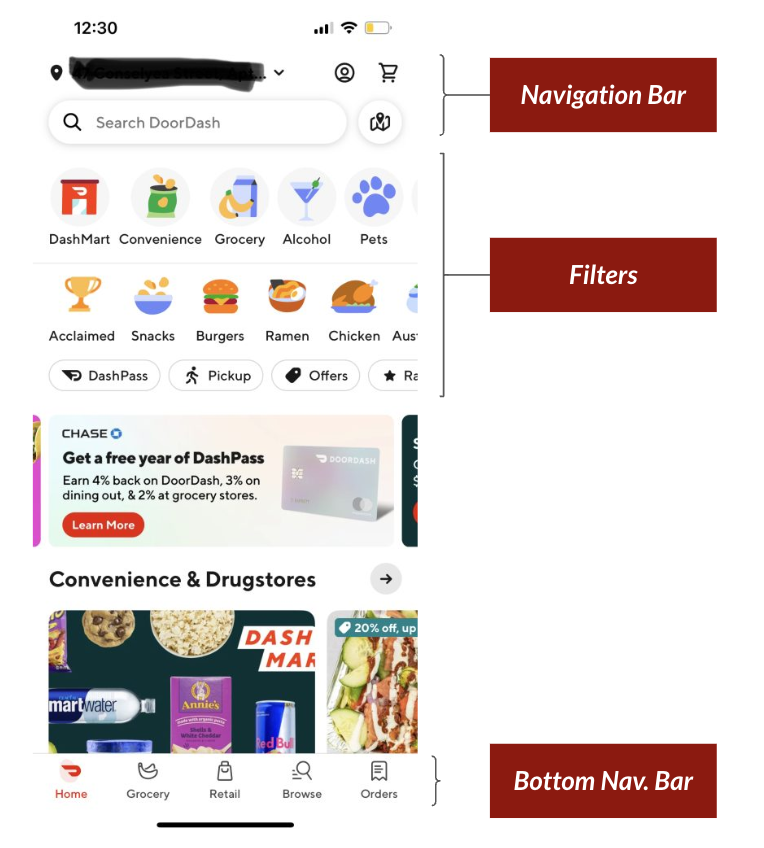
The home screen is split into a few different sections, as shown in Figure 1. It starts with a fixed top navigation bar, which contains icons that act as signifiers for current location, profile, cart, search bar, and map. Next, there are three horizontal scrolling sliders with icons with text that act as filters, another horizontal scrolling slider that showcases deals and advertisements, and many more horizontal scrolling sliders that group merchants together by category. At the bottom of the screen, there is another fixed navigation bar, which contains more icons with text that navigate to specific screens.
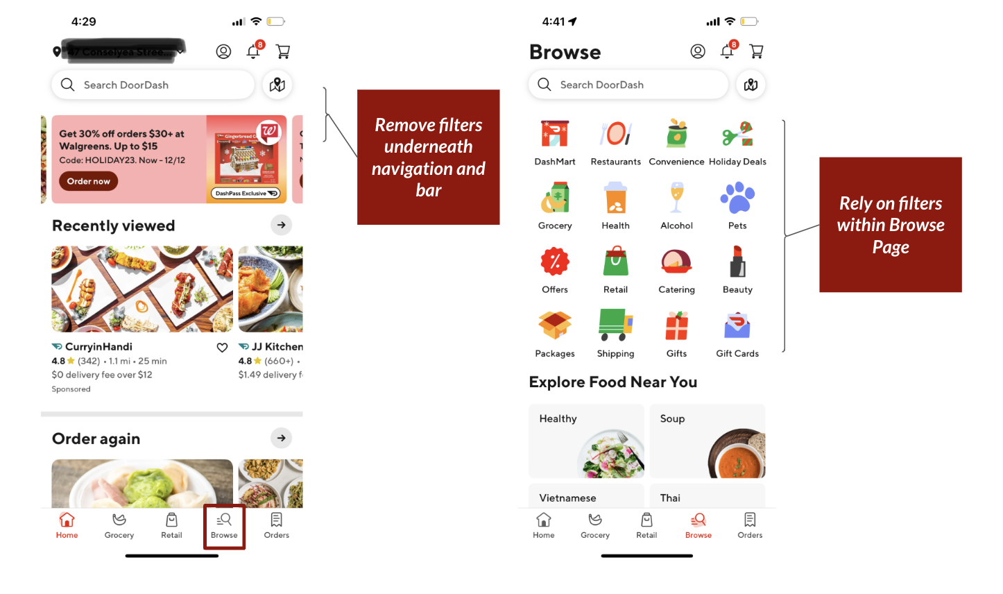
All of these signifiers make the home screen cluttered and confusing – the lack of constraints present makes it difficult for a user to decide what action to take in order to complete their chosen task. This is a result of “featuritis”, as previous versions of the DoorDash App contained noticeably less affordances and signifiers and as a result had greater understandability. One option to simplify the home screen and increase discoverability would be to remove the three rows of filters underneath the top navigation and use the filters shown in the “Browse” screen, as shown in Figure 2.
Filter Behavior

The filters (shown in Figure 3) also present an issue. Although they are signifiers, they are poor signifiers with inconsistent actions occurring when they are clicked on.
When a user clicks on the “Acclaimed” button, it directs them to a different screen, where only top-rated restaurants are shown. On the same row, there is a “Breakfast” button – there are visual similarities between the two buttons, so a user may be expecting to see a similar response. However, the “Acclaimed” button leads to a separate page, while the “Breakfast button” returns a list of restaurants on the same page. The user will have to go through multiple cycles of execution and evaluation to understand how the product works, since the two buttons do not have functional similarities.
In order to bridge the gap between the gulfs of execution and evaluation, the “Acclaimed” button should behave the same way as the rest of the filters, as shown in Figure 4.

Order Submission

Once a user places an order and a merchant accepts it, the ability to modify the order or cancel the order entirely is severely limited to protect the merchant. However, this poses a problem for the user in the case that they placed an incorrect order or an order that they were not meaning to. The rate of this error occurring was high, as the checkout process previously only consisted of two buttons – “Continue” and “Place Order”.
One new feature released by DoorDash is a confirmation screen (Figure 5), which aims to lower the rate of this error occurring. After clicking on “Place Order”, the confirmation screen shows for ten seconds, giving the user the opportunity to go back and edit or cancel the order as needed. This screen poses a constraint on user actions – they have only three options: 1) wait for the timer to run out for the order to place, 2) select “Confirm” or 3) select “Go Back”. By placing this constraint, the user is forced to evaluate whether or not they want to place the order, thereby reducing the risk of mistakes or slips happening.
Conclusion
The DoorDash app is generally pleasant to use while accomplishing its purpose, but has a few opportunities for betterment. The application could improve its usability by removing distracting and repetitive elements in the design. By doing so, DoorDash could improve the experience for both new and existing users.