
Apple Maps is a web mapping service created by Apple inc. Apple Maps is the default mapping software on all iOS devices. As a web mapping service, Apple Maps provides global cartography based on the travel patterns from iOS devices. Users can get directions through various modes of transportation as well as find locations nearby or within a certain location that fall into a desired category. As a person with an iPhone, I frequently use the Apple Maps app and have developed my own rapport with the software, a bias I would like to state outright.
Explore
Upon opening the app, users are greeted with a vector graphic image of the neighborhood relative to their current location. Apple Maps is aesthetically and usably consistent with Apple’s Human Interface Guidelines. At the bottom of the screen, the area considered most reachable to smartphone users with the understanding that users often hold smartphones with one hand and interact with their thumb, is the search bar.

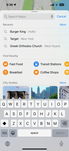
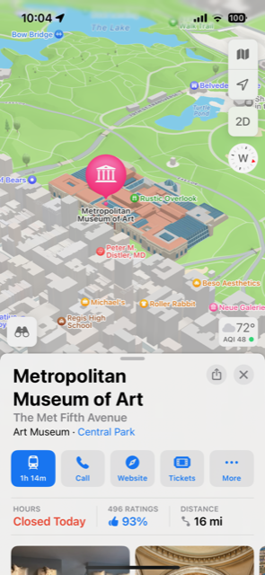
Within the search section, users can search via typing, recent searches and common categories. Recent searches alleviates the need for conscious attention and can make navigating using Apple Maps more subconscious. The iconography of the categories is descriptive and fairly universal. The color schemes of the categories remain consistent throughout use (ex: orange for food, blue for transit, red for medical centers, etc.) which aids in software learnability. Upon selecting a location, a vector graphic and overview of the location are provided. The bright blue button with the time begins the directions with other options for a location populated next to it.
The button is the most obvious on the screen but it is not the only one. As Don Norman discussed in his book The Design of Everyday Things, the paradox of technology is that “added complexities increase our difficulty and frustration with technology” (32, Norman). Making cartography usable is a challenge in and of itself, but web mapping services also provide information other than location and direction. Information on locations varies by accuracy and accessibility. Since much of the information about locations is collected via user input, some restaurants may be listed as “Open” when they have in fact been closed for many years as not enough iOS users reported the error, a feature that is nested within Apple Maps and not visible to casual users. The Design of Everyday Things touches on the benefits of the transactive memory of the internet and our reliance upon it, however he fails to acknowledge the great potential for error when information is crowdsourced instead of outsourced.
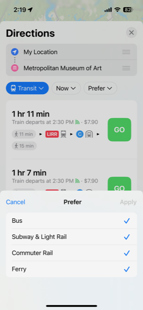

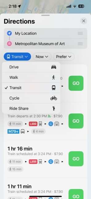
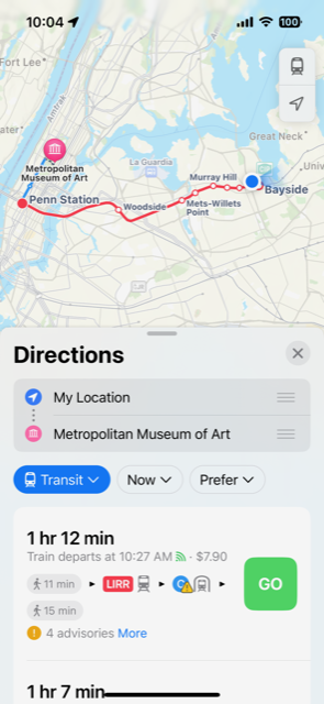
Besides accuracy, a common pain point on Apple Maps is the default mode of transportation. The default mode of transportation cannot be changed in Apple Maps, but must be changed in iOS settings. As you can see on my iPhone, I have set my default mode of transportation as “Transit” as depicted by the train icon. Within a user’s conceptual model of the system, having the mapping software be linked to a user’s Apple ID is not obvious. It is helpful however when visiting a residence and having “Emily’s Home” or “Betsy’s Work” be a suggested and viable destination that Apple Maps collects from Contacts. Contacts and Maps are two of the preinstalled apps on iOS products. They are both considered very valuable and are therefore connected by Apple ID.
Navigation
Upon selecting a location, potential directions pop up at the bottom of the screen. The phone’s current location is set as the default start location. Here, mode of transportation, time and travel preferences can be changed. Clicking on a potential navigation provides an overview of the directions. Navigation mode doesn’t begin until the “Go” button is pressed. Because the “Go” button is so big and on the right hand side of the screen, it’s easy to accidentally start navigation mode when you may have only wanted to see the overview. Once in navigation mode starts, the screen moves to a close radius of your current location showing the first step of the navigation.
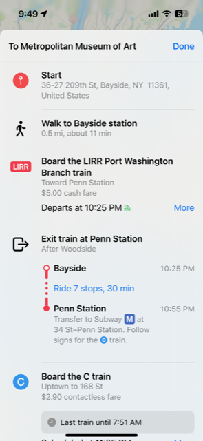
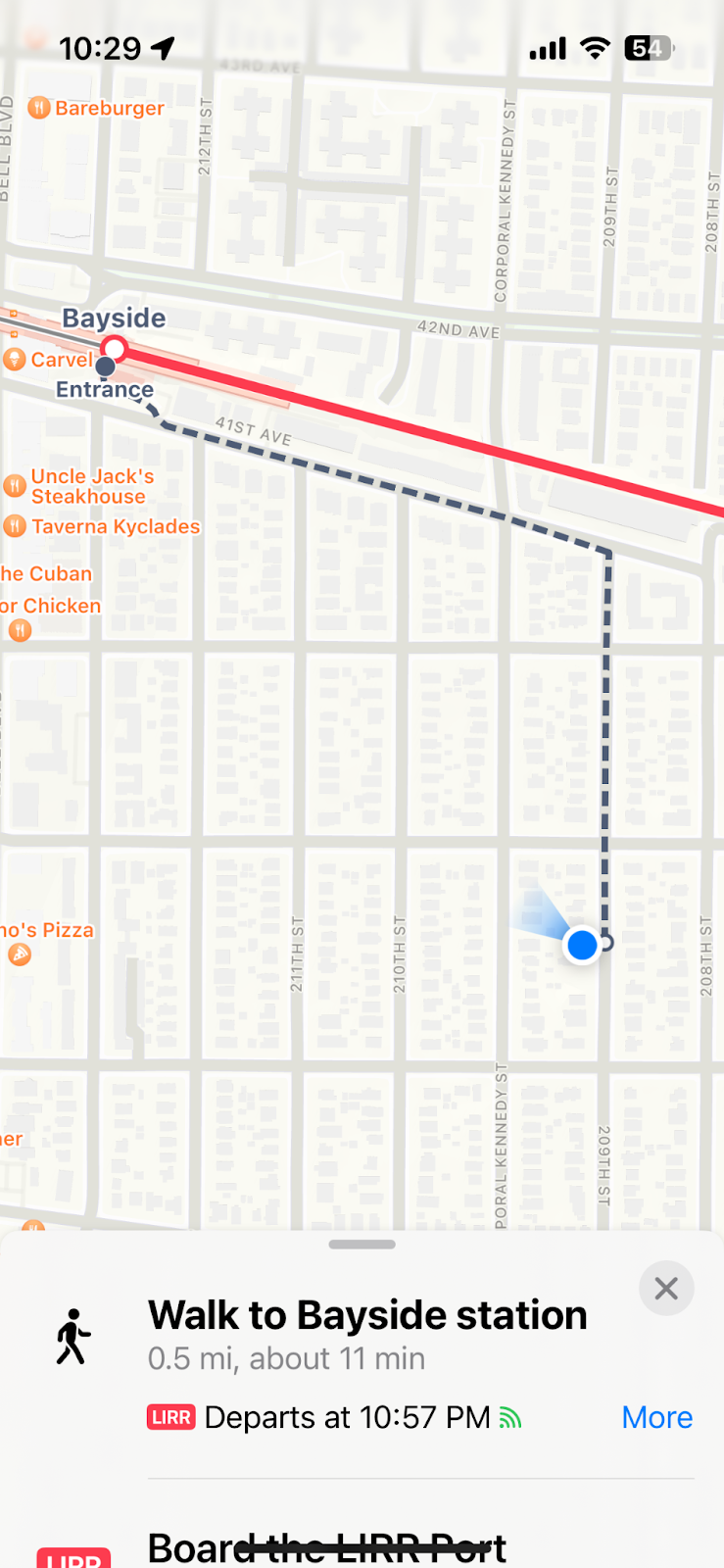
The navigation screen replaces the lock screen on the phone when in navigation mode. The assumption is that you are actively communicating when in navigation mode and need to easily access the next step when reaching for your phone. This affordance has its benefits and its drawbacks. When actively commuting or actively lost, having the next step in your navigation so easily accessible is very beneficial. When you are more casually commuting and perhaps want to be on your phone during your commute, this affordance becomes an annoyance when attempting a more leisurely iPhone experience. Personally, I tend to keep the overview of directions open so I can reference them without navigation mode taking over my iPhone. For fellow casual travelers, a potential fix for this problem would be a navigation mode when the overview of the directions take over the lock screen instead of just the next step. An advanced commuter mode, if you will.