The Cornell Lab of Ornithology adopted a clever way to answer the question “What’s that bird?” making the wealth of knowledge in ornithology accessible to the general public. This critique provides user-centric insights on how usable the Merlin Bird ID app is for anyone interested in identifying and learning more about birds around them.
“What’s that Bird?”
If one has this question, they have visited the app to identify one or a few birds that sparked their curiosity . This section briefly illustrates the principles and methods on how the Merlin Bird ID app helps identify and educate the user.
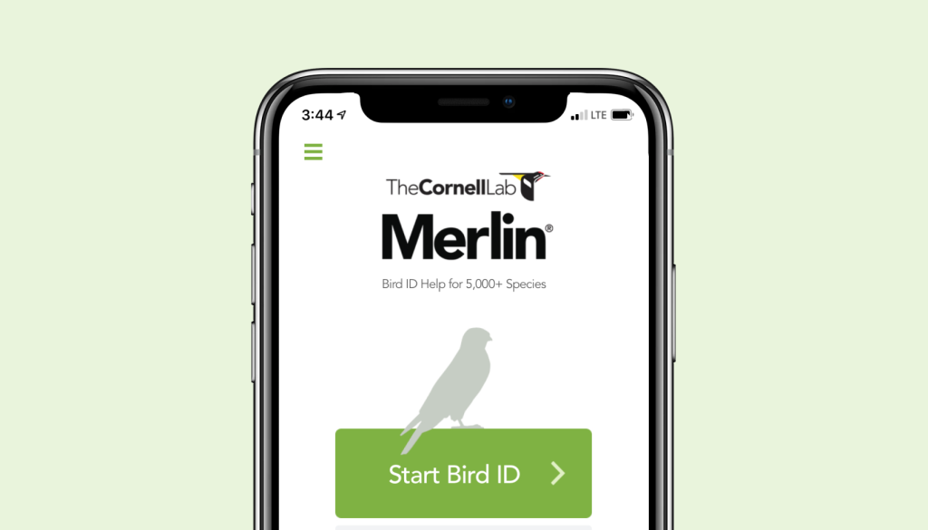
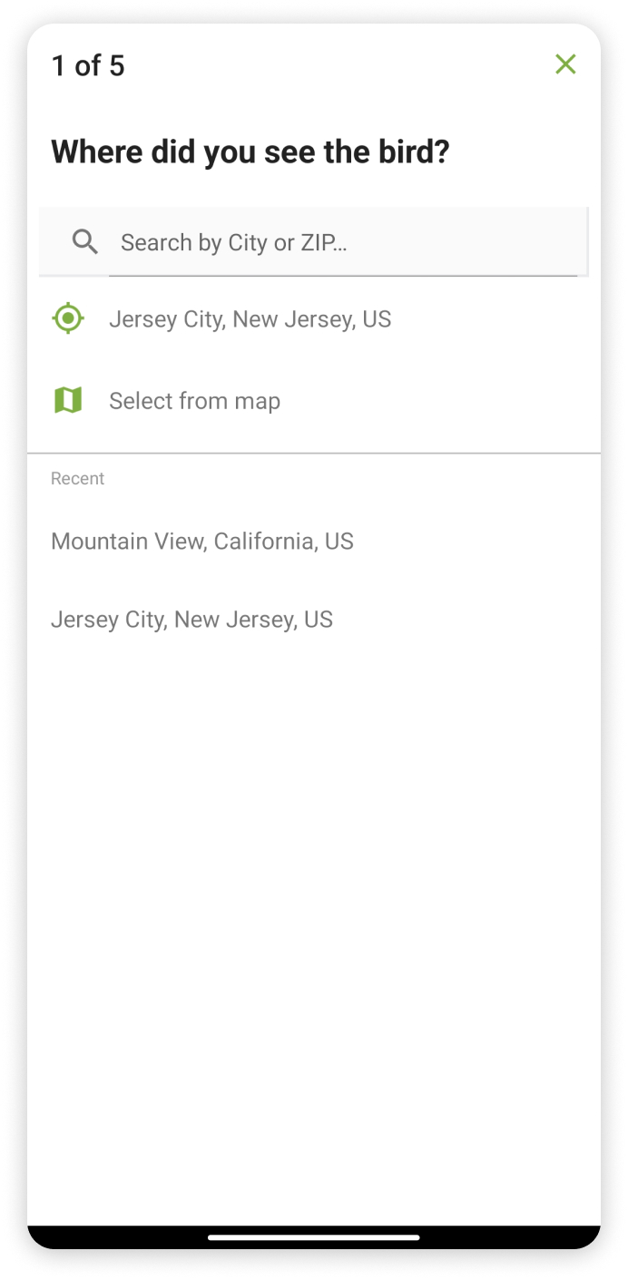
the Landing page
- Merlin ID being primarily an Identification app the identification modes are shown upfront. clear signifiers such as the contrasting green and the use of space emphasizes on starting the identification process.
- The Layout of the environment is made easily understandable dividing all of the app’s functionalities into four main groups which are Identify, Explore, Life List and Settings, this menu is placed on the bottom of the screen making it easy for the user to use their thumbs to navigate.
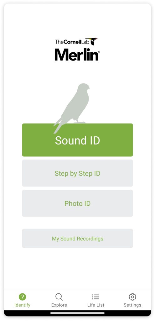
Sound ID
The app makes the gulf of execution extremely easy by mapping commonly used terms such as sound and photo to name the identification options. Placing Identification on the landing page also contributes to the user passing the gulf of execution.
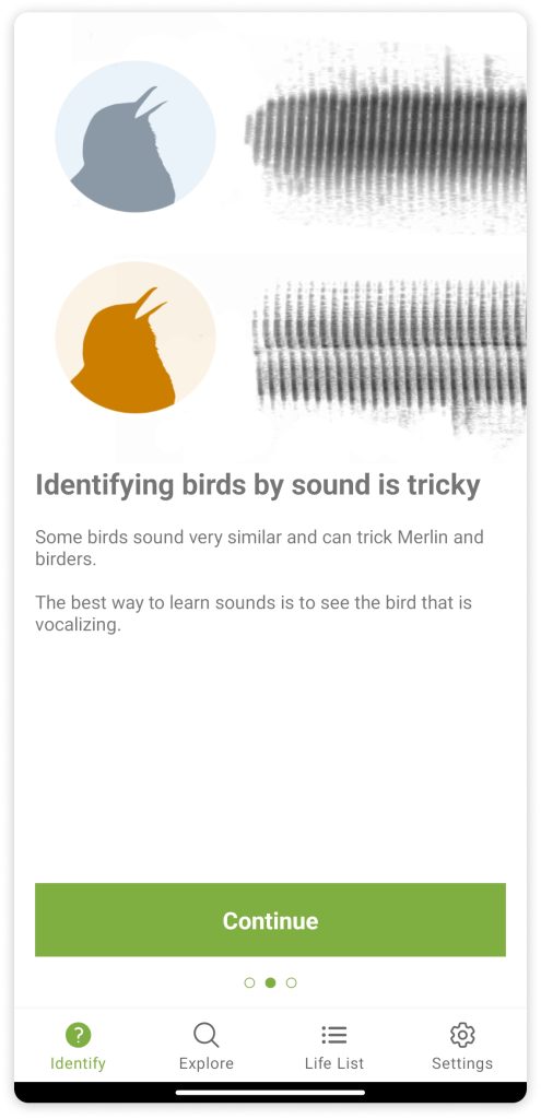
Before Recording :
- Upon tapping on the Sound ID button, straight away Merlin emphasizes improving the user conceptual model by providing procedural knowledge. This step helps the user gain basic familiarity of the sound Identification environment beforehand which reduces the need of signifiers further.
- This information has been broken down into 3 parts and with the use of constraints made the user go through each step and make sure each step is clearly visible.
While Recording :
- Once the user starts recording, the user gains feedback if the recording is in progress in 3 ways: 60 percent of the screen is free and just mentions ” Listening for birds”, this space is further used to mention detected birds.; A visible pitch graph of the chirps and sounds is present on top of the screen and the running stopwatch.
- With the use of cultural restrains, the stop button uses a red color and the familiar stop symbol to signify it stops the recording.
- During recording sound merlin provides feedback if it recognizes a sound first with the small blue dot right below the grap, this feedback helps pull the user’s attention and re-assures them that the app is working.
- The app then lists out all the birds it detected from a garden or a space with many birds, and lays them out, a non-intrusive yellow highlight is used to indicate which bird is making the sound at this instant.
After Recording :
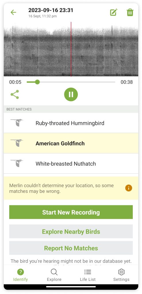
- Upon ending the recording the gulf of Evaluation is crossed as the recording autoplays signifying that the recording is complete.
- When the recording is auto-played the corresponding bird is also highlighted improving mapping to enhance learning.
- This page has too many signifiers: the drag across recording, and the bird’s names are also clickable, and on the same page there are other further options.
- When the user gets no matches, the “Report No matches” button has a description that provides declarative knowledge to the user and further improves the user conceptual model decreasing the gap between the system image and the coneptual model.
Step by Step ID
Unlike Sound and Photo ID, which are self-explanatory names, the Step by step ID relies on user observation to identify a bird. It is similar to describing a bird to an expert in ornithology and getting to know the exact specifics of the bird.
observation, simplified :
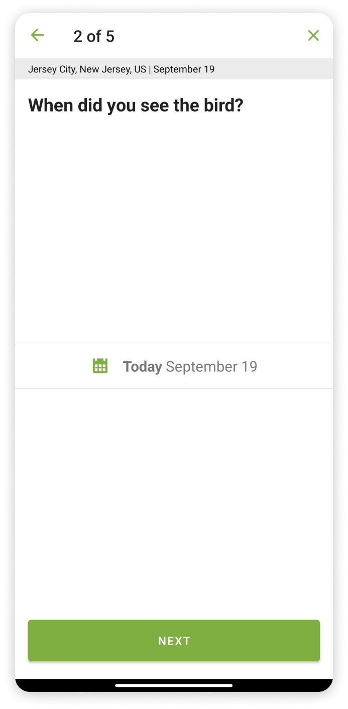
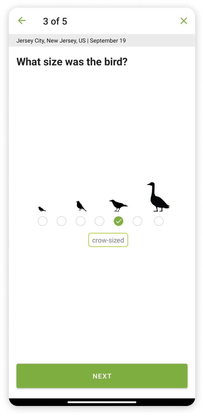
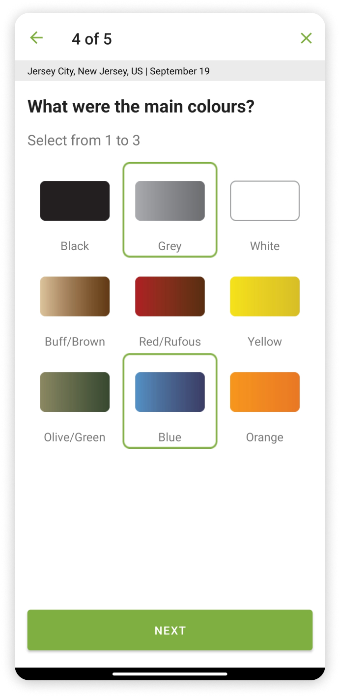
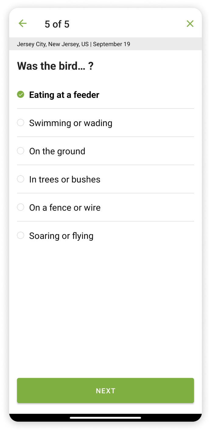

- Merlin Bird ID simplifies the process of asking details about a bird by breaking them down into 5 steps and constraining them to one sequential next button. The clever user of signifiers and constraints promote the user to recall specific features from cluttered memory.
- Very effective and necessary use of mappings helps the user pick the right size and color of the bird reducing error drastically. Imagine if there were only text descriptions of the size and color without the images to help, it would be chaotic!
- The results are then published in the form of cards.
Photo ID
prompts:
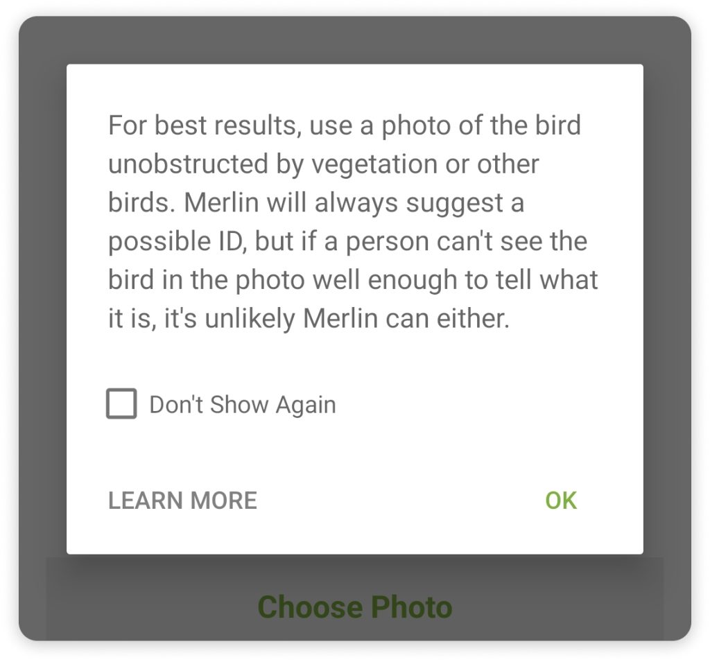
- This prompt appears right after clicking on the photo ID button which tells us that this app is Designed keeping errors in mind.
- This prompt is necessary to educate the user on the kind of photos users should use to identify birds, they use clever mapping of common sense to make an effective filter to significantly reduce errors.
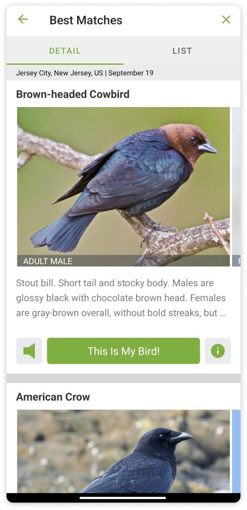
results:
- The results then are presented in a desriptive format to help gain feedback, the large image description, and sound all are features that helps the user identify the right bird.
- Clear Signifiers are used for the button ” This is My Bird!” for feedback and the more information button is tucked to the right to not clutter the Best Matches page. The same tile based results are used for step by step ID.
Exploring birds.
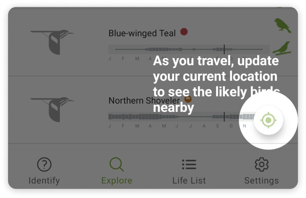
- Signifiers are used to grey out the entire screen and educate the user on the layout of exploration.
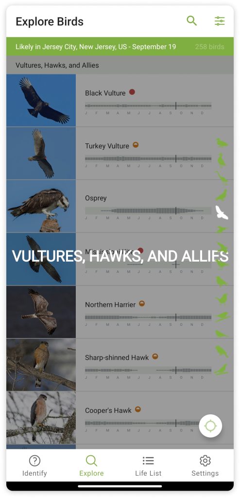
- To enhance the usability of the explore birds feature, a custom scrollbar with symbols of various bird types are given, clear signifiers such as the name of type are given to provide feedback that the user has selected a type of bird.
- Results are then viewed in a card format and subdivided into ID info, Sounds and map, constraining the amount of information displayed at once.
Design language

- The pastel color palette used to design this app provides a nature reminding visceral feeling, the blend of the grays with the green and yellow is seemless, ensuring readability . Most of the app is monochromatic making emphasis easy.
- Text is readable throughout the app and grey font reduces strain on the eyes.
Negatives
- Lack of icons for the various Identifying options reduces procedural knowledge as the user can map the icons to the kind of identification
- Sometimes the feedback that a bird pack has to be installed is missing causing confusion when the images and details don’t load, after trial and error the images loaded after a while, and then it is understood that the explore option requires bird packs , there is not in app progress option to check if the pack is downloaded.
- The option Step by step ID can cause confusion and user trial and error to figure out the right identification option. it would be easier if the app educates the user beforehand.
Possible Changes
- The emphasis is made on all the identifiers instead of only sound ID, icons are added to improve relatability .
- The information provided in the explore section after clicking on a bird is very cluttered. The explore section is not problem oriented, hence it can be made more fun, currently the section is fairly desricptive, it would be nice to mention fun facts or giveaways of a birdto gamify the exploration, and lead to more effective learning.
Overview
The Merlin Bird ID app has very effective and well-researched ways to help the user in every single step, it requires minor design changes to further enhance the app. It has employed many of the Human Centered Design principles and has various feedback avenues to correct the application. It Is a great app that does well in all three levels of processing, which makes it easy to understand and fairly enjoyable, making it an exemplary application compared to other Bird ID apps.