
By: Cathelyna Saskia Suherman / September 7, 2023 / Design Critique
Craigslist is a classified advertising website that dates back to 1996. The website has sections from housing, gigs, community service, services, items and resumes. The website serves in 570 cities and 70 countries. It initially began as an email distribution list for friends to feature events in the San Francisco Bay Area. The Craigslist’s website has not been redesigned since it was launched, but it has been hailed for its simplicity and ode to the era of the early internet interface.

HOMEPAGE
Upon opening the website, the homepage showcases an array of categories in the form of links. In terms of visibility, Craigslist’s home page interface provides a clear list of categories as well as its subcategories. Although it is minimalistic and simple, it does not provide clear affordances because the links and buttons are not obvious, thus creating an environment where users may not instinctually complete an action as easily. This is due to its textual affordances. The homepage is incredibly textual, even having buttons and links presented with plain text. This does not convey affordance because users are becoming more accustomed to buttons which are visually distinct.
For added visibility, Craigslist’s home interface may differentiate each list using different colors as well as adding more visuals. By adding visuals to each category like housing or community, the page may have better affordance. In terms of mapping, Craigslist’s text heavy menu interface – although intuitive that they are links – makes it unintuitive because users would have to read each sub category, in order to select. In comparison to Facebook, Facebook’s marketplace utilizes tags instead, in which users are able to select, reducing the clutter of a myriad of subheadings. If Craigslist was to be improved for its usability, they may have to transform each sub category into tags or another page, while the homepage should only showcase the six categories itself.
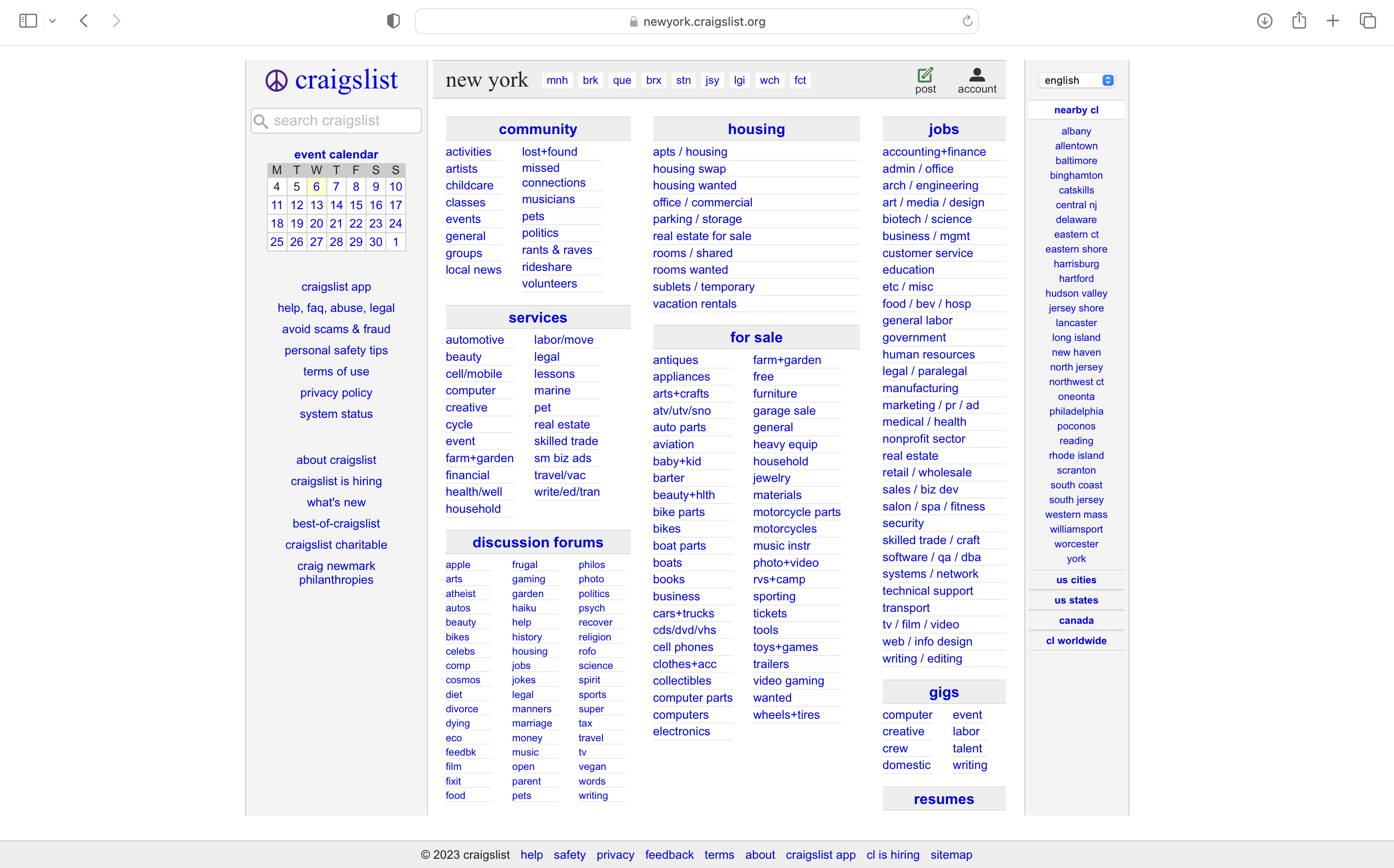
Fig. 1 – Home page / Landing page
CATEGORIES LISTING MENU
In terms of Icons, Craigslist’s listing page uses them very sparingly, limited to the Reply, Flag and Prohibited icons. There is an option to reply to the lister / poster with its button clear, unlike the buttons and links within the home page. The reply then redirects directly to your mail, with an encrypted email. Although straightforward, users may be more accustomed to chat rooms like Facebook marketplace’s Facebook Marketplace, where there is more transparency from both sides; users are able to view each other when communicating, increasing spam and scam detection
Only allowing communication through an encrypted email means that users are not able to have any indicators of when a listing was last updated or when users have received new messages. Whereas Facebook Marketplace, users are able to see when the listing was posted, as well as if each message has been read. It proves that Craigslist’s listing website lacks the visibility of system state.
Consistency wise, the listings page remains consistent in terms of its design and layout. This assists users in building a mental model of how the site functions, thus reducing confusion. For example, each link uses the default blue link color, and any headers and body text are assigned a Times New Roman sans serif font, while smaller texts as well as buttons and links use a sans serif font.
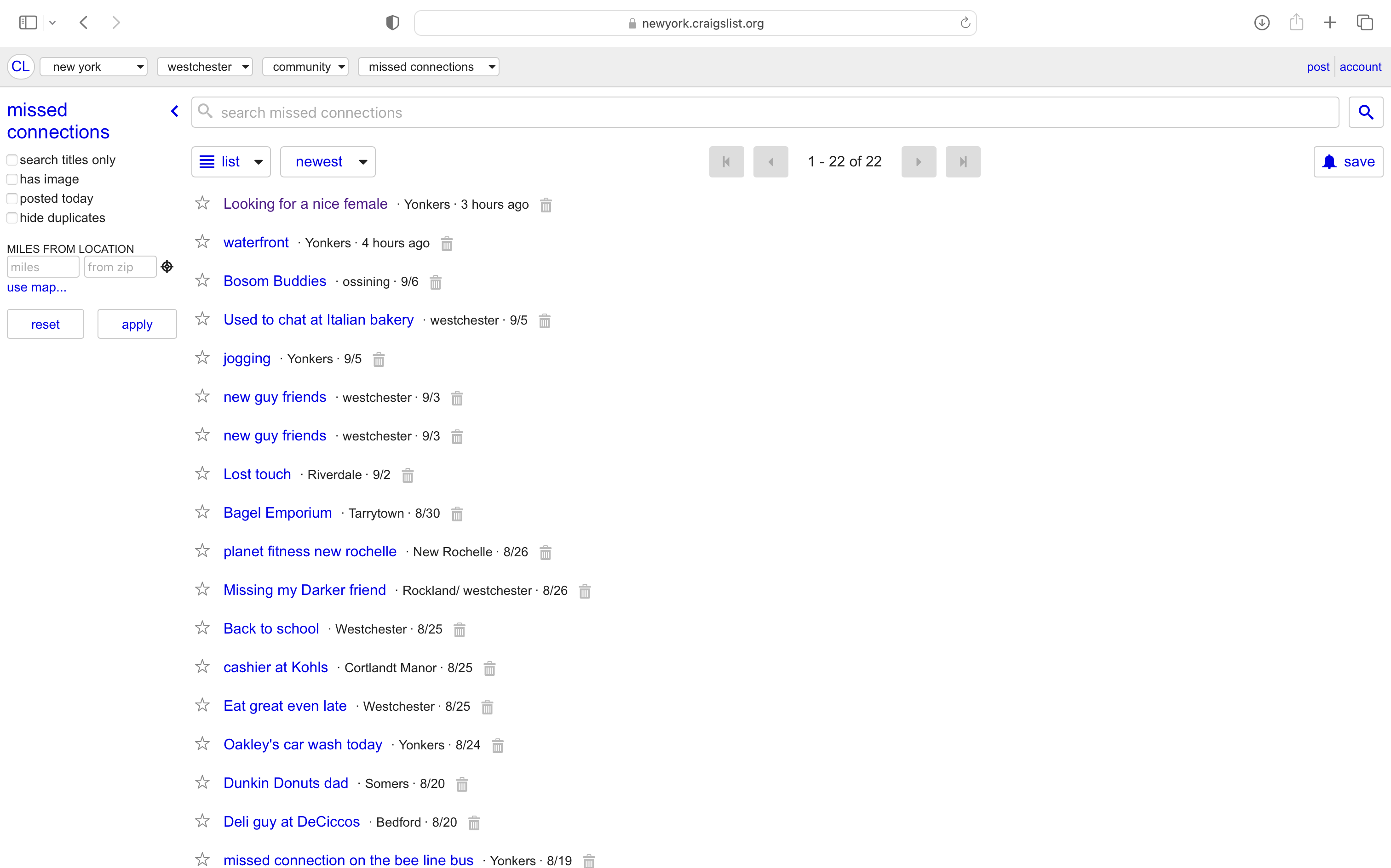
Fig 2. – Listings Menu
LISTINGS SPECIFIC PAGE
The Listings page is somewhat different from the main homepage, although it’s also a list of listings, laid out like bullet points. On the top navigation, users can view the location, categories of listings, as well as the subcategory. In this example (Fig. 3) the location is New york, the category being community and the sub-category being missed connections. In terms of affordance, the navigation shows a pretty clear indication of what each button means, with the down arrow indicating that users are able to change. Listings button wise, the color is the same blue as the homepage, indicating that it is a clickable link. This differentiates from the down navigation which does not have the same color because it’s black. It shows an inconsistency in the design. What saved the interface however, is the hover function in which the button and links would highlight if a user’s cursor hovers over an active link.
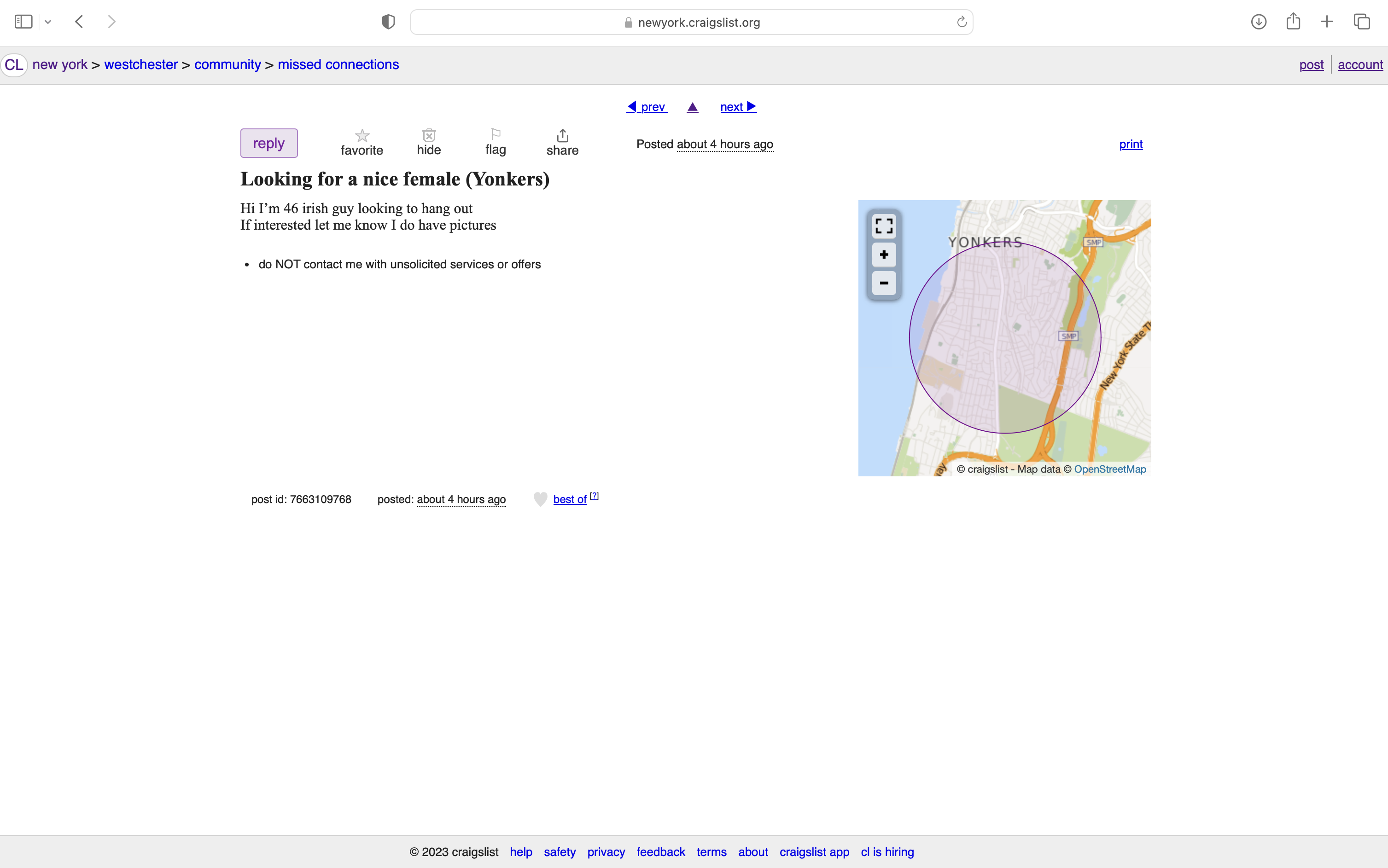
Fig 3. – Listings Specific Page
CONCLUSION – MY TAKE
Craigslist’s usability itself is very simple and intuitive for users who are familiar with the early 2000s interface, but for users who are not familiar with it such as Gen-Zs and Gen-Alphas, the design itself has a cultural constraint. I personally grew up with the early 2000s internet and have no constraints with the design. Visibility wise, Craigslist’s website is also incredibly transparent and obvious with links to listings being very easily categorized. Each listing also has a clear address with a live map, information, title and indication of when the listing was uploaded.
My only concern with Craigslist’s design is that the early 2000s internet era design has a flair of suspicion attached to it, especially around illegal listings, as well as its adult service activities. In terms of its emotional design, the aesthetics and emotional appeal when using Craigslist is anxiety inducing because of the lack of security around who can post. All in all, the design itself is very simple and intuitive (with a cultural constraint), but its image around its brand may call for a rebrand of its UI and security.