
Gmail is a popular email service developed by Google. Users can manage email, conduct a team space, and start chat and meetings. The Gmail app version minimizes tools and setting constraints for users to access Gmail, allowing them to use all the functions of Gmail from any location by mobile devices.
Navigation Bar
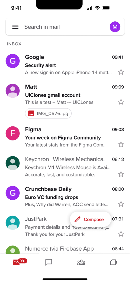
The bottom navigation bar effectively uses Discoverability for the user, making the four functionalities evident. Icons are used as a signifier that helps users understand their function. The Four icons clearly describe the function of email, chat, team, and meeting. The red button floating above the navigation bar at the bottom is another practical use of discoverability and signifier; users can immediately notice and understand that this button can instantly open and create a new email. It provides feedback when the user selects an icon; the icon itself will turn read. A number will show in the upper right corner of the icon to remind the user of the unread message if there is a new reminder in one of the four features. Users will recognize the icon with four horizontal lines in the top right corner as a side navigation bar (see the figure below) by recalling knowledge.
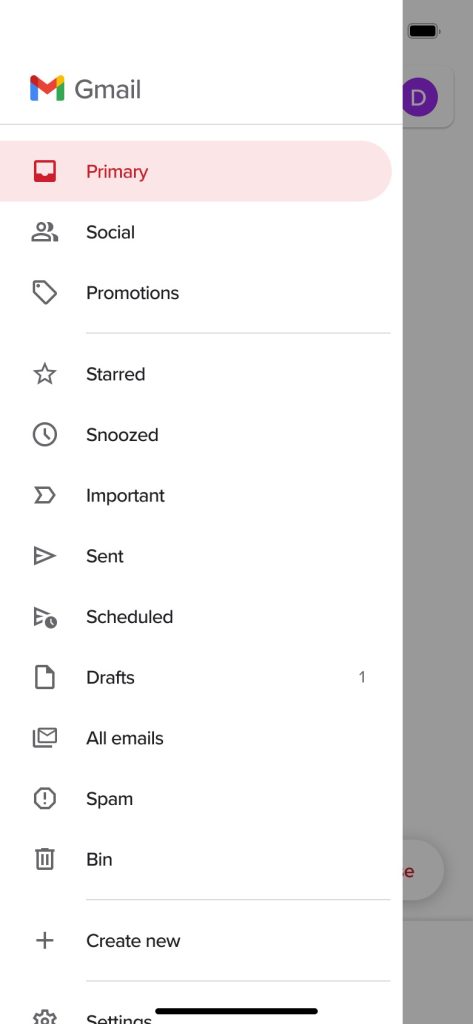
The side navigation bar is a great conceptual model of how the user could interact. The use of text and icons allows the user to understand how to attain what they want to do quickly. It will immediately give feedback when the user selects an icon.
Account Management
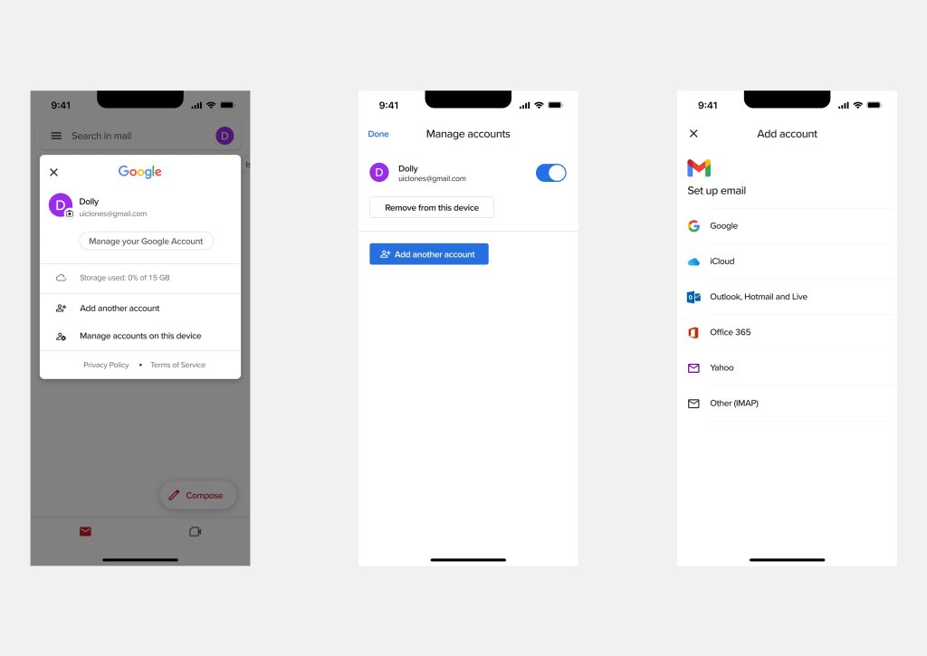
The user profile in the upper right corner is an excellent mapping ; users will understand that assessing their profile picture will allow them to perform account management operations.
The signifier is used well in the popup, clearly identifying the distinct action buttons for “adding a Google account” and “adding other accounts”. In the manage account interface, there are two different functions, “remove account” and “add account”, that show the Affordances, and there is a line that separates these two different functions, which is a good use of logic constraint to let the user understand that the function of the button in the upper right corner is the same as the remove account since they are in the same section.
Mail Swipe Actions
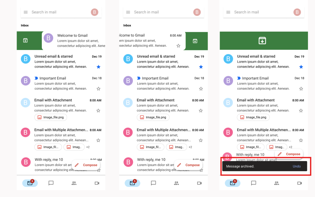
The Affordances enables swipe action, providing users with a convenient option to archive emails. When the archive mail action completes, an undo popup window appears at the bottom, reducing the number of times the user archives the email mistakenly.
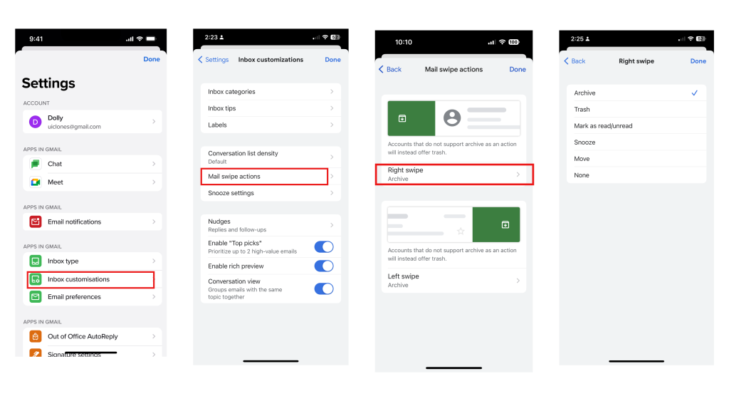
However, I discovered that the swipe action not only can archive emails but also has additional functions such as marking as unread, trash, and move, and changing the swipe action requires four steps, with no clue to the user that the swipe action has capabilities other than archive. To begin, the user needs to click on the side navigation bar and then select “Settings.” Within Settings, select ”Inbox customizations,” then, in the selection that appears, select “Mail Swipe Actions” to edit the swipe action. From here, the user can customize the left and right swipe functions. (See the figures below) The lack of visible cues makes it challenging for users to locate the edit swipe action. This is a design error that has resulted in a gulf of execution. It doesn’t do a good job of connecting the user’s operation path with affordances and signifiers.
Solution
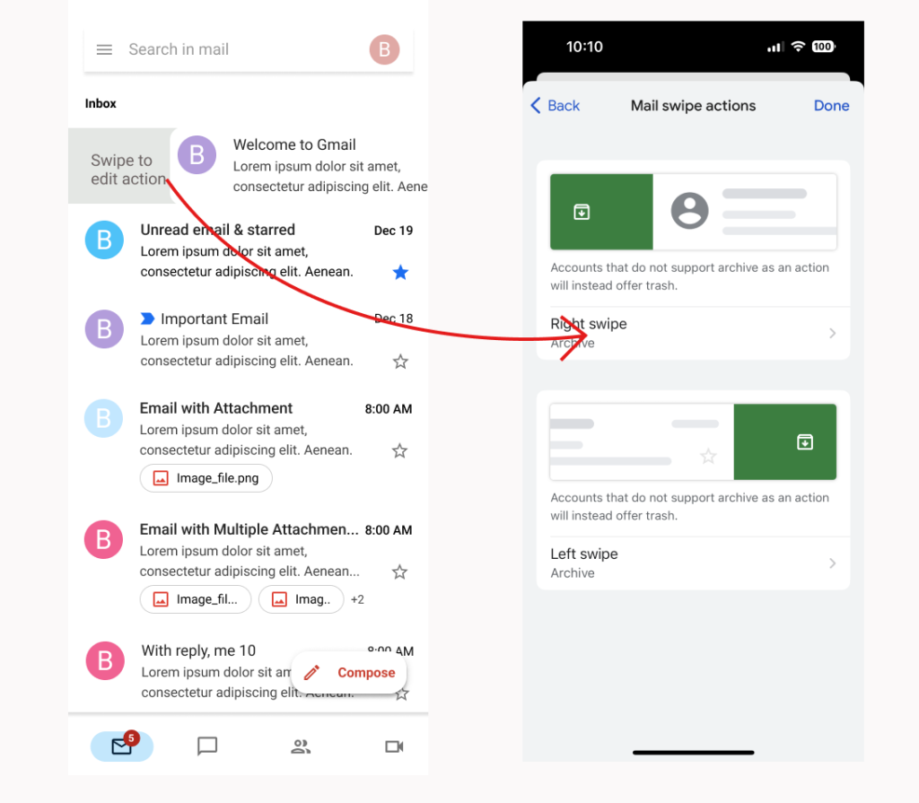
To address the gulf of execution, an Affordance and Signifier should be added to help the user quickly notice possible functions and methods of operation. For example, maintain the left swipe displaying the archive icon but change the right swipe action to a brief reminder: “Swipe to edit action,” terminating the right swipe action with a straight jump to the “Edit Swipe Action” interface (See the figures below). This helps the user recognize possible actions and instructs them on how to do it.
Conclusion
The Gmail app is a well-designed mobile email service with several functions. It provides collaboration, chat, and meeting functions to fit the demands of users in their studies, life, and professions. Since Gmail chooses to use a simple interface, many small features and shortcuts of Gmail are likely concealed . This simplicity may cause users who do not spend that much time exploring the shortcuts and features to have a difficult time performing some functions. However, Gmail is still a highly recommended email application.