StreetEasy provides information on real estate listings in the New York metropolitan area via its website and mobile applications. It helps users find apartments and homes, especially in NYC, for rent or sale with details such as amenities, property history, and neighborhood information.
Sign Up and Login Process
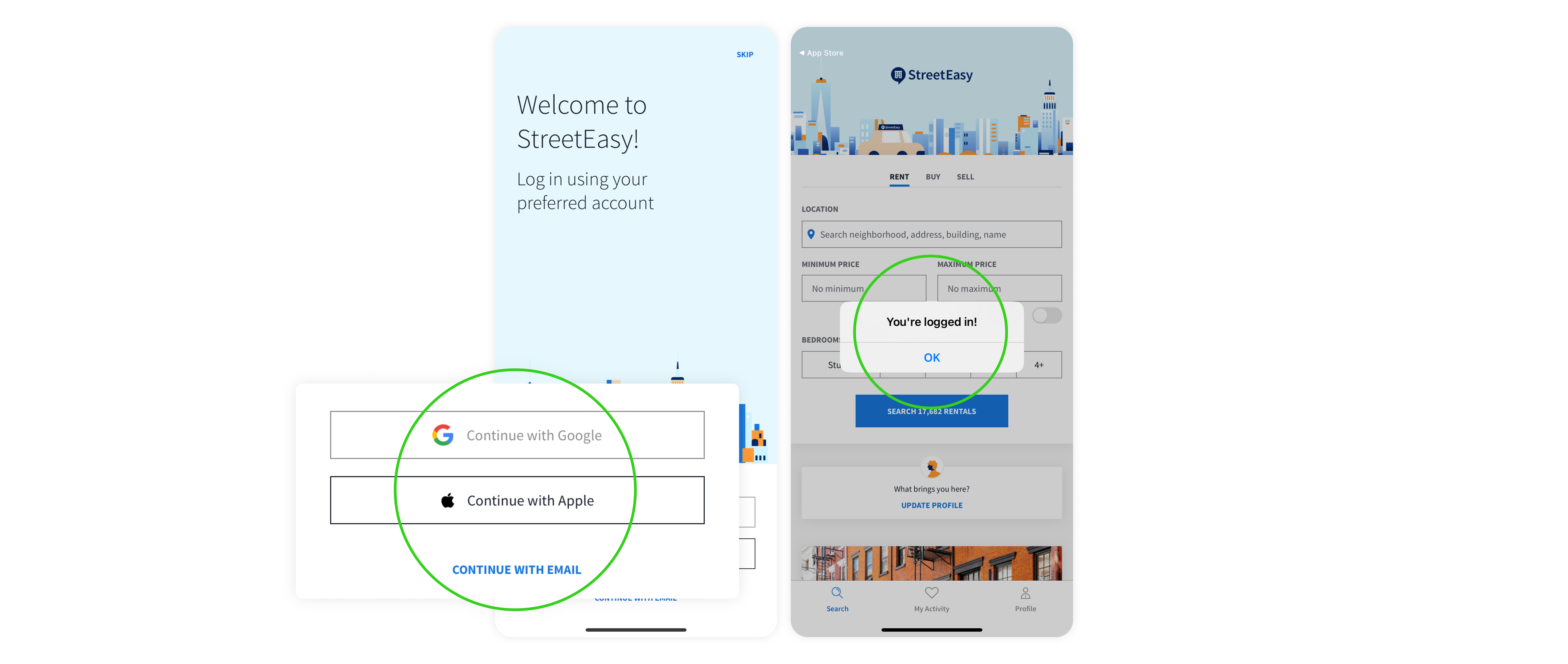
The initial entry screen after StreetEasy’s splash screen utilizes the design aspect of knowledge in the world, prompting users to continue with Google, Apple ID (for iOS users), or email. This familiar sign-up ensures users a seamless start to using the app. After logging in, it provides clear feedback with a straightforward dialogue confirming successful login.
Onboarding and Shaping User Expectations
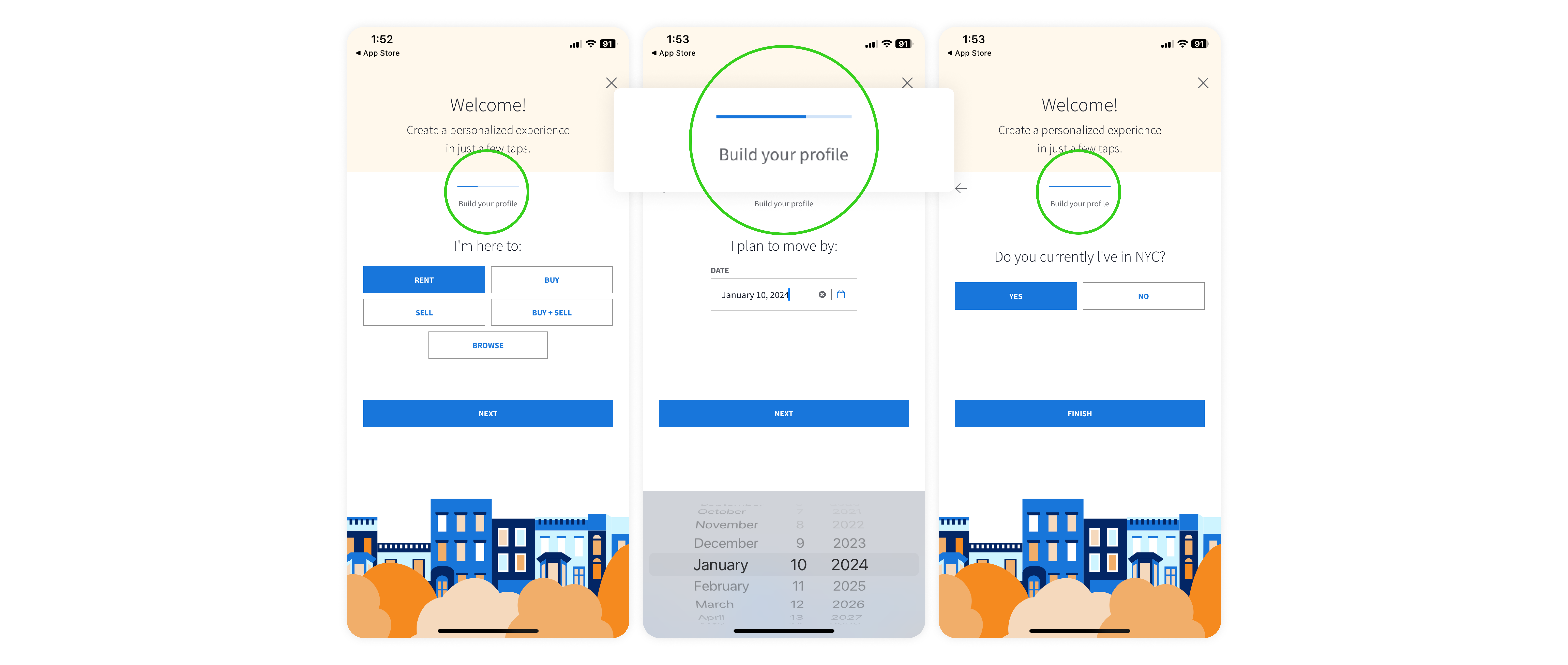
After login, the onboarding process begins. This process is the user’s first interaction with the app, and it will shape the user’s system image on this service, such as what features the user will mainly use and what data they can access through this platform. Users gain a fundamental understanding of the service and build expectations for their overall app experience. This process plays a significant role in forming the app’s system image.
The app thoughtfully informs users where they are and the remaining steps to finish this onboarding process using a progress bar. This progress bar is an effective feedback that aids users in understanding ongoing procedures and estimating how much more they need to complete.
Clear Exit Signifier
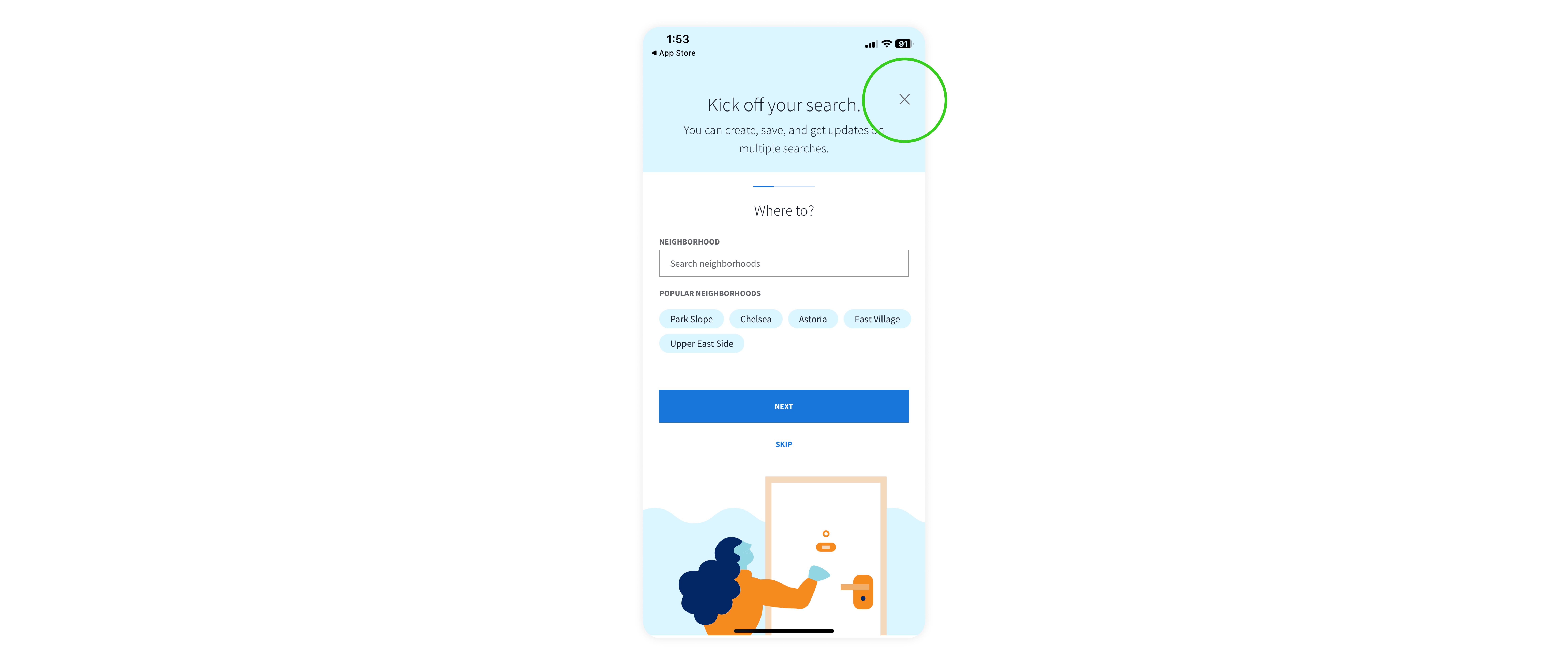
This X icon acts as a clear visual signifier, allowing users to dismiss this process. It also provides an explicit affordance for exiting the screen and signifies a close action.
Bottom Sheet Modal Design
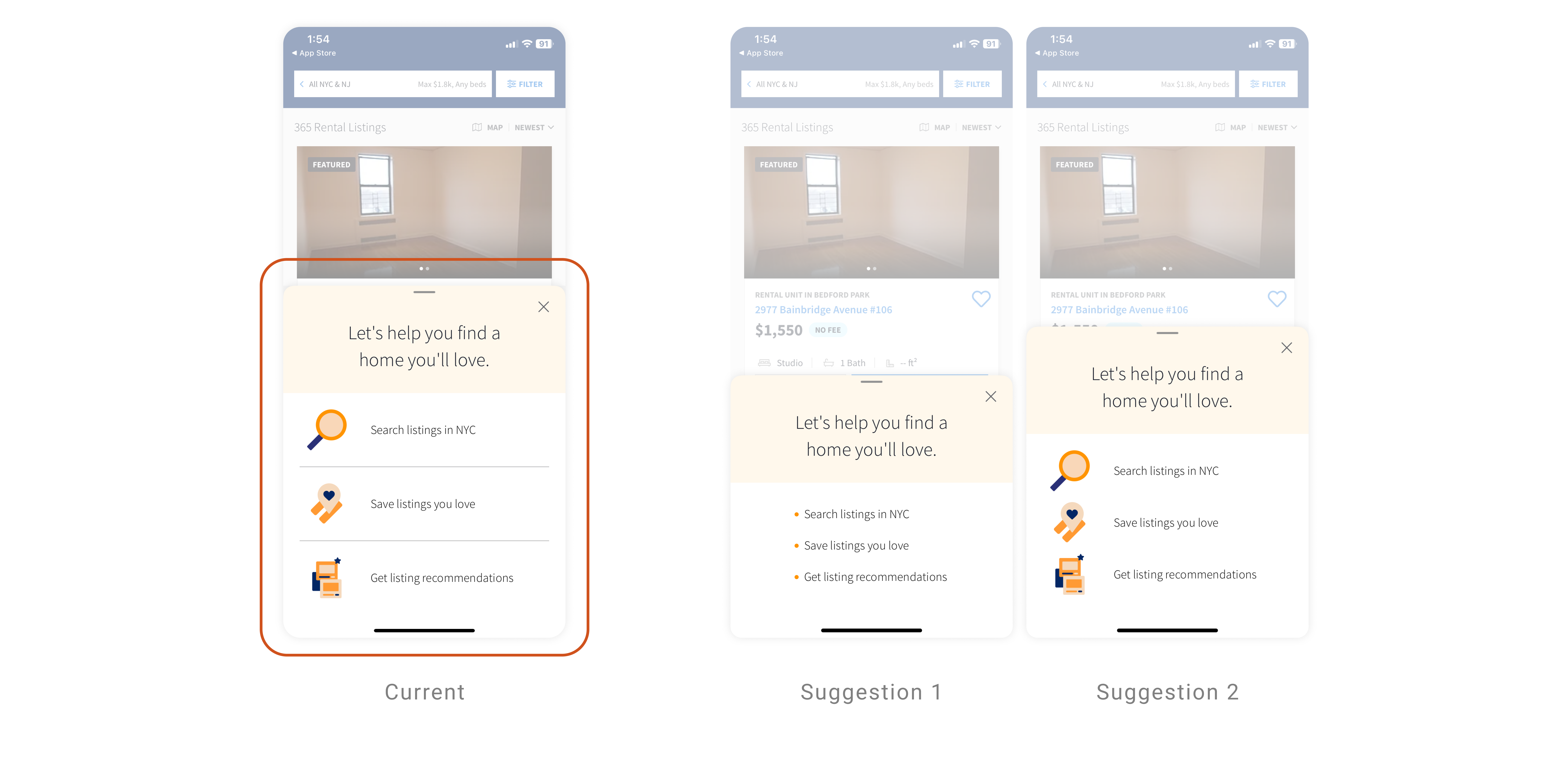
Once the onboarding process is done, a bottom sheet modal is dragged into view. This bottom sheet modal gives a false affordance because of the layout design and wording. The elements are arranged in a card-like configuration, and the sentences starting with ‘search,’ ‘save,’ and ‘get’ may give an impression that it can be interacted with by tapping them, potentially confusing users. I would use a bullet point to show users clearly that they are a list of the main features or remove the divider to minimize any unintended interactions.
Listing Card and Key Signifiers
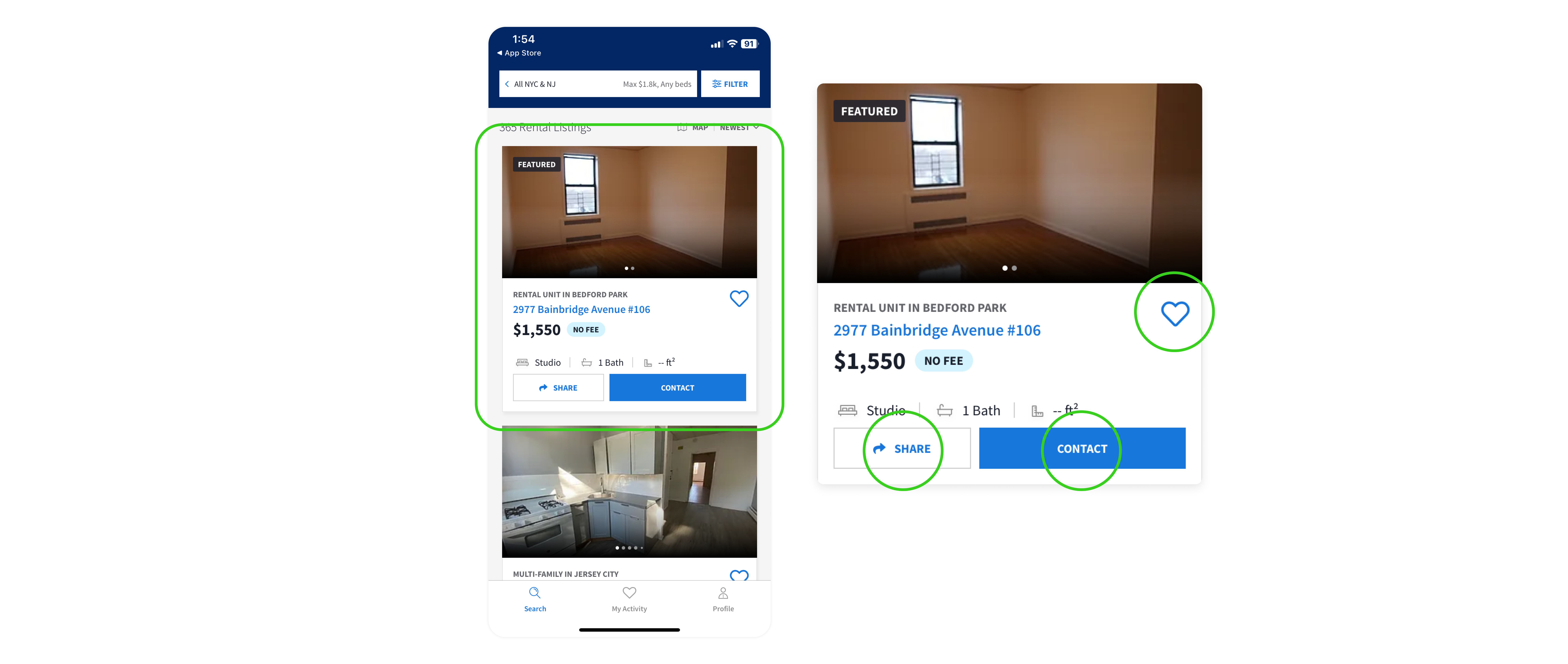
This card design affords users to click to learn about this listing without needing a separate ‘view more’ button.
Share, contact, and like buttons and icons are clear signifiers of actions users can mainly take.
Search Results with Logical Constraints and Map View
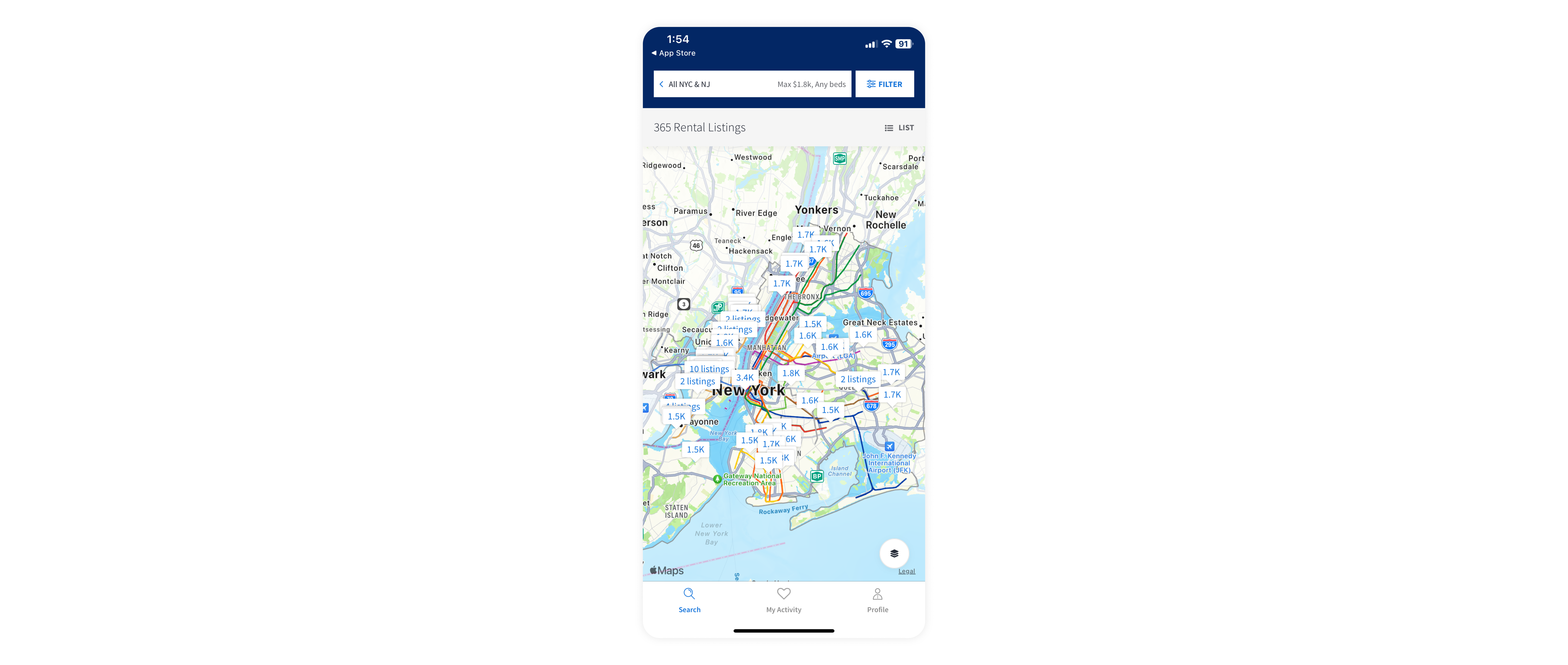
This screen appears when no specific neighborhood location is required during the search process. It exclusively shows users listings in NYC and New Jersey areas close to NYC. These logical constraints enhance the user experience by narrowing search results and providing only relevant and contextually appropriate results.
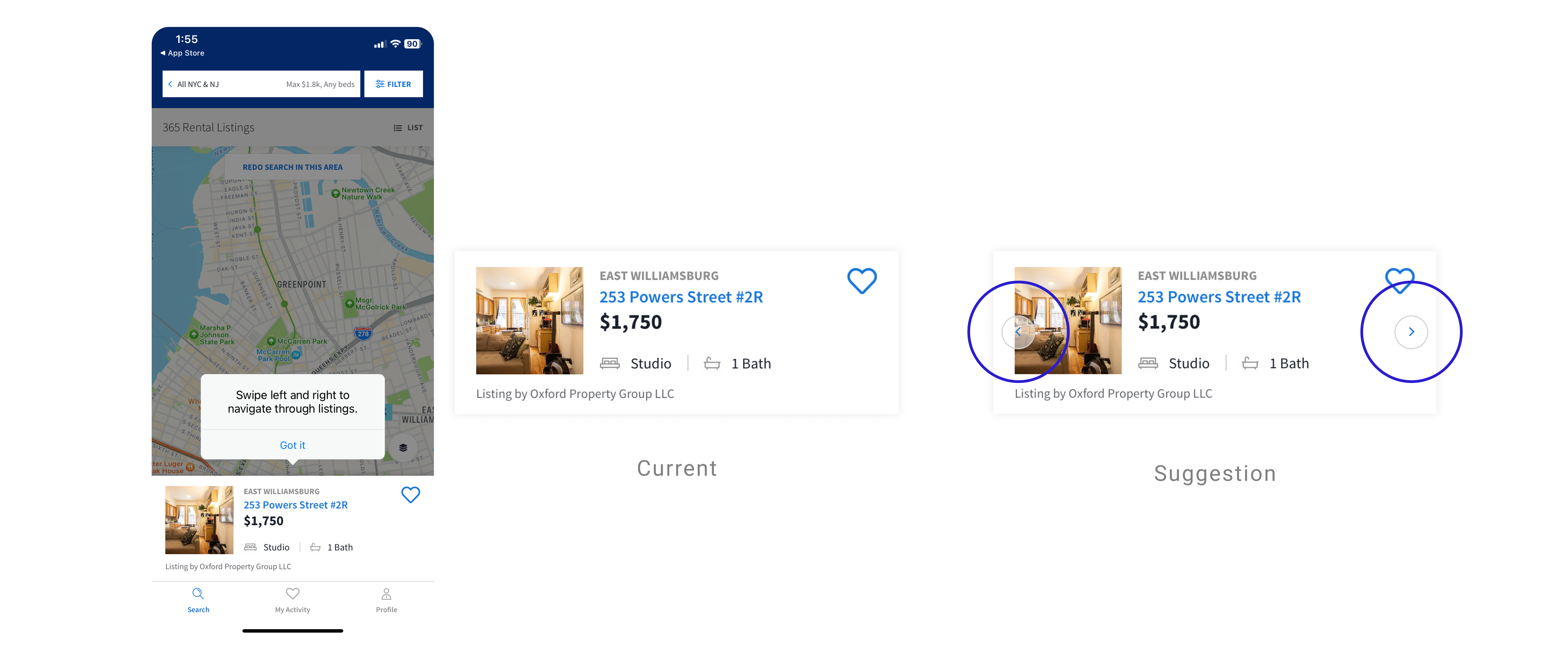
When novice users initially enter this map view, a tooltip guides them on interacting with this bottom sheet to explore the listings. However, upon returning to this page, no signifier indicates that swiping is possible. To address this, considering the space is limited, I would add transparent arrows that appear briefly in 1-2 seconds each time users enter this page.
Consistency in Design System

This divider creates the impression of a tab element when users cannot switch between sections. The app’s inconsistent use of design components in different contexts can be misleading. I would not use the tab-looking divider and match heading styles with other headings on this page.
Custom Map Area Affordance
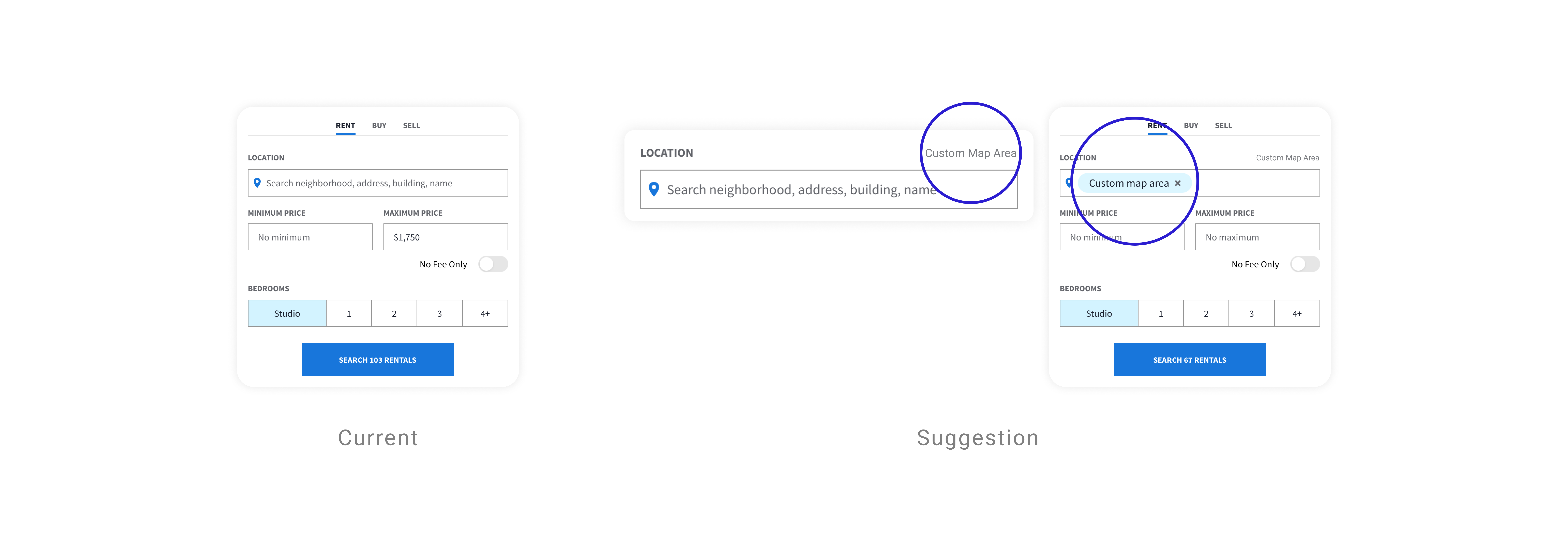
This page does not afford an option to search by custom map area. However, a custom map area is an available function when users search for the result first, move the map, redo the search in this area, and return to this page. If this is a possible procedure to enhance the user experience, I recommend making an affordance to search by custom area in this step.
Feedback for No Search Results
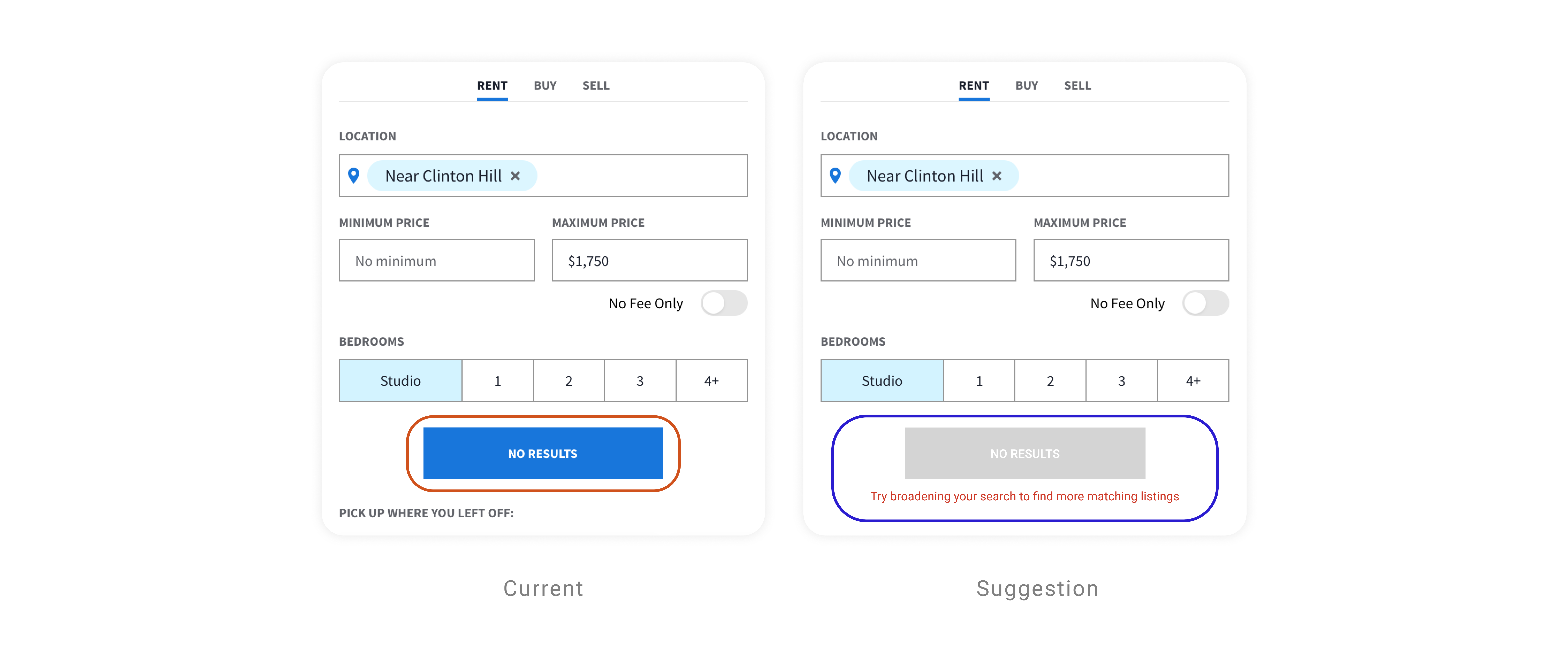
When there are no results with the entered filters, it gives essential feedback in the button ‘NO RESULTS.’ However, this button lacks a clear signifier due to visual similarity to active buttons. To improve this, I suggest making the button visually disabled to signify no results. Furthermore, I recommend informing users of the next step by stating, “No results found; please adjust your search filters/settings.”
Conclusion
In conclusion, StreetEasy’s user-friendly interface and process designs enhance overall user experience. However, attention to detail in creating clear affordance and signifiers would improve the app’s overall system image and usability.
