Clay Design System
Quick Summary
My Role:
Design Manager, Product Designer and UX Researcher
The Team:
Sneh Ganjoo, Marc Molta, Becky Su
Outcome:
Building a Design System for Formbricks with a UI Kit and detailed documentation
The origins of a Design System

Formbricks is a product aimed at helping companies better understand their customers. It is a suite of survey and survey analysis features built on the underlying ethos of Open-Source development. Formbricks has relied on the open-source community and internal team to be able to build the product and push it to deployment. It has also heavily relied on Tailwind CSS for it’s components and styling. However, the distributed library usage and quick launch strategy aren’t conducive to linear product growth. All of these are indicative of the need for a design system.
Signs hinting the Design System need
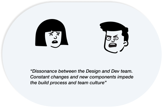
Dissonance between the Design and dev team due to constantly changing components
Scaling up and growing has been causing an increasing number of components and design components. Every new feature had a new element and this was impacting team productivity and Design-Development collaboration and handoff.
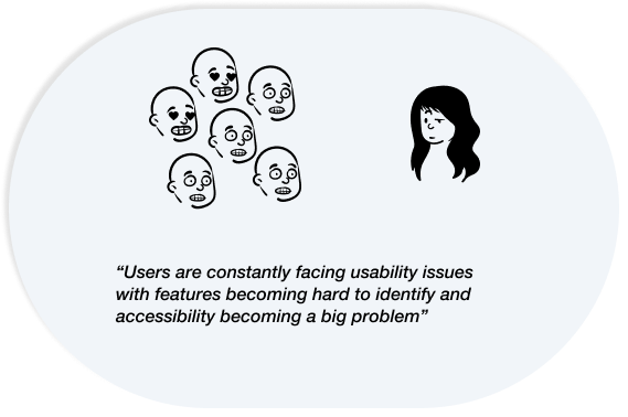
Users constantly face usability and accessibility issues with components having multiple definitions.
Users are constantly faced with changing UI components and multiple components that act as signifiers for different functions. Accessibility is a thought in hindsight hence making it challenging for users to use the product.
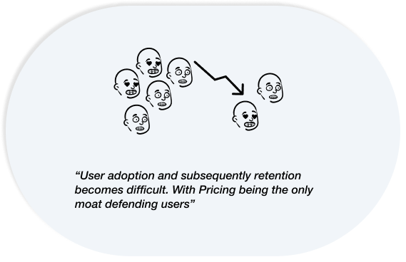
Users find pricing to be the only reason to stick around, thus having an impact on adoption and retention
User adoption becomes more challenging and retention numbers are difficult to retain. Users see pricing as an Open-source product as the only moat. Formbricks needs to evolve from just being an open-source alternative to
feature-forward product with great usability.
What it takes to build a design system
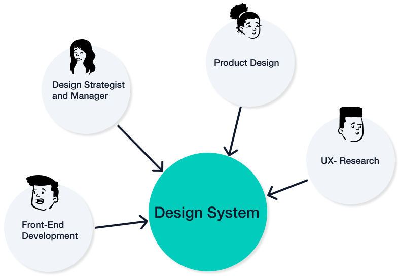
Roles :
A design system is built on the backs of multiple team members each with a specific role that is instrumental through the entire process. The team that worked on Clay followed a lean model. A Design Strategist and manager is required to manage the entire project and guide key decisions. A product designer helps build the UI kit and support documentation and content needs. A UX Researcher is required to ensure Design System’s usability is maintained and accessibility remains a prime focus. A front-end engineer is required to complete the code by mapping design components to code components. This system did not have a Front – End Developer.
The Evolution of the Clay Design System
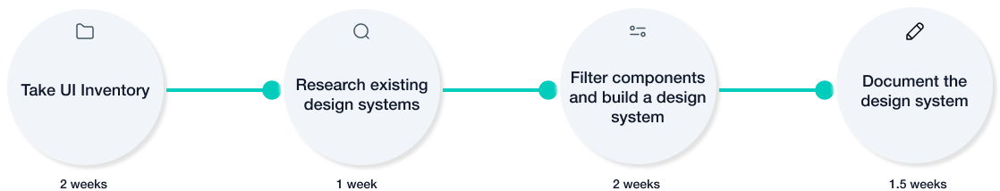
Performing a UI Inventory:

Performing a UI inventory meant taking note of every component and its variants that exist on every page of the product. This helped assess the breadth of the UI we were dealing with and categorise repeatable components across pages.
Researching an existing Design System:

Researching an existing design system helped set a precedent with mature design systems like Google’s Material Design and Twilio’s Paste. Additionally, a quick design exercise recreating a few pages with an existing design system like Paste helped assess the need for a design system better. It also helped ensure that we weren’t creating a new design system just purely because of a difference in Branding styles from existing systems.
Building and testing the design system:

Fuelled by an in-depth inventory and research we got down to creating the UI kit with a style guide and component library. Decisions were made prior as to which components that saw repeatability needed to be a part of the library and which could be omitted. The number of variants to have was another critical decision in designing the library. Post v.01 draft of the UI kit it was tested with designers who used the kit to recreate few pages from Formbricks and helped us test for usability and make requisite changes before publishing.
A Quick Introduction to Clay:
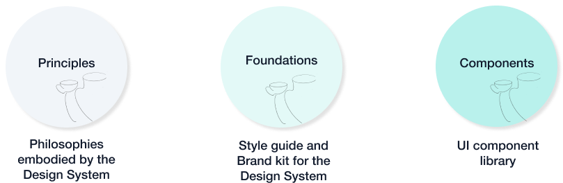
Clay is made up of 3 parts the principles, the foundation and the components. The Principles that Clay espouses are Clarity, simplicity and Inclusivity. Clarity helps Clay focus on usability and user needs. Simplicity ensures that we stick to minimalism and keep the interface clean and Inclusivity ensures we build a product which is for every kind of user.The Foundations cover Clay’s Branding and styling guidelines which make for the design tokens and the UI Component library makes the building blocks of every feature/Page within Clay.
Documenting the Design System:

Documenting a design system encourages the dissipation of knowledge and easy adoption. The documentation covered all aspects from a quick getting started to usage and best design practices for every component.
What the Design system achieved
Efficiency through component reduction :
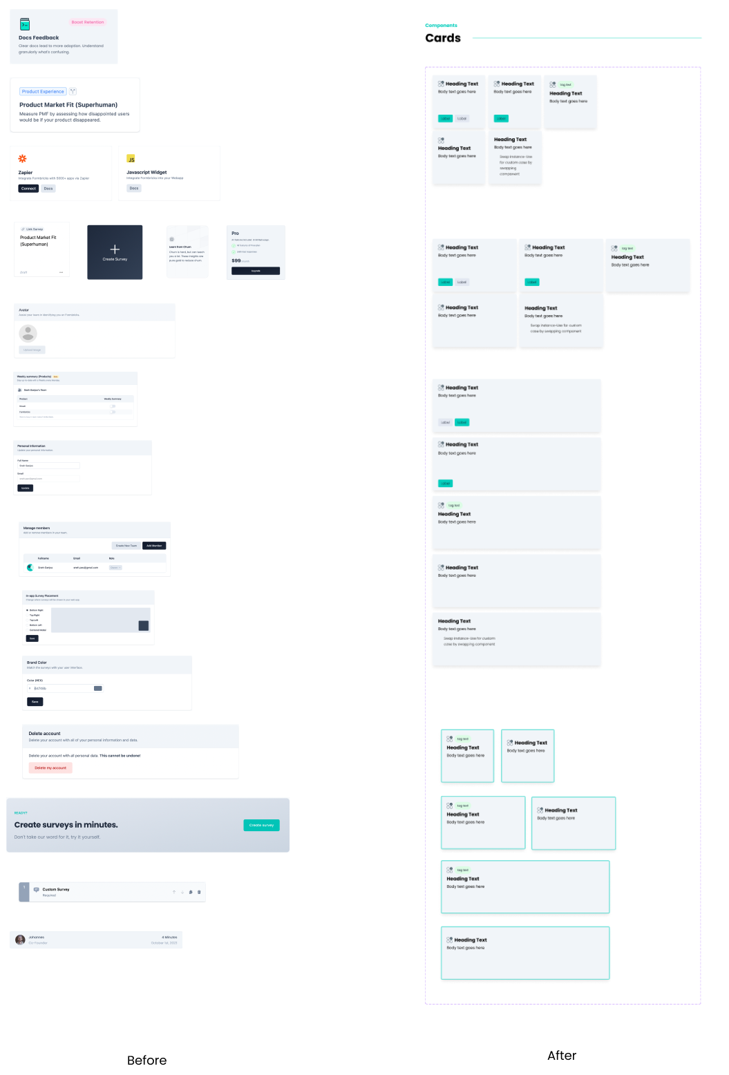
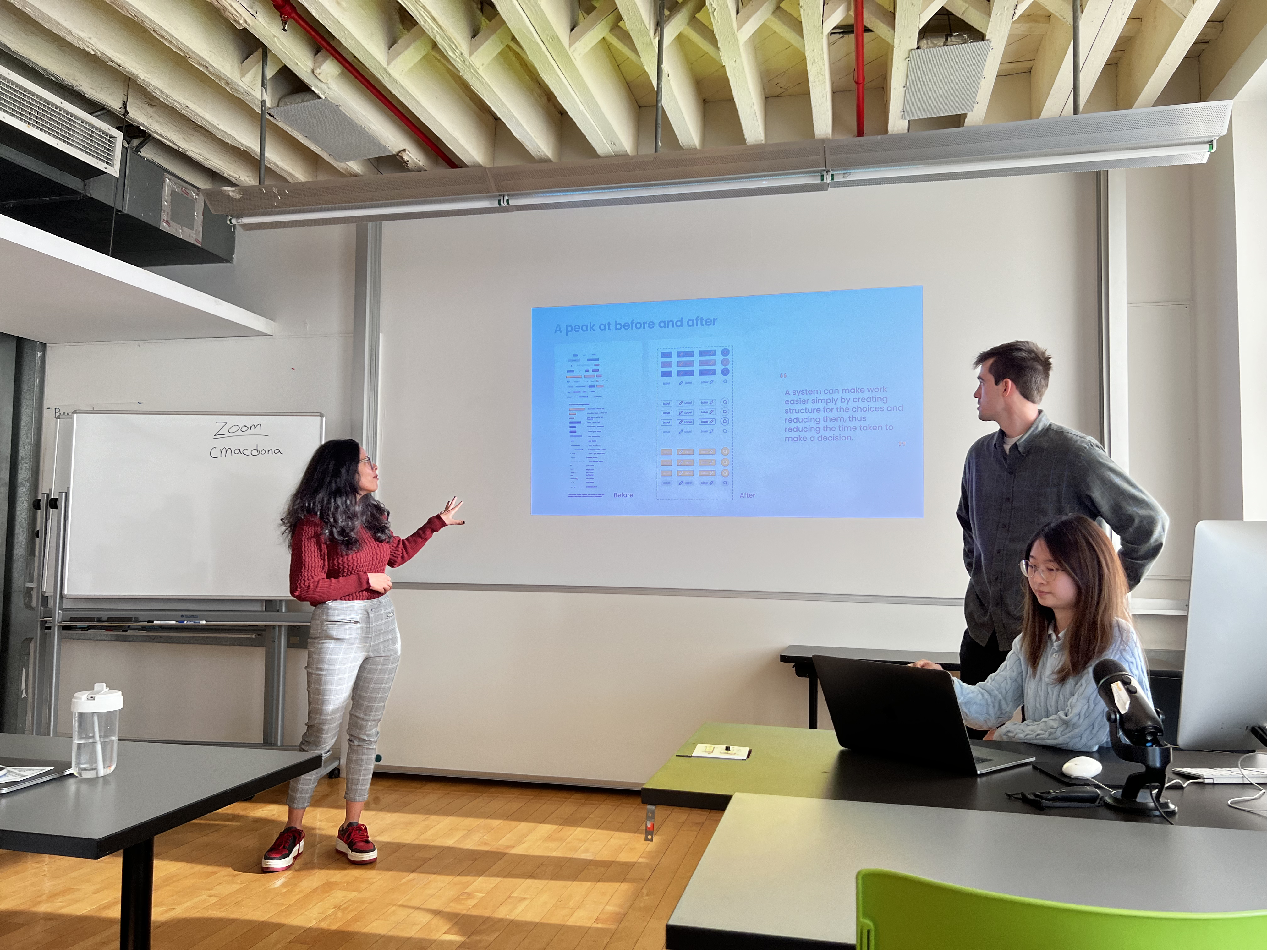
The design system helped reduce components on average by 37% thus saving designers 63% of time. This means a design that earlier took 2 hrs can now be completed in 45 mins.
Improved accessibility:
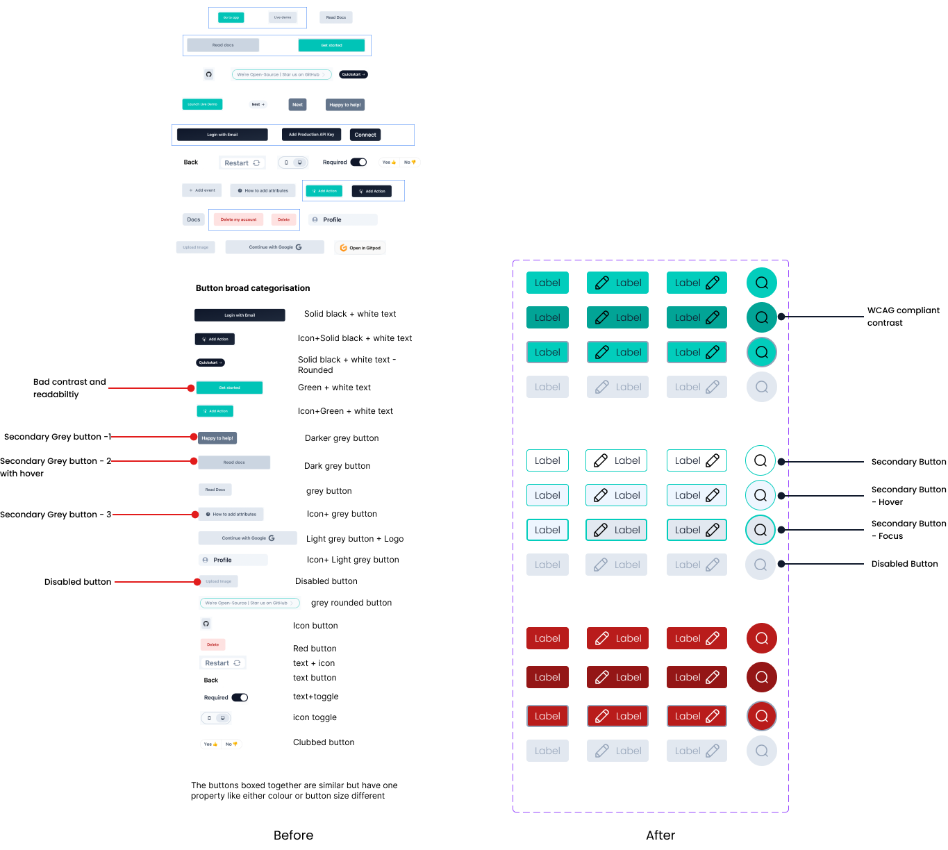
The Design system helped remove UI issues and improve accessibility of the UI. The buttons with confusing states and bad contrast ratios in the old UI is a prime example of this improvement.
Better collaboration :
The Design system will help improve design-dev handoffs and communication. It will help increase team efficiency by 50% thus creating time for product improvement and business growth.
The Grand Finale
A design system is incomplete if it isn’t adopted. We ensured awareness and adoption through a pitch by the team that built the system. We ensured that stakeholders were introduced and educated about the system and the documentation.