
Embarking on a transformative mission, our team set out to revolutionize Oppenheimer Financial Institution’s digital landscape, a finance pillar with over 140 years of expertise. Our goal was ambitious yet clear: to develop a comprehensive design system that foregrounds accessibility and enhances user experience. This endeavor aimed not just to refine visuals but to reimagine how users interact with Oppenheimer’s digital realm, ensuring every touchpoint resonates with ease, inclusivity, and innovation. This project was more than a design overhaul; it was a step towards making complex financial interactions intuitively accessible to all users, aligning with Oppenheimer’s commitment to excellence and client empowerment.


Enhancing User Experience at Oppenheimer
Oppenheimer’s website was a dense labyrinth of financial information. Functional yet overwhelming, it posed navigational challenges, especially for users new to financial concepts or digital platforms. Our mission was to transform this complexity into an intuitive and accessible user journey.
Key Challenges:
- User Accessibility: Difficulty in navigating through the complex information structure.
- Intuitive Design: Lack of user-friendly interface for diverse user demographics.
- Information Overload: Balancing the depth of content with ease of use.
Our Objective:
- Simplify the user experience while maintaining the comprehensive nature of Oppenheimer’s services.

Team Synergy: Collaborative Leadership
In our work on Oppenheimer’s digital interface, the essence of our success lay not just in our individual skills but in our collective leadership and collaborative spirit. Our team embraced a unique approach where leadership was shared and fluid rather than centralized.
Key Highlights of Our Team Structure:
- Equal Footing: We operated on a level playing field, where each member’s voice held equal weight in decision-making.
- Diverse Perspectives: Our diverse backgrounds and skills complemented each other, enabling a more holistic approach
- Shared Responsibility: Leadership was not the task of one but a shared responsibility, fostering a sense of collective ownership of both challenges and successes.
Laying the Foundation
At the heart of our project lay a pivotal task: constructing a design system from the ground up for Oppenheimer Financial Institution. This initiative marked the beginning of a path to alter and fundamentally enhance how users interacted with Oppenheimer’s digital presence.
Initial Stages and Objectives:
Foundation Building
The first step involved creating a solid foundation. We meticulously audited Oppenheimer’s existing digital assets, identifying key UI components and patterns that needed refinement or reinvention.
Scope Definition
Our scope was extensive. It included developing guidelines for ‘Getting Started,’ establishing branding parameters, and setting design principles. Central to all these was a strong focus on accessibility and user experience.
Oppenheimer’s Legacy
We remained cognizant of Oppenheimer’s rich heritage while innovating. Our system had to resonate with their longstanding tradition of financial expertise yet be agile enough to adapt to the evolving digital landscape.
Core Principles
We anchored our approach in four foundational principles. These guiding tenets were not just abstract ideas but practical directives informing every aspect of our design process. As seasoned professionals in UX design and system architecture, we understood the importance of having clear, actionable principles that could adapt to changing needs and technologies.
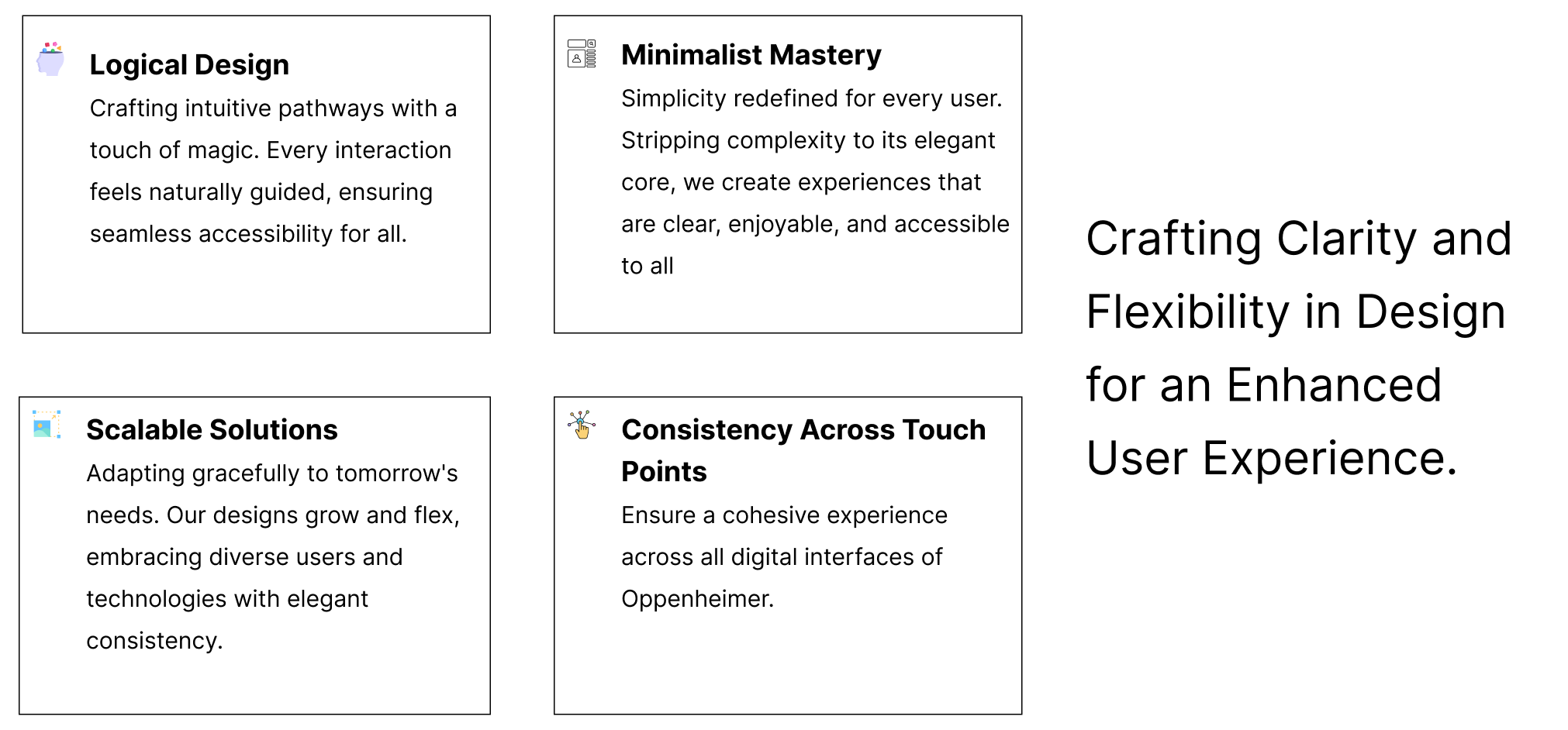
These principles served as our north star, guiding us through each decision and design iteration. They are reflective of our commitment not just to aesthetic excellence but to creating a user-centered design system that stands the test of time.
Overcoming Challenges
Tackling the immense task of cataloging Oppenheimer’s extensive UI components, we executed a thorough audit to pinpoint inconsistencies and areas for enhancement. Accessibility was a focal challenge; we rigorously applied WCAG guidelines to ensure universal usability.
We also faced the challenge of design consistency across different platforms. Our solution was to establish a unified set of design standards, guiding our team towards a cohesive visual language and user experience.
Throughout, our adaptability and commitment to innovative solutions were crucial. We adopted an iterative design process, ensuring a resilient and user-focused design system.

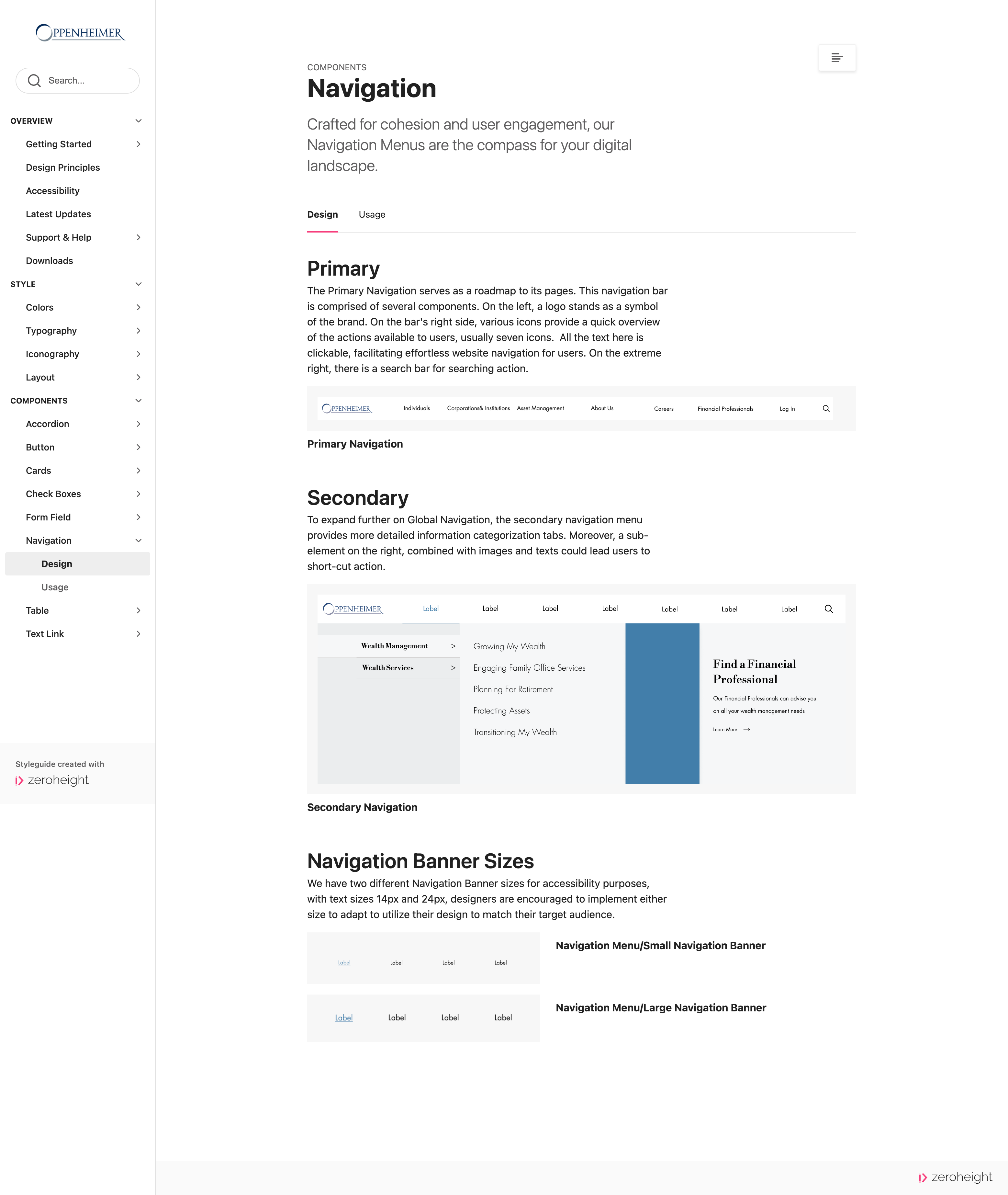
Our Enhanced Design Components
Our design system significantly enhances user interaction, accessibility, and aesthetics. By refining key elements like buttons, checkboxes, and colors, we’ve created an interface that melds functionality with visual elegance. Our diverse range of button styles ensures intuitive use for all abilities, while our checkboxes are streamlined for ease and clarity, accommodating visual and motor impairments. The color palette is carefully chosen for both aesthetic appeal and accessibility compliance, offering high contrast and readability. Overall, this approach elevates the user experience, achieving a harmonious balance of engaging visuals and inclusive design in line with contemporary UX standards.
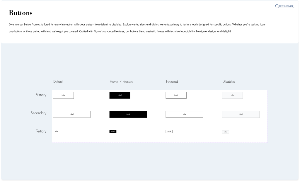
Buttons for Every Need
Our button designs offer versatility and clarity. From primary to tertiary styles, each type is tailored for specific user actions, ensuring intuitive engagement. We provide icon-only and text-incorporated options, meticulously balancing aesthetic appeal with functional adaptability.

Checkboxes
Clear and User-Friendly Checkboxes are a vital element, facilitating user decisions with ease. Our design includes checked and unchecked states, crafted for simplicity and straightforward interaction, contributing to a seamless user experience.
A Palette That Speaks Volumes
The color scheme in our design system is both comprehensive and purposeful. It spans primary and secondary hues alongside neutral tones, with dedicated colors for text and borders. This range ensures consistency and harmony across all user interface elements.

The Keystone of Our Design System: Comprehensive Documentation
Our design system’s success and sustainability are anchored in its comprehensive documentation, which serves as both a guide and a record of our evolving design philosophy and practices. Hosted on Zeroheight, this documentation is more than just a reference; it’s a dynamic, living framework that ensures the continuity and coherence of the design system across teams and over time. It’s a central hub where team members can access detailed guidelines, understand the rationale behind design decisions, and stay updated with the latest system changes. As the design system adapts and grows in response to user feedback and technological advancements, the documentation evolves alongside, ensuring that every modification or addition aligns with our core principles and objectives. In this way, our design documentation is not just a repository of information; it is the backbone of our design system, underpinning its ongoing relevance, usability, and effectiveness.

Reflections and Learnings
Reflecting on the creation of our design system, we’ve garnered invaluable insights that transcend the boundaries of traditional design. Central to our learnings is the criticality of a user-centric approach. The project also reinforced the power of collaborative effort, with diverse perspectives fueling innovation and inclusivity. A key aspect of our process was emphasizing continuous testing and governance. A robust governance framework proved essential in maintaining the design system’s consistency, quality, and relevance over time, guiding decision-making and system updates.
One of the most profound realizations was design systems’ dynamic, living nature. Adaptability emerged as a crucial attribute, with the design system requiring ongoing evolution to stay abreast of technological advancements and shifting user needs. This journey has been about more than just creating tools and guidelines; it has been a deep dive into sustainable, user-focused design, highlighting the need for forward-thinking and continuous engagement with the evolving digital landscape.