Introduction
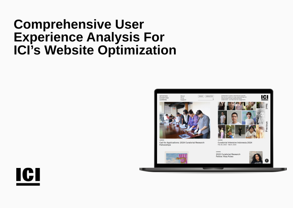
Independent Curators International (ICI) is a non-profit arts organization that supports curators. ICI connects curators worldwide, providing many resources, including fellowships, intensives, and seminars. Our approach involved moderated remote testing—a dynamic method allowing us to capture authentic user interactions across diverse demographics.
Client: Independent Curators International (ICI)
Team Members:
- Cathelyna Suherman
- Chieh Lei
- Madhumitha Pradeepkumar
- Nallammai Kannan
- Wenjia Liu
What were the project scope and goals?
After our initial meeting with Taylor Black, The Head of Communications at ICI, we gained insights into the organization’s mission, goals, and the specific challenges they faced in evaluating their online presence. We brainstormed to understand the client’s objectives and to frame the project scope.
Objective: This project aimed to conduct a thorough user experience analysis for ICI’s website.
Project Scope:
- Quantitative and Qualitative Analysis: Conduct moderated user testing to understand navigation patterns, sentiments, and content evaluation.
- Content Examination: Deep dive into the substance, tone, and resonance of current material featured on the ICI platform.
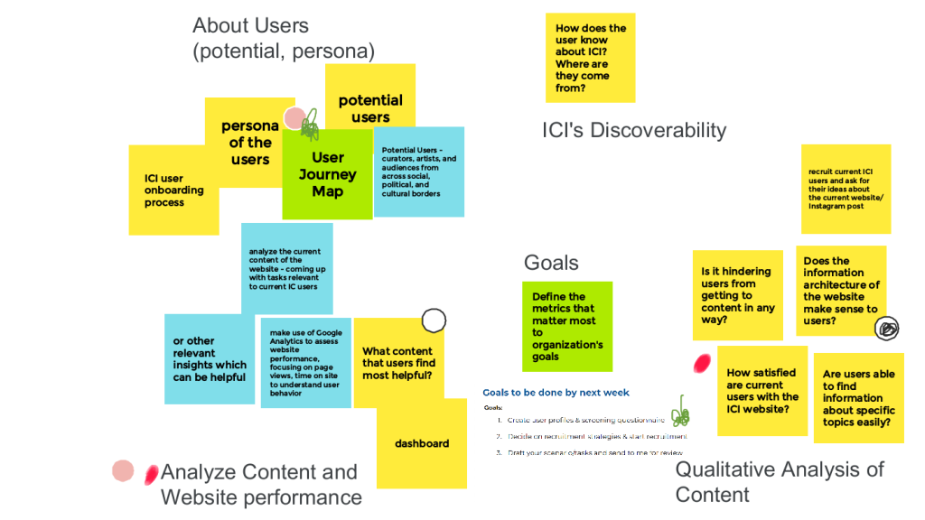
A screen clip from our Jam Board after the initial discussion with the client
How did we accomplish our goals?
We employed a comprehensive methodology, starting with a moderated remote user testing approach with diverse participants. This method is widely recognized for identifying usability issues in digital interfaces effectively.
Here’s a step-by-step breakdown of our methodology:
- Recruitment Survey:
- Identified relevant participants through the survey.
- Confirmed appointments through email.
- Consent Form and Pre-Test Questionnaire:
- Ensured participants’ informed consent.
- Gathered preliminary insights through a pre-test questionnaire.
- Moderated User Testing:
- Conducted tasks to cover key areas requiring attention.
- Utilized Zoom’s screen share for real-time observation.
- Post-Test Questionnaire and Debrief:
- Collected additional feedback through post-test questionnaires.
- Conducted a debrief session to analyze the insights gained from the testing.
The Methodology – Moderated User Testing
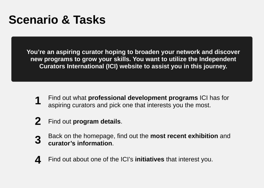
Based on our collaborative discussions with the client, we strategically honed in on evaluating the web page browsing experience as the focal point of our study. We came up with a scenario and crafted four tasks around it, which effectively addressed key areas requiring attention. Using Zoom’s screen share functionality, we meticulously observed user interactions, capturing real-time feedback to gain comprehensive insights across the entire website.
Who were the participants?
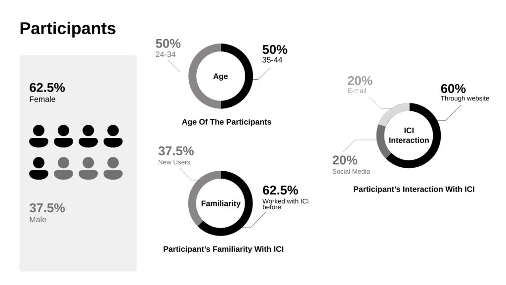
A total of 8 participants (62.5% Female & 37.5% Male) representing various demographics were recruited. Participants were sourced from ICI’s target audience, including curators, artists, and those interested in the curatorial field. Of these, 5 were familiar with ICI’s online presence, and 3 were new participants.
How did we analyze the data?
My teammates and I took turns conducting tests, with one playing the moderator while the other took notes. After testing, we tabulated the results in a spreadsheet to identify patterns and conducted a detailed analysis of both qualitative and quantitative data. We then synthesized the findings to identify recurring patterns and issues across user interactions.
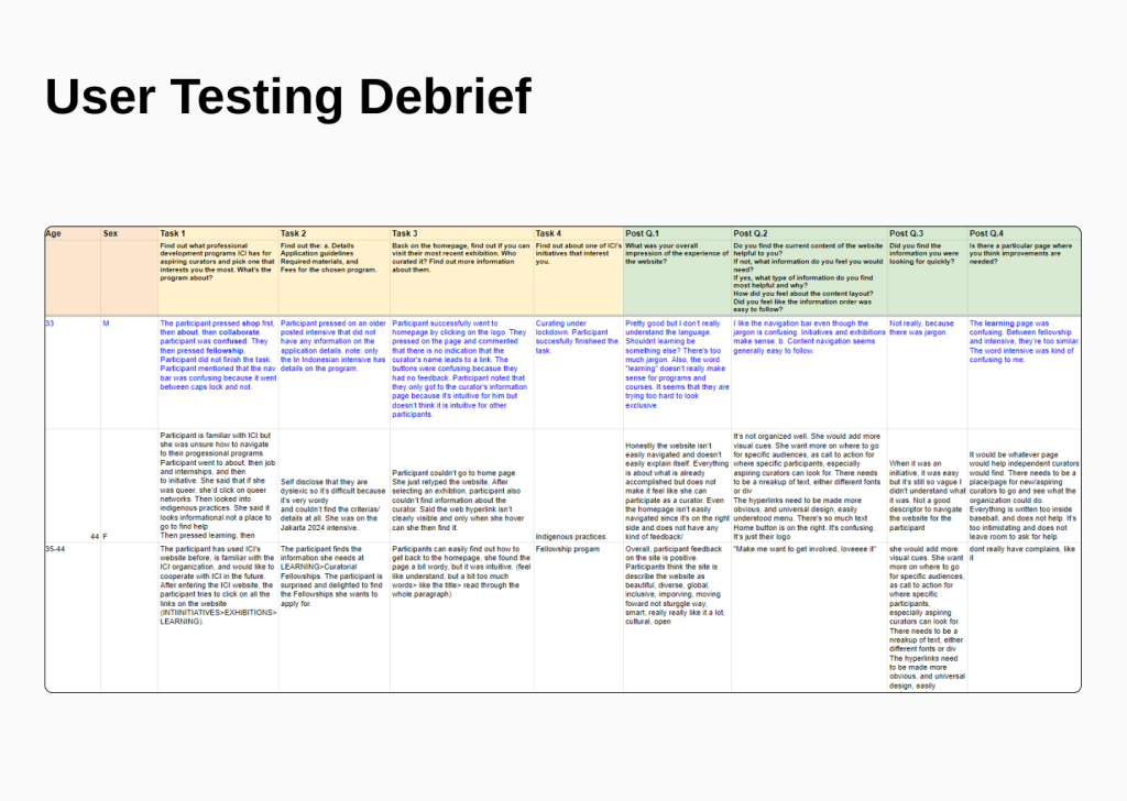
What were the results of the testing?
Overall, participants praised ICI’s website and provided positive feedback. The aesthetic appeal and overall user experience were positively acknowledged by the majority of participants. Though the website received a lot of positive feedback, we managed to identify some areas of improvement by paying keen attention to the participants. We also developed design mockups to convey our recommendations to adopt the best usability practices.
Identified areas of improvement and the recommendations:
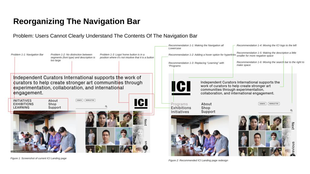
- Reorganize the top navigation bar to help users navigate around the website and get to where they’re going.
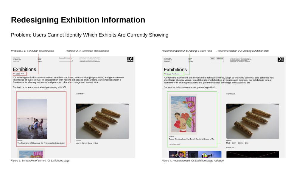
- Redesign the exhibition page to clarify which exhibits are current.
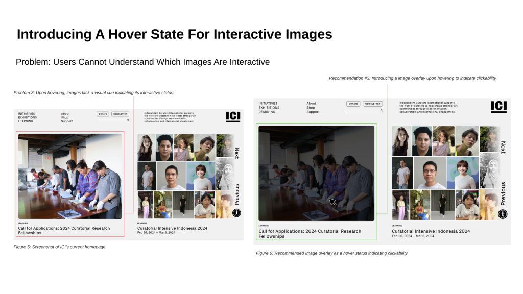
- Introduce a hover state for interactive images to signal to users which images are clickable and which images are not.
- Incorporate headings and summaries for content to give users an easily digestible overview of what the content is about.
- Create a call to action that links to programs accepting applications so users can easily understand which programs they can apply to immediately.
#1 Reorganizing The Navigation Bar
Participants expressed confusion and difficulty navigating ICI’s website due to a cluttered and jargon-filled navigation bar. Specifically, participants encountered challenges locating information about ICI’s professional development programs, a primary objective of the organization.
#2 Redesigning Exhibition Information
Participants found the exhibition-related information lacking in meeting their expectations. The term “Current” exhibition was perceived differently by users, leading to misunderstandings about the timing of events.
#3 Introducing a Hover State for Interactive Images
The absence of a hover state for images emerged as a notable concern during usability testing. Participants indicated that the lack of a visual cue for interactive images and it led to moments of uncertainty.
#4 Incorporating Headings for Quick Content Access
While the comprehensive details provided in exhibition descriptions were appreciated, participants raised concerns about readability. The lengthy paragraphs were perceived as text-heavy, potentially hindering effective engagement with the content.
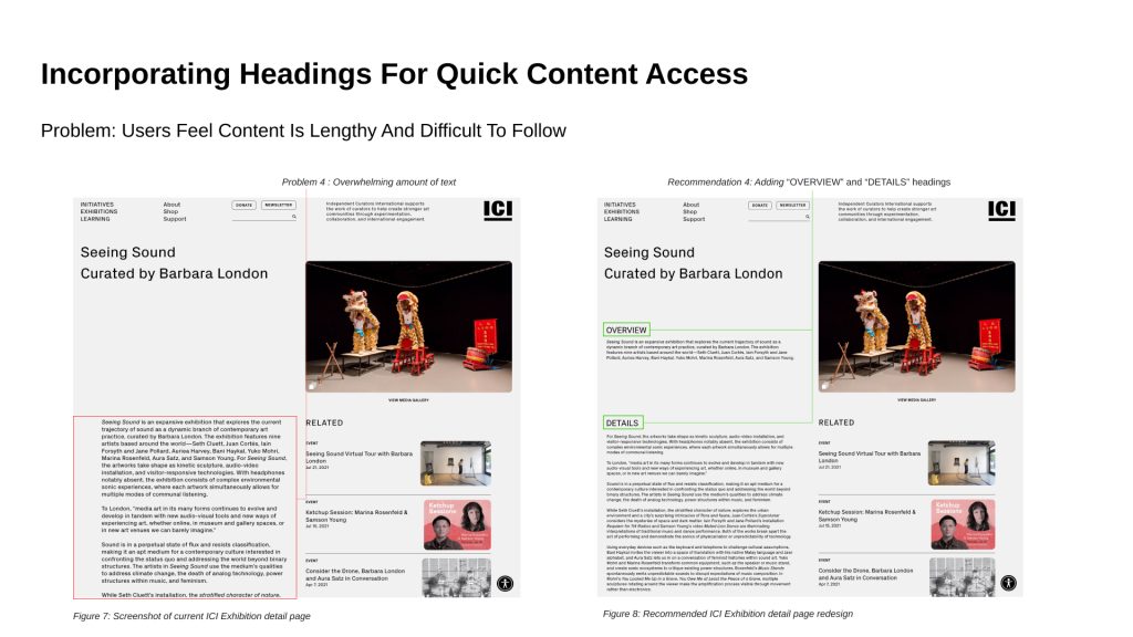
#5 Call-to-Action for Open Applications
Participants faced challenges identifying which programs were currently accepting applications. The dispersed nature of open application details across various pages led to confusion and a time-consuming process for them.
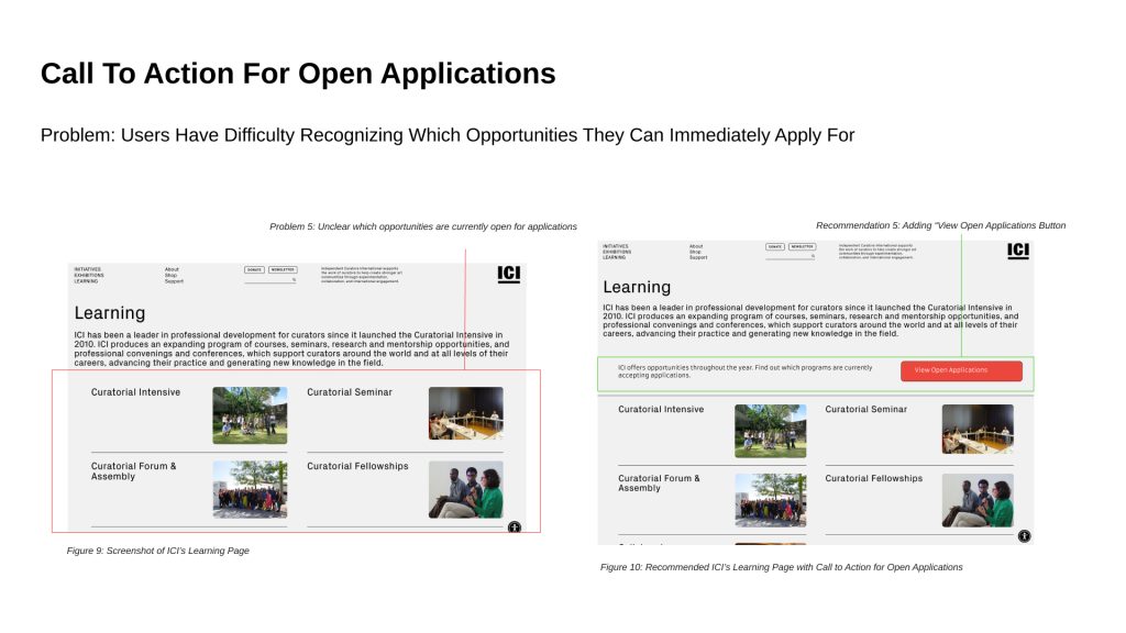
Conclusion
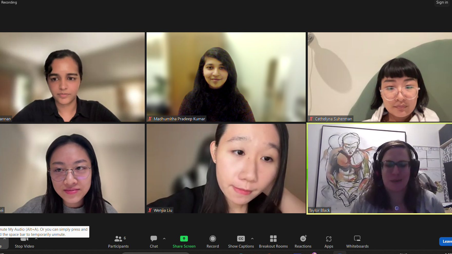
The findings and the recommendations were presented to the client. Following the presentation of results, the client expressed appreciation for our insights and showed interest in the suggested improvements. It has been a pleasure working on this client-facing project and collaborating with ICI. Though this collaboration is coming to an end, I will keep an eye out, always ready to lend support should Independent Curators International decide to incorporate positive changes based on our insights.
