DoorDash is a versatile food delivery application enabling users to explore and order from local restaurants based on their geographical location. Beyond its primary service, DoorDash extends its offerings to include grocery and various convenience item deliveries in select regions, enhancing its utility and convenience for users.
Log in Page
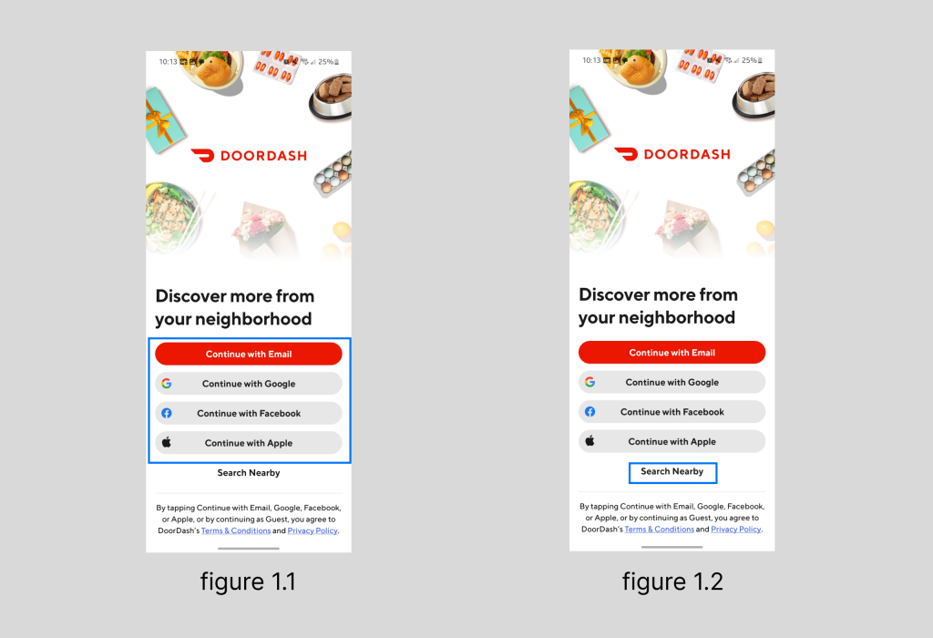
The login page(figure 1.1) of DoorDash is very clear, allowing users to choose their preferred login method based on the provided signifiers. Additionally, at the bottom of the page, there’s an option to enter the app and search without logging in (figure 1.2), ensuring users can quickly find the restaurant information they need without being hindered by login constraints, thus minimizing unnecessary restrictions on users where it matters.
Homepage
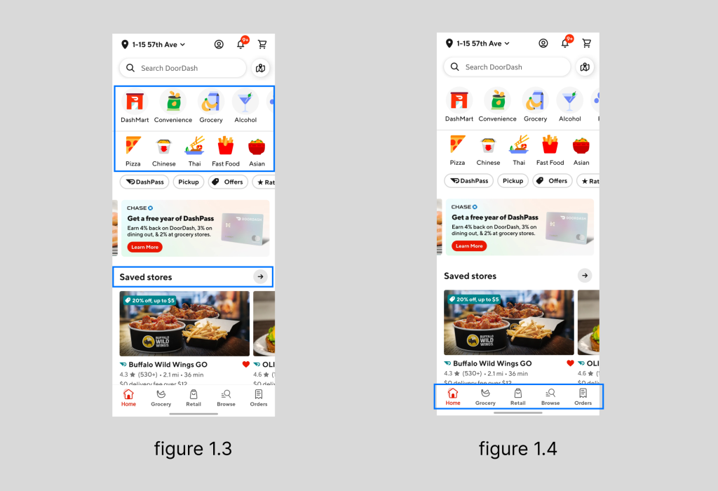
The homepage(figure 1.3) is designed for discoverability, where users can find a variety of delivery services and different types of restaurants. Restaurants that have been previously ordered from or favorited will appear in a prominent position on the homepage for convenient reordering. Additionally, the navigation bar(figure 1.4) at the bottom of the homepage utilizes a vertical mapping of icons and text, preventing user confusion over the meanings of icons and thus reducing the time it takes to operate the app.
Item Info Page
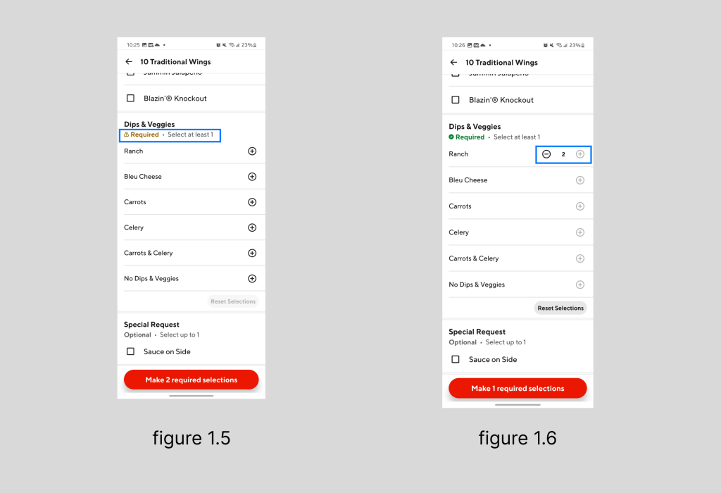
When users are choosing sides or sauces for their meals, the system enforces a constraint(figure 1.5 & 1.6) by graying out unavailable options once the maximum allowable selections are reached. This mechanism provides immediate visual feedback to users, clearly indicating they’ve hit the limit. This intuitive design aids in minimizing confusion and cognitive effort, thereby streamlining the ordering process and enhancing the overall user experience by making it smoother and more user-friendly.
Check Out Page
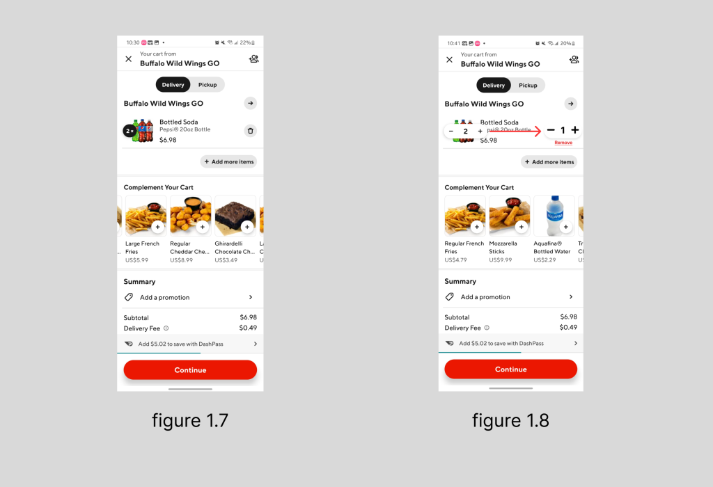
When users add items to their cart and the total is below $10, a progress bar is mapped beneath the cart to indicate how much more is needed to qualify for DoorDash Pass. This provides timely feedback to users, reducing the need for mental calculations regarding the total cost. However, there exists a Gulf of Execution during the checkout process, particularly when users attempt to decrease the quantity of the same product. The design expects users to click on the quantity button to adjust the numbers, but this isn’t always intuitive. Many users, including myself during my first use, may find this confusing. I ended up navigating to the product detail page to remove an accidentally added extra item. To improve user experience, the buttons for increasing or decreasing item quantities should be placed on the same line as the product for clearer and more straightforward interaction(figure 1.7 & 1.8).
Conclusion
Overall, DoorDash is a user-center product with an overwhelmingly positive interaction experience. Throughout my three years of using it, I have rarely encountered confusion due to unclear icons or perplexing operations. From opening the app to making a payment, the entire process has been virtually seamless. If the checkout page could further optimize the placement of buttons for adjusting item quantities, making them intuitive enough for users to operate without a second thought, then DoorDash would stand out as an exceptionally user-friendly application.
