Introduction
Otter.ai is an AI-powered productivity tool that assists in real-time speech-to-text transcription across various scenarios, such as lectures, meetings, interviews, and everyday voice conversations. It accommodates the user needs of reading live transcriptions, generating key points summaries, or synching team meeting notes.
Usability Issues
No.1
1.1 Task: Add photo to the note
1.2 Problem
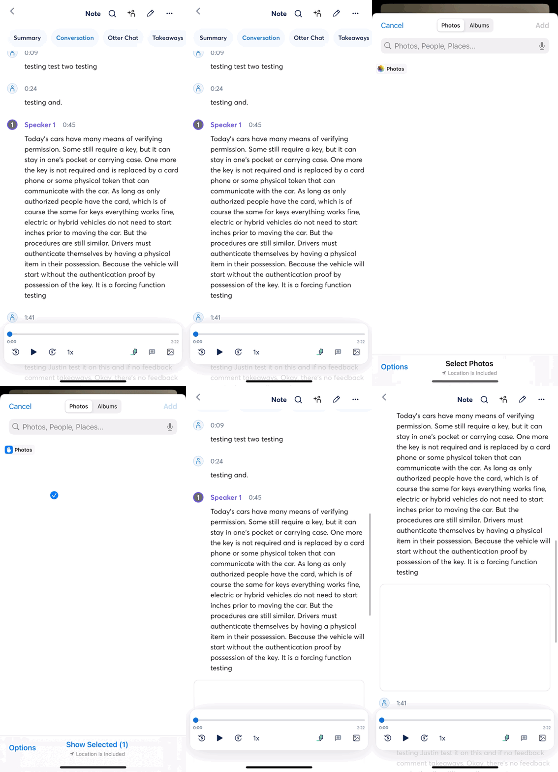
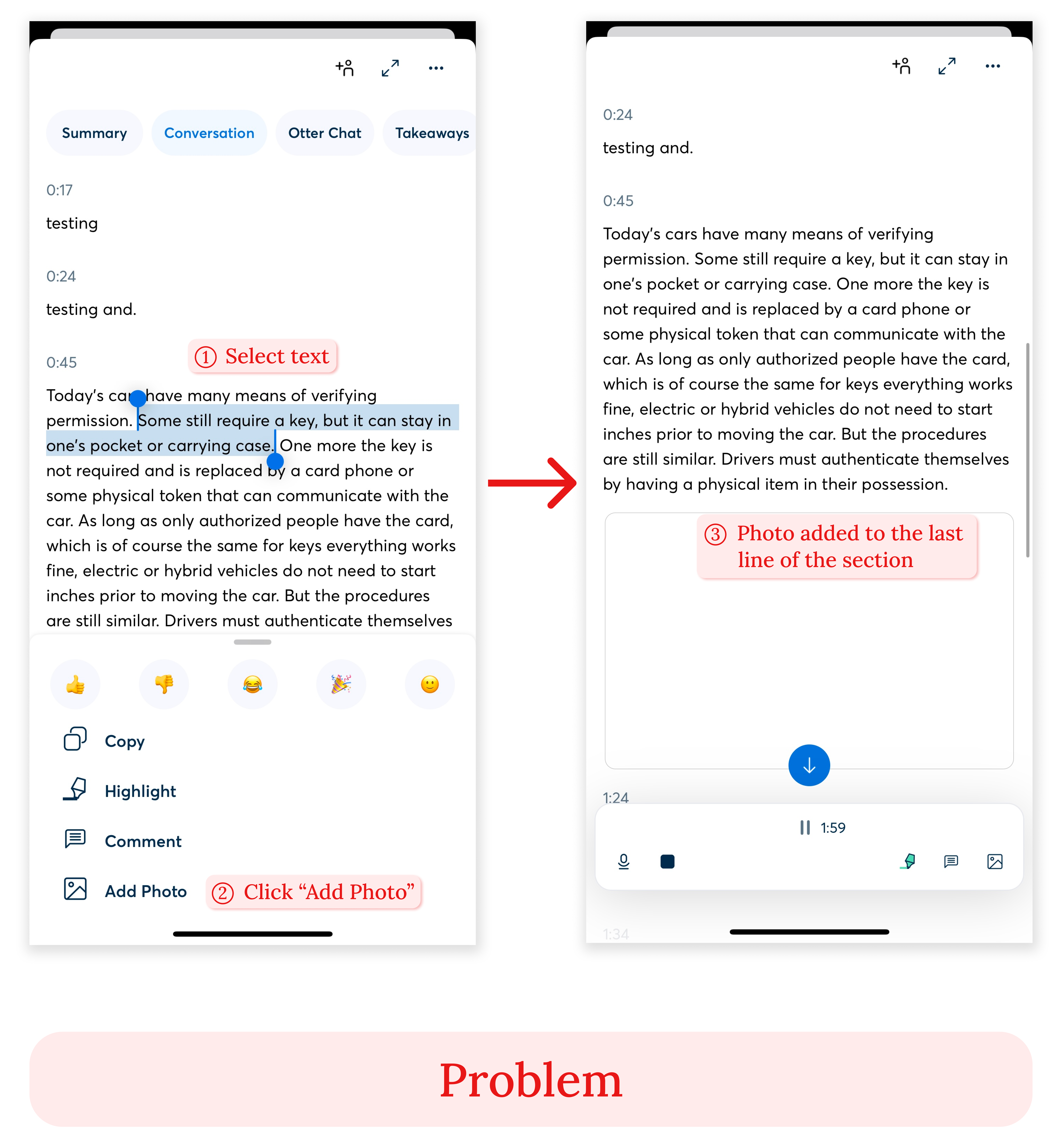
On the Note detail page, after the user highlights one sentence and chooses “add photo”, the photo is added to the end of the paragraph block. In a user’s conceptual model, the “add photo” function pops up while selecting the sentence, suggesting the photo placement would be near the highlighted text exactly. Instead, it is placed at the end of this whole paragraph, which is not even sectionalized through parsing the semantic relations, but through closeness in time. If the user wants to insert a photo-format note to complement the information of the highlighted sentence, placing the photo far away from that sentence is unintuitive and not aligned with the conceptual model. If the photo is to be placed at an unexpected spot, there is a gap between the desired results from the user’s actions and the actual results, leading to a Gulf of Evaluation.
1.3 Solution
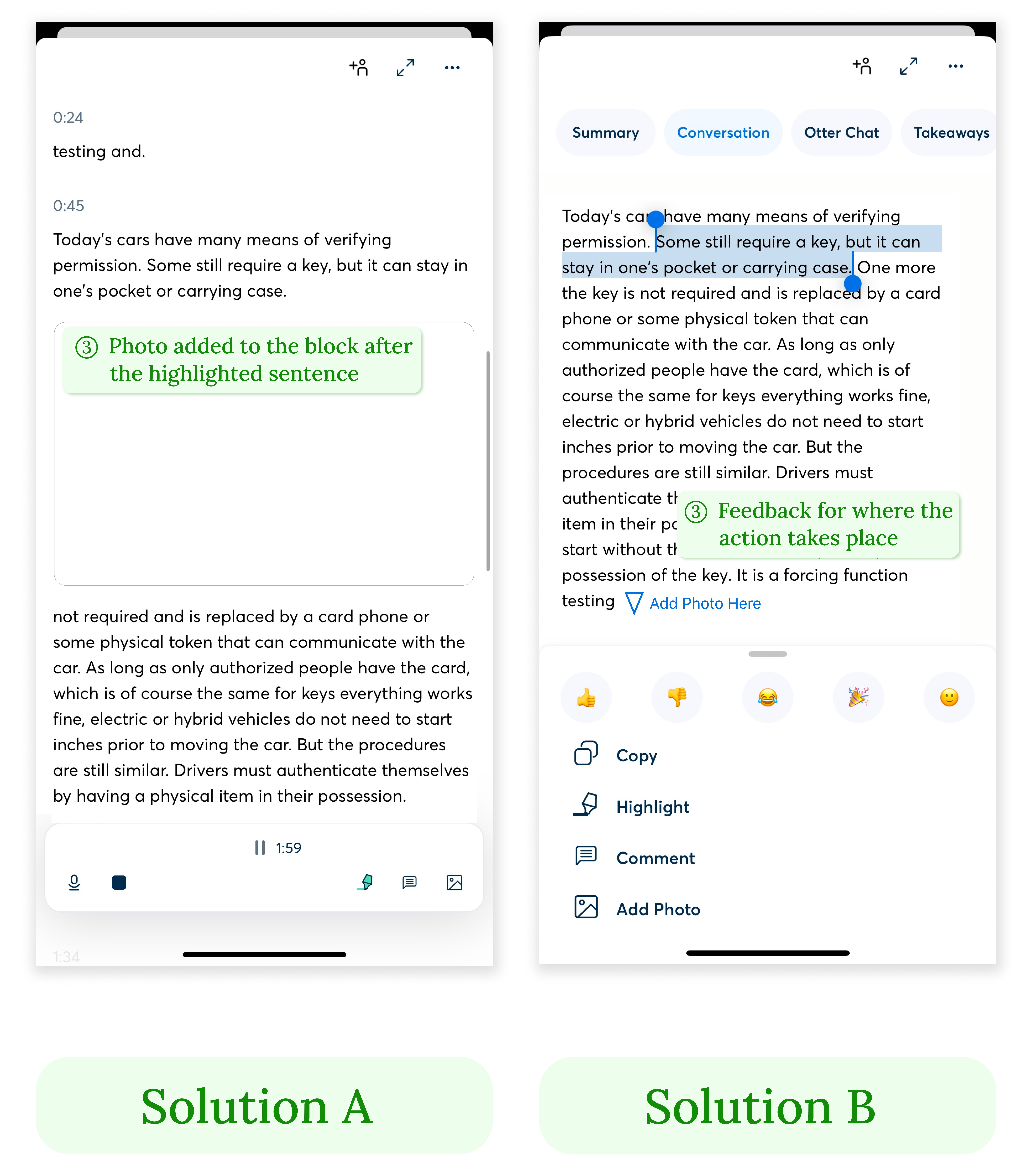
To be compatible with their conceptual model, the photo should be placed in the line exactly after the text highlighted by the user. Or to bridge the Gulf of Evaluation, there should be clear feedback to communicate to the user where the “add photo” action should take place, such as a flashing arrow pointing to the end of the paragraph with clarifying text.
No.2
2.1 Task: Move the note to a folder
2.2 Problem
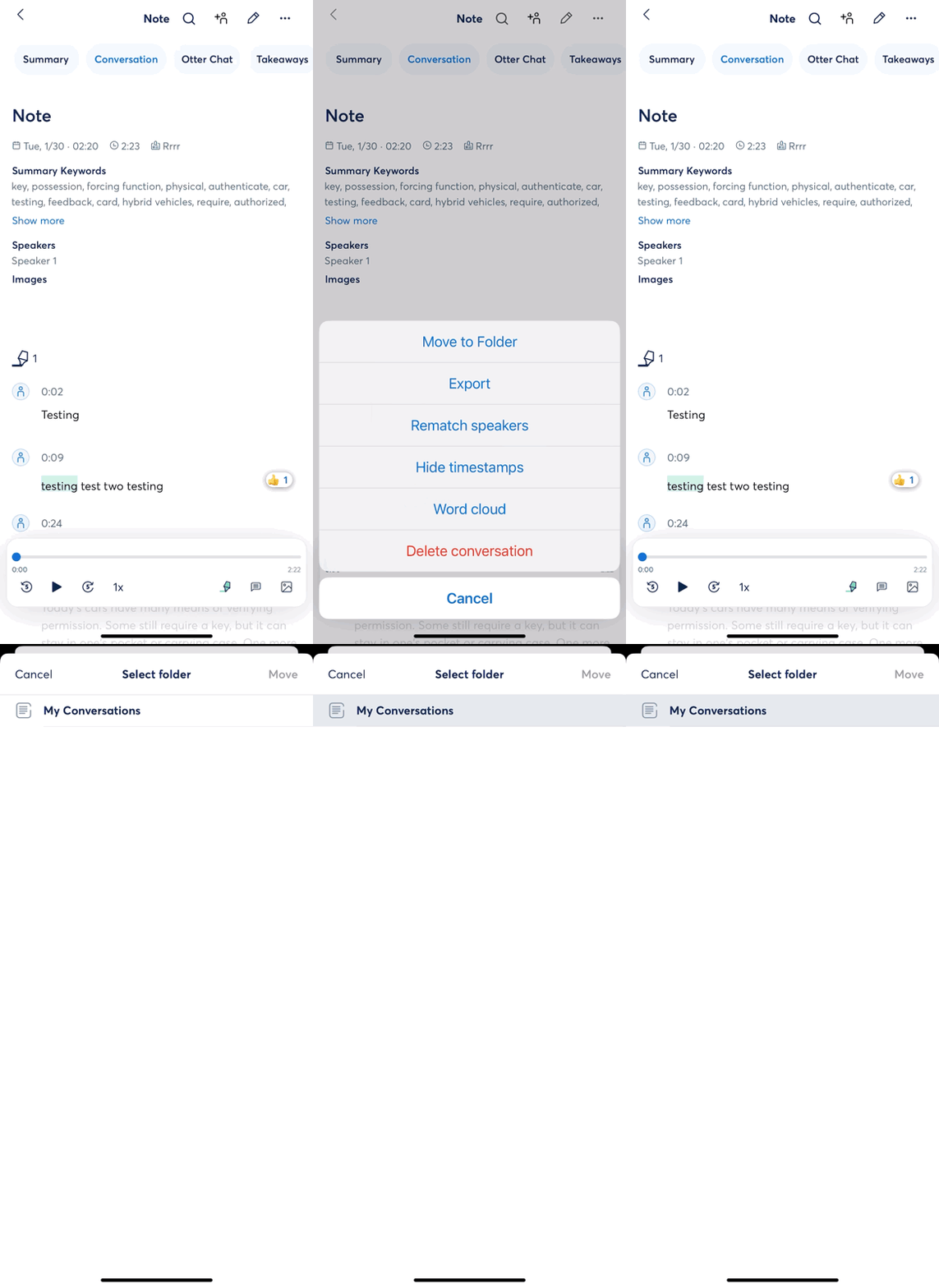
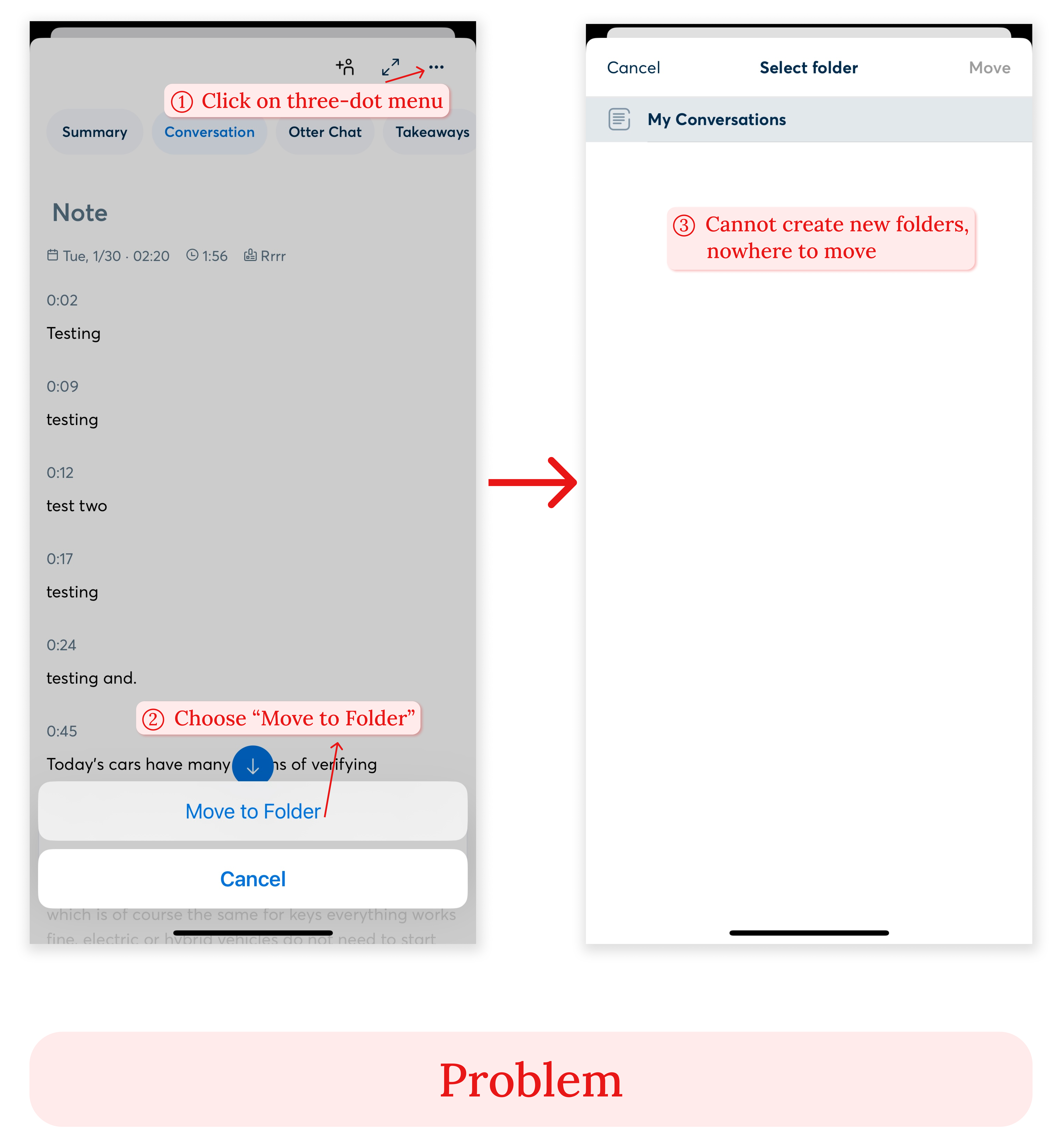
On the note detail page, when a user clicks the three-dot menu and choose to move the note to a folder, the bottom sheet that pops up does not afford moving the note to a folder. In a user’s conceptual model, when there is only one default folder and the user wants to move the note to a new one, the bottom sheet should allow adding a new folder on this interface, but there are no discoverable signs that support it. Besides, if this action is not possible on this interface, there is no feedforward that instructs the user how and where to execute the action of adding a new folder, or if it’s even possible.
2.3 Solution
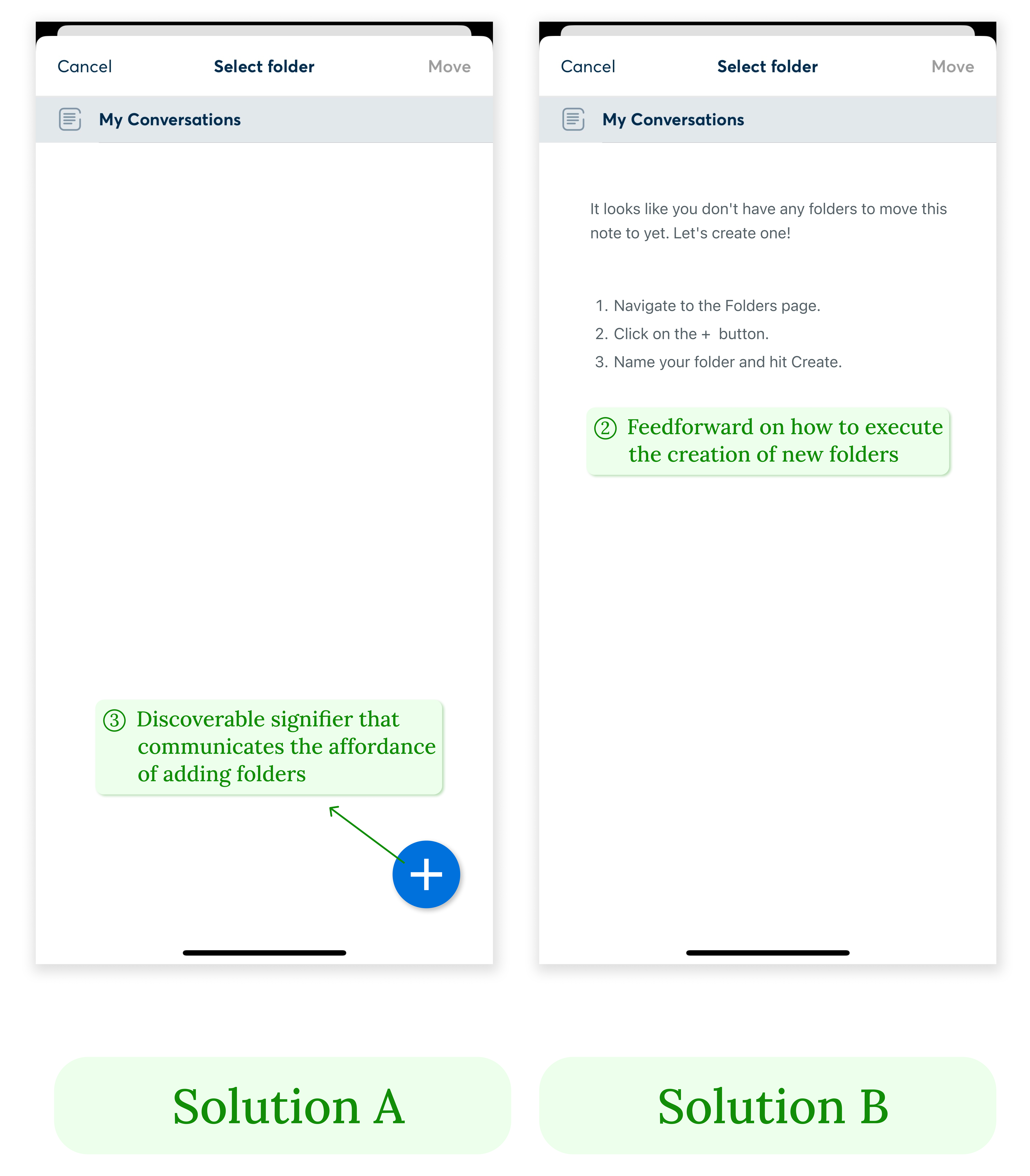
There should be a clear, discoverable signifier on this interface that communicates the affordance of adding new folders, such as a clickable “plus” button placed at the bottom right of the screen. Or else, to bridge the Gulf of Execution, feedforward such as an instructional copy can be placed on this interface that tells the user to go to the folder page to execute the creation of new folders.
No.3
3.1 Task: Pause and resume the recording
3.2 Problem
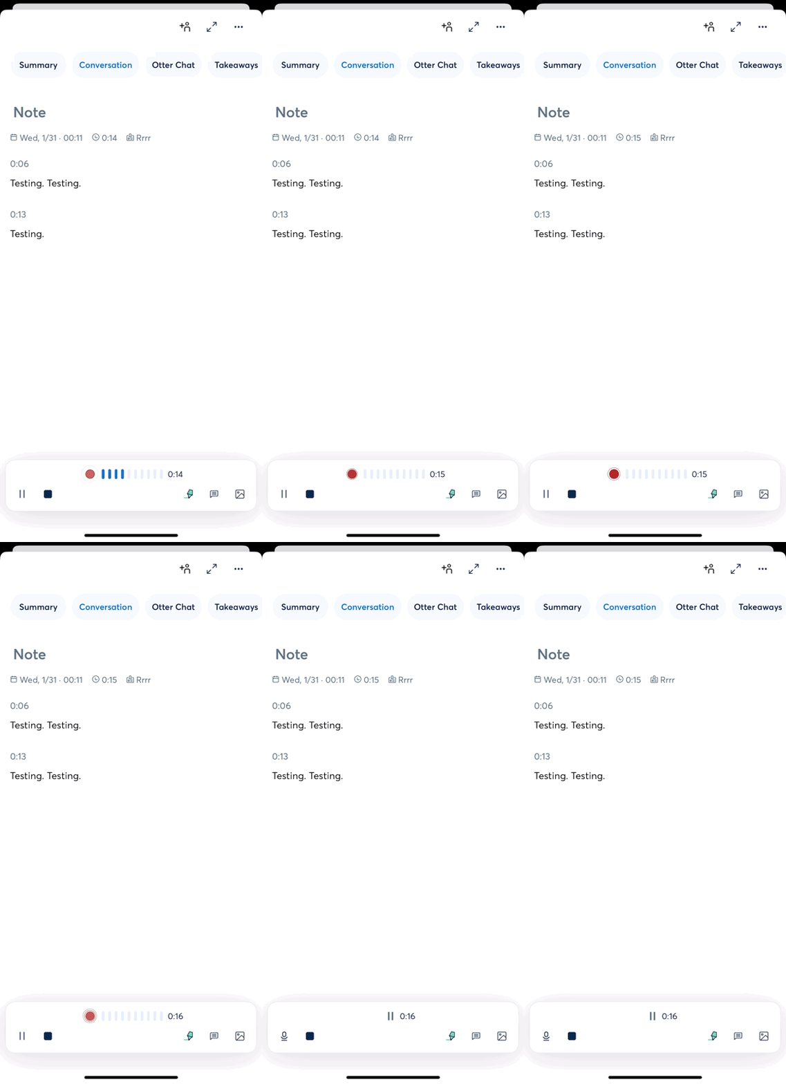
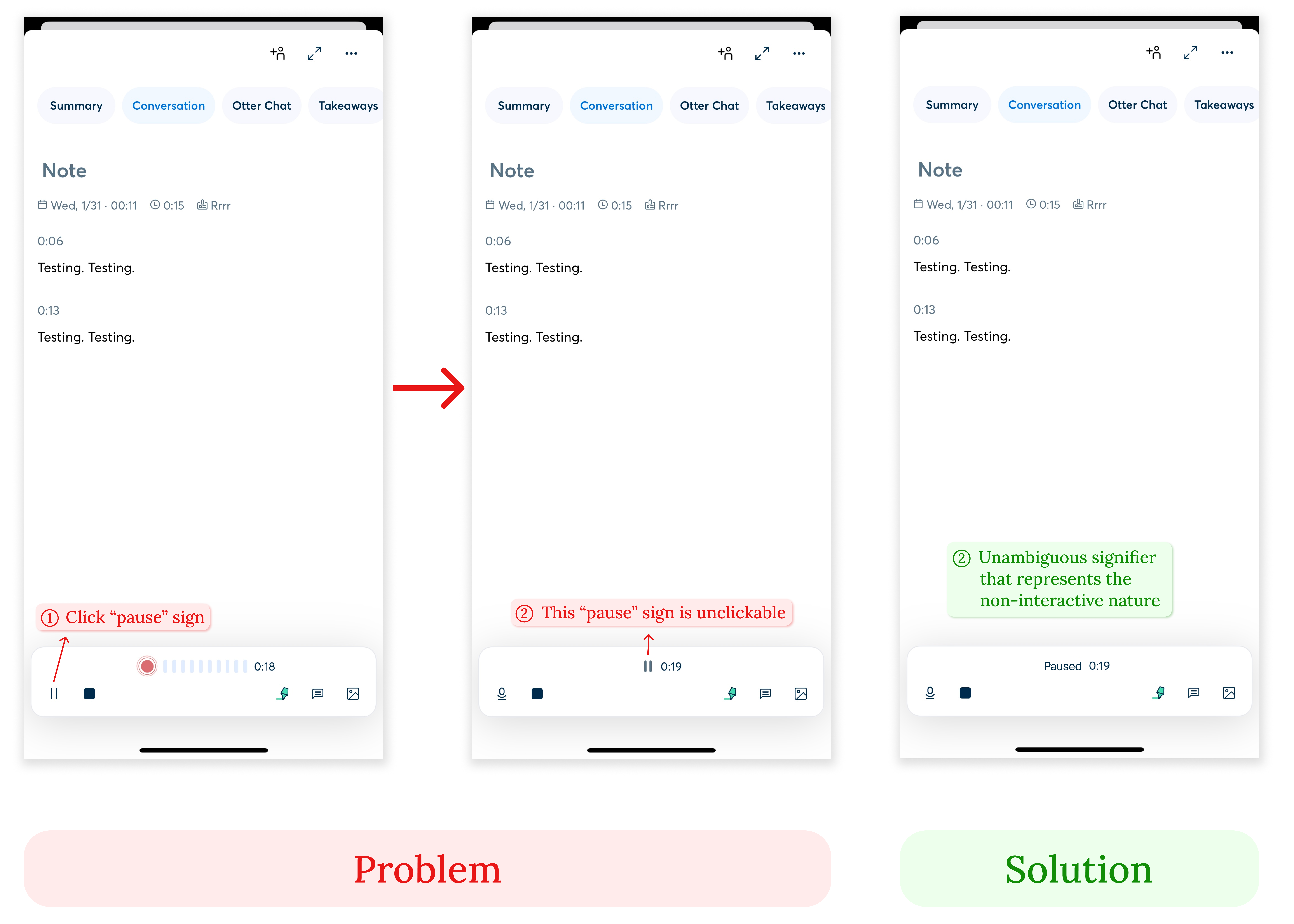
During recording, after the user clicks the “pause” sign on the bottom left, the “pause” sign changes to a “record” sign, while another “pause” sign replaces the original volume meters. It appears to be confusing as there are simultaneously a “record”, a “pause”, and a “stop” sign on the interface. The conceptual model of the user would be that all of the three signs are clickable and can be interacted with, however, the “pause” sign in the middle is unclickable and does not afford resuming the recording, only the “record” sign does. It violates the use of a signifier to indicate that the clicking action is possible, leading to user confusion and the Gulf of Evaluation. In this case, the user would be making a “knowledge-based mistake” as the goal to interact with the static “pause status” is already inaccurate, and no existing rules apply to this unfamiliar interface.
3.3 Solution
To better communicate the “pause status”, there should be an appropriate signifier that unambiguously represents the non-interactive nature of a status sign, such as replacing the “pause” sign with the text “Paused”.
