Project Overview
The New York Microscopical Society (NYMS) was founded in1877 by leaders of the American Museum of Natural History. Their mission is to promote theoretical and practical phases of microscopy for all of those interested, including people who have worked with microscopes for decades and those new to the field.
The client was looking to redesign the website to give it a more modern aesthetic and ultimately achieve three strategic objectives for the organization:
(1) expanding NYMS’s reach to create a more diverse audience base;
(2) attracting new members and improving ease of membership sign up; and
(3) promoting upcoming events and leveraging the website as a tool to manage information and registrations.
The team

Final design
The Journey of NYMS Website Redesign

Identify the current problems by conducting exploratory research
Crafting an ecosystem map to identify key involving groups and understand their relationships
The New York Microscopy Society (NYMS) is a dynamic community fueled by the commitment of its members. Actively involved members have the opportunity to take on roles such as the board of managers or responsibilities within various committees.
Externally, NYMS actively engages with a diverse audience that includes amateurs, hobbyists, technicians, scientists, researchers, educators, and educational societies. This broad engagement showcases NYMS’s commitment to inclusivity and its desire to appeal to a wide range of interests within the microscopy field.
NYMS also takes pride in its collaborations with esteemed organizations, fostering valuable connections within the scientific community. Partnerships with organizations such as the Eastern Analytical Society, American Museum of Natural History, Science Council of New York City, and NYC Parks Department demonstrate NYMS’s commitment to enriching its offerings through strategic alliances.

From the stakeholder map, several key learnings emerge:
Target Audience Focus
To foster growth, NYMS should strategically target and engage a younger audience while maintaining inclusivity for professionals. This aligns with their commitment to openness and diversity.
Diversity as a Strength
The diversity of backgrounds and connections among NYMS members enriches the community. Leveraging this diversity can enhance collaboration, knowledge exchange, and the overall vibrancy of the organization.
Volunteer-Driven Culture
NYMS stands out as a volunteer-driven community, where members dedicate their time and energy to the organization. Recognizing members’ effort and work is crucial to fostering a sense of appreciation, motivation, and sustained engagement within the community.
Conduct competitive audit to learn how our competitors meet similar or shared goals
We analyzed the website of six competitors of NYMS, to gain an understanding of how these competitors were leveraging their digital channels to achieve their strategic objectives. The competitors selected included four direct competitors (defined as regional microscopical societies open to hobbyists and professionals) as well as two indirect competitors (defined as organizations in the NYC area that supported scientific interests).
The competitors were analyzed along six dimensions, with the following main takeaways for each dimension:
Homepage
Clean, non-cluttered homepage that states the organization’s mission can help orient users within the site’s architecture.
Information Architecture
Systematic hierarchy and plain language labels can be leveraged to render IA a tool for navigation rather than an obstacle to wayfinding.
Visuals & Aesthetic Design
Use of sans-serif fonts, a unified color scheme, and images that create visual interest can make the organization feel more welcoming and approachable.
Content (Events)
Event flow should be easily found from the homepage and flows should include robust events descriptions and integrated registration flow. Users should be able to readily locate and distinguish between upcoming and past events.
Content (Membership)
Membership flow should be easily found from the homepage. Flow should include pertinent membership information up front (pricing, descriptions of tiers) with integrated payment.
Content (Resources)
Resources should be properly contextualized and categories so they can be easily parsed and referenced by users who need them.
Perform technical analysis to evaluate strengths and weaknesses of current website
The current site map
It is difficult to locate specific information from the top navigation and the homepage. It is necessary to reevaluate the structure and enhance discoverability of information architecture. Plus, the website should highlight essential information and CTAs such as contact information, membership registration, and enhance their accessibility.
Workflow and Content
The most critical issue was a questionable practice of mailing documents and payments. Users needed to download a pdf file, fill out the information, and sent a document and payment via mail. This could result in losing potential members. Additionally, membership applications need to be placed with better visibility and create shortcuts for accessibility.
Visuals
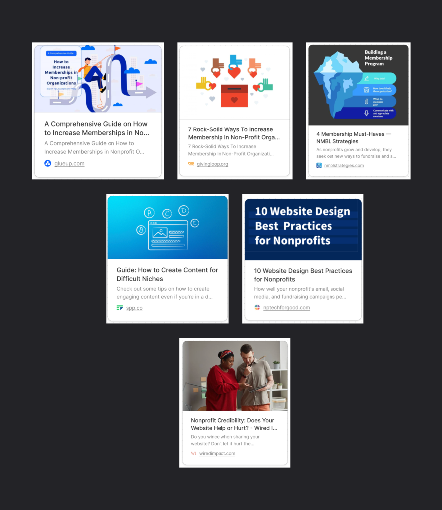
Complete a literature review to find guidance from outside resources with respect to specific goals
We focused on 2 main topics: “How to increase membership in non-profit organizations”, and “How to build a trustworthy website with a niche interest”.
- There are several types of nonprofit membership models. NYMS’s model = Members-as-Donors Model + Members-as-Advocates Model
- Our client could consider these actions to attracts new member
- Clarify the reasons somebody should join, and the benefits they could get from the organization
- Offers multiple membership options
- Offer a quick, easy, smooth sign up process to increase the chance for a new member to sign up
- Add members’ review or testimonials
- Conduct survey among new members to gain insights from them and improve the organization’s service to them
- Host a public event instead of member-only events
- Ideas for a more engaging content on a niche website
- Target audience’s common problems and offer solutions for them, make the information useful for viewers
- Offer insightful information from subject-matter experts
- Provide simple, easy to understand content, cite source
- Display third-party validation, and social proof to gain more trust
- Keep the design clean and simple, provide adequate white space on the page
Interview stakeholder and users to understand how current members, and new users interact with the website
For the final study of our exploratory research phase, we conducted interviews with five individuals of varying degrees of familiarity with NYMS and experience with microscopes. We invited these individuals to share background information about their relationship with microscopy in order to understand their mental model. Three users who were not affiliated with NYMS were also asked to participate in a user test of the current NYMS website. They completed three tasks which reflected NYMS’ new strategic objectives and provided about their experience completing the tasks and with using the website more broadly.
Start schematic design by generating initial design ideas based on principles formed in the exploratory research phase
Build a product architecture showcasing the organization, structure and interrelation of features and functions of the website
Leveraging the insights generated from the exploratory research phase, we generated a product architecture diagram to visualize the key pillars of our redesign. Our product architecture focuses on growth of the organization as the goal of the website. Providing information kicks off this goal while engagement opportunities help achieve it. As the organization grows, the new members create new opportunities for engagement and vice versa – hence the cyclical relationship between engagement and growth upon presentation of information.

Craft personas classifying of the potential user types
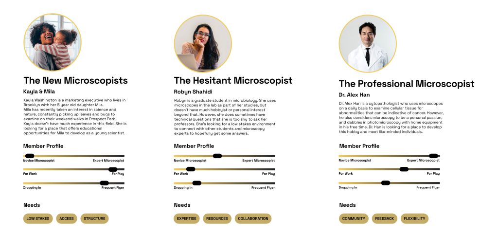
To further illustrate the practical application of the product architecture, we crafted three personas which represented the potential users we hoped to reach with our redesign of the NYMS website. These personas were generated with a combination of insights from our user interviews and provisional inferences based on our client brief.

Revise the information architecture, which focuses on organizing, and labeling content in a more effective way for users
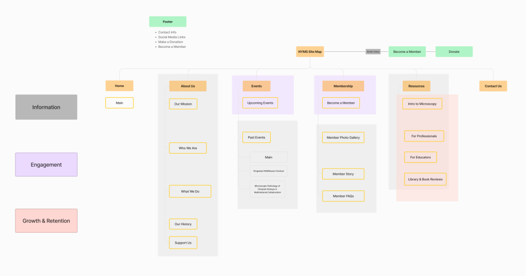
Now having a clear understanding of what our redesign should aim to accomplish and who it would be serving, we developed a revised information architecture to explore how users would navigate the website to meet their needs.
The key changes reflected in our proposed information architecture were:
- Removing niche references in the top navigation (e.g., “Jan’s Corner”)
- Replacing all labels (in top navigation and in sub-menus) with plain-language labels easily understood by all audiences
- Creating an action menu in the header for donations and membership
- Creating subcategories to organize previously unsorted information (e.g., categories of “Past” and “Upcoming” for Events, “Professionals” and “Educators” for Resources)

Create Wireframes that demonstrates the layout of each page in the user flow

Evaluative Research & Design Development
With the schematic design complete, we began the evaluative research phase of the design process. This involved two parts: card sorting to test our revised Information Architecture; and usability testing to test our product architecture and wireframes. Four of the five users who had also participated in the initial user interview phase were asked to complete one or both parts of the evaluative research explorations.
Conduct card sorting to test the proposed information architecture
Using Optimal Workshop, we created a card sorting exercise that asked users to sort 17 cards into the five main categories of our revised information architecture. While overall, the results were consistent with our initial proposed information architecture, three cards resulted in noticeably inconsistent results: Member Photo Gallery, Newsletter Archive, and Support Us

Select feedback from users on these three cards included:
- Member Photo Gallery: Two users placed this card in its own group; one user commented that the existing “Membership” category seemed catered to current members while the Member Photo Gallery might appeal to non-members as well.
- Newsletter Archive: One user placed this in “About Us”, stating that this card seemed like it would be information about the society.
- Support Us: One user put this under “Resources” because they felt it spoke to intellectual contributions by members rather than donations of money or equipment.
The result of the Evaluative Research was a further revision of the information architecture to its final iteration.
Changes that made it to the final version of the IA included:
- Creation of a new top navigation category for the Photo Gallery, and generalizing it to all audiences rather than just members
- Placement of the Newsletter Archive under resources
- Creating the Meet Our Members label as a way to further illustrate the composition and benefits of NYMS membership

Perform usability testing to collect feedback for the proposed design
Increased User Satisfaction
4/4 participants in user testing rated the tasks as ‘super easy,’ reflecting their enhanced satisfaction with the task simplicity. Across all tested activities, participants expressed that everything felt remarkably straightforward.
Heightened Event and Membership Interest
Three out of four participants showed excitement about upcoming NYMS events and memberships. They all believed that the revamped NYMS website would attract individuals interested in microscopes, indicating a successful connection with our audience’s preferences.
- Extended Website Interaction:
All participants are spending more time on the website. The clean layout and lack of overwhelming information make it easy to navigate. The image gallery, especially, caught the attention of both professionals and non-professionals, highlighting the website’s effectiveness in appealing to a diverse audience.
- Elevated Visual Appeal:
All participants appreciate how the visuals align with the scientific essence and overall vibe of NYMS. The integration of micrographs taken by NYMS on the website has significantly contributed to the improved satisfaction with visuals.
Create visual design strategies for the final design
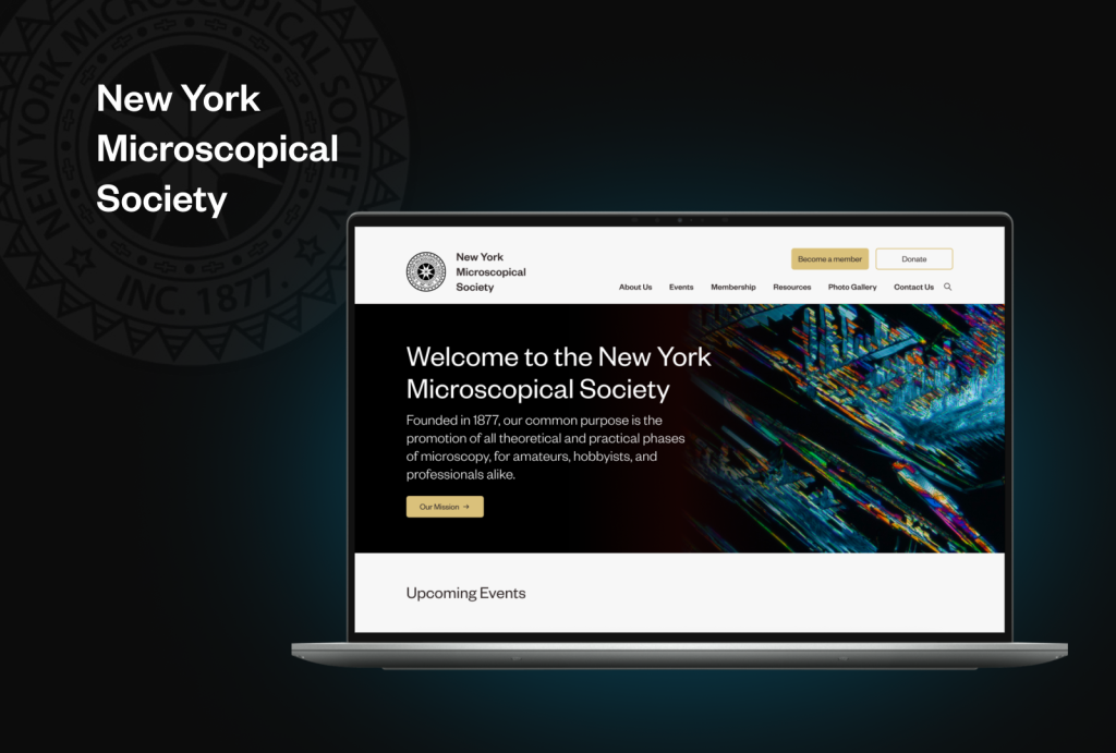
The final step to completing the NYMS website redesign was to redefine the visual strategies of the NYMS website. Our goal with the visual strategy was to honor NYMS’s historical foundation while also demonstrating its continued growth and evolution to the present day and beyond.
Four design principles were established and applied to the new website design.
- Easy and intuitive navigation to help users quickly locate desired information
- Clarity and simplicity that embrace a visual identity of imagery and colors
- User engagement through interactive elements to encourage user participation
- Effective communication of core information

Create style guides and component library


Conclusion
What We Learned
Our journey was all about understanding users, tackling challenges, and creating a website that resonates. From nailing down text style preferences to enhancing navigation, each step brought us closer to a user-friendly and visually appealing NYMS website. We’ve seen the positive impact through increased satisfaction, engagement, and a website that truly speaks to our audience. The journey continues with design development and refining based on user feedback – exciting times ahead!
Next Steps
Looking ahead, we have identified key steps for NYMS:
- Craft a Detailed Content Strategy
NYMS needs to Develop a comprehensive content strategy outlining the creation and optimization of website content and media resources.
- Confirm Technical Specifications:
To do that, NYMS needs to work closely with the technical team to confirm and document necessary specifications for the website.
- Define Development Milestones:
NYMS can Collaborate with the development team to establish clear and achievable milestones for website construction.


