The photos app is one of the apps users get pre-installed on all their Apple products. This application is the destination for all media that is captured on the iPhone. It also serves as a hub for organizing, editing, and sharing photos and videos. It automatically organizes content into albums and categories, offers powerful search functionality, and provides editing tools for enhancing photos and videos.
The interface
On opening the app, a user is presented with a collection of albums. Affording the user many albums to interact with. A user can swipe to find other albums in the same category which is signified by the slightly visible next column of albums.
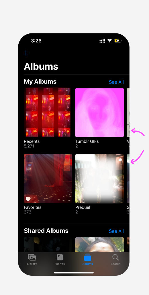
Fig 1: Opening interface of Photos
Below these albums, there is a classification of media types and utilities – imports, duplicates, hidden and recently deleted. There is also a clear signifier for any of these that are locked using the lock icon. The app places constraints on the opening of such albums by anyone that is not the primary user of the phone. To unlock, the user must use face ID or enter the correct password.
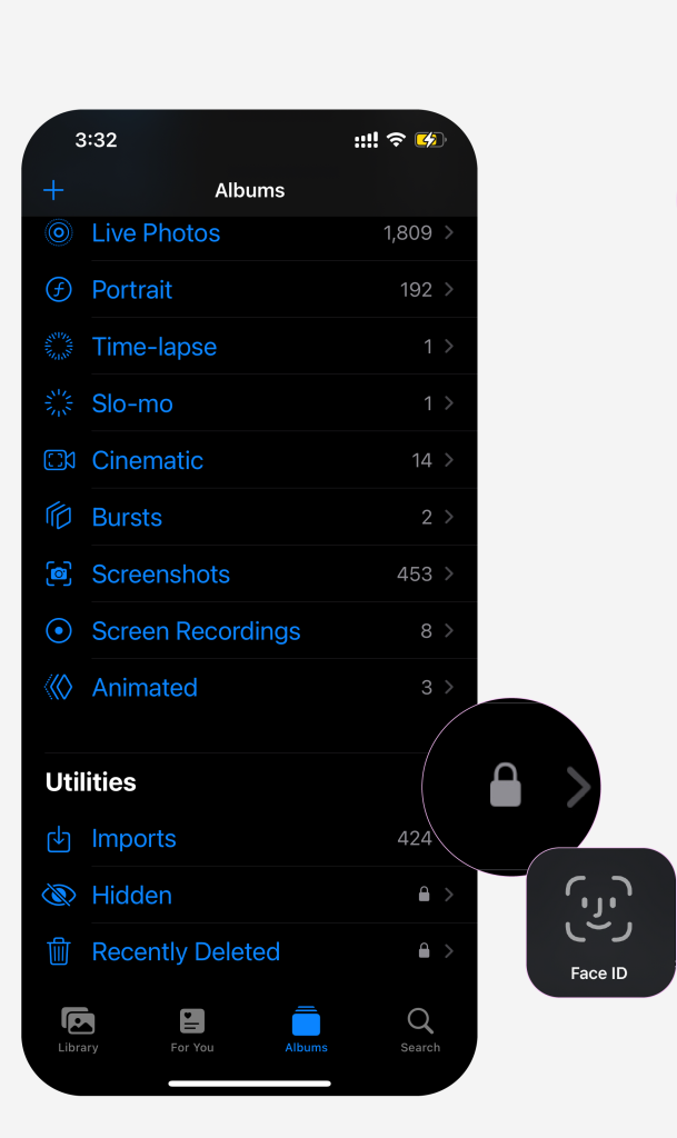
Fig 2: Media types and utilities
If a user tilts their phone to be horizontal, the view also changes in accordance to its natural direction based mapping. This can be particularly helpful for viewing media that does not fill the screen due to its aspect ratio.
Library
This page organizes all media into years, months, days, all photos. The feedback on clicking on these follows a simple and effective conceptual model – days belong to months and months belong to years. It is viscerally pleasing. The date is signified on the top left corner and there is an option to select multiple photos using select on the top right corner.
The three dot menu on the right allows for filtering and displaying of the media. These include: zoom in or out, aspect ratio grid – changes the layout grid to provide immediate feedback to the media’s aspect ratios without physically opening each image (shown below), filter – by various albums within the library, and map – according to locations you have visited.
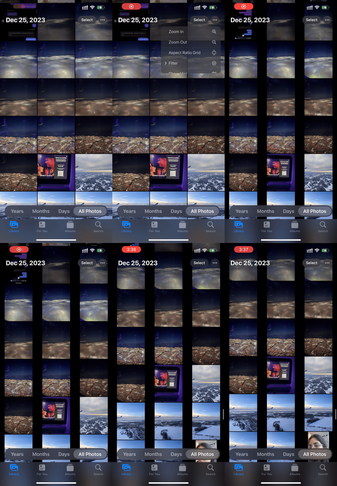
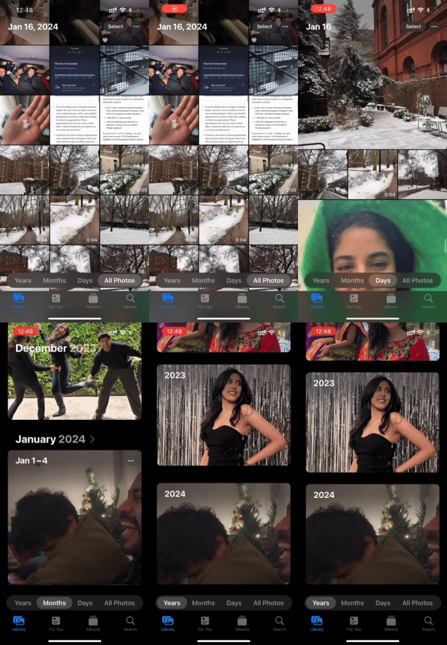
Left to right: Fig 4. Library navigation interactions Fig 5. Aspect ratio filter
The different categorizations of media cater to multiple mental models and can be helpful when looking for a particular file.
When any photo is selected, there are a few ways of interacting with it:
The first icon on the bottom left – opens up a range of options which allows users to share or place the item elsewhere. It is important to note that this is a relationship I have discovered as a researcher, not as a user.

Left-to right: Fig 6. Opening an photo Fig 7. Clicking the icon on the bottom left – share Fig 8. Clicking the icon on the top right
The icons within this navigation icon contain their own mapping system. Some are easily understandable, while the same cannot be said about the others. They add unnecessary signifiers and can be designed to accommodate more universal mapping.
For example – the watch icon is clear. However the icon for “export unmodified original” is the same as “Files”, which may lead to confusion. The “add to album” icon can be a simple “+” on top of an album, similar to the + icon on the album page (Fig 1). The airplay icon looks similar to the rest of the icons, perhaps something that indicates a wireless transfer would be better suited.

Fig 9: Proposed changes to the signifiers
The conceptual model of the share menu might make sense on paper but it allows for confusion. A signifier indicating “share or export” or “where does this photo go?” would make the distinction between the two menus clearer.

Fig 10: Proposed addition of “Share or export” to the share menu
The 3-dot menu on the upper right corner (Fig 8)- the actions in this menu are copy, duplicate, hide, slideshow, add to album (also exists in the share menu), adjust time and date, adjust location. There is no fixed mapping for what this menu does, for first time users who are trying to achieve a specific task.
Achieving a task: Convert live photo to video.
As a user of the app, existing in the gulf of execution, if I want to turn a live photo* into a video, I will go through both the 3-dot menu as well as the share menu to find a “save as a video” option. In the evaluation stage, I may not find the option in the share menu. Then I will attempt to find it within the 3-dot menu. Due to the volume of options available, it is possible that as a user, I will miss the option entirely and fail in the perception stage of the gulf of evaluation.
*Live photos gives additional options to animate the recorded media. It provides options such as loop, bounce, long exposure and live off. A conceptual model could be satisfied here with the addition of “video”.

From left to right: Fig 11. Where “save as Video” currently exists in the navigation Fig 12: The given options under “live” Fig 13: Proposed change to the design
Hidden capabilities / not signified / low discoverability – an interesting theme in Apple’s products is hidden features and uses that users cannot possibly know about on their own. There are many affordances but no clear signifiers of the same. Examples of this in the photos app include:
- Press and hold on images selects a subject. But once selected signifies 3 actions – copy, add sticker, and share.
- Zoom in and out – procedural knowledge for anyone who has used a touchscreen smartphone. At some point it moves to the behavioral level of processing and becomes second nature.
- Selecting text from images – Great addition for note taking. It satisfies a goal and makes a user’s life easier. It also gives additional options such as copy, select all, look up, translate, search web, share. These enhance usability.

Fig 14: Press and hold to select subject – hidden feature
Conclusion:
Photos are an integral part of our everyday lives. They capture and collect many of the memories of people and things that are important to us. The photos app fulfills its role as a repository for this valuable information. Its versatile search functionality offers users multiple avenues to locate specific images, a notable feature. Yet, as it grants users more capabilities, ensuring effective guidance becomes important, presenting an area with potential for enhancement.
