The app critique that will be discussed is Polycam, which allows its users to scan real-life items or space into 3D objects in the software.
Some of the goals and tasks the user may want to perform on this app include scanning an item of interest and converting it into virtual reality objects as well as inspecting the object in virtual or augmented space. Below are snippets of the functions available in the app. Let’s begin!
Capturing Photos
One of the main functions of this app is to allow users to scan an object of interest and upload the 3D object to the user’s profile. Right off the bat, when the user opens the app, a familiar interface mimicking the phone’s camera appears. This convention stemming from the cultural constraint of the modern phone camera makes perceiving its affordance simple, as well as taking the cognitive load off new users. To perform the task, the default semantic constraint pushes the user into taking the action of taking the picture by deactivating the “Done” button. The start of this task then sets off the 7 stages of action starting from the goal-driven behavior of wanting to scan an item, to completing the cycle of determining if this goal has been achieved once the object has been uploaded.
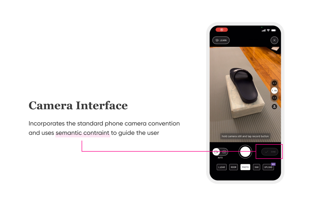
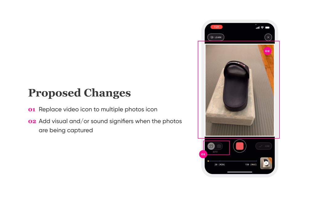
However, during the photo-capturing process, there is a discrepancy between the user’s knowledge in the head and knowledge in the world. The conceptual model of recording and continuous shooting is broken when the user chooses the option to capture the image automatically. In the interface, the signifier for the option to capture the images automatically has an image of a video recorder labeled as “Auto.” The instruction on the screen also says to “tap record button.” The actual photo-capturing process is closer to continuous shooting in standard photography terminology. Therefore, some changes to be implemented include: changing the icon into something that signifies multiple photographs, changing the instructions with the correct terminology, and using more attention-catching visuals around the electric viewfinder and/or shutter sounds as signifiers.
Reviewing Photos
Once the minimum number of photos is captured, the user can break away from the semantic constraints in which the “Done” button is activated. Before the user uploads the photos, there is an option to review the photos. The goal of the user is to double-check that all the photos meet the standard of the quality of the photos to be uploaded. This is the stage of data-driven behavior in which the execution has been done and now the user is evaluating the actions to see if it will meet the user’s goal. By reviewing the photos, the user is trying to perceive the state of the world, which are the pictures taken.
It is worth noting that this also relieves the automatic photo-capturing process from the paradox of automation, in which errors are hard to detect when the action is done by machines because humans put a lot of trust in automated processes. Here, the user can manually check the photos that had been taken by the phone and discard any that are not up to par, and retake if necessary manually.
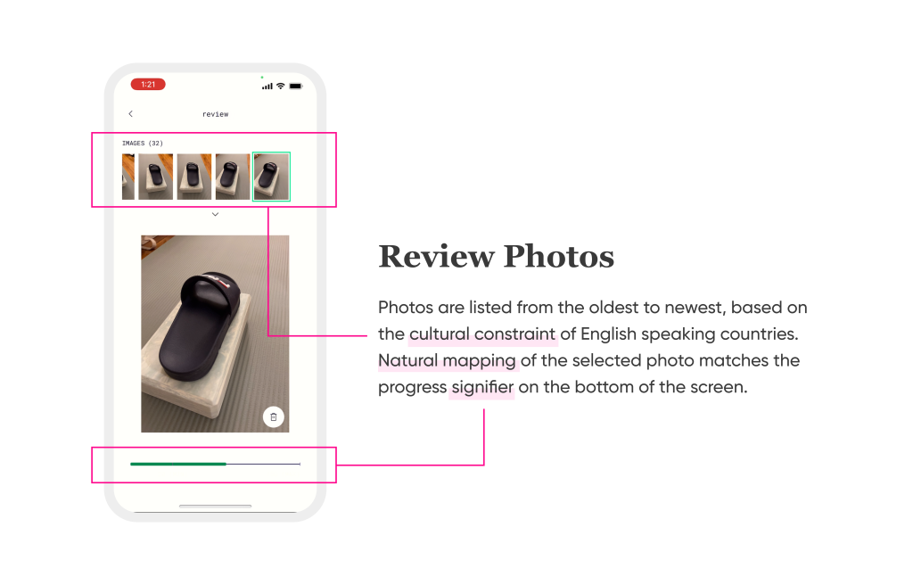
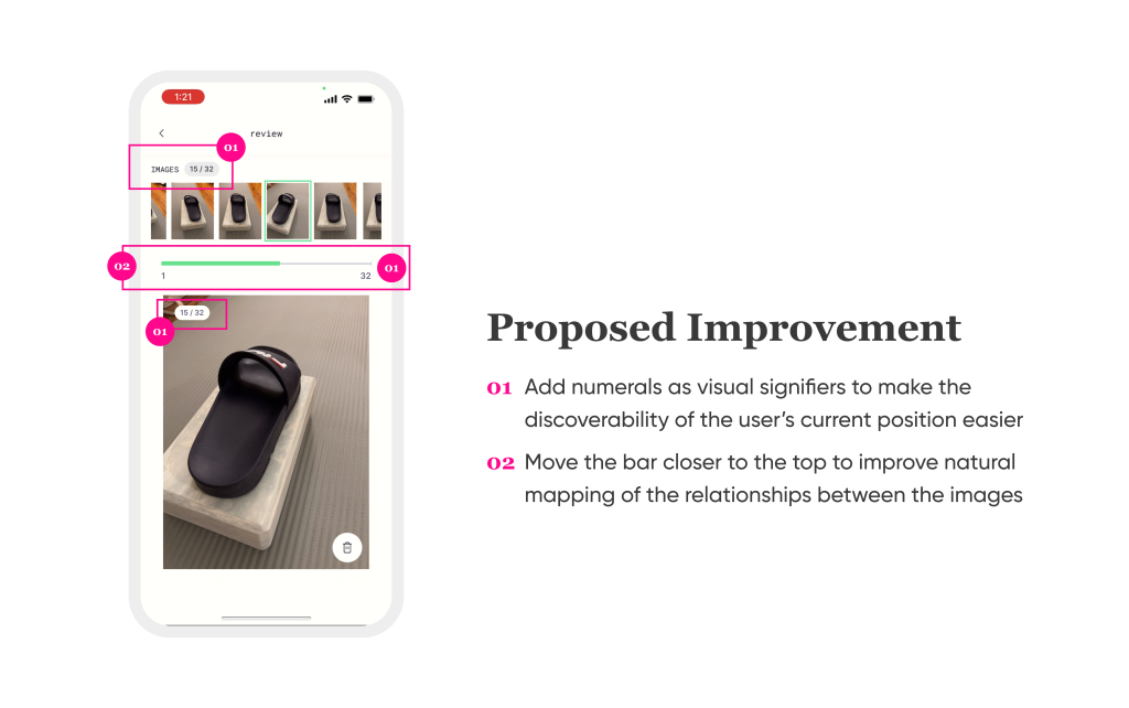
The interface at this stage (image above) is clearly designed for this purpose. First of all, all the images are ordered from the time taken, with the oldest on the left and the newest on the right. Based on the cultural constraints of English-speaking countries, this fits the user’s mental model of time progression convention. The natural mapping of the sequence matches the enlarged image that is being selected from the image list at the top, in addition to the signifier highlighting the place of the image from the full list. The green bar at the bottom of the page shows how far the user has scrolled across the list, therefore allowing the user to mentally map how many images they have reviewed already. One improvement that can be made here is to improve the discoverability of the user’s current position within the list of images.
Exploring the Object
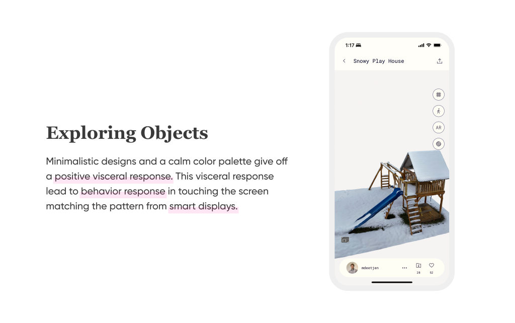
After the object has been processed, the user can explore it in a couple of different ways. One of which is to see it virtually in the app’s interface. The interface for this purpose itself is very simple, with minimalistic components and a harmonious color palette. The main actions are listed on the right side of the screen, with the object of interest in the center. The overall visceral response is positive, leading to the behavioral response of touching the screen to explore more. This focus on the object invites the user to touch the screen where the object is, and thus allow the object to be moved around with the finger, matching the expectations of how the action’s response should be since it conforms to the natural mapping convention on smart displays, where texts or objects move in the same directions as the fingers.
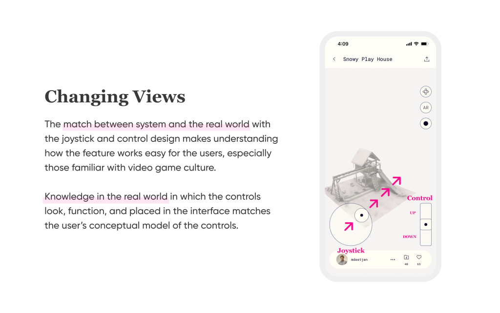
Additionally, the user can choose to move their views around the object with the virtual joysticks and controls. The joystick is designed in a similar fashion as the joystick in real life, with the direction control in the center bounded by a circular border constraining its movement. Having 2 circles within each other without direction arrows gives the user the freedom of control within the interface’s constraints. The control of moving the view up or down in a vertical spectrum design makes it easy to understand that by moving the switch up, the view moves up. And the closer it is to the end of the spectrum, the faster it moves. Both of these controls are most likely influenced by the cultural constraint and mapping of video game culture. Knowing that the application of mixed reality is heavily used in gaming, it makes sense to incorporate components from the gaming culture.
Conclusion
Overall, Polycam follows most of the design recommendations from The Design of Everyday Things. It heavily relies on cultural constraints and conventions that ensure quick learnability based on knowledge of the world. Most of the problems are fairly small and only require small adjustments. In the future, I believe Polycam can implement more visual signifiers and feedback since these are very important in the world of virtual/augmented reality.
