Duration:
3 months
(Spring 2024)
Client:
Seattle Art Museum
Role:
Usability Studies,
UX Research
Product Architecture,
Prototyping
Tools:
Figma, Figjam,
Google Workspace,
Zoom
Project Overview
Objective & Scope
The project aims to optimize the smartphone tour to better align with the Seattle Art Museum’s objectives of enhancing engagement and improving visitor experience for a diverse audience.
This project’s scope includes redesigning the smartphone tour’s experience and visual design to accommodate diverse audiences and improve the overall in-gallery experience.
Background
The Seattle Art Museum (SAM) is a non-profit organization that aims to share its global collections, powerful exhibitions, and dynamic programs to engage, educate, and inspire. SAM is committed to equity, exceptional art, and dynamic programs. SAM’s different sites offer enriching, fun, and rewarding experiences for all.
The Seattle Art Museum’s smartphone tour faces challenges with engagement, seamless navigation, and providing an optimal in-gallery experience.
Key Guiding Question
How might we enhance the functionality of the smartphone tour to elevate the current experience and provide additional value to museum visitors?
Research & Insights
Research Goal
The research goal is to comprehensively assess the current smartphone tour, identifying current issues and areas for improvement to ensure our redesign efforts align with the goal of increasing engagement and improving user experience. We employed a multifaceted approach to gather insights.
Our methods included:
- Usability Audit: Assessing the current platform’s performance and identifying current issues.
- Competitive Analysis: Explore potential opportunities by visiting other museums to gain insights into industry trends and innovative practices
- Literature Research: Delving into established methodologies and effective interaction strategies in virtual tours.
- Stakeholder Interviews: Conducting interviews with the museum’s visitor experience staff to gain firsthand insights into visitor observations and challenges.
Areas of Opportunity
DISCOVERABILITY refers to the ease with which users can find and access information, features, or resources within a platform.
CONTINUITY refers to the coherence and seamless flow of the user experience across different interactions, pages, or stages within a platform.
USABILITY involves optimizing the overall user experience by making the smartphone tour intuitive, easy to navigate, and enjoyable to use.
Key Insights
- The smartphone tour’s navigation as an in-gallery wayfinding tool proved challenging, leading to a high dependency on museum staff.
- Some visitors exhibited reluctance to repeatedly scan QR codes, indicating a need for alternative access methods.
- The smartphone tour lacked evident integration with curatorial insights, impacting the depth of engagement with artwork.
- Users expressed uncertainty about how to initiate and navigate the tour, highlighting a gap in addressing user expectations.
- Accessibility within the smartphone tour emerged as a significant concern, underscoring the importance of ensuring inclusivity for all visitors.
Heirarchy of Needs
We need to establish clear ‘Hierarchy of Needs’ in order for a design to be successful, it must meet people’s basic needs before it can attempt to satisfy higher-level needs (Lidwell, Holden and Butler, “Universal Principles of Design”). The sequence is defined with a pyramid where ‘Functionality’ is at the bottom and ‘Creativity’ is at the top. For SAM, specifically for increasing discoverability and developing continuity, we prioritize Functionality, Reliability, and Usability.
Way Finding Tool
Strategy
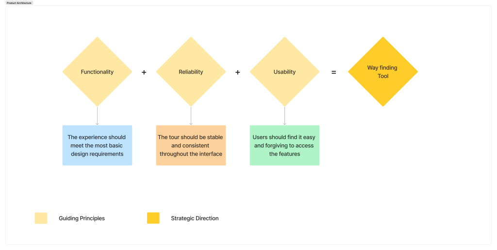
After confirming the project requirement with the stakeholders to proceed with developing ‘A Way finding Tool‘, we prioritized Functionality, Reliability, and Usability as the three most important aspects as the guiding principles for designing the ‘Way finding Tool’, based on research insights about the hierarchy of needs.

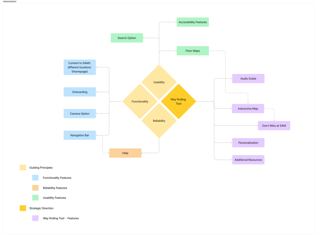
We created this product architecture diagram to visualize our proposed structure and organization of the smartphone tour platform. By creating this diagram, we understood of how different components and features are interconnected and how information flows within the system, enabling us to identify points of interaction and design a more intuitive and user-friendly experience.

Design Decisions
We developed a product architecture to help envision the proposed strategic direction, ‘the wayfinding tool’ for the SAM smartphone. We started off by developing the design system from the rebranding materials provided by the SAM designers.

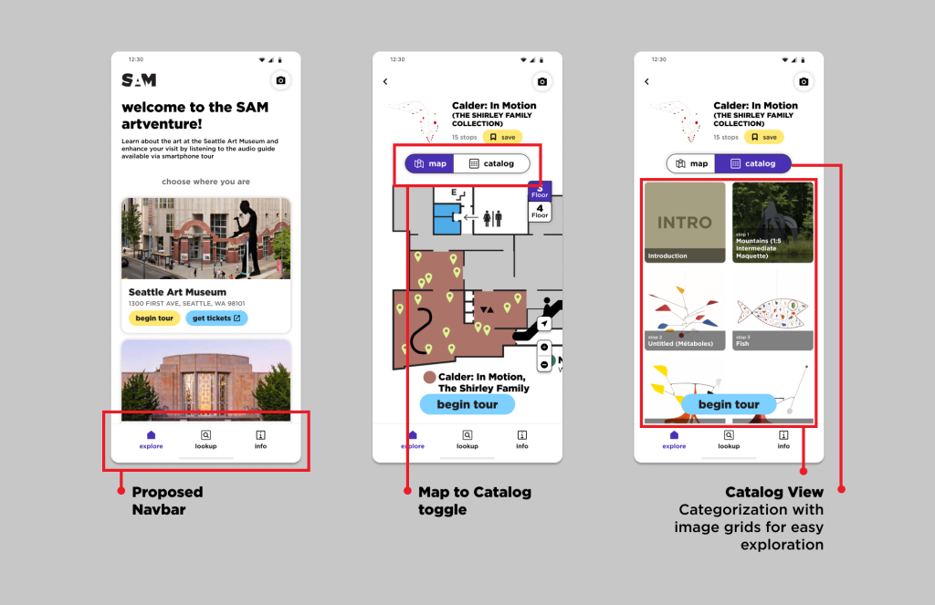
Addressing the discoverability issue, onboarding screens were developed to help new visitors understand the functionality of the smartphone tour. The onboarding is accompanied by guided tips to introduce the new functionalities and develop familiarity, increasing user engagement in the following dimensions.
- Interaction (save, play, camera)
- Navigation (toggle from map to catalog view)
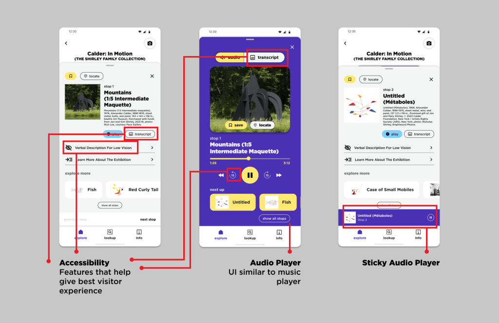
- Exploration (locate, explore more, and transcript)

We established continuity by crafting a user-friendly navigation that consisted of Home, Lookup, and Info as the three main categories for exploring the smartphone tour. The content of each screen was designed to assist the user in exploring the museum. The primary flow for exhibition exploration was Home, whereas Lookup enabled searching, and Info provided additional information.

Returning to our key guiding question, ‘How might we enhance the functionality of the smartphone tour to elevate the current experience and provide additional value to museum visitors?’ we brainstormed on evolving the existing tour to provide features and functionality that evoke exploration. The toggle between Map view and object Catalog and the option to save objects and exhibitions give users the key to personalizing their interests. Along with the option to view floor maps, it will periodically help them navigate their own way through the exhibition.

The audio player is designed to resemble the UI of the music player to establish familiarity, and related objects from the same exhibition are shown as suggested. Few accessibility features, such as verbal descriptions for low vision and transcripts, are included to provide similar experiences for all. This helped incorporate accessibility considerations (like customizing font size) and made the smartphone tool more intuitive and accessible, improving its overall usability.
Next Steps
Based on the client feedback, we will iterate on designs and do a round of feasibility checks with SAM’s developer. There will be another round of design iterations once we understand the tech ecosystem involved in implementing this concept. Post, we will prepare ourselves for the implementation of the smartphone tour by providing support to the tech team and getting ready for user testing before launching it to the visitors. This testing will reveal many insights from not only the visitor’s POV but also from the internal stakeholders like the visitor experience team and the guards who spend a lot of time with the visitors to help them navigate and troubleshoot. At every step of the way, we will ensure that accessibility is prioritized.
Reflections
If we had more time, we would like to
- Prioritize Tech Feasibility: Recognizing the importance of feasibility checks throughout the design phase, I would allocate more time to thoroughly assess the technical feasibility of each design concept..
- User Testing: Understanding the significance of user feedback in refining design solutions, I would prioritize conducting user testing sessions with actual visitors of the Seattle Art Museum.
- Expand Museum Terminology Research: Acknowledging the importance of clear and accurate communication, especially in a specialized context like a museum, I would dedicate more time to researching museum terminology and jargon.
- Enhance Accessibility Research: I would conduct additional research on advanced accessibility considerations being implemented in the current museum landscape.
During the project’s tenure, the team had its ups and downs. We often came to a standstill, not knowing the way forward and trying to make sense of the data we had gathered during research. However, overall, the experience was truly rewarding, as we were able to present and pitch to SAM a product that will truly create an impact.
