This case study was authored by our team members: Liwen Chang, Michelle Huang, Nivedita Thakurdesai, and Shuyang Lin.
Project Overview
Our Client
Know Sue Rock Original’s – Plus size women clothing brand
Sue Rock Originals is a true independent lifestyle brand for sizes 18 and up based in New York City. Using local manufacturing, they create high-quality and sustainable apparel, accessories and home textiles.
Meet Our Team
Liwen Chang
Michelle Huang
Nivedita Thakurdesai
Shuyang Lin
Project Duration
11 Weeks
Tools Used
Figma
Google suite
Zoom
The challenge we had was to stand out in modern retail & unfold Sue’s story
The owner Sue Rock has an incredible story of how her business Sue Rock Originals came to be and what it represents. When looking at the current website, it’s clear that this story isn’t translated all the way. On top of that, with all the various shopping experiences that exist today, it’s a challenge to gain the attention of consumers and stand out while also implementing a new pre-sale model.
We decided to redesign website to gain more attraction & create intuitive shopping experience.
A redesigned website that helps the client visualize her story, gain more attraction, and provide an intuitive pre-sale online shopping experience.
You can view our Final Design Solution here.
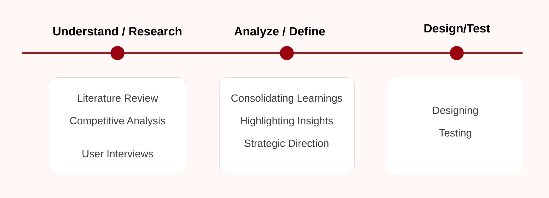
Our methodology for redesigning Sue Rock Original’s website

Research
Through conversations with four plus-size shoppers, we uncovered valuable insights that are guiding our design decisions for enhancing the online shopping experience.
Here’s what we discovered:
- Emotional Connection: Our interviewees were clear—they crave more than transactions from their shopping experiences. They seek stories and communities that uplift and reflect their identities, valuing brands that make them feel recognized and included.
- Detailed Information: There’s a strong demand for rich product details. Shoppers stressed the importance of comprehensive descriptions covering size, fabric, and care to make informed decisions from afar. They want to feel the fabric and understand the fit, even if only digitally.
- Transparency: Clear and honest communication about what to expect, particularly concerning pre-sale processes, shipping, and returns, is non-negotiable. It’s the cornerstone of trust and customer satisfaction in online shopping.
Pain points Uncovered:
- Limited Fashion Choices: The lack of stylish, well-fitted options in plus-size fashion frequently leaves consumers feeling overlooked. This gap in the market underscores a significant opportunity for design innovation.
- Uncertainty in Online Shopping: Not being able to touch or try on items when shopping online makes purchasing decisions risky. Without enough detailed product information, the fear of disappointment is significant, leading to hesitation and often dissatisfaction.
Competitive Analysis
Competitor analysis for insights on branding, storytelling, and current market trends
We selected eight websites based on distinct focus areas such as plus-size offerings, branding, pre-sale focus, and shopper fidelity.
The key findings from the competitive analysis on enhancing plus-size online shopping:
- Visual Design: Effective brands use compelling visuals and clear narratives on key pages to strengthen their brand identity and connect with customers.
- Navigation and Information: Clear navigation and detailed product information, such as size guides and fabric care, are essential for an intuitive shopping experience.
- Social Impact: Successful competitors leverage their platforms to communicate their social commitments, using storytelling and visuals to engage ethically conscious consumers.
Literature Review
Understanding our target users’ experiences and industry customs through desk research
Before conducting interviews with plus-size professional women, we aimed to understand our target users better, helping us to ask more specific questions during the interviews, thereby gathering deeper insights. Additionally, we sought to familiarize ourselves with online fashion brand practices, particularly regarding pre-sale models and brand storytelling. To achieve this, we read relevant articles to gain a clearer understanding of both our users and the problem we aimed to address.
- Plus-size Market
Plus-size fashion has evolved significantly over the years, reflecting changing societal attitudes towards body image and diversity. Historically, fashion for larger body sizes was limited, with fewer options and styles available compared to standard sizes. In the mid-20th century, there was a shift towards more inclusivity, with the introduction of plus-size clothing lines and models.
- Pre-sale Models
In the plus-size fashion industry, pre-sale models involve offering upcoming designs for purchase before they are produced, allowing brands to gauge demand and customers to secure exclusive or customized items. Challenges also exist in this model, such as returns during the production process, lack of incentive for customers to buy and the core idea of the pre-sale model may be hard to accepted by some customers, as stores are selling something that doesn’t exist yet.
- Brand storytelling
Effective brand storytelling on a Shopify store can enhance customer engagement and loyalty by creating an emotional connection, showcasing values, and differentiating the brand in a competitive market. Below are the common strategies used by other online stores:
- Strong brand mission and vision that highlights authenticity.
- Using social proof (e.g. press, testimonials) to help establish credibility.
- Including images to show the brand’s aesthetic/personality visually
Strategic Direction
Based off of the our research findings and client goals, we were able to narrow down our scope to the following three directions:

Client feedback
After presenting all of our research findings and strategic plan, our client gave us very positive feedback about the work we did and effort we put in improving her website’s storytelling and showcasing her brand’s impacts. She couldn’t wait to see our actual page design for her online Shopify store.
Design Process

Infusing Sue’s vibe in style choices and storytelling for our initial designs.
The primary obstacles in initiating the design process involve effectively conveying Sue’s essence through the website and guiding users through the pre-sale model.
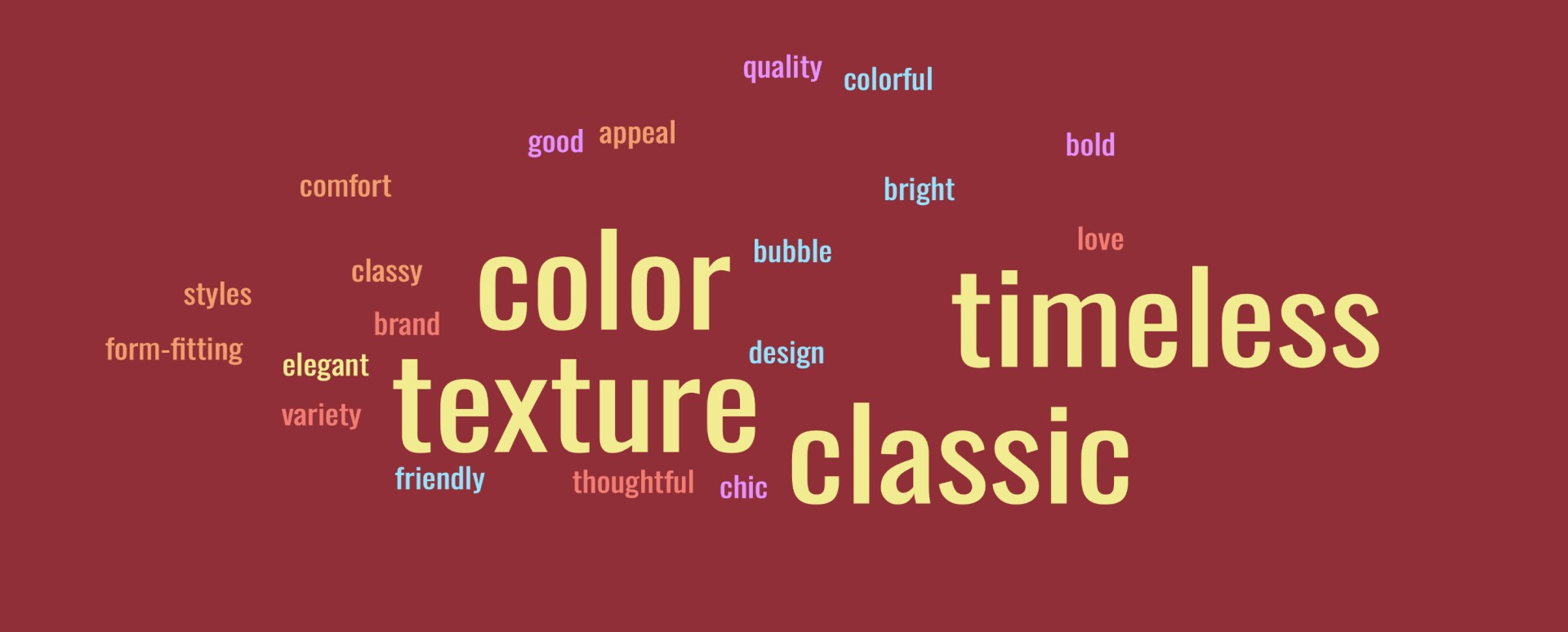
To capture Sue’s vibe, we crafted two design options: one with vibrant, colorful UI elements reflecting her bold, vibrant, and positive energy, while the other maintains a subtle, neutral UI, allowing her product images to stand out prominently.
Story & Impact page
We meticulously designed Sue’s story and brand impact page, ensuring an engaging narrative by balancing visuals and text. Short paragraphs accompany striking images, amplifying their impact and keeping the reader engaged.
Product listing & product details page
We kept the product listing and details pages simple yet aligned with current trends, incorporating detailed information such as sizing, fabric, shipping, and returns to enhance the user experience.
User Testing
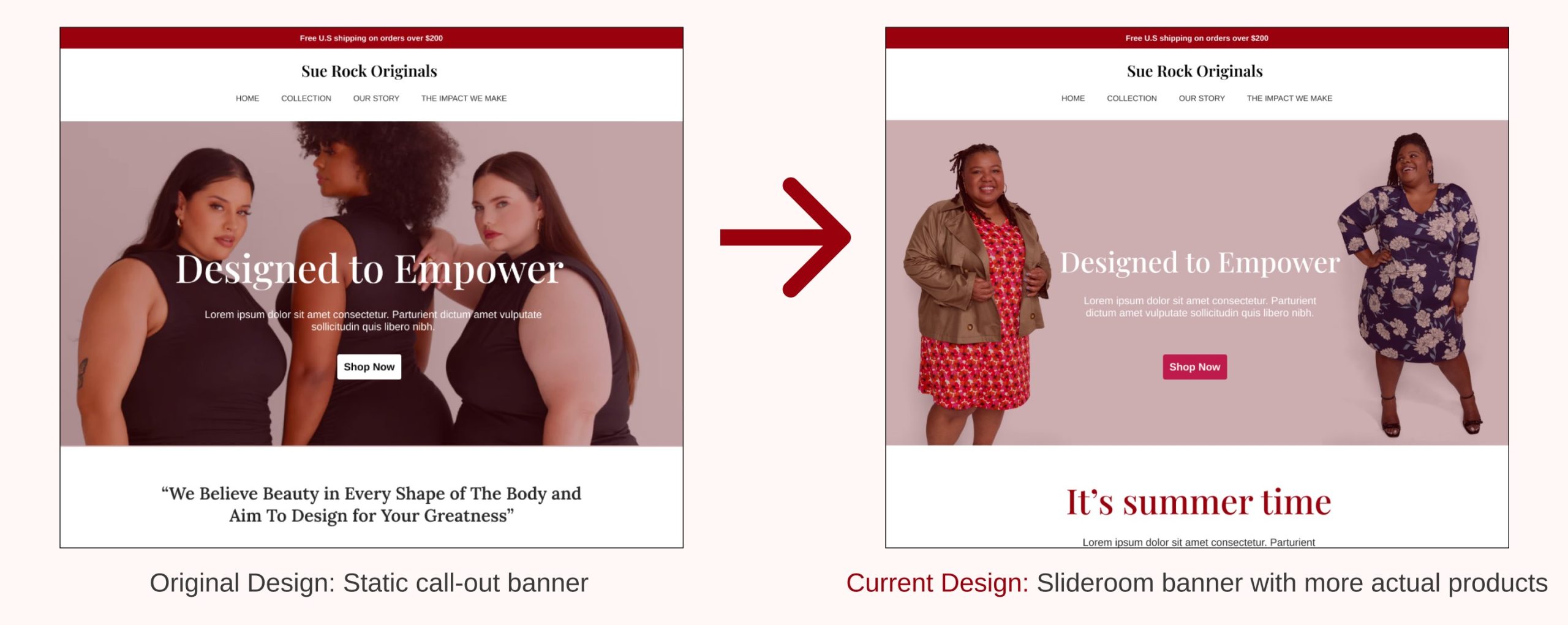
Problem 1: The homepage banner is not attractive enough.
“I want to see more actual products , not just three beautiful plus-size models wearing black.”
The current banner is actually our placeholder image because we did not find the appropriate one. However, this feedback is valuable information for the future design and for the client’s implementation.

Solution: Change the banner image and replace the static banner with slide room.
Based on this feedback, we redesigned the section and adjusted our plan from static banner to interactive slide room. We put the touch point statement in the next slide, so that customers could see the actual collection section as soon as possible.
We suggested our client to always put featured products at this section for customers to see when they first land on the website, showing them what the brand is proud of.
Moving animation gave us options to show more. However, this format has higher requirements for the background image. The text area should not block the model’s face, and the text and buttons should be easy to read, making sure the color contrast of the text and background image is high enough. Finally, we recommended choosing the arrow or bar mode of the slide room section for better accessibility.
Problem 2: Testimonials on homepage is not helpful.
Participants felt confused about seeing testimonials on the homepage.
“I won’t read this section on homepage; it should be somewhere else.”
Then we asked where it would be most appropriate to present this information, and participants said somewhere under the about page.

Solution: Relocate the testimonials to better connect customers with the brand
We decided to put this section below the whole story to show how other people are telling their story by wearing Sue Rock Originals products. We wanted
to connect Sue Rock Originals products with customers. After this section, we displayed the featured products to motivate customers to take actions.
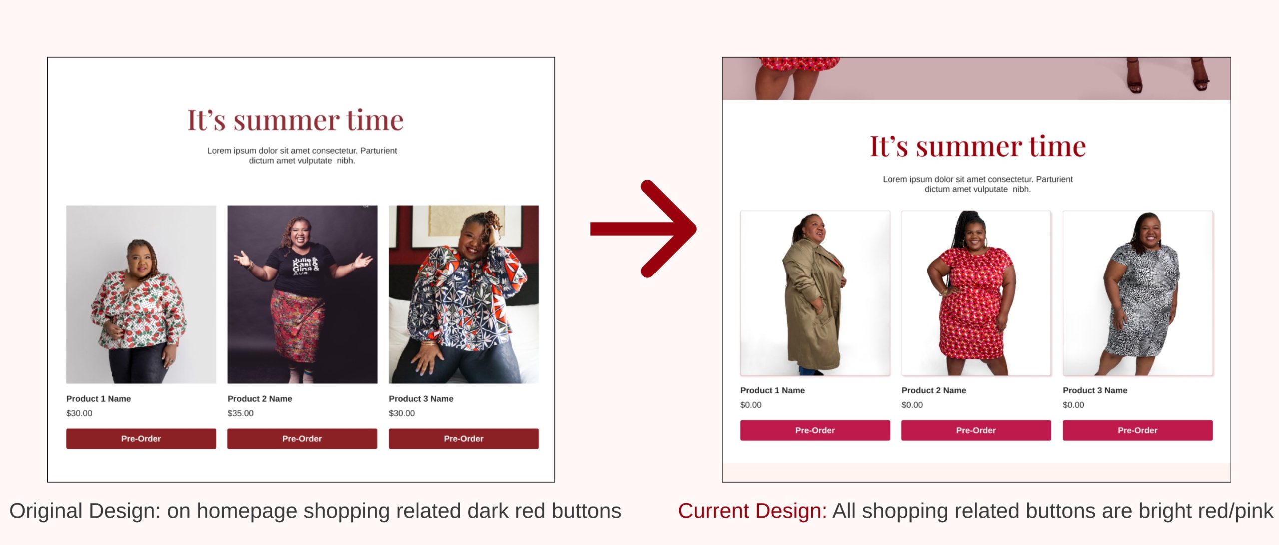
Problem 3: Subtle color is not elevating shopping experience
Participants are not satisfied with the dark red we have for now. They wanted to see more colorful options on the website to represent the brand.
“I want to see a pop of color; the colorful website attracts me more.”

Solution: Add bright reddish pink as pop-up color for purchase
We tried a few different colors to add more flavor to the current design and finally landed on the bright reddish pink. It worked out the best with our current color palette but also gave energy to the visual design, encouraging customers to view more products and to shop.
Problem 4 : Overlapping of content makes it less engaging
Participants felt confused about seeing the same images over and over again on the same page.
“Keep website content concise and avoid repetition.”
The reason behind this was that we did not find more on the internet, so images used for the introductions of the organization were placeholders. However, participants did remind us of a wonderful point: if there is overlap between the introduction of the organization and its impact, consider combining those two sections into one.

Solution: Remove the overlapped section for better flow.
We decided to remove the local impact section as it was repetitive to the introduction. We also pointed out that if the actual content is not overlapped with the introduction part, it is okay to keep both sections on the page, but images need to be different.
Presenting final design to Sue Rock
We shared our finalized designs with Sue for feedback and offered insights on easy implementation through Shopify. We also provided Sue with guidelines for product images on the website, emphasizing their importance in enhancing visuals and overall impressions.
She was thoroughly impressed with our work and expressed eagerness to collaborate with us in the future.
You can view our presentation here
Our Takeaways
For Design Strategies:
Understanding the client’s needs & resources for the project is important
As a UX designer / design strategist, understanding the end user is crucial, but equally important is Understanding the client’s needs and resources for implementing the design. Balancing both ensures a successful outcome that meets everyone’s requirements and constraints.
To understand Businesses:
Website becomes key communicator in E-commerce trading
For an e-commerce clothing brand, translating the brand’s story into design elements is crucial, as the website serves as a powerful means of communication with users.
Incorporating user research is vital for Website Styling and Lay outing to create a successful E-commerce brand
Understanding end users and what factors lead them to associate with a brand is key.
We can focus on these factors through website design by emphasizing elements such as user experience, brand identity, storytelling, visual appeal, and aligning with their values and preferences.

