Our team of five, each held roles as UX Researcher and UI/UX Designer, conducted usability testing and iterative design to evaluate and optimize the conversion process on Happy N’ Beyond website.
My Role
UX Research, UI/UX Design
Team
Kefan Ma, Allison Long, Emily Gu, Lena Nazaryan, Lori Chiang
Client
Happy N’ Beyond
Platform
Duration
6 weeks, Mar 20 – Apr 26 2024
Tools
Figma, Google Form, Google Doc, Zoom
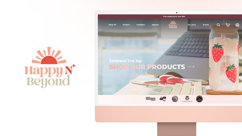
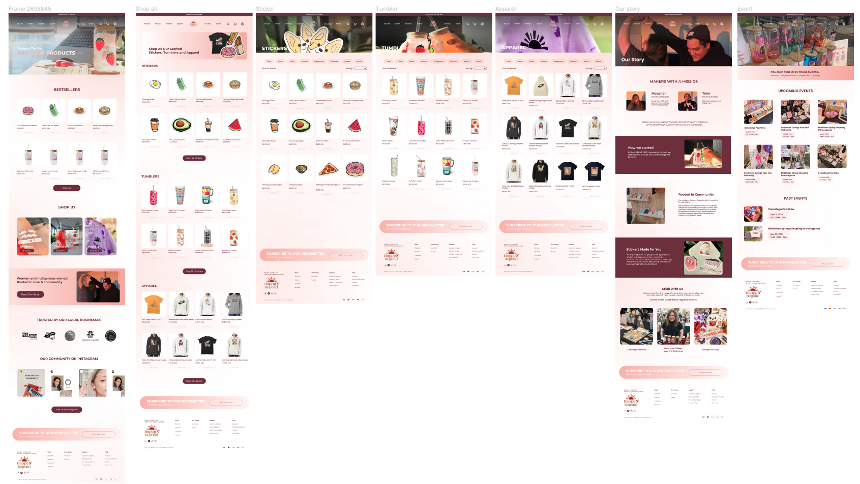
Final Prototype
Prototype 1
Prototype 2
Prototype 3
Final Presentation
Slides
About the Client
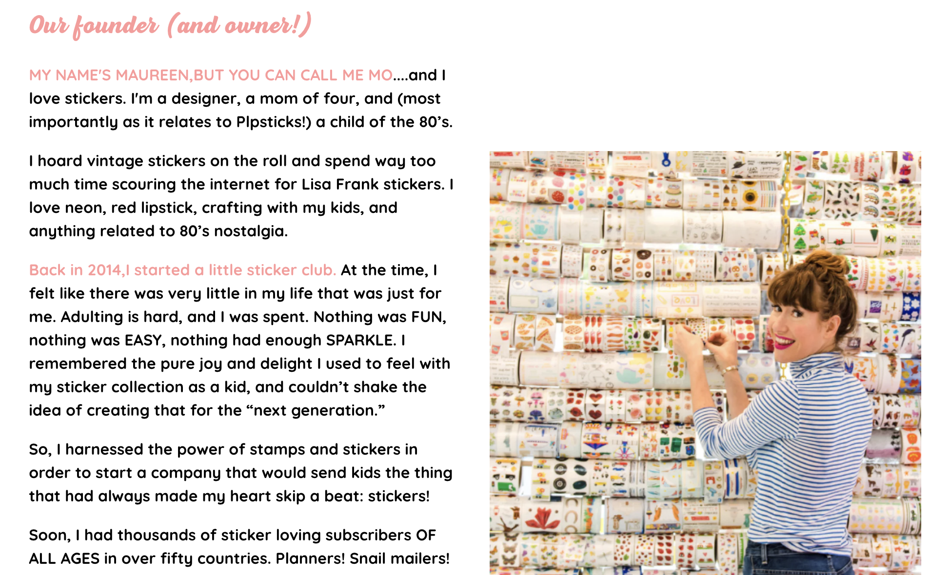
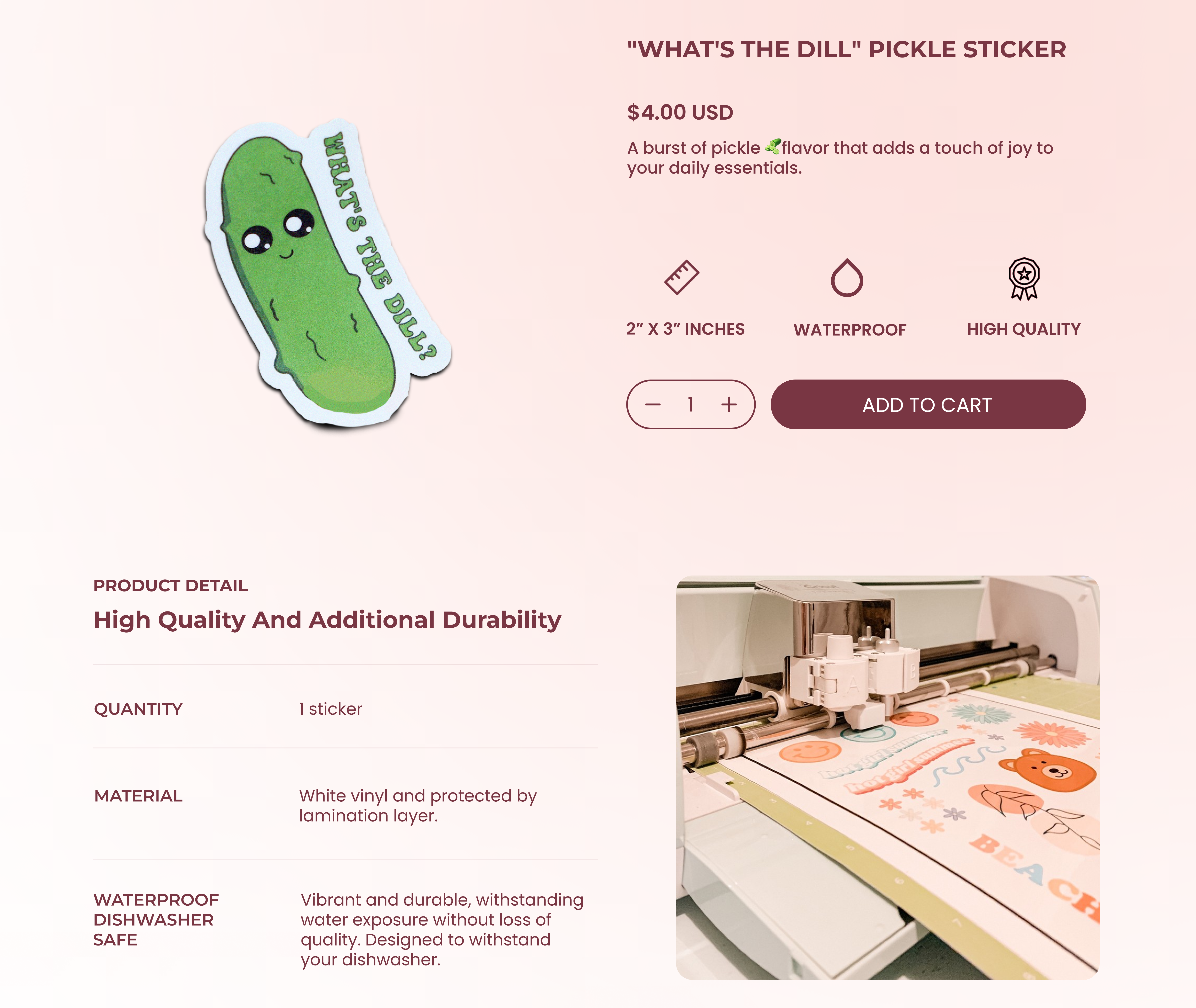
Founded in Ontario, Canada by Meaghan Turner and her partner Tyler Miller, Happy N’ Beyond is a Woman & Indigenous owned e-commerce business that crafts joyful hand-drawn stickers, trendy tumbler cups, and unique accessories. Started from 2021, the business has grown from a small Etsy shop to its own Shopify website. Their products emphasize artistic expression & eco-conscious choices, catering primarily to millennial women, parents, and students.
How might we improve the UI Design and Content Organization to increase conversion rates for Happy N’ Beyond Shopify website?
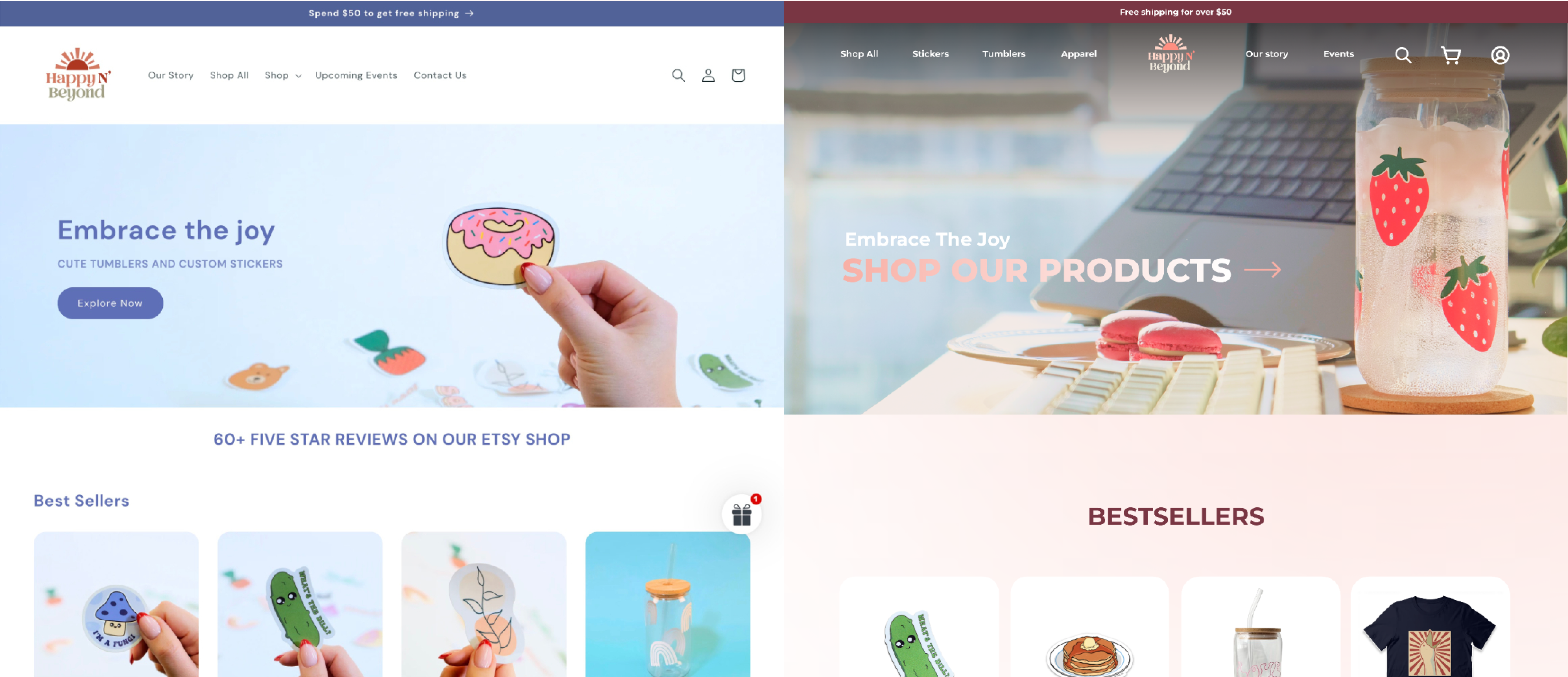
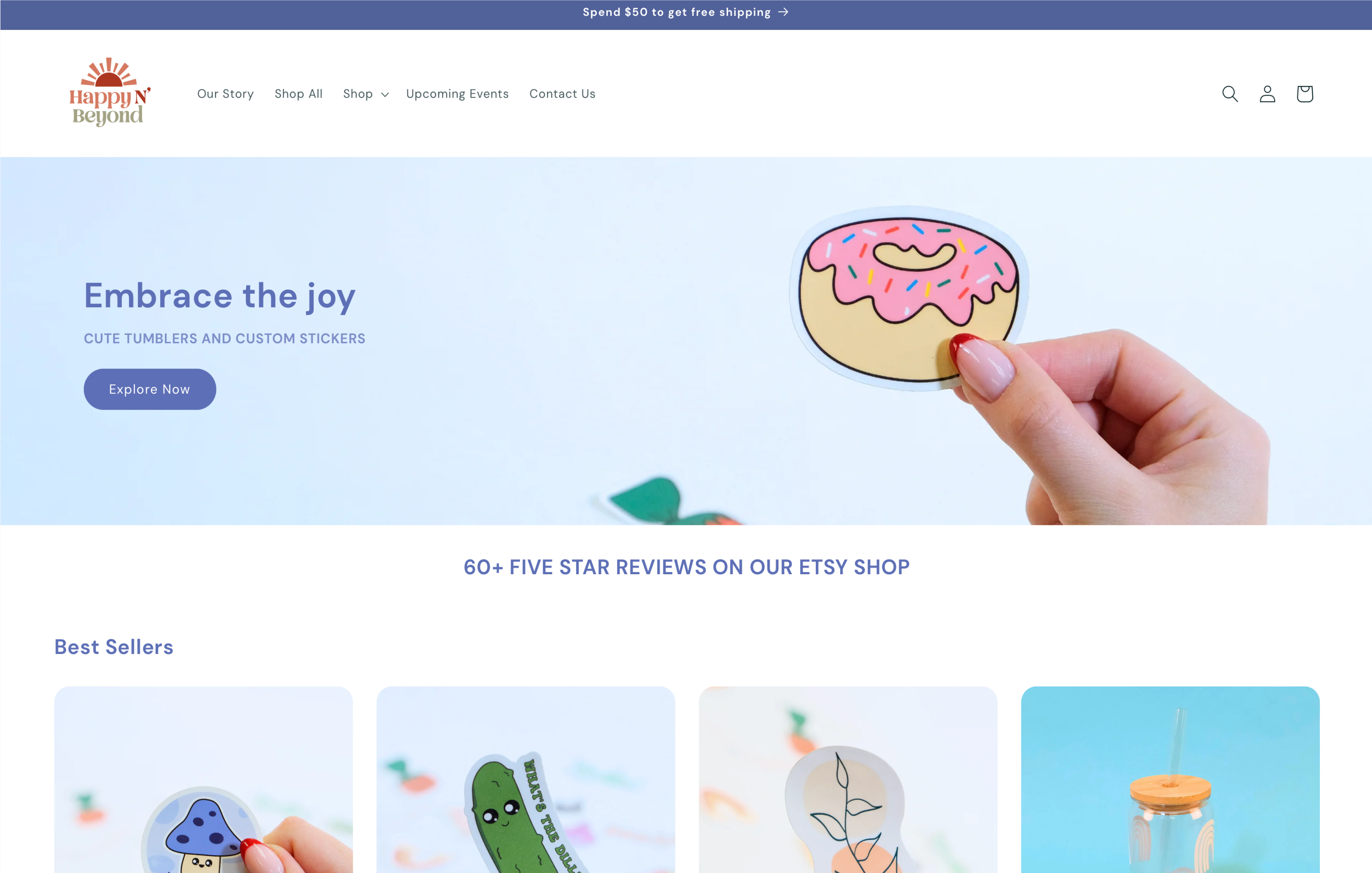
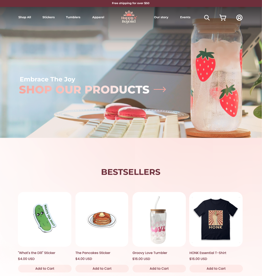
Taking a Peek at Before vs After
We made a complete revamp to the key interfaces to improve the user experience, with the focus on # UI Design # Brand Identity # Content Organization # Copywriting.
Our Process
Getting to know the Client
We initiated the project through a 45-min kick-off meeting with our client Meaghan, focusing on aligning the project scope & goals, as well as setting expectations for the following research process & final deliverables. We learned that Meaghan is a full-time Web Developer, while she works part-time as the Shop Owner & Graphic Designer for this side hustle.
Main takeaways from this kick-off meeting are:
Client’s Goal
- Transition from Etsy shop to an independent Shopify site to save on commission fees & express branding
- Increase website visitors and promote conversion rates
- Increase sign-ups for newsletters
Target Audience
- Primary demographic: Women in 20-30s, along with indigenous people buying for themselves or their children
- Location Focus: North America
- Locals in London, Ontario area supporting in-person market sales
Existing Marketing Practices
- Social Media Channels: Facebook, Instagram, TikTok
- Google paid Ads
- Traffic from Etsy
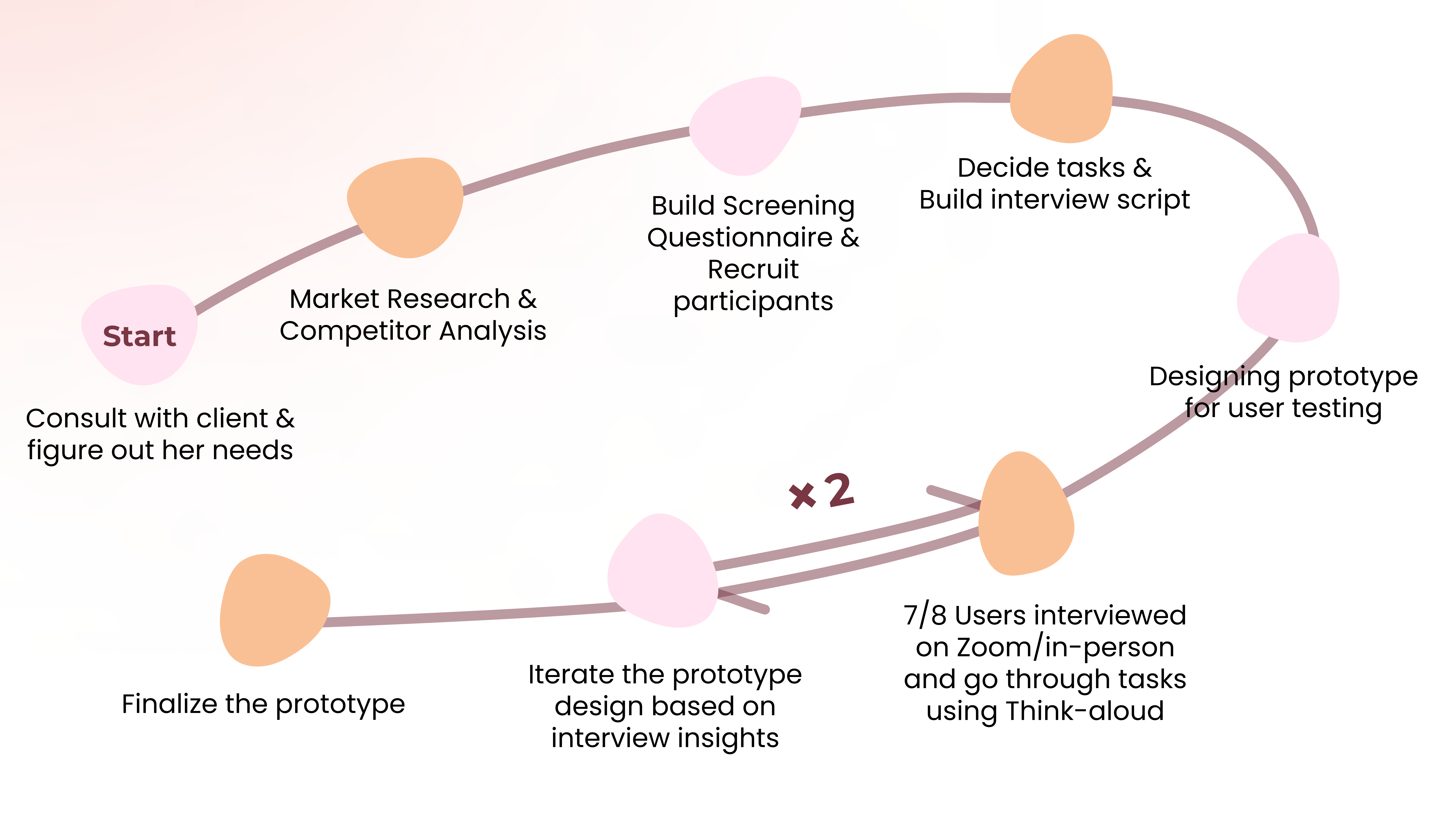
After discussing within the team, we decided to build our prototype for testing rather than using the actual website of Happy N’ Beyond, primarily because the limited number of products currently available fail to provide the variety and complexity necessary for conducting usability tests. Additionally, we chose to apply an iterative design strategy that allows us to rapidly collect feedback and iterate on our prototype during each testing phase.
Understanding the Market
To gain more in-depth insights into the e-commerce industry standards for our first prototype, we conducted competitive analysis on 13 sticker businesses (direct competitors) and comparative analysis on 11 e-commerce businesses in diverse domains (indirect competitors).
In developing the first prototype, we grounded our redesign in these insights from the industry practices:

Product Diversity
Gumroad shows a wide variety of products that appeal to a broader range of customers.
Brand Identity
PIPSTICKS uses vibrant color schemes and has memorable branding story that emotionally resonates with customers.
Building the 1st Prototype
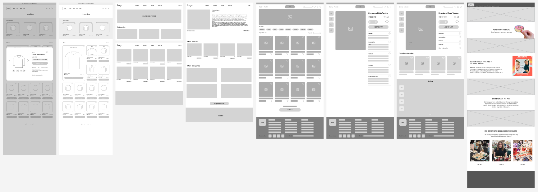
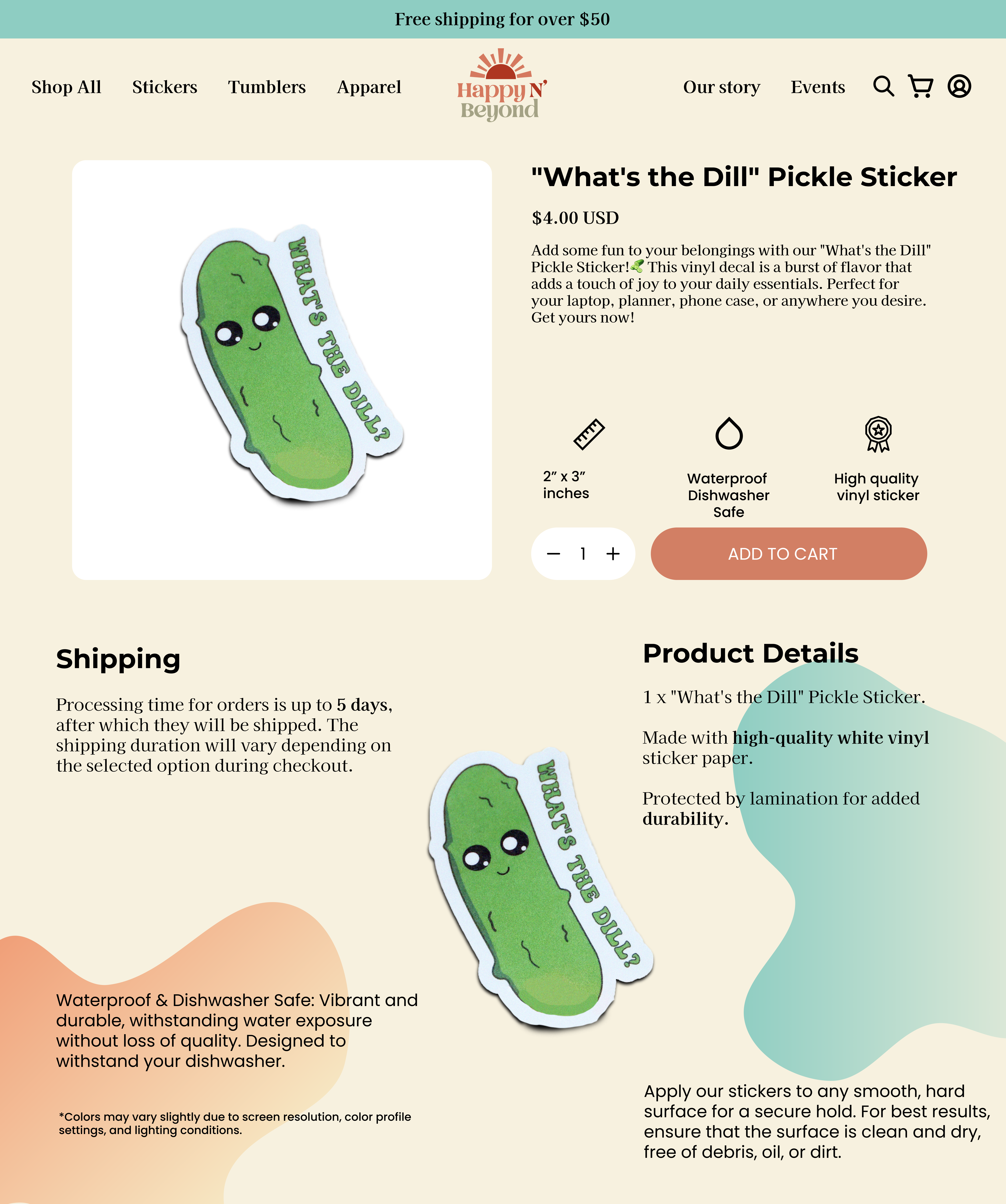
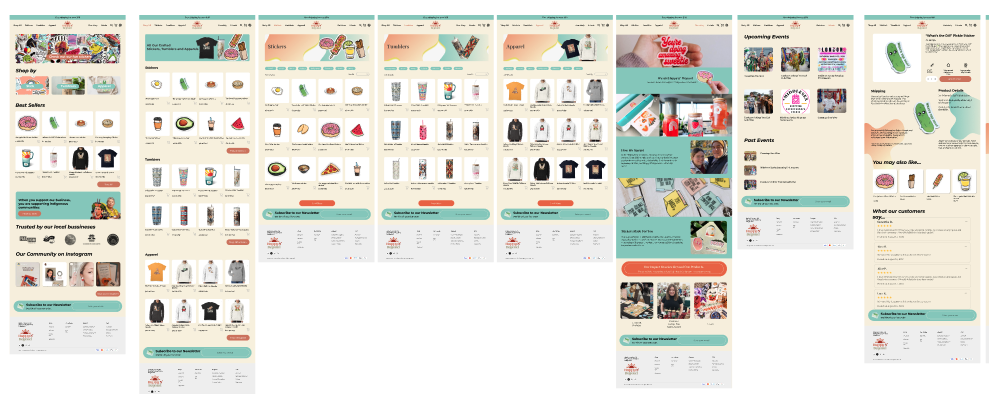
We wanted to narrow down our scope to the key venues that are really impacting conversion rates, so we decided our final deliverables would be the following 8 screens: Homepage, Shop All, Sticker, Tumbler, Apparel, Our Story, Event, and Product Detail.
Based on our initial research insights, each of us brainstormed what the wireframe may look like. We then locked on a unified UI scheme to prototype the 1st draft, and get ready for testing!
Interact with the 1st Prototype
Moderated User Testing
Recruiting Participants
Based on the desired demographics, we built a screening questionnaire to recruit interviewees from Happy N’ Beyond‘s target audience groups. We sent out the survey both within our school and to external audiences to gather a broad range of perspectives.
Our target User Profile:
- Age 18-30
- Preferably female
- Students/Working professionals
- Living in Canada/the US
- Have frequent online shopping experiences
Conducting the Usability Testing
We conducted in total 15 moderated usability tests in-person or via Zoom, 3 are living Canada, 12 in the US. Each participant was rewarded with a $10 Amazon gift card after successfully finishing the interviews.
Interview Scenario: You are interested in fun stickers and would like to find out what’s new on sale online. You find the brand Happy n Beyond on instagram and want to check out what they are selling right now.
Part 1
Overview of the website
- Browse the page without clicking, what is your first impression about this website? Please speak your thoughts out loud as you read the site.
- Is there any specific thing that caught your attention?
Part 3
Visual Branding and Senses
- How would you describe the overall vibe or atmosphere of the site?
- Is there anything in particular that you think contributes most to the vibe of this website?
- How do the colors and visuals on this website influence your impression?
- What emotions or feelings does this website evoke in you?
- Is there anything unique about this website that feels different from other websites you usually do online shopping on?
- One the scale of 1-5, how much do you enjoy the website’s visual design?
Part 2
Content Organization
- Please interact with the site freely. Before every time you click on something, please speak about what you expect to happen when you click on it and why you choose to click on it.
- Navigation bar
- About Us + Community page
- You’re buying a gift on this website, try to find an item you like related to the occasion and add it to the cart.
Part 4
Brand Identity
- What is your perception of the person who designed the stickers?
- This brand has close connections with indigenous communities in Canada. Is that information apparent to you from the website?
- Would you be willing to make a purchase from this site/brand? Why or why not?
Iterating the Prototype – 2nd
At the midpoint, based on feedback from the 7 interviews conducted during testing phase 1, we made the first iteration on our prototype that changed the entire color scheme, typeface, and refined the product pictures.
Interact with the 2nd prototype
Finding & Recommendations
Interact with the final prototype
Finding 1
Generic Template Appearance
Users noted that the website lacks a personalized touch, it appears more like a basic template rather than a unique brand site.
“The site looks clean and the information seems clear, it’s just a bit generic.”
Finding 2
Lack of Content Strategy
The content across the site was not engaging enough, and many users did not understand the significance of certain sections.

Finding 3
Unclear Brand Story
Users were confused about how exactly the brand is supporting indigenous communities. They were unclear about how their purchases can contribute to this cause.
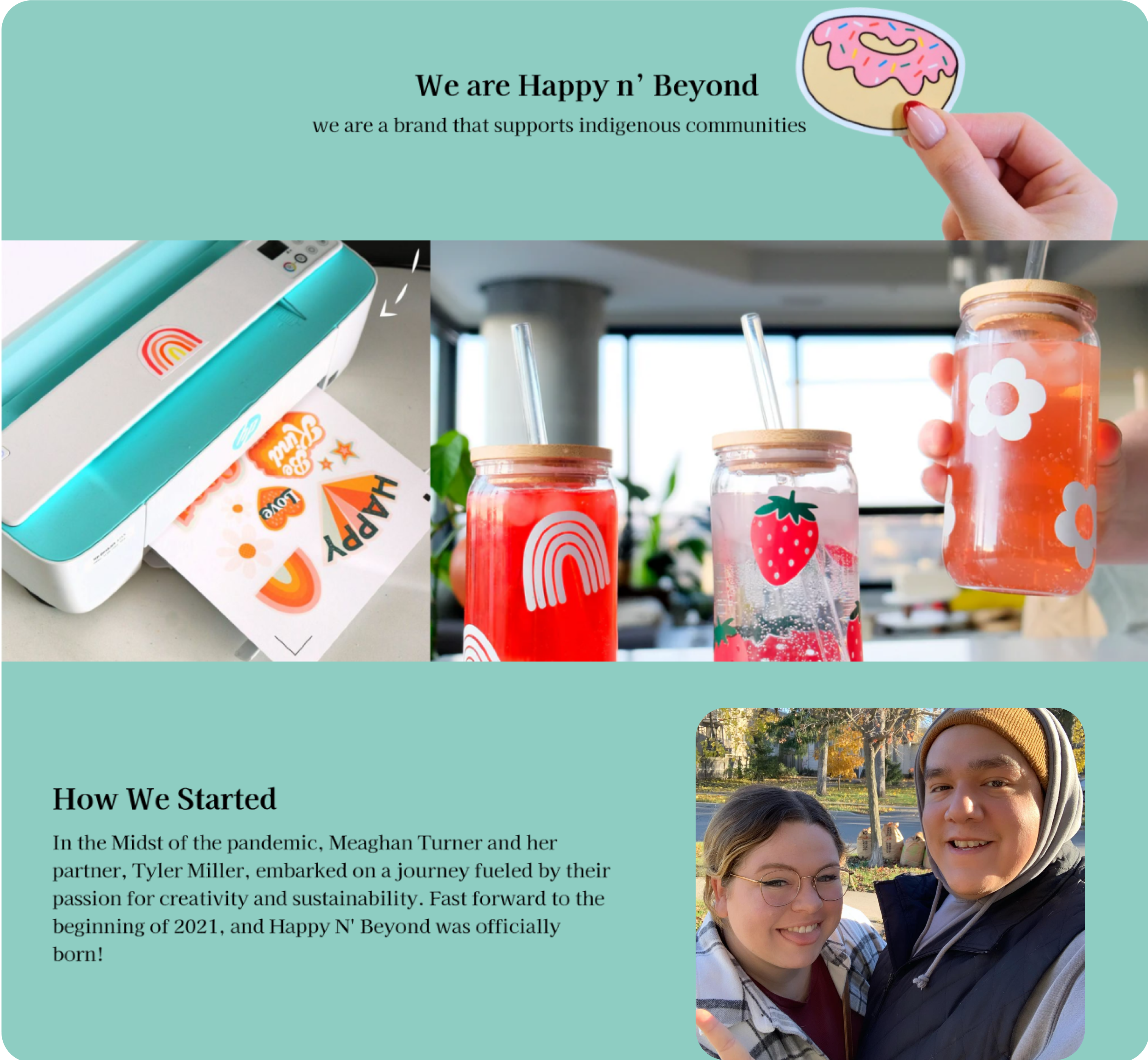
“How exactly does the brand support indigenous communities? You can’t just say that and not explain how.”
Recommendation 1
UI Revamp for
Apply a more customized, visually exciting design, choose the visual elements that best fit the brand storytelling.
Recommendation 2
Develop Robust Content Strategy
Craft more engaging copy and use clearer hierarchies to prioritize important information, make it easily accessible and understandable to users.
Recommendation 3
Infuse Personalities into Brand Narrative
Weave the clients’ personal stories into the brand narrative, reflect their personalities to make the brand mission more compelling.

Final Client Presentation
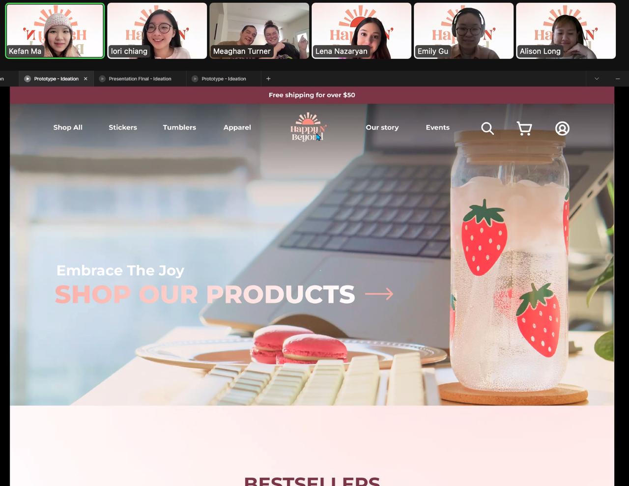
We presented our findings and actionable recommendations to both Meaghan & Tyler via Zoom, and they were extremely impressed by our solutions. It was BEYOND their expectations! They showed us the upcoming batch of stickers that incorporate more indigenous elements, and they looked forward to implementing our design!
Reflection & Next Step
Setting expectations is important since the beginning
It has been a challenging project from the very start since it is not a “typical” usability problem to solve. We’ve had multiple discussions within the group, with the client & with our teacher to clearly define the project scope. At some point, we reached the agreement that we would deliver a template design focusing on the visuals and branding for our client, considering Meaghan is a Web Developer herself! Since then, we have been more and more confident and enjoyable during the process. The client may have their own expectations when taking this project to us, however, it is our job to set the boundaries and inform them of what’s in scope and what’s out of scope beforehand.
Next Steps
If the project were to continue, the next steps would involve
- an overall implementation of the proposed solutions across the website
- paired with data analytic tools to monitor the site views, conversion rates, etc.
- expand on the range of product offerings