- Course: Info 606 – Digital Accessibility
- Student: Alaa Shihab
- Team: Alaa Shihab, Anika Mujamder, Allison Chen, Liz Von Klemperer
- My Role: Solution Concept & Ideation, Visual Design, Sensory Map
- Timeline: Spring 2026 Semester – 15 Weeks
When the Environment Becomes the Barrier
Art galleries and museums are built for looking. But for many neurodivergent visitors, individuals that experience ADHD, autism, or anxiety disorders, the experience of getting to the art is often the hardest part. Before you can stand in front of an art piece, you have to navigate a crowded entrance, figure out an unfamiliar layout, survive overhead lighting that reflects off glossy walls, and endure overlapping sounds from audio installations, crowds, and conversation. Each of these, on its own, might be manageable, however together they create conditions for sensory overload.
Our project focused on Positive Exposure gallery, a nonprofit exhibition space in New York City dedicated to celebrating human diversity and dignity. The gallery’s mission is inclusive and yet, like most gallery spaces, its physical environment was not designed with neurodivergent visitors in mind. The gallery environment systematically excludes neurodivergent visitors not through any single barrier, but through the accumulation of unpredictable sensory demands, absent way finding, and lack of staff preparation; all of which accumulates before a visitor has even seen a single artwork.
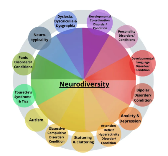
conditions and sensory profiles the design needed to consider
Following the Thread
We began with secondary research to understand how neurodivergent individuals actually experience sensory environments. Scientific literature gave us a structural foundation: a study by Wada et al. (2023) documented self-reported sensory issues across a broad range of inputs, confirming that neurodivergent individuals process sensory stimuli differently across multiple channels simultaneously. Choi et al. (2025) further identified neural substrates associated with sensory over-responsivity, grounding the lived experience of overload in measurable neurological difference,
However, academic research, by its nature, describes patterns across populations. It does not capture what sensory overload feels like at the moment. That is why we turned to content analysis. Forsthand accounts shared by neurodivergent individuals in their own words, on platforms such as TikTok and YouTube, to understand the real-world level of these experiences. Where scientific research tells us that sensory overload occurs, content analysis tells us how its lived
One person described being overwhelmed by “a lot of competing sound in an environment.” Another described the experience of simultaneous inputs: “when everything is happening at once, noise, people, lights, it feels like my brain can’t process it all” (TikTok user, 2023). These accounts brought the research into human scale and made the design stakes concrete.The real pivot came from watching a Youtube video by Orion Kelly (2025), “Change is Hard! How Social Stories Help Autistic People”, a content creator and autistic advocate.
Social stories first developed by Carol Grey in 1990, are written or illustrated step-by-step narratives that describe social situations in clear, predictable terms. They are tailored to an individual’s context and their purpose is to reduce anxiety by making the unknown known; setting clear expectations before a challenging situation. Institutions such as the Guggenheim and MoMA museums have developed their own Social Story guides for visitors ahead of gallery visits, recognizing that preparation is itself an accessibility tool.
This reframed our problem entirely. The issue wasn’t only that galleries were too loud or too bright. It was that they were unpredictable. And unpredictability, for many neurodivergent visitors, is its own trigger independent of the sensory environment itself.
This insight directly shaped our direction: accessibility needed to begin before the visitor walked through the door.
Our research process began with a valuable kickoff meeting with Amanda McFee, Director of Arts at District 75. A New York City public school program that serves students with significant disabilities, many of whom are neurodivergent, and whose classes regularly visit Positive Exposure. Ms. McFee joined our class via Zoom and was generous with her time and knowledge. She spoke about her role, shared examples of accessibility plans District 75 has developed to make spaces more inclusive, and described how they prepare and accommodate students who visit the gallery. It was an insightful and encouraging start to our research.
Building on that foundation, we sought to deepen our understanding of the gallery itself. We visited Positive Exposure in person and met with Ian Burto, Director of Operations, who gave us a tour of the space and spoke openly about how the gallery currently receives neurodivergent visitors.
Ian walked us through the gallery’s practices such as coordinating with teachers ahead of school visits. He showed us a draft of an email he had once shared with a teacher who had requested a social narrative. It was a text only document that described what students could expect, where the entrance was, what the artwork was like. It was something he had put together quickly and hadn’t revisited. It contained no visuals, no structured format, and was never made available to individual visitors, but it was a social story.
Seeing that the email confirmed our solution direction. The instinct to prepare visitors in advance already existed at Positive Exposure, it just hadn’t been designed. Our task was to take what was already happening informally and give it form., structure, and scale. Ian also shared the gallery’s floor plan with us, which became the direct foundation for the sensory map we developed as part of the social story.
Mapping the Visitor Experience
This grounded our design in a specific, observable situation, we developed a scenario informed by our secondary research and stakeholder conversations: a neurodivergent visitor arrives at an art gallery on a busy weekend afternoon. Moving through the exhibition, the environment becomes overwhelming. Crowded rooms, echoing sounds, harsh overhead lighting reflected off glossy walls, an audio installation playing. The visitor looks for somewhere to step away and regulate, but there are no clearly marked calm areas and no staff equipped to help. The experience becomes inaccessible.
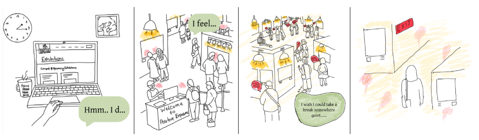
a negative experience at a gallery. Illustrations by Anika Mujamder.
This scenario was constructed from the convergence of the lived experience accounts in our content analysis, the sensory barriers identified in academic research, and the gaps we directly observed during our visit to Positive Exposure. It gave our team a shared, concrete reference point throughout the design process.
From this scenario we built the user journey map tracing six stages, from anticipation to aftermath, and mapped pain points and design opportunities at each stage (Figure 5). This exercise made visible something the the research had implied but not made explicit: the barriers were distributed across the entire experience of a visit, not concentrated in a single moment.
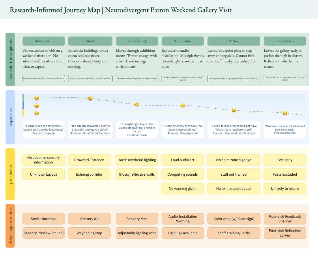
gallery on a weekend afternoon, from anticipation through aftermath.
Pain points and design opportunities mapped at each stage. Created by team.
A Kit for The Whole Journey
A kit that follows the visit, not just the space.
Drawing on my background in Interior Architecture where environments are understood as sequences rather than static objects. I proposed that our team design not a single artifact, but a coordinated package, a kit that a neurodivergent visitor could use across the full arc of their visit. A gallery visit is a spatial journey, and the design response needed to match that.
We named the package “Visit Ready – A Sensory Access Guide to Positive Exposure Gallery”. It consists of four components, each designed to address a specific cluster of barriers identified in our research:
- Social Narrative: (online and hard copy available at the gallery). A step-by-step illustrated guide covering arrival, what to expect inside, what to do if overwhelmed, and how to leave. This component responds directly to the research finding that unpredictability, not sensory intensity alone, is a primary trigger. It is grounded in the Social Story framework and modeled after existing institutional precedents at the Guggenheim and MoMA. Available as a pre-visit download and as a printed booklet at the front desk.
- Sensory Map: (my primary design contribution, described below). A color-coded floor plan of the gallery that allows visitors to understand the sensory intensity of each space before entering it. Directly addresses the absence of spatial orientation and the unpredictability of gallery layouts identified in our journey map.
- Sensory Kit: (available at the front desk) A lending kit including noise-canceling headphones, tinted glasses, and fidget tools, accompanied by a card explaining what is available and where the calm/silent zone is located. Responds to the finding that neurodivergent visitors currently must arrive fully self-equipped, with no institutional support.
- Staff Training Card: A laminated card used as quick reference for gallery staff covering signs of sensory distress, how to respond calmly, and suggested phrases to use. Addresses the gap identified both in our field visit and in the scenario: staff were present but unprepared to recognize or respond to distress.
Reading the Room – Literally
[Note: This section describes my individual design contribution in depth]
The sensory map was my central design deliverable, and it was where my background in Interior Architecture became directly applicable to a UX problem.
Reading a floor plan is not an intuitive skill for most people. My training taught me to think about how spatial information is communicated, what a plan needs to convey, and how to make that legible to someone who isn’t spatially trained. For a neurodivergent visitor, spatial clarity isn’t just convenient; it’s a precondition for reducing anxiety. Knowing what a space will feel like before entering it is itself a form of accessibility accommodation.
The map represents the gallery as a single large space, its actual footprint, subdivided into zones. Each is color-coded by sensory intensity.
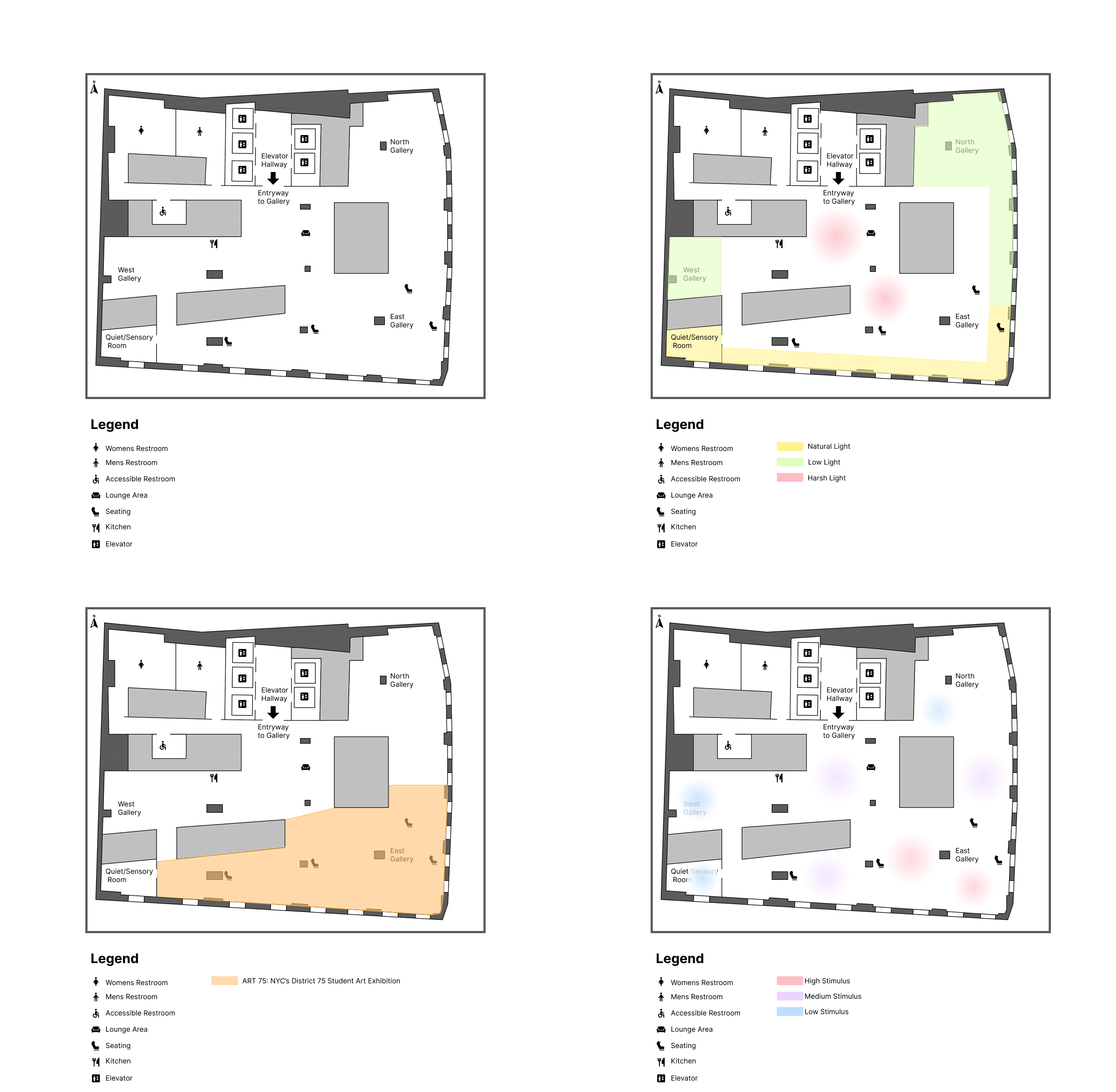
The key design decision was to prioritize legibility over completeness. I deliberately excluded room labels, artwork titles and curatorial information that a standard gallery map would include. This map has one job: to help a visitor understand, before they enter the space, what their sensory experience is likely to be.
Validating Our Ideas
We presented the package as a Design Progress Gallery walkthrough, displaying the physical board alongside all four deliverable components, the feedback from our classmates and instructor was focused and useful.
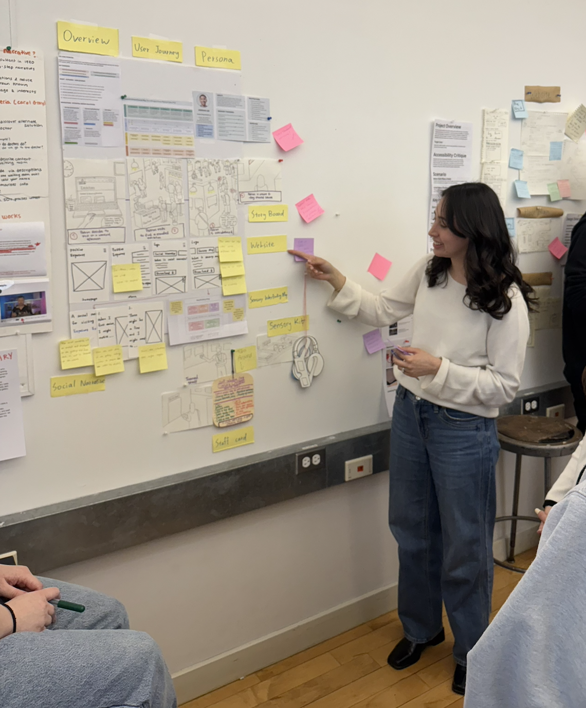
The most consistent piece of feedback centered on how to package and distribute the four components. Specifically, how a visitor would actually encounter this kit in the real world. We were pushed to think beyond the individual artifacts and consider the full delivery experience: would someone receive all four pieces at once when they visit the galley? How could they access them before arriving? The feedback pointed toward a dual-channel distribution model. A physical version available at the gallery entrance and a digital version available on the Positive Exposure website to view ahead of the visit, This shifted our thinking from “what are we designing” to “how does someone actually get access to this”, which is, ultimately, the more important design question.
Unfinished, On Purpose
Looking back on this project, the most significant design lesson for me was about the relationship between research and constraint. The pivot from “sensory overload is directly related to too much input” to “unpredictability is a major causality to sensory overload”. The confirmation of our solution direction happened because we showed up to the gallery unannounced and asked to talk to someone.
The sensory map, in particular, is a design I’m proud of because it reflects a genuine application of spatial thinking to a UX problem. It isn’t a digital wireframe, it’s a printed artifact with a physical location in the world. Designing it required me to think about how someone holds a piece of paper, how quickly they can orient themselves on a floor plan, and what they need to know when they are already feeling overwhelmed. That’s a different problem from designing a screen, and it was a good reminder that UX encompasses a much wider range of artifacts than solely digital interfaces.
If we were to continue:
- User testing with actual neurodivergent visitors, ideally in partnership with a District 75 class or a community organization
- Iteration on the social narrative based on feedback from autistic self-advocates, who have noted that Social Stories can sometimes feel patronizing if not written in the right register.
- Digital integration: working with Positive Exposure’s web team to embed the package under their “Plan Your Visit” page, with version-specific downloads and an accessible.
- Staff training workshop using the card as a starting point, not an endpoint, the card is a prompt, not a substitute for actual training
The gap between our ambitious scope and what we could responsibly design in a semester was real. But the framework we built, a full-package approach that addresses the visit before, during, and after, gives a genuine foundation for that future work.
References
Choi, H. L., Lazerwitz, M. C., Powers, R., et al. (2025). A neural substrate for sensory over-responsivity defined by exogenous and endogenous brain systems. Journal of Neurodevelopmental Disorders, 17, 68. https://doi.org/10.1186/s11689-025-09
emhahee [@emhahee]. (2023, May 29). [Video]. TikTok. https://www.tiktok.com/@emhahee/video/7238350544249621802
Kelly, O. [Orion Kelly – That Autistic Guy]. (2025, August 17). Change is hard! How social stories help autistic people [Video]. YouTube. https://www.youtube.com/watch?v=5ZmVALDFM3w
Morton, K. (2018). What is sensory processing disorder? [Video]. YouTube. https://youtu.be/baO9vLlHh5s
owlibee [@owlibee]. (2025, May 3). [Video]. TikTok. https://www.tiktok.com/@owlibee/video/7499996678871665962
thoughts_by_elle [@thoughts_by_elle]. (2024, June 14). [Video]. TikTok. https://www.tiktok.com/@thoughts_by_elle/video/7380722292692765985
Wada, M., Hayashi, K., Seino, K., Ishii, N., Nawa, T., & Nishimaki, K. (2023). Qualitative and quantitative analysis of self-reported sensory issues in individuals with neurodevelopmental disorders. Frontiers in Psychiatry, 14, 1077542.
The Metropolitan Museum of Art. (n.d.). Resources for visitors on the autism spectrum. https://www.metmuseum.org/events/programs/access/visitors-with-developmental-and-learning-disabilities/for-visitors-with-autism-spectrum-disorders
The Museum of Modern Art. (n.d.). Accessibility: Social access guide. https://www.moma.org/visit/accessibility/
Solomon R. Guggenheim Museum. (2023, October 30). Visiting the Guggenheim: A social narrative for visiting the museum [PDF]. https://www.guggenheim.org/wp-content/uploads/2023/10/guggenheim-for-all-social-narrative-in-person-visits-20231030.pdf
Stimpunks Foundation. (n.d.). Neurodivergent. Retrieved May 16, 2026, from https://stimpunks.org/glossary/neurodivergent/