Team: Yash Wake, Ammara Fatima, Yu Ting Chiang, Carlos Soriano, Robert Rivera.
Client: Wikimedia Foundation
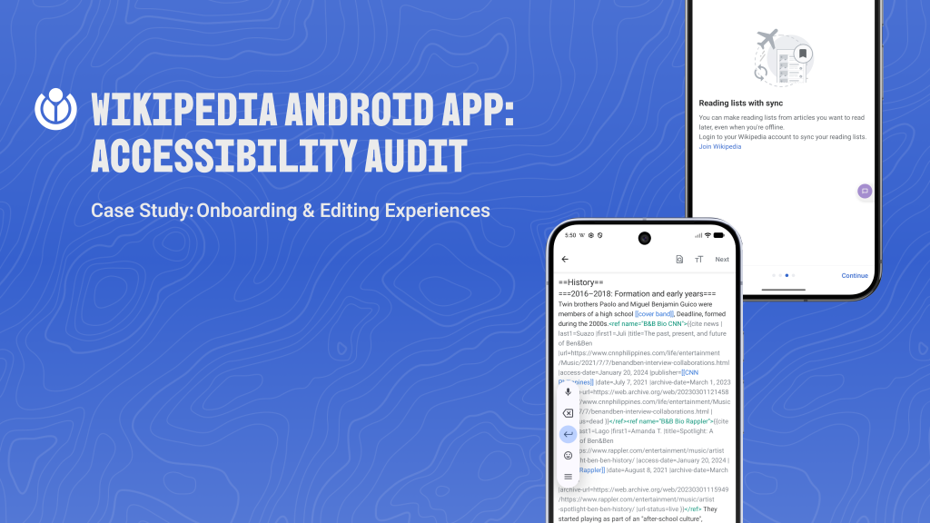
Platform: Wikipedia (Android App)
01. The Problem
Wikipedia is one of the most visited websites in the world. For billions of people it is the first place they go to answer a question, understand something new, or verify a fact. The Wikimedia Foundation’s mission is to give every person free access to the sum of all human knowledge. That mission sounds straightforward until you ask: what does free access actually mean for someone who cannot see a screen clearly, cannot control a touchscreen precisely, or navigates the app through a keyboard and a screen reader?
The Wikipedia Android app had never been formally evaluated against WCAG standards. No one had sat down with two assistive technology users, traced their journey from the first onboarding screen through the act of actually editing an article, and asked: does this work? That is the question this project was built around.
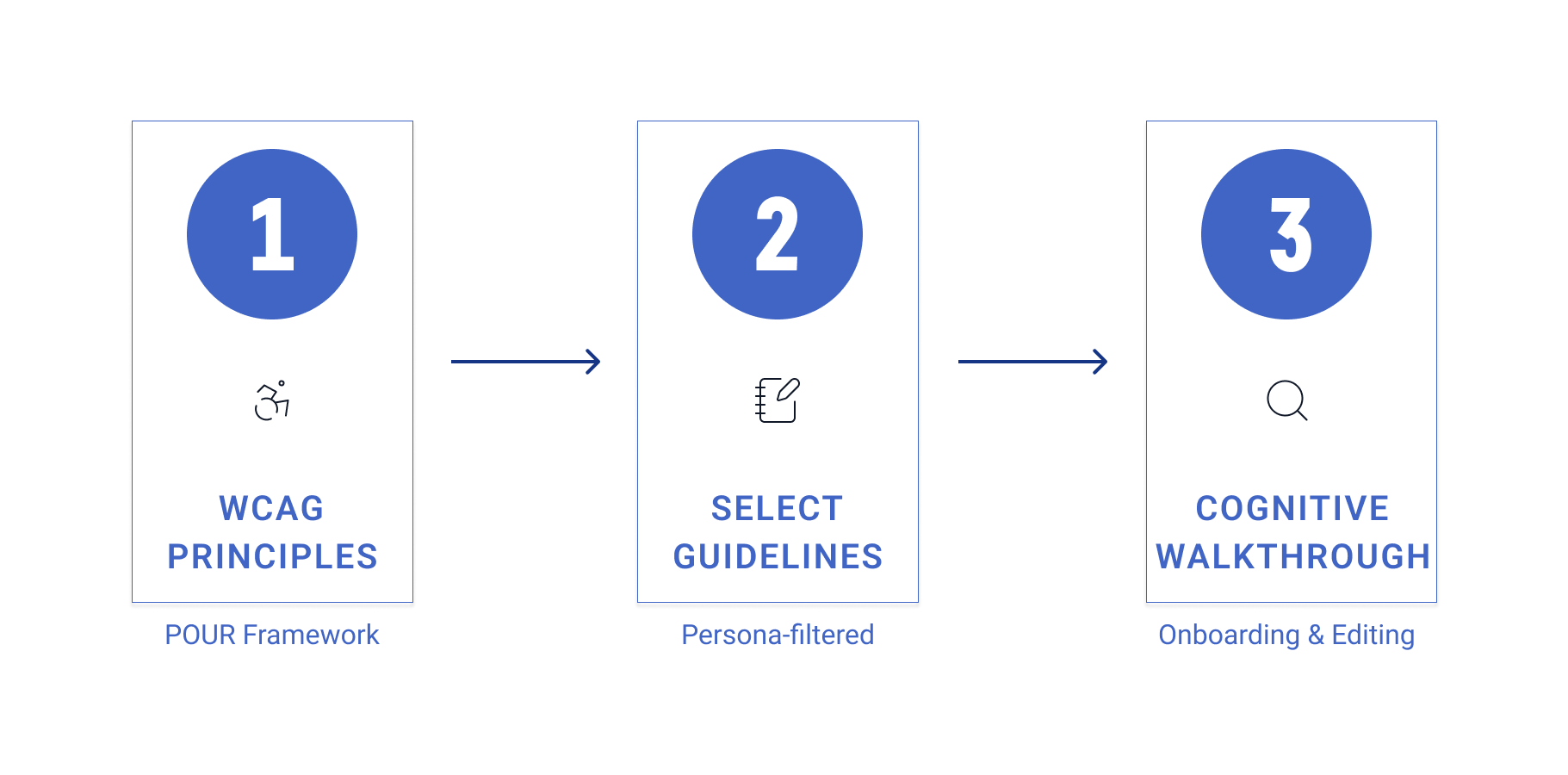
A team of five, including myself, conducted a (WCAG) 2.1/2.2 Level AA cognitive walkthrough of the Wikipedia Android app. We focused on two flows that represent the full user lifecycle of the product: onboarding, the experience a new user has when they first open the app, and editing, the experience of contributing knowledge back to Wikipedia. We tested both through the lens of two user personas representing the most underserved groups.
02. My Role
Within the team, I contributed in two ways. First, I led the secondary research into hearing disability, investigating how users who are Deaf or hard of hearing interact with Android apps, what barriers they face, and how those barriers map to WCAG guidelines. That research informed the broader picture of our personas and shaped the guidelines we prioritized.
Second, I worked on the Operable principle for both personas. This meant conducting the keyboard navigation audit, the TalkBack focus order audit, and evaluating all 13 WCAG success criteria under sections 2.1 through 2.5 across both the onboarding and editing flows. I ran every test on a physical Android device, documented findings, and wrote the evaluation entries for both Maya (Persona 1) and Brandon (Persona 2) in our shared evaluation spreadsheet.
The Operable principle is the most directly physical of the four POUR principles. It asks whether a user can actually navigate and interact with the interface, regardless of how they are controlling their device. For our personas, this was the principle most likely to surface critical failures, and it did.
03. The Research
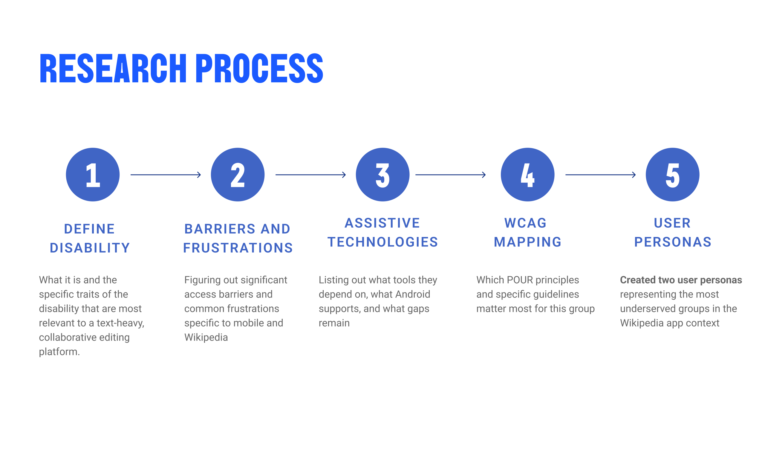
Before anyone touched the app, each team member independently researched a different disability category. The goal was not to produce a literature review but to answer one question: what does using a Wikipedia-like app actually feel like for someone with this disability, and what does the design need to get right?
Each research area followed the same structure: we defined the disability and its spectrum, mapped the specific barriers users face on mobile interfaces, catalogued what assistive technologies they rely on, identified where Android’s built-in accessibility features help and where they fall short, and matched everything to the WCAG principles most directly relevant to that group.
What we found
- Visual: 85% of visually impaired users have some remaining vision. Accessibility cannot be designed for a single case. The spectrum runs from total blindness requiring TalkBack, to color blindness requiring more than color alone to convey information, to low vision requiring scalable text and high contrast. The app needs to serve all of them.
- Hearing: I researched this one. Over 1.5 billion people globally live with some degree of hearing loss, but only 6% use dedicated assistive technology. Most Deaf and hard-of-hearing users rely on system-level workarounds: Android’s Live Caption, vibration alerts, or simply avoiding audio content entirely. The biggest gaps on Wikipedia were audio-only notifications, uncaptioned media, and the visual design of status messages after editing actions.
- Motor & Mobility: The most common disability category, affecting 1 in 7 U.S. adults. For Wikipedia, this translates directly to keyboard access. Users with motor impairments may rely on external keyboards, switch access, or voice control. If keyboard navigation fails, the app fails them. This is why the Operable principle was the highest-priority section of the audit.
- Cognitive: 13.9% of U.S. adults report serious difficulty concentrating, remembering, or making decisions. On a platform like Wikipedia, which is inherently text-heavy and structurally complex, cognitive accessibility is about reducing load, not just labeling elements. Clear headings, predictable navigation, and plain error messages are not enhancements; they are access requirements.
- Speech: Android lacks native support for atypical speech patterns. Users with dysarthria or stuttering cannot rely on voice input tools because automatic speech recognition systems are not trained on their patterns. For Wikipedia, which does not require voice input, this was a lower direct risk, but it informed how we thought about form interactions and authentication flows.
From Research to Personas
We synthesized our research as a group and identified two recurring user profiles that represented the most meaningful intersection of disability types and Wikipedia use cases. Both personas became the testing lens through which every WCAG criterion was evaluated.
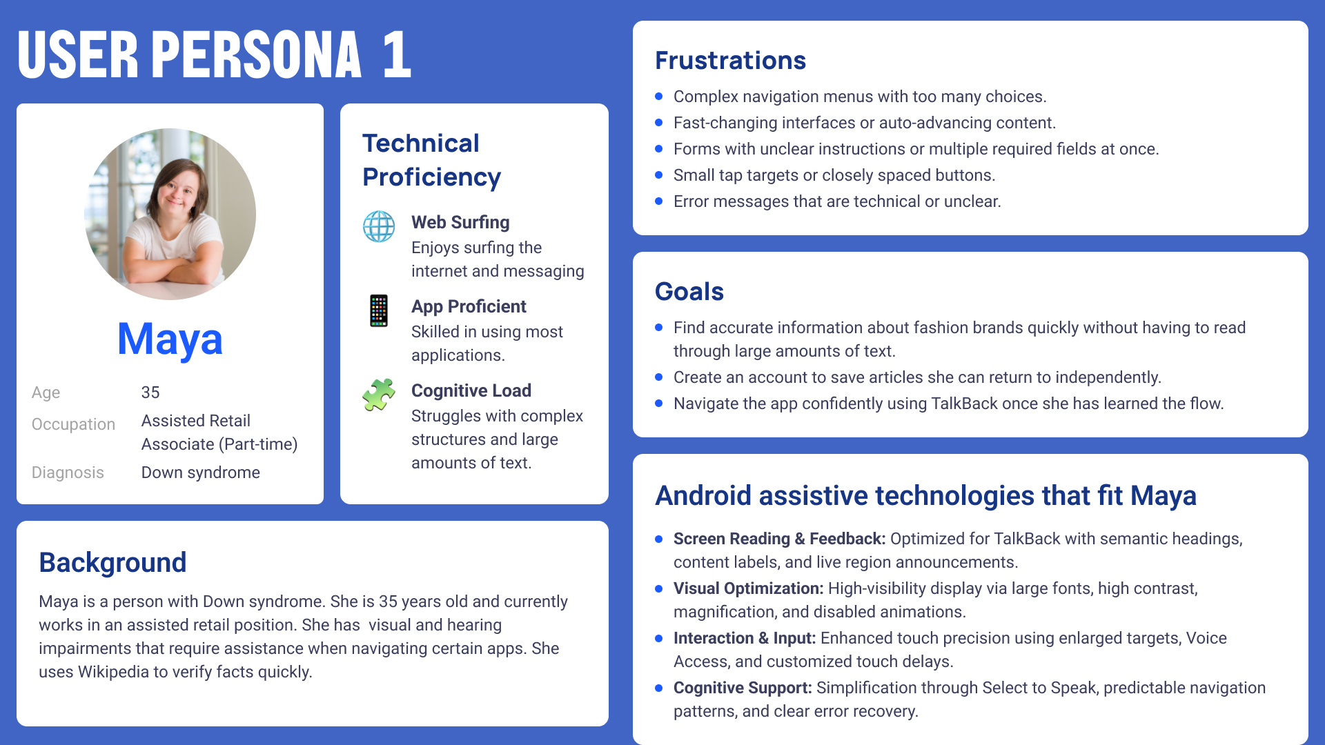
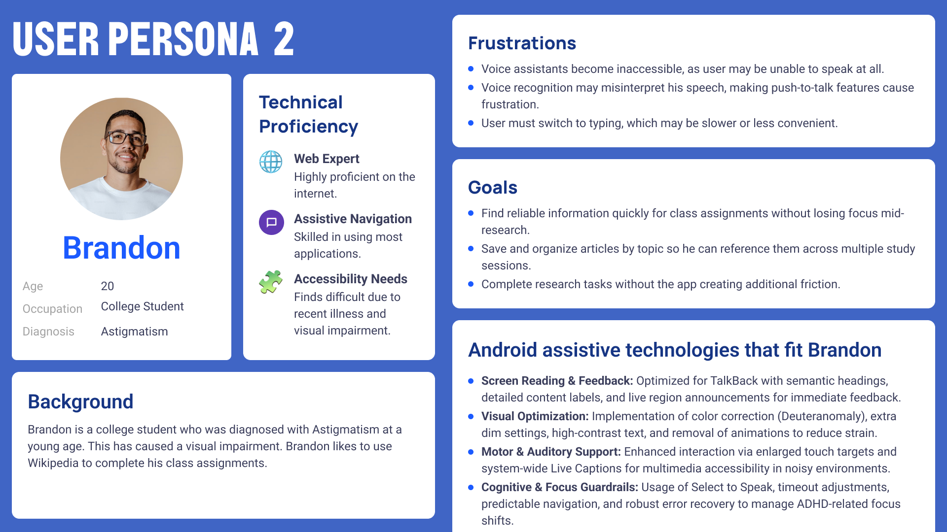
04. The Personas
05. The Evaluation
I tested the Wikipedia Android app against all Operable WCAG criteria using two methods in parallel. For keyboard navigation criteria (2.1.1, 2.1.2, 2.4.7), I connected a physical Bluetooth keyboard to the Android device and navigated both flows without touching the screen. For screen reader criteria (2.4.1 through 2.5.3), I enabled TalkBack and used swipe navigation, single-tap selection, and the TalkBack reading controls to move through every interactive element.
I tested both the onboarding flow (the four-screen welcome sequence through account creation) and the editing flow (navigating to an article, entering the editor, making a change, and attempting to save). I documented each criterion against both flows separately, recorded whether it passed or failed, and wrote persona-specific observations in the Other Comments column of our shared evaluation spreadsheet.
Android Accessibility Features
In addition to the WCAG audit, our team also evaluated which Android platform-level accessibility features were relevant to the two flows we tested. This was a separate workstream from the WCAG evaluation and was conducted across five feature categories.
- TalkBack: The primary screen reader for Android. The Wikipedia app performs well for TalkBack in structured screens such as onboarding and article reading. The editing experience, however, exposes significant gaps, particularly in screen context announcements, live region feedback after saves, and focus management within the editor. Custom action shortcuts for common editing tasks are absent, requiring users to navigate through many more gestures than a sighted user needs.
- Visual Features: Color inversion, high-contrast text, and motion reduction all functioned correctly with the app. The app did not override system accessibility display settings. One notable failure under maximum font sizes is that some headings were truncated with ellipses and bottom navigation text was cut off, suggesting the editing interface does not handle dynamic type gracefully at system scale.
- Motor Features: The Assistive Menu and Voice Access both worked well with the app. All onboarding and article navigation flows could be completed with Voice Access commands. The motor failure was concentrated in the editing experience, where the keyboard navigation breakdown directly blocked users relying on alternative input methods.
- Hearing Features: LED notifications and haptic feedback notified users when account creation and edit submission were completed. No audio-only notifications or alerts were observed. The app did not use sound as the sole channel for conveying information.
- Cognitive Features: The Undo and Redo controls in the editing toolbar directly support error recovery, and they are correctly labeled for TalkBack. The main cognitive failure was the absence of a structural navigation hierarchy in the editing experience. Users navigating with TalkBack must move linearly through raw article HTML to determine which section they are in, with no heading shortcuts available inside the editor.
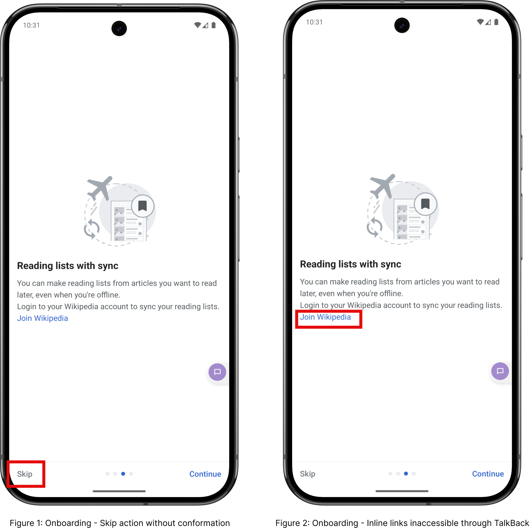
Onboarding Flow: Key Findings
- The onboarding flow is structurally sound. TalkBack follows the content in a logical, predictable order. All primary call-to-action buttons are correctly labeled and individually focusable. The Skip button provides a meaningful mechanism for bypassing repeated onboarding content, satisfying the Bypass Blocks criterion. There are no time limits and no animated content that cannot be dismissed. For the most part, a new user with TalkBack enabled can get through the onboarding flow independently.
- But there are two notable failures.
- The link accessibility. The third onboarding screen embeds the “Join Wikipedia,” “Terms of Use,” and “Privacy Policy” links inside a description paragraph. TalkBack reads the paragraph as a single text block rather than exposing each link as an individually focusable interactive element. For Maya, who may need to read the privacy policy before agreeing, or who wants to create an account directly from that screen, this is a meaningful barrier to independent access.
- The Pointer cancellation on the Skip action. When a user taps Skip, the onboarding dismisses immediately with no confirmation and no way to go back. For Maya, who may activate Skip accidentally due to touch imprecision, there is no recovery path. This is a direct failure of 2.5.2.
Editing Experience: Key Findings
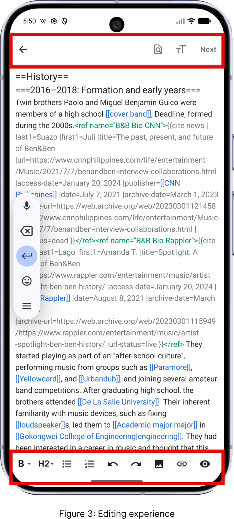
- The editing experience is where the audit’s most critical failure lives. Once a user activates the Edit button and the editor opens, pressing Tab on a connected keyboard produces no response at all. No element receives focus. The rich text formatting toolbar at the bottom of the screen, the search button at the top, the save/Next button, all of them are completely unreachable via keyboard navigation. A keyboard-only user cannot format text, cannot save, cannot exit cleanly. The entire act of editing Wikipedia is inaccessible.
- This is not a partial failure. It is a complete breakdown of the keyboard interaction model at the point where the app’s core purpose requires it most. For Maya, who may rely on keyboard input as a fallback when motor precision makes touchscreen use difficult, editing is simply not possible. For Brandon, who relies on keyboard navigation for efficient interaction during study sessions, this is a session-ending barrier.
- Related to this, keyboard focus becomes trapped inside the editable HTML text area. If a user does manage to get focus into the editor body, they cannot Tab out of it to reach formatting or navigation controls. This is a separate failure under 2.1.2 No Keyboard Trap, and it compounds the 2.1.1 failure.
- There are genuine strengths in the editing experience. TalkBack correctly announces toolbar icon labels with descriptive and accurate names. The confirmation dialog that appears when a user attempts to exit with unsaved changes is well-implemented and works correctly with TalkBack. Labels and control states including disabled states are announced accurately. These are not accidental wins; they reflect that the app was built with some accessibility intent. The gaps are specific and fixable.
06. Summary of Findings
The table below summarizes all 13 Operable success criteria I evaluated, with pass/fail results for both the onboarding and editing flows.
| Criterion | What It Tests | Onboarding | Editing |
| 2.1.1 Keyboard (A) | All functionality operable by keyboard | PASS | FAIL |
| 2.1.2 No Keyboard Trap (A) | Focus never gets locked in a component | PASS | PASS |
| 2.2.1 Timing Adjustable (A) | Time limits can be extended or turned off | PASS | PASS |
| 2.2.2 Pause, Stop, Hide (A) | Moving/auto-updating content can be paused | N/A | N/A |
| 2.4.1 Bypass Blocks (A) | Mechanism to skip repeated content | PASS | FAIL |
| 2.4.2 Page Titled (A) | Screens have descriptive titles | PASS | FAIL |
| 2.4.3 Focus Order (A) | Focus follows logical, meaningful order | PASS | PASS |
| 2.4.4 Link Purpose (A) | Link text communicates destination/purpose | FAIL | PASS |
| 2.4.6 Headings & Labels (AA) | Headings and labels describe topic or purpose | FAIL | PASS |
| 2.4.7 Focus Visible (AA) | Keyboard focus indicator is visible | PASS | FAIL |
| 2.5.1 Pointer Gestures (A) | No multipoint or path-based gestures required | PASS | PASS |
| 2.5.2 Pointer Cancellation (A) | Actions can be cancelled or undone | FAIL | PASS |
| 2.5.3 Label in Name (A) | Accessible name contains visible text label | FAIL | PASS |
07. Recommendations
Onboarding
| Severity | Problem | Recommendation | Benefit |
| Tier 2 (Important) | Inline links (Join Wikipedia, Terms of Use, Privacy Policy) inside onboarding descriptions are not focusable via TalkBack or keyboard. Users cannot access them independently. | Convert embedded inline links to standalone accessible buttons or separate focusable link elements below the description text. Add explicit link roles and accessible names. | Maya and Brandon can independently access account creation and policy information using TalkBack or keyboard without requiring visual identification of the link. |
| Tier 3 (Enhancement) | The Skip action triggers immediately on tap with no confirmation dialog and no ability to undo onboarding dismissal. | Add a confirmation dialog before skipping onboarding, or provide a way to re-access onboarding from the app settings. | Prevents accidental onboarding loss for users with motor imprecision and gives Maya a recovery path if she activates Skip unintentionally. |
Editing
| Severity | Problem | Recommendation | Benefit |
| Tier 1 (Critical) | Once inside the editor, Tab navigation produces no response. The formatting toolbar, navigation controls, and save button are entirely unreachable via keyboard. | Implement full keyboard focus management within the editing interface so all toolbar buttons, navigation elements, and the text area are reachable via Tab and activatable via Enter. | Keyboard-only users can actually edit Wikipedia articles. This resolves the single most critical barrier to the app’s core function for both Maya and Brandon. |
| Tier 1 (Critical) | Keyboard focus becomes trapped inside the editable HTML text area, preventing access to save and formatting controls. | Add a Tab key escape route from the editor text area that moves focus to the toolbar or navigation bar, with a clear keyboard shortcut communicated to the user. | Restores full operability of the editing workflow for assistive technology users and removes the most severe navigation blocker in the app. |
| Tier 2 (Important) | There is no mechanism to skip the formatting toolbar and jump directly to the article text area in TalkBack. | Add a focusable shortcut at the top of the editing screen that moves TalkBack focus directly to the article text area, bypassing the toolbar icons. | Reduces navigation effort for TalkBack users who want to start editing directly without swiping through every toolbar button first. |
| Tier 2 (Important) | The editing screen does not announce a clear editing context when TalkBack users enter it. TalkBack begins reading article content immediately. | Set a descriptive screen title on the editing view that TalkBack announces on entry, such as ‘Editing: [Article Name].’ | Reduces disorientation for screen reader users by confirming they have successfully transitioned into the editing mode. |
08. Reflection
Before this project, I understood accessibility as a design principle. I knew the vocabulary, I had read about screen readers, and I could define WCAG. After running these tests, I understand it as something different: a measure of whether someone can actually participate.
The keyboard trap inside the Wikipedia editor stayed with me. It is not a subtle bug. It is a complete door closing at exactly the moment when a user has invested effort, navigated into the app, found an article, and decided to contribute. For Maya, who processes tasks at her own pace and relies on predictable interfaces to operate independently, that door closes before she can do the thing the app is fundamentally for. For Brandon, who is managing an illness and trying to stay productive on his coursework, it is one more unexpected friction in a day that already has too much of it.
I also found that researching hearing disability for this project changed how I read product decisions I used to take for granted. The fact that only 6% of U.S. adults with hearing difficulty use dedicated assistive technology does not mean the other 94% are managing fine. It means they have adapted, worked around systems not designed for them, or stopped using features entirely. That is not success. That is abandonment made invisible. The most useful thing I will carry out of this project is not a checklist of criteria. It is the habit of asking who is not in the room when we make a design decision, and what it costs them when we get it wrong.