Project Overview
The Student Medical Ethics Journal is a nonprofit, student-run academic journal with a rare ambition: to democratize medical ethics discourse across students, practitioners, and educators worldwide. They publish peer-reviewed articles, video seminars, and multimedia content — and they’d been growing.
But something wasn’t working. Users who arrived rarely stayed. Submissions were declining. And the site’s structure was quietly buckling under the weight of new content formats it was never designed to absorb.
When SMEJ came to our team, their brief was clear on the surface: rethink the information architecture, improve discoverability, and design a system scalable enough to grow with them for years. What we found underneath was more interesting — the site had been organized around how editors think, not how readers arrive.
The Problem
Users land with one purpose. They rarely find it and almost never discover anything new.
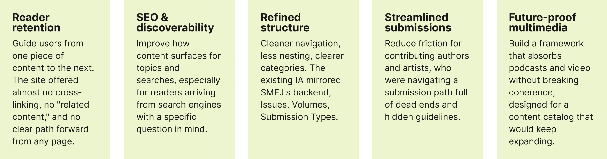
SMEJ came in with five goals: improve reader retention, boost SEO and discoverability, clarify the site structure, streamline contributions, and build a multimedia framework that wouldn’t collapse under the weight of podcasts and video seminars.
These weren’t five separate problems. They were symptoms of a single root cause: the site was organized around SMEJ’s internal taxonomy, not how readers actually think and browse.
Our Process
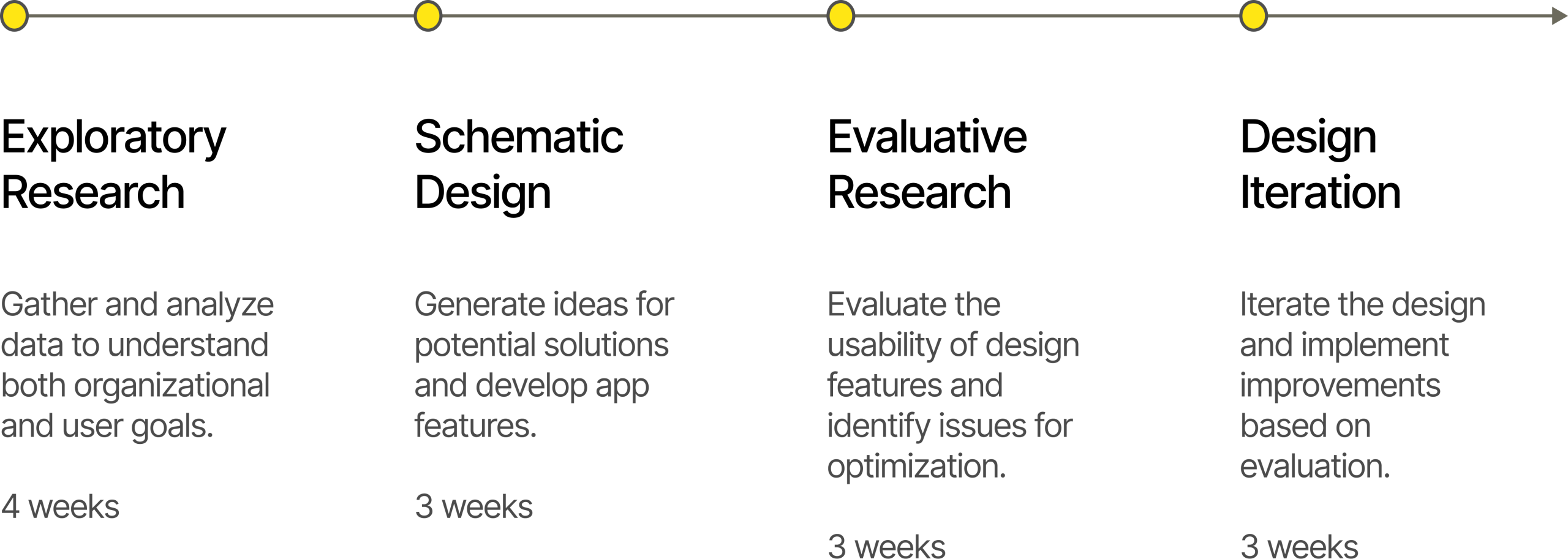
Research : Exploratory Phase
Our exploratory phase wasn’t linear. We ran five research streams simultaneously over four weeks, each answering a distinct question about the system, the audience, and the competitive landscape.
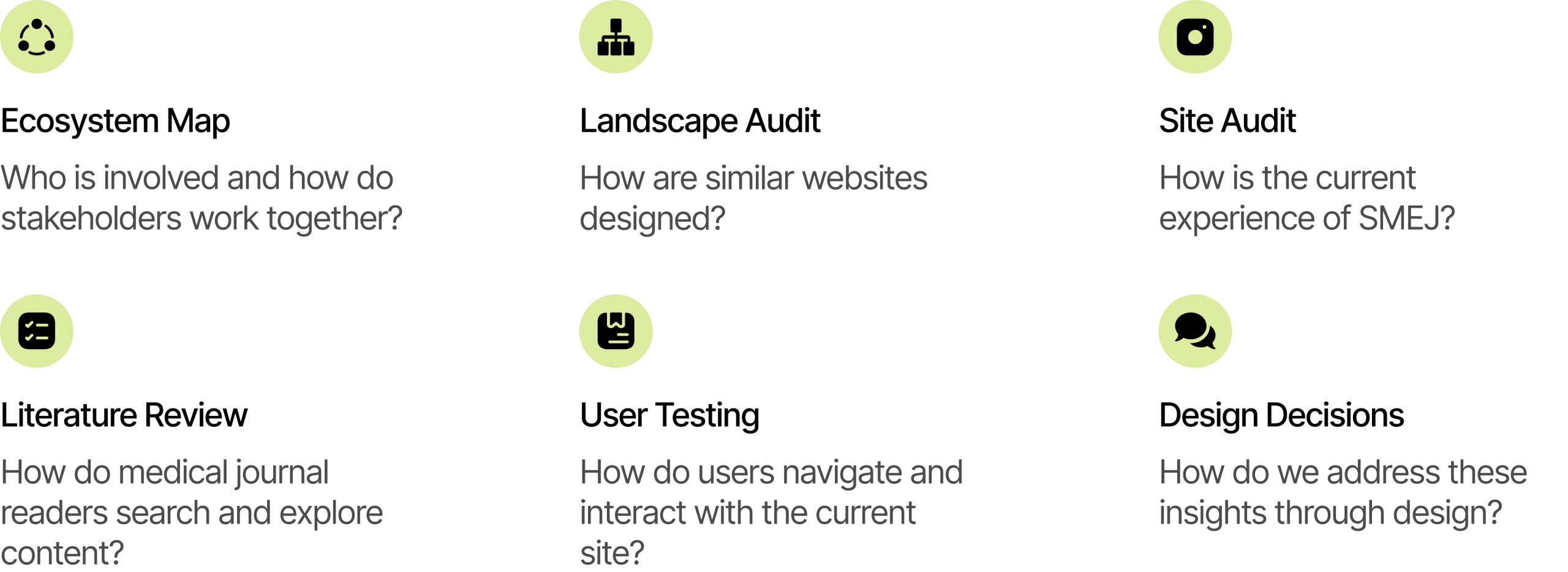
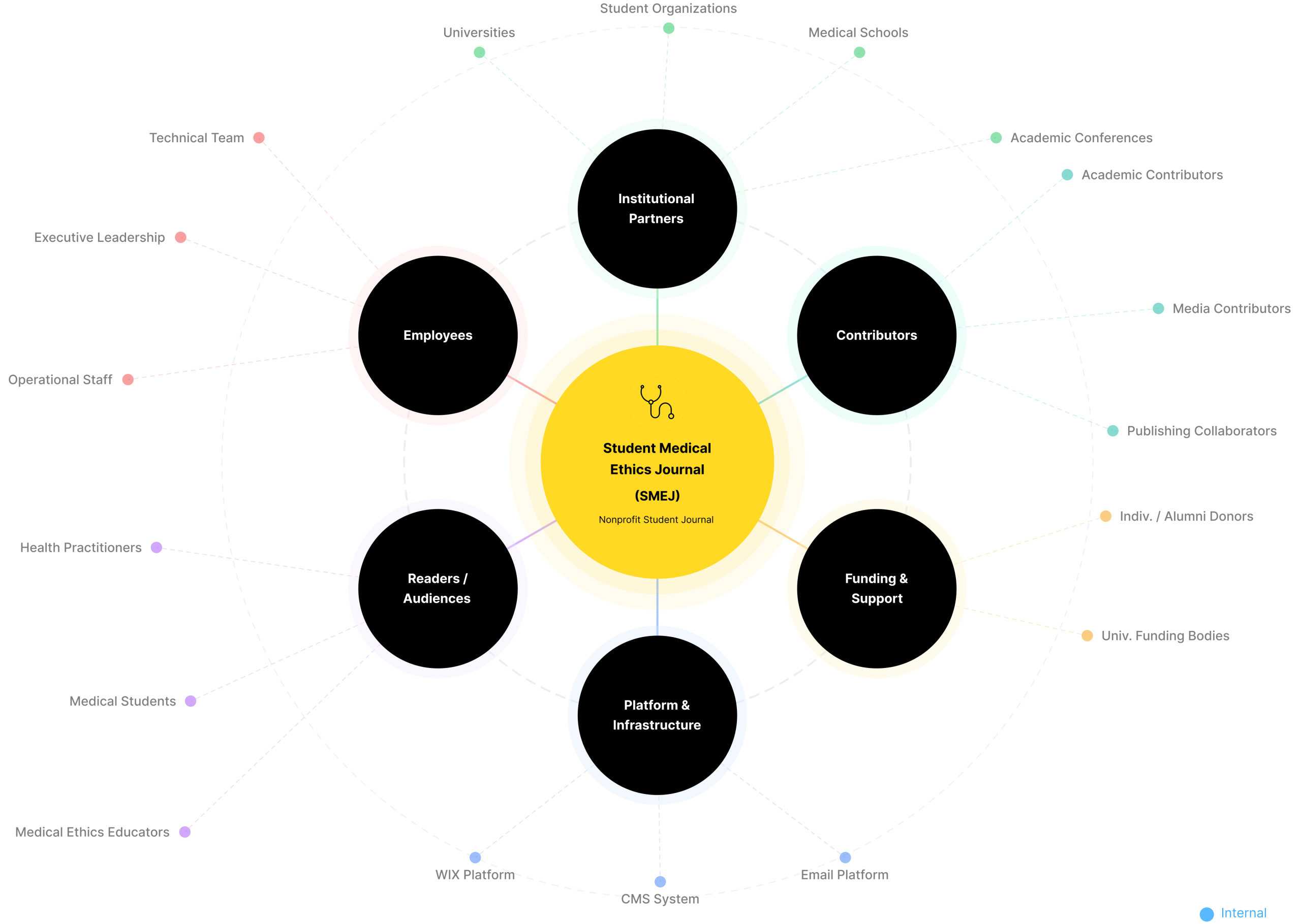
Ecosystem Map
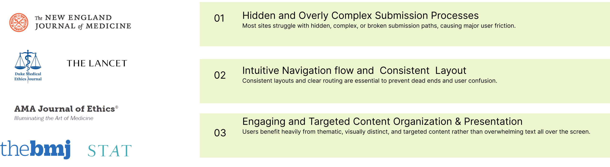
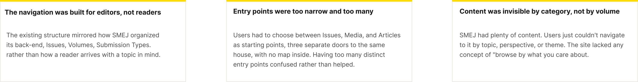
Landscape Audit: What It Revealed
Across comparable platforms, three patterns repeatedly caused user failure: hidden or broken submission paths, inconsistent navigation that created dead ends, and content presentation so dense it overwhelmed rather than invited. These weren’t edge cases — they were the norm.
Key Insights
Gathered insights from HE, Lit. Review, audits to inform our design objectives like improving discoverability & implementing search functions.
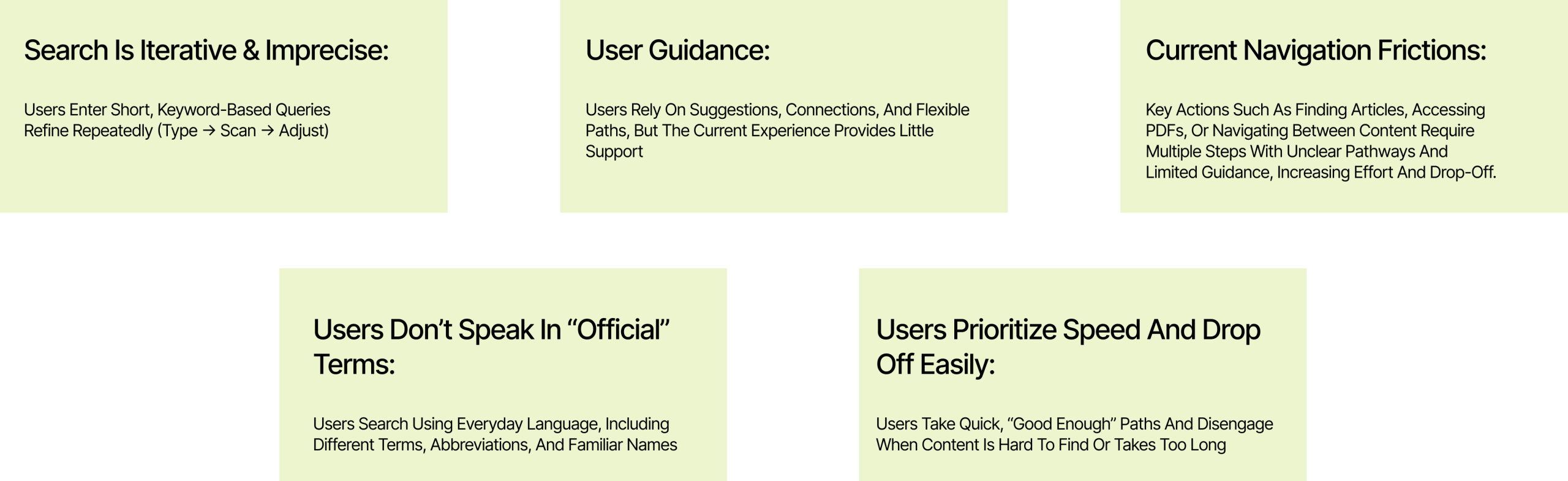
User Testing: Evaluative Research
We used the following two methods to conduct research on low-fidelity prototypes and our information architecture.
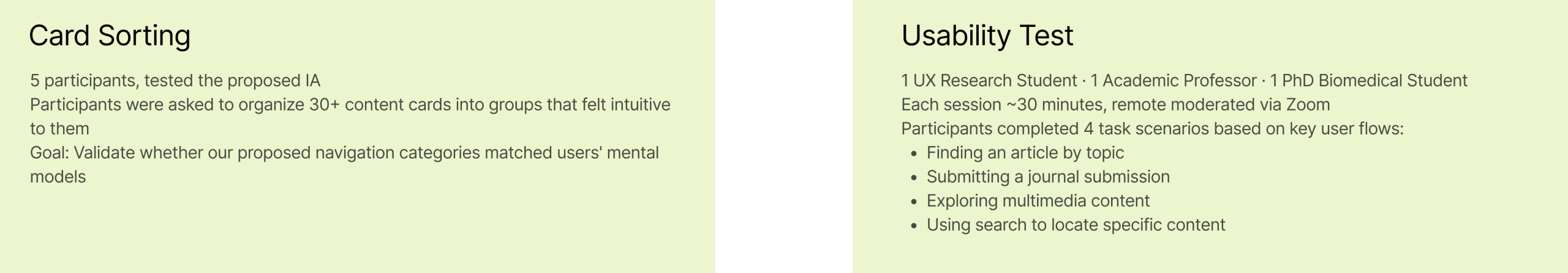

Key Insights
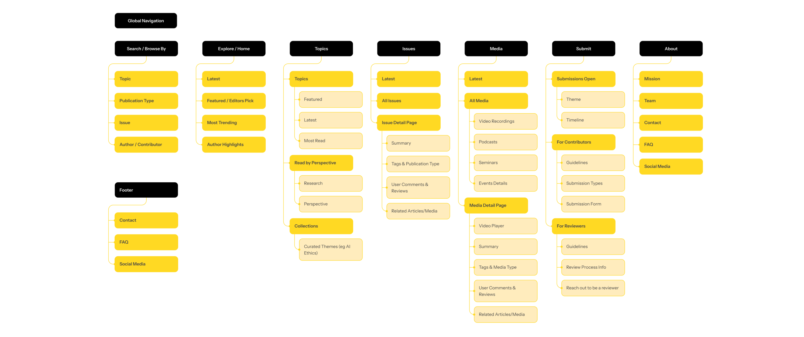
Site Map
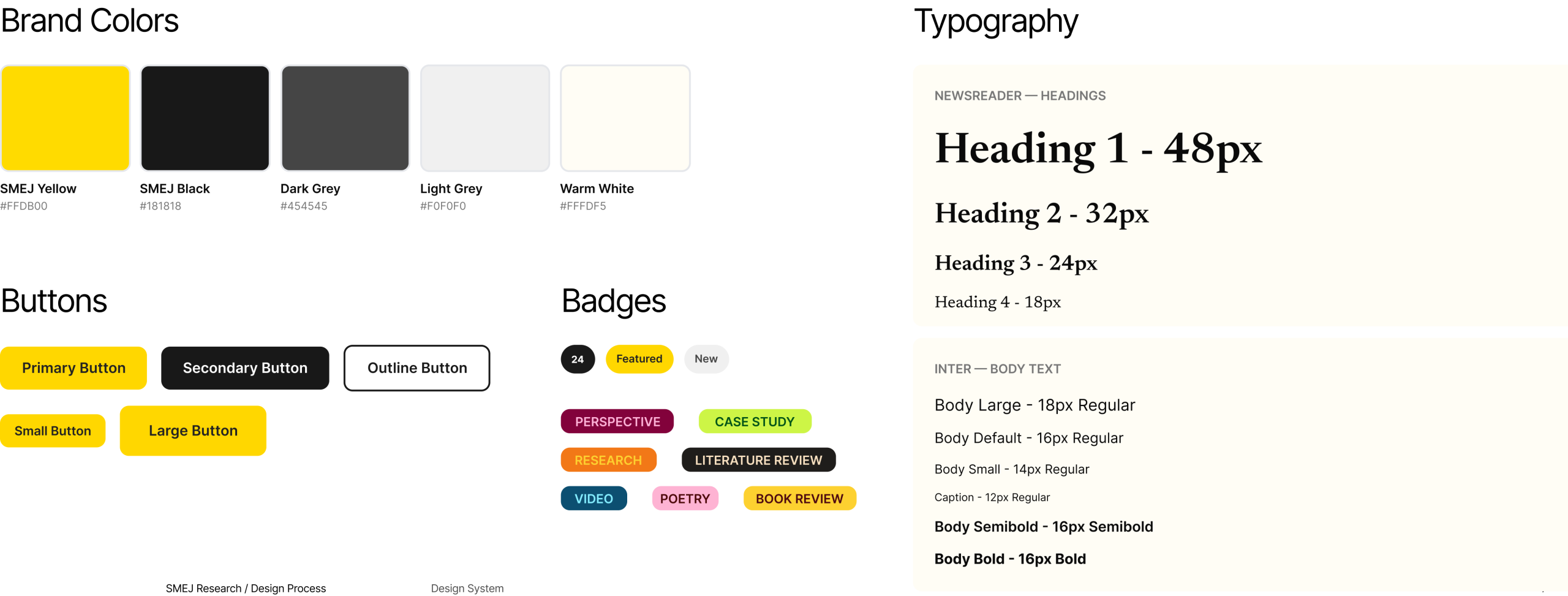
Design System
A comprehensive guide to the visual language, components, and design patterns used across the SMEJ platform.
Final Design Walkthrough
The final design covered six complete flows:
1. Homepage — Providing clearer entry points for content browsing
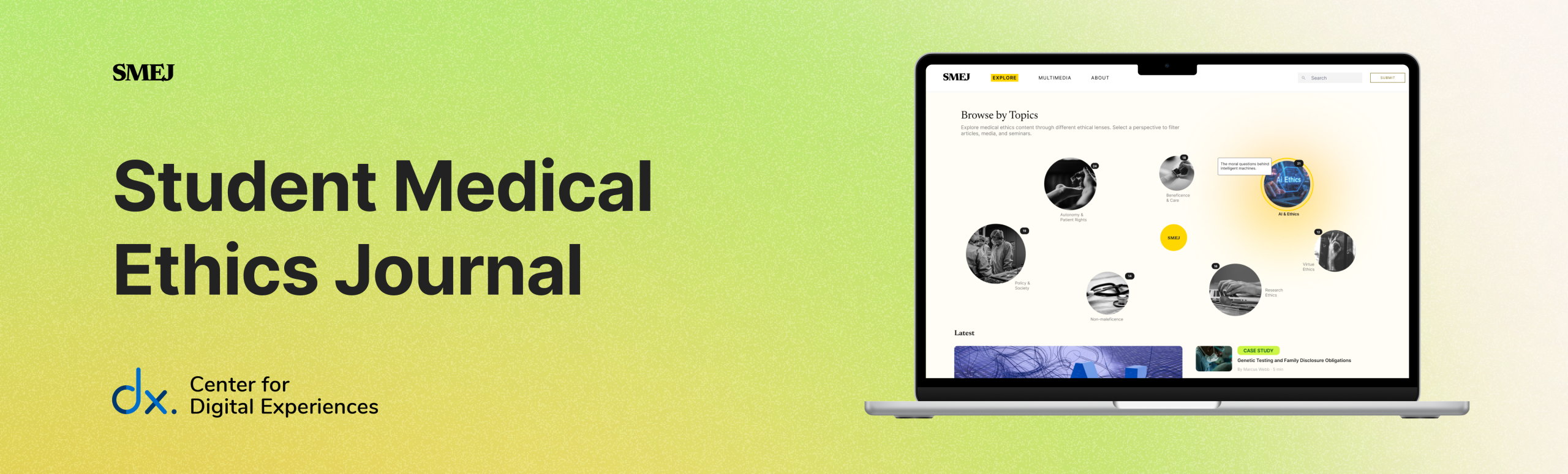
The homepage is redesigned to better support discovery, serving as a central hub for exploring content across the journal.
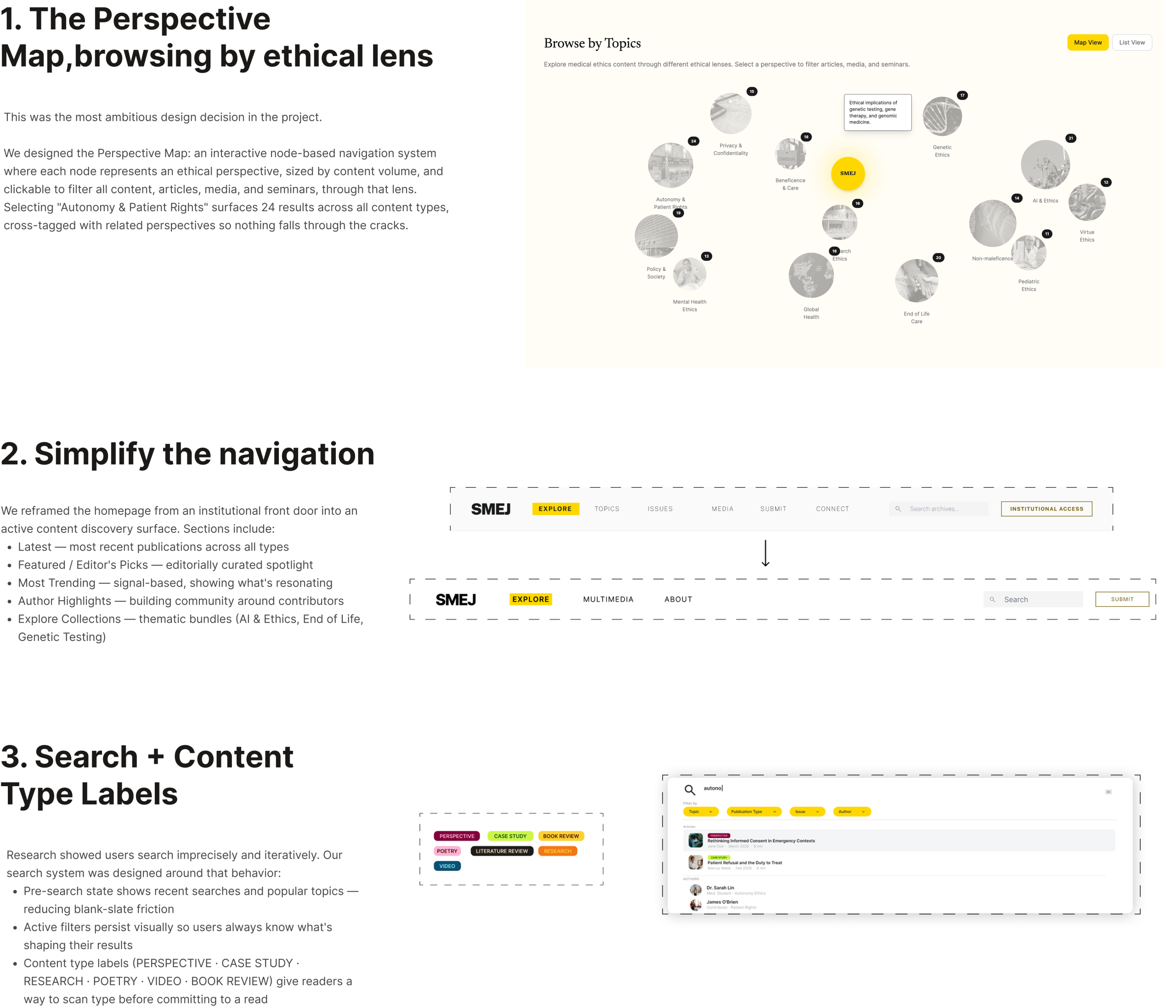
Perspective Map – Interactive Exploratory Tool
Introduced Perspective Map as an interactive exploration tool that helps users discover connections across topics & perspectives.
- Interactive Topic Bubbles
- “Explore Topic –>” CTA
- Map vs List Toggle View
2. Search Experience — Embedding content discovery throughout
A search bar was introduced to allow users to quickly find content by topic, keyword, or interest.
- Filter (Topic, Publication Type, Issue, Author)
- Recent Searches
- Article Preview
- Metadata-driven labels
3. Issue Exploration — Refining The Journal Structure
Designed to better highlight the SMEJ’s issues while reducing the overwhelming browsing experience present in the current site.
- Restructured Issue / Article Organization
- Filter (Topic, Publication Type, Author)
- Metadata-Driven Labels
- Download & Share Issue Feature
4. Multimedia — Introduce ‘Video Recordings’ and ‘Podcasts’ & Merging the existing Seminar section
Designed to expand the journal, creating a scalable system for richer forms of storytelling, engagement, and educational content.
- Multimedia Integration (Podcasts, Videos, Seminars)
- Dedicated Pages for Each Media Experience
- Discussion Sections
- Integrated Media & Articles
5. Submission — Simplifying The Contribution Path
Designed to reduce friction and create a clearer, more unified experience for both Contributors & Reviewers.
- “Submit” CTA in Navigation
- Floating Contributor Pop-Up
- Contributor / Reviewer Toggle
- Themes & Guidelines Pop-Up
- Clearer Content Hierarchy
6. About Page — Communicating SMEJ’s Mission & Community
Designed to better communicate the journal’s mission, credibility, and community through a more engaging and human-centered experience.
What’s Next:
Three areas scoped for future development
The redesign was always meant to be a foundation, not a finish line. We scoped three areas where the system is primed to grow.

What This Project Taught Us
The most durable lesson from this project is that organizational logic and user logic are almost never the same thing. SMEJ’s site wasn’t broken because of bad intentions, it was built by people close to the content, organized around categories that felt natural from the inside. The problem only became visible once we stood outside it.
That’s the practical argument for user research: not that the people building things are wrong, but that proximity creates blind spots. The participant who paused on ‘Issues’ wasn’t confused because they were unsophisticated, they were confused because the label was doing the wrong job.
The Perspective Map was the decision we’re most proud of because it came directly from listening. Academic readers navigate by ethical framework first, topic second. That’s not an assumption. It’s something people told us.