By: Uraiba Zafar, Mariel Go, Youlu Xu
Overview
Online clothing shopping is built around a sizing system that is both rigid and inconsistent. Standard size charts flatten bodies into measurements, “people like you” features oversimplify fit, and model imagery often reinforces narrow beauty standards. What should be a simple decision — choosing a size — can quickly become emotionally charged. Many shoppers enter the experience already expecting disappointment, uncertainty, or self-judgment.
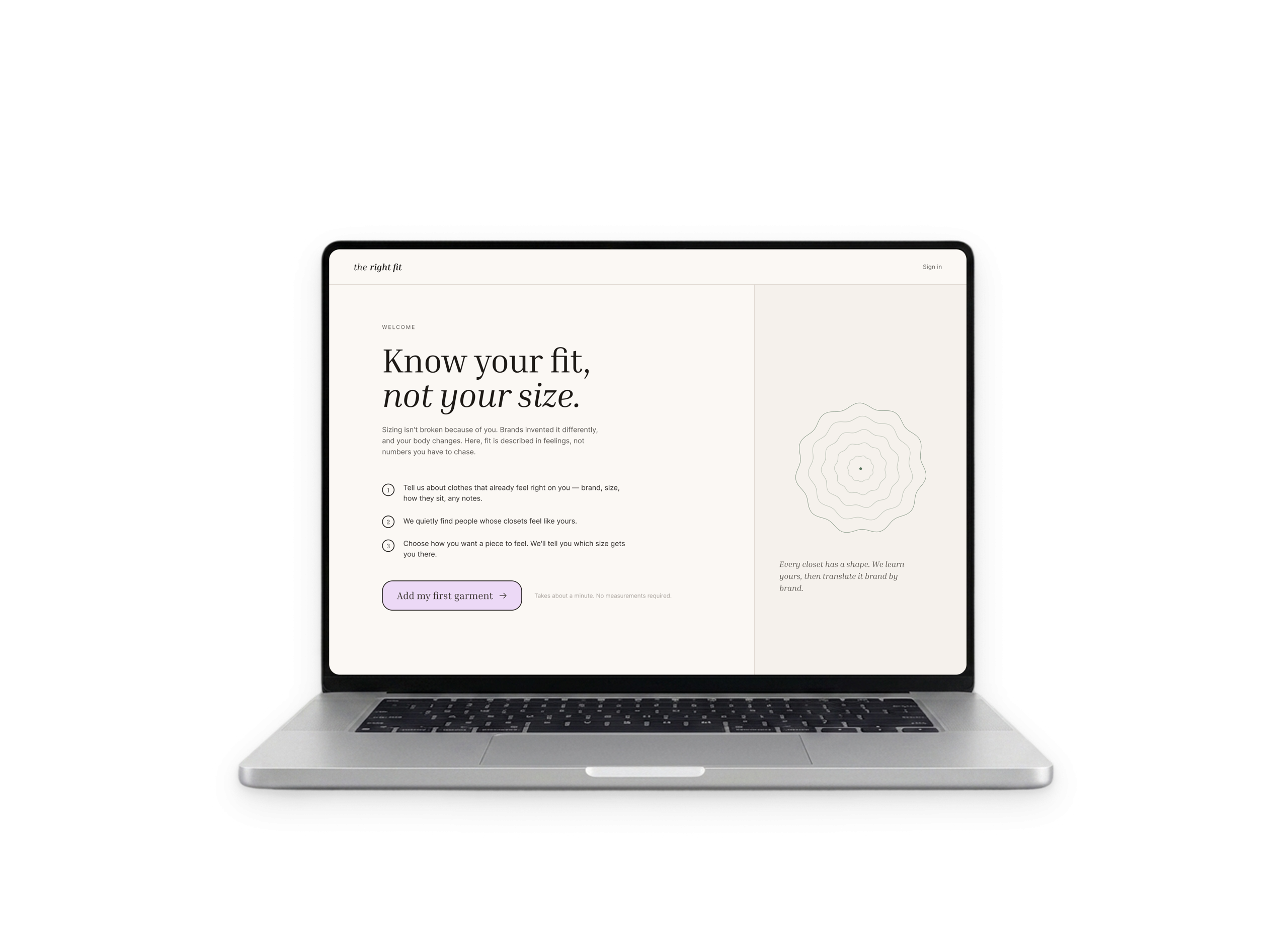
For our Emotional Design course, my team designed The Right Fit: a web app and browser extension that reframes sizing around fit preference rather than body evaluation. Instead of asking “What size are you?”, the system asks: “How should this garment fit you?”
The goal of the project was not just to improve sizing accuracy, but to reduce the emotional friction embedded in online shopping experiences. We wanted to explore how interface language, interaction patterns, and community-driven feedback systems could help users feel more confident, represented, and emotionally supported while shopping online.
My role focused on UX/UI design, emotional design strategy, research synthesis, interaction design, and visual iteration across both the web app and browser extension experience.
Context & Background
The project was grounded in emotional and inclusive design theory, particularly:
- Lisa Feldman Barrett’s Theory of Constructed Emotion, which argues that emotions are constructed through context and prior experiences rather than being purely instinctive.
- Kat Holmes’ Inclusive Design framework, which reframes exclusion as a design mismatch rather than a user failure.
- Don Norman’s emotional design principles, especially the visceral layer of design and how visual tone shapes emotional response.
These theories became central to the project because sizing is rarely just functional — it is deeply emotional. The interface itself participates in constructing feelings like shame, doubt, exclusion, or confidence.
Our guiding question became:
How might we remove self-judgment from the sizing experience and reduce unnecessary emotional friction in online shopping?
Research & Approach
Emotional Journey Mapping
We began by conducting six emotional journey mapping sessions where participants either reflected on a recent online shopping experience or walked through a live shopping flow while thinking aloud.
Rather than focusing purely on usability, we focused on emotional lows throughout the shopping process.
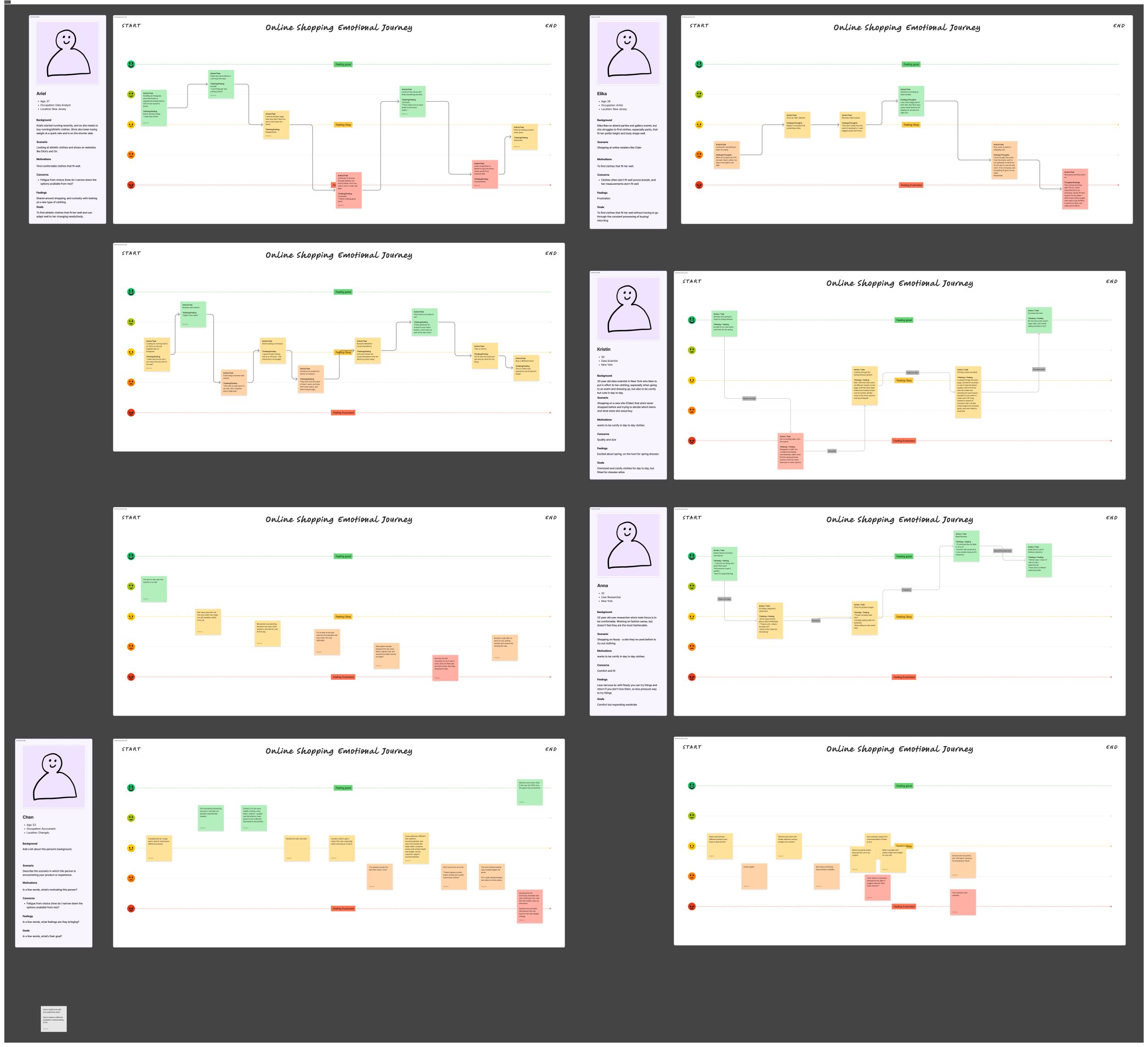
Key Findings
- Users distrusted size charts, model imagery, and AI sizing recommendations.
- Many relied on Reddit, reviews, or trial-and-error workarounds instead.
- Participants described online shopping as a “calculated gamble,” often lowering expectations before purchasing.
- Flexible return policies significantly reduced emotional stress and increased willingness to experiment.
Design Direction
- Use language that avoids blaming or evaluating the user
- Surface community experiences instead of rigid sizing rules
- Prioritize emotional reassurance alongside utility
- Increase transparency around fit consistency and return policies
Iteration 1
Reframing Sizing Around Feelings
Our first prototype introduced a web app and browser extension designed around the idea of fit preference instead of body measurement.
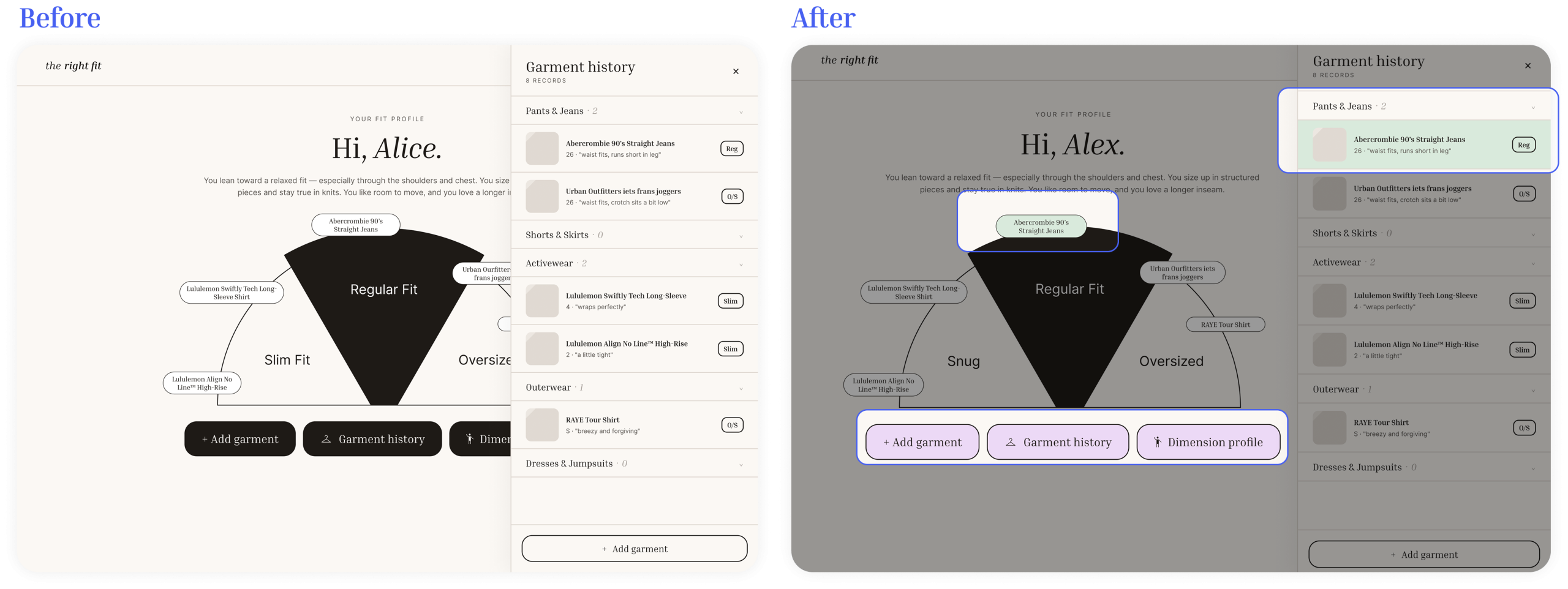
Users could build a personal “Fit Profile” by adding garments they already owned and describing how those garments felton their body using a fit meter ranging from slim to relaxed. Measurements and weight were intentionally excluded from the experience.
A key onboarding message stated:
“Sizing isn’t broken because of you. Brands invented it differently.”
This framing immediately shifted responsibility away from the user and toward the system itself.
Community-Based Recommendations
The browser extension surfaced:
- Personalized fit suggestions
- Community reviews from users with similar fit preferences
- Retailer transparency information
- Return policy visibility
- Fit consistency insights
This was directly inspired by participants already relying on Reddit threads and review sections as informal trust systems.
Instead of trying to replace those behaviors, we structured and personalized them.
Inclusive Persona Work
To ensure the project remained grounded in the experiences of users most affected by sizing systems, we created three inclusive personas representing different forms of exclusion in fashion retail.
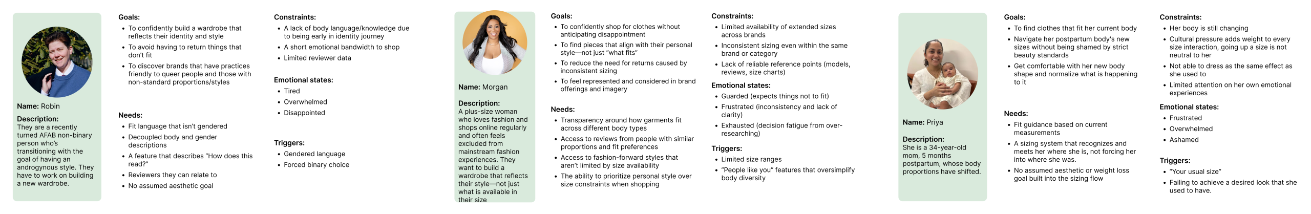
Robin — Nonbinary User
Robin represented users navigating fashion outside traditional gender binaries. Their frustrations centered around gendered sizing language, binary choices, and a lack of relatable representation.
This inspired us to:
- Add androgynous, masculine, and feminine style tags
- Remove gendered assumptions from fit language
- Surface inclusivity signals directly within retailer reviews
Morgan — Plus-Size Shopper
Morgan represented users exhausted by inconsistent sizing and exclusion from fashion-forward styles.
This reinforced the need for:
- Transparent fit reviews
- Community-driven fit context
- Style-first rather than size-first experiences
Priya — Postpartum User
Priya represented users whose bodies are actively changing and who feel emotionally tied to previous versions of themselves.
This directly informed one of our most important interaction changes:
- allowing users to edit and update garment history over time rather than treating fit data as fixed or permanent.
Cognitive Walkthrough & Iteration 2
After the first prototype and inclusive persona work, we conducted cognitive walkthroughs focused specifically on emotional responses rather than task completion. Participants narrated how they felt at each step of the experience.
Key Design Changes
1. Redesigning the Fit Meter Language
One participant pointed out that the word “slim” felt loaded and exclusionary. We changed the terminology to “snug” to describe the garment rather than imply an idealized body type.
This small language shift reinforced an important lesson:
Neutral wording can dramatically change the emotional tone of an experience.
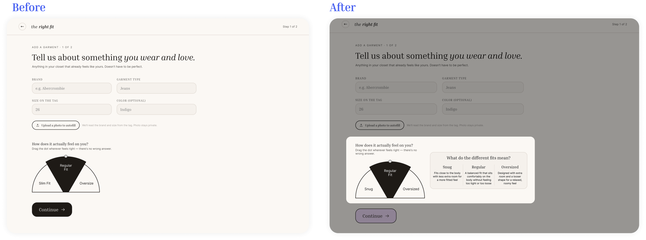
2. Increasing Emotional Warmth
The first version of the interface felt too clinical. Based on feedback, we introduced softer colors, green highlights, and lavender accents to create a warmer and more emotionally supportive visual system.
This directly connected to Norman’s visceral design layer — users emotionally interpret visual tone before they consciously process functionality.
3. Designing Around Intent, Not Assumption
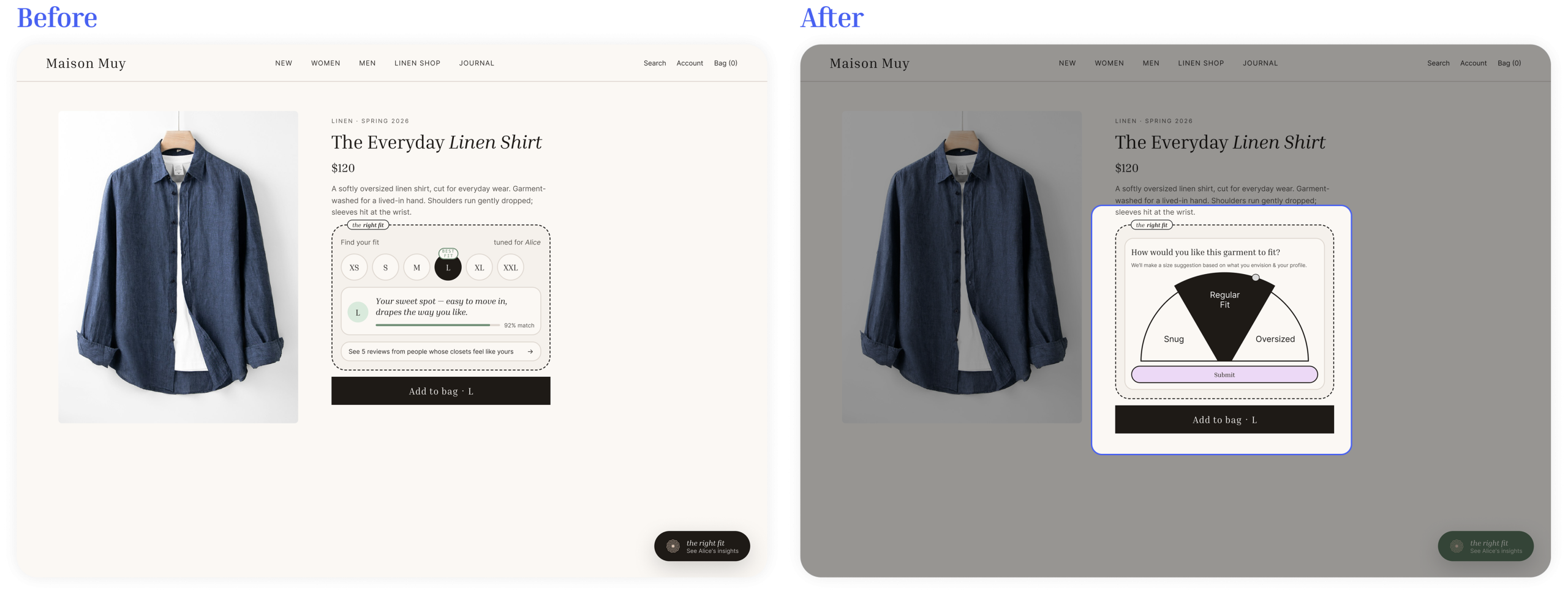
Originally, the browser extension generated recommendations automatically. During testing, participants wanted more control over how they wanted a garment to fit in that specific moment.
We redesigned the flow so users first selected their intended fit preference before recommendations appeared.
This made the system feel collaborative rather than prescriptive.
Final Design
The final prototype combined:
- A personalized Fit Profile system
- A browser extension integrated directly into shopping flows
- Intent-based fit recommendations
- Community-driven fit reviews
- Retailer transparency reports
- Inclusive fit and style language
- Editable garment history
- Emotionally supportive onboarding and visual design
The final experience reframed sizing as:
- flexible rather than absolute
- emotional rather than purely functional
- personal rather than standardized
Most importantly, it shifted the focus away from “fixing” the user and toward helping users better understand how garments fit them.
Reflection
This project fundamentally changed how I think about design.
Before this project, I often approached friction as something purely functional — a usability issue to optimize away. The Right Fit taught me that emotional friction can be just as important as interaction friction, especially in experiences tied to identity, self-perception, and vulnerability.
I also learned how much power small design decisions hold:
- a single word choice
- the placement of information
- whether a system asks or assumes
- whether an interface feels clinical or caring
Each decision subtly communicates who the product was designed for.
The project also reinforced the importance of inclusive design not as a checklist, but as an ongoing process of identifying mismatches between systems and real human experiences. Designing for emotional sensitivity means recognizing that users do not enter products as blank slates — they arrive carrying histories, anxieties, expectations, and previous harms.
Moving forward, this project has shaped my design philosophy around one core idea:
Good design is not only about helping users complete tasks — it is about helping people feel understood while doing them.