About Purrfect Match
Purrfect Match is a mobile application that aims to match users with pets that most match their lifestyle and needs. We decided to develop this product to help more pets not only find homes, but also to boost the number of successful adoptions. This application aims to specifically help elderly pets, pets that have more extensive medical needs, as well as boost shelter discovery for users in that particular area.
The Purrfect Project Overview
Project:
Purrfect Match
Timeline:
13 weeks
Goal:
To match pets with owners who most match their needs and boost the number of successful adoptions.
Audience:
Pet owners and animal lovers
Team:
Jasmin Rose Guerrera, Federico Sarno and Xin Jiang
Role:
UX Designer and Researcher
Tools:
Figma
The Problem: Matching Up the Adoption Playing Field
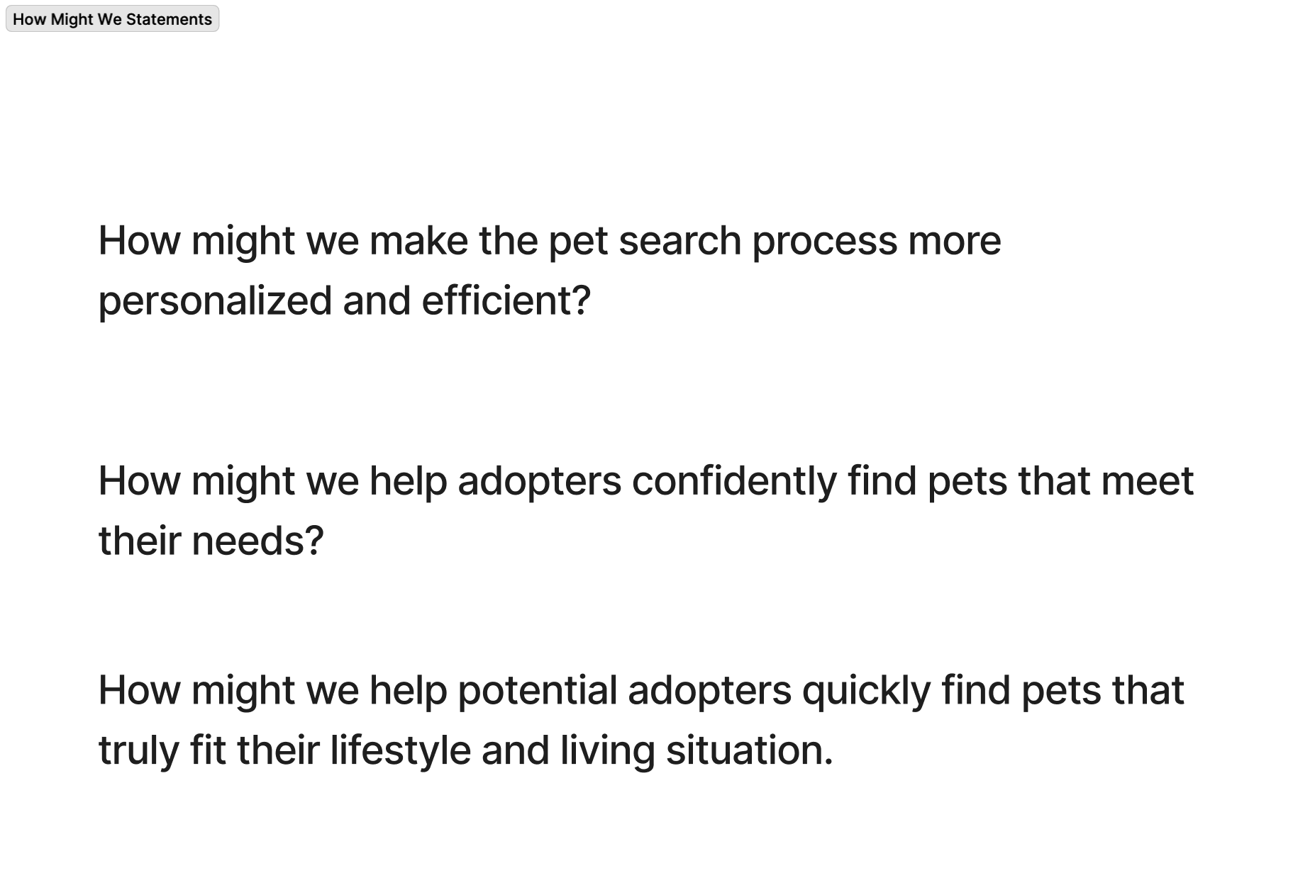
We began the project with an interest in helping elderly pets or pets that have trouble being adopted due to medical needs. We wanted to create an efficient system that not only helped pets and owners get matched but also allowed for a successful adoption long term. We went through multiple iterations of how we could structure our How might we statement. For instance, we debated whether it was more of a personalization tool or how we would match users’ personal needs. However, we chose to finalize our statement by centering our statement around users lifestyles due to housing, travel, or users current pets within the household being potential factors.
Our final “How Might We” statement:
How might we help potential adopters get matched with pets that are highly compatible with their needs and lifestyle?
The Process
Research: 6 Interviews, Affinity Mapping, Personas & a Final User Journey Map
6 Interviews: Shelter and Breeder Experiences from the USA, Canada and even Cuba
We conducted 6 interviews with users between the ages of 23 and 65 years old. We interviewed users who already owned pets and who had adopted from shelters before, as well as users who had never dealt with pets or shelters in their lifetime. Our range of interviewees was vast, from one interviewee having knowledge of breeders more than shelters, while another had experience adopting two dogs from a shelter in Cuba. We did this to get a wide range of perspectives about the adoption process.
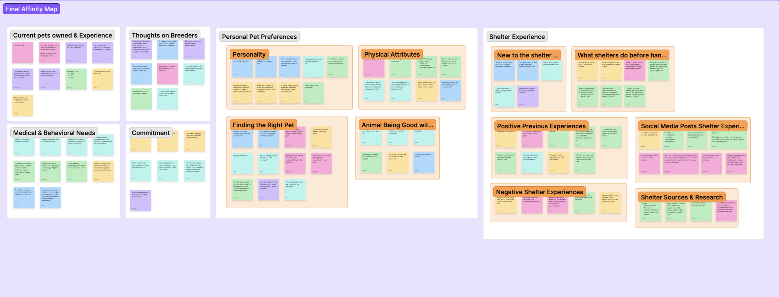
Affinity Mapping: Medical Transparency, Financial & Commitment Concerns
These interviews led to our affinity map. We split it into 6 main categories.
- Users Current Pet Experience
- Medical & Behavioral Needs
- Commitment
- Personal Pet Preferences
- Shelter Experience
These six categories helped us see the different processes users went through when adopting their current pets. This included phone meetings, in-person meetings and background checks. We were also able to learn more about users’ concerns about adopting a pet for the first time, including commitment issues, fear of underestimating the effort it would take, and financial concerns. Many users who preferred breeders also discussed how many shelters lacked transparency about the health of a pet. Users who had dealt with shelters in the past and who were also pro-shelter revealed the same issues with shelters telling them a pet was healthy, only for them to find out later on about certain medical issues.
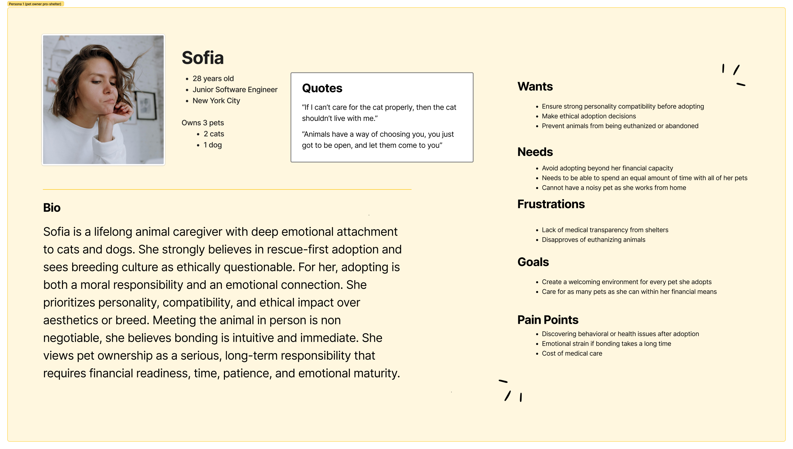
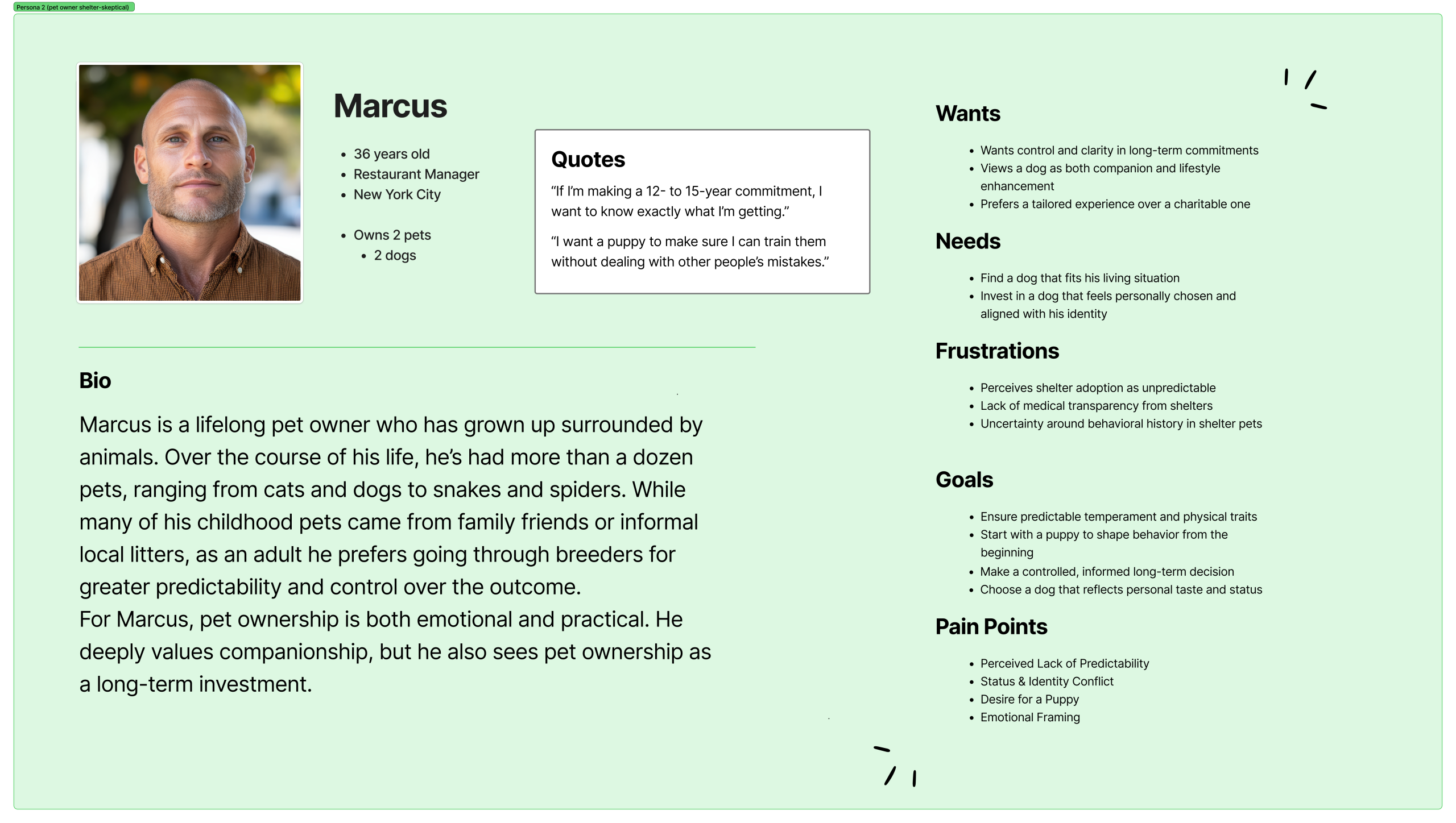
Three Personas: The Shelter Lover, the Shelter Skeptic and One Fresh New Pet Owner!
We made three personas to cover a range of perspectives.
- Sofia represents users who are current pet owners, pro-shelter, and who are against euthanization.
- Marcus represents users who are current pet owners, skeptical of shelters due to lack of medical transparency, and prefer breeders.
- Laura represents users who have never owned a pet before and the concerns they may have about finding a pet that matches their lifestyle when they have no prior experience with animals.
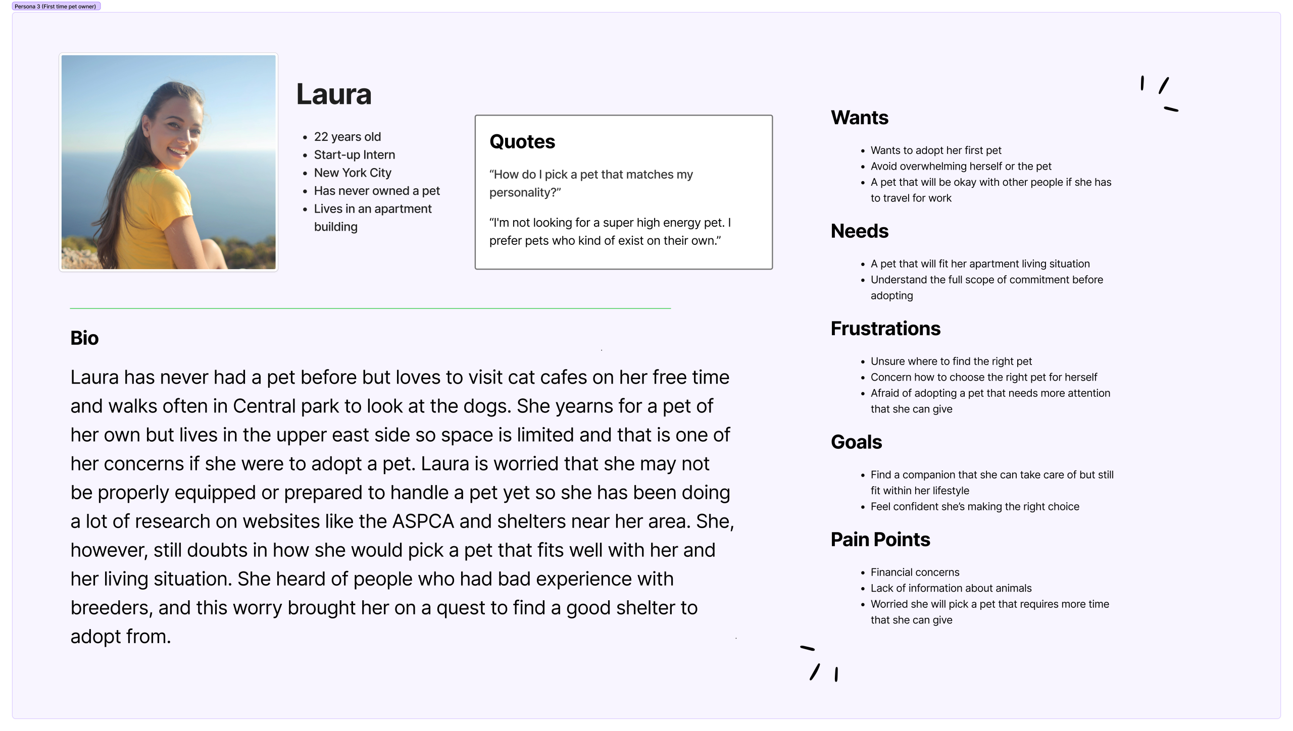
We focused on Laura the most due to the fact that users who have never owned a pet before have the most concerns, as adopting a pet is still an unknown area for them. By centering our perspective on a user with no experience or confidence in their pet-caring skills, it allowed us to keep many more factors in mind when we got to the ideation phase.
User Journey Map: Mapping out Laura’s Searching and Adoption Process Troubles
Through Laura’s journey, we realized we needed to do more research on two specific parts of her adoption voyage.
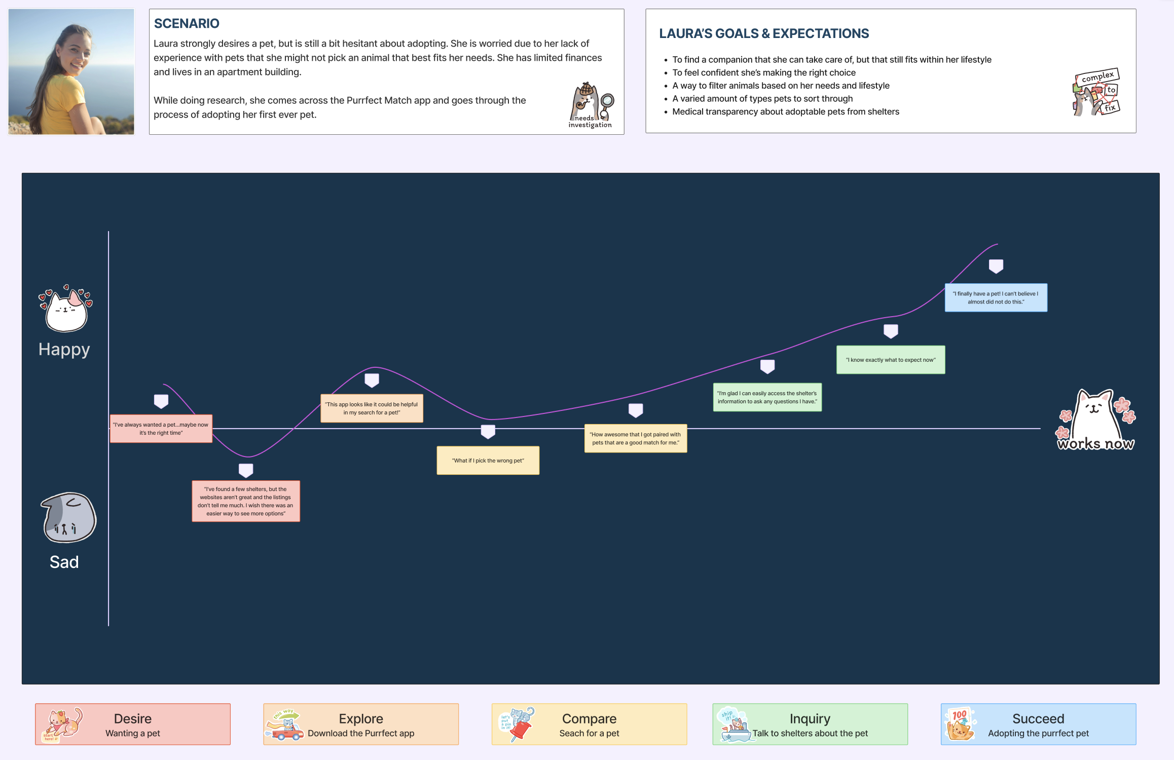
1. Compare: Searching for a Pet
This stage of the journey revealed that for users like Laura, who have never owned a pet before, it is imperative that pet profiles’ interfaces are informative and digestible. The pet profile page should remain informative and help users like Laura get all the knowledge she needs to make an informed decision. This includes a pet’s vaccination history, behavior, personality, preferences, breed, age, etc. The pet profile page, however, also needs to still be easy to read and digestible so that users who have never owned a pet before do not feel overwhelmed when searching for a pet. Thanks to the user journey map, we knew we would have to balance these two elements while designing to get the best outcome for users.
2. Inquiry: Talking to Shelters About the Pet
As much as we learned about the adoption process, usually involving background checks or phone calls, through our interviews, we knew that was not enough. Users like Laura might already be feeling overwhelmed and feeling clueless about how to adopt a pet due to this being their first time going through it. If the process has too many steps within our interface or looks too complicated, users may not complete the journey. This, in turn, would mean fewer pets being adopted. Therefore, we knew we needed to do more competitive research and find a way to make the process seem less threatening within interfaces while also representing the adoption steps accurately.
Competitive Research: A Lightning Demo, a MOSCOW & Mind Mapping the Matching Algorithm
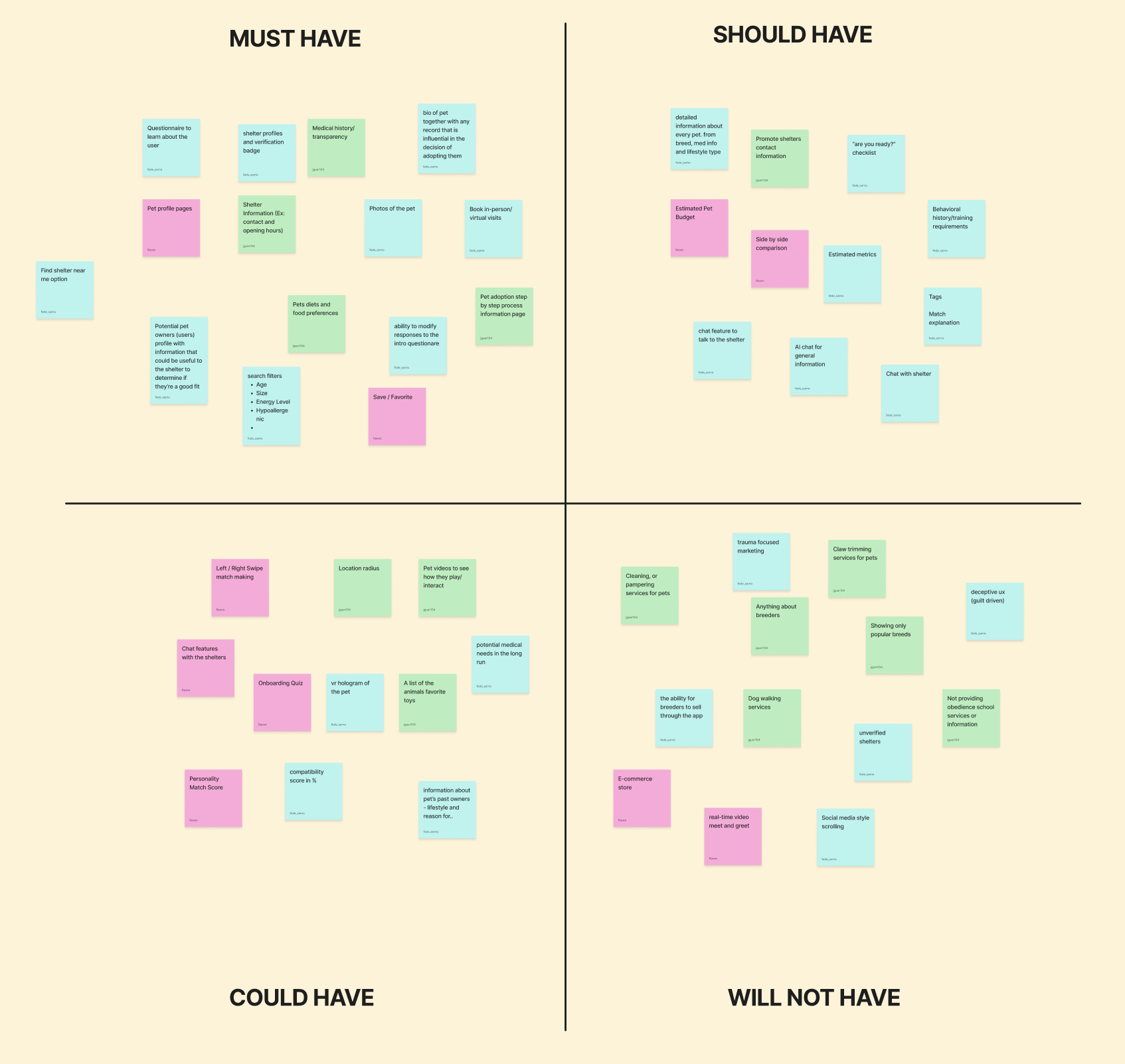
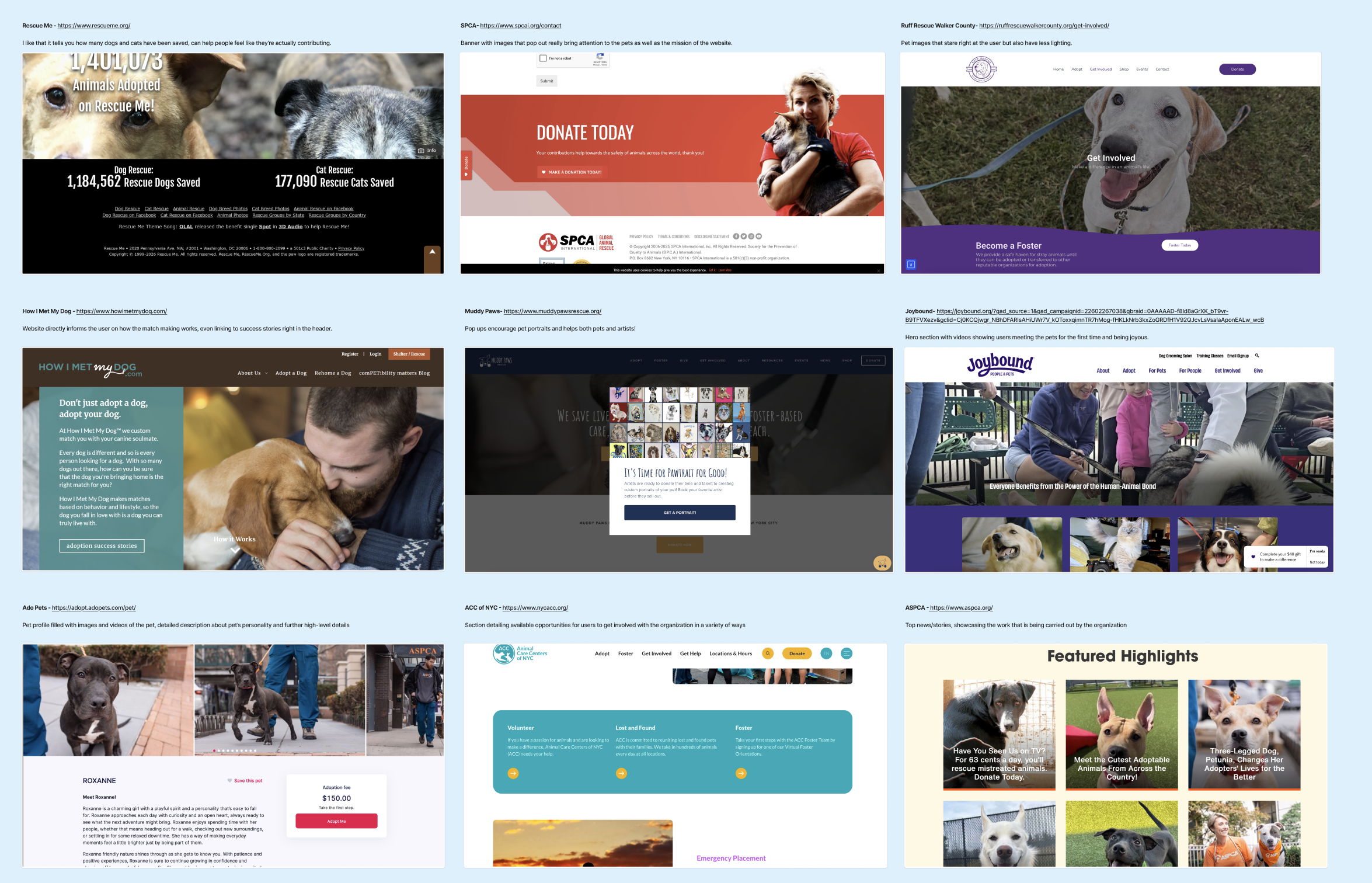
A Lightning Demo & MOSCOW: Determining Features & Analyzing the Organization of 9 Websites
We completed a lightning demo and MOSCOW to help determine our scope. The MOSCOW helped determine what parts we should include and what parts we may need to discard for the time being. We knew that compatibility, pet profiles and the adoption process would be a core part of our product. Therefore, those elements were put into the must-have section of our Moscow. However, even though we also wanted to include the grooming of pets and post-adoption support, we knew those were not as high a priority for the time being. We then did the lightning demo to help us further understand how shelters organize their pet profiles, the different parts of the adoption processes, documents shelters are legally required to ask for, as well as how pet photos and media is used.
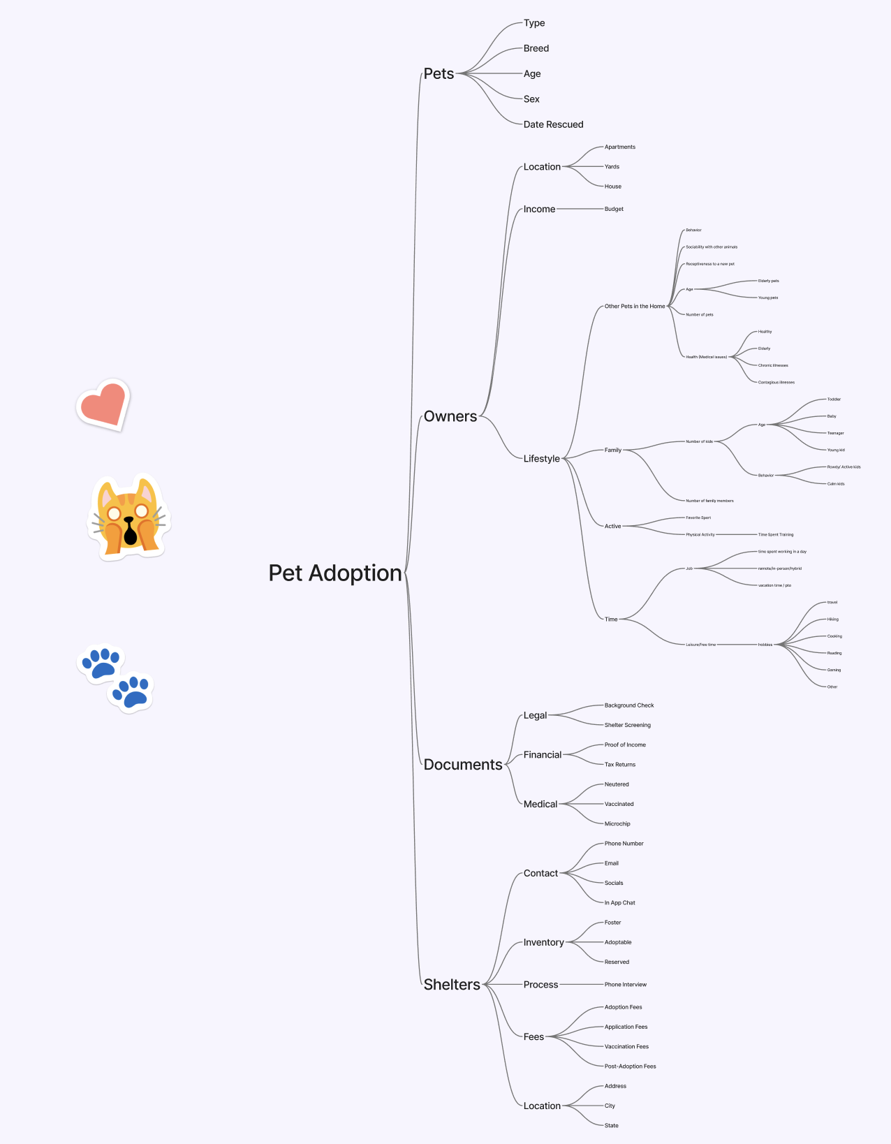
Mind Mapping between Pets, Documents, Shelters & Especially Owners
When we proceeded to mind map our main focuses for the application. We knew pets, documents, owners, and shelters would be part of our main topics. Despite being aware that these would be subjects we would delve deeply into, we did not expect owners to be the biggest part of our map. The mind map helped us realize that no adoption can be completed without the owner. We could not look at pets and owners as equal partners, as the reality is that owners have more control over the future of each pet. If the owners cannot find a pet that matches their lifestyle, through our application, then no pet can find their home.
Ideation Phase: Wireframes, Mid-fidelities, High fidelities and Branding
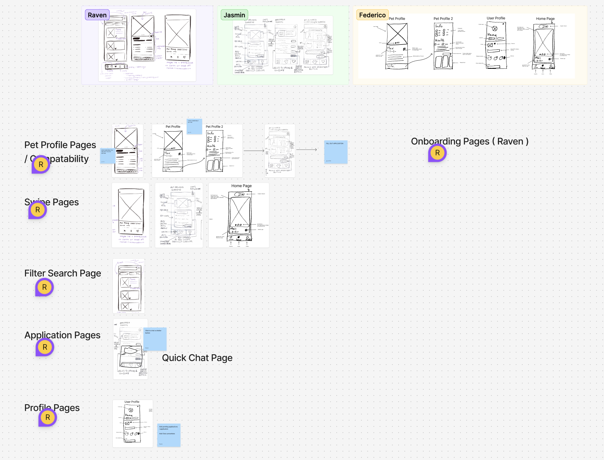
Wireframes: Determining the Main Scope from Pet Profiles to the Application Pages
We each made our own wireframes and then compared our results. We did this by grabbing each of the sketches we felt would best help us create the necessary flows. We knew pet profiles would be necessary for the application, which is why we began with that particular screen as a starting point. My design of the compatibility page was taken as part of this flow. We then agreed to turn the browsing page into a type of swiping page similar to Tinder’s interface. Federico’s designs were chosen for this part. We then delved into the filtering and user profile pages, which we knew would be single screens. My application design was taken into account, and after further discussion, we decided to add a chat feature within this page as well. After organizing all of our wireframes, we realized that onboarding pages were missing. Xin took over the design of those pages to finish up our plan and flows.
Mid-fidelity
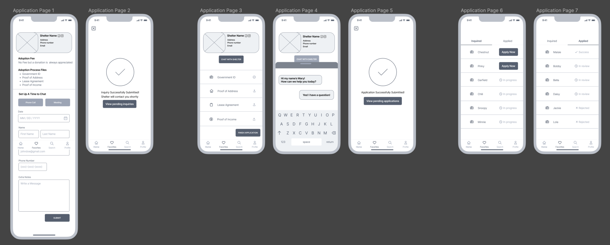
We jumped into our mid-fidelities by focusing on the onboarding, home page, pet profile page, compatibility, favorites and application pages. I was particularly tasked with designing the profile and application pages. The profile page was straightforward and did not have many complications. The application page, however, went through multiple iterations as it was the most complex flow within our mobile application.
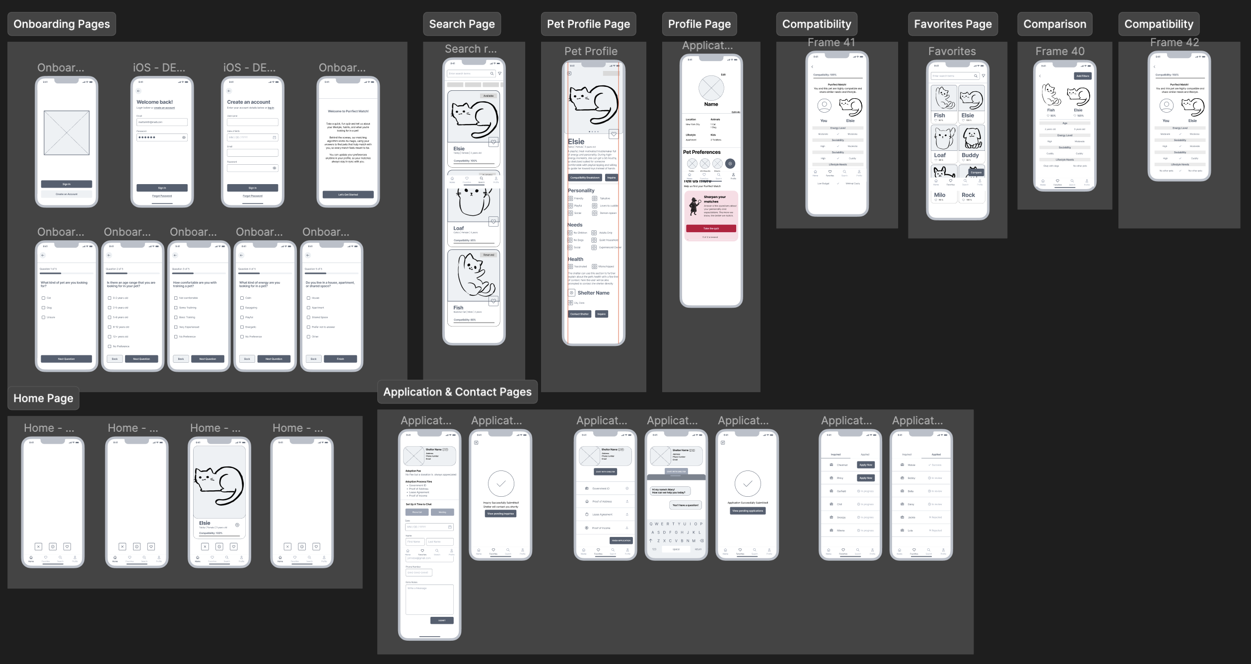
It started with only having one application tab, but over time, we realized we would need to add another step to the adoption process. This meant adding an inquiry page before applying for a pet. This meant that the process changed from applying for a pet and waiting for a review, to inquiring about meeting a pet and then applying fully for that animal companion.
Branding for Comfort First
Mood boards & Style Guides: Finding Brightness and Warmth
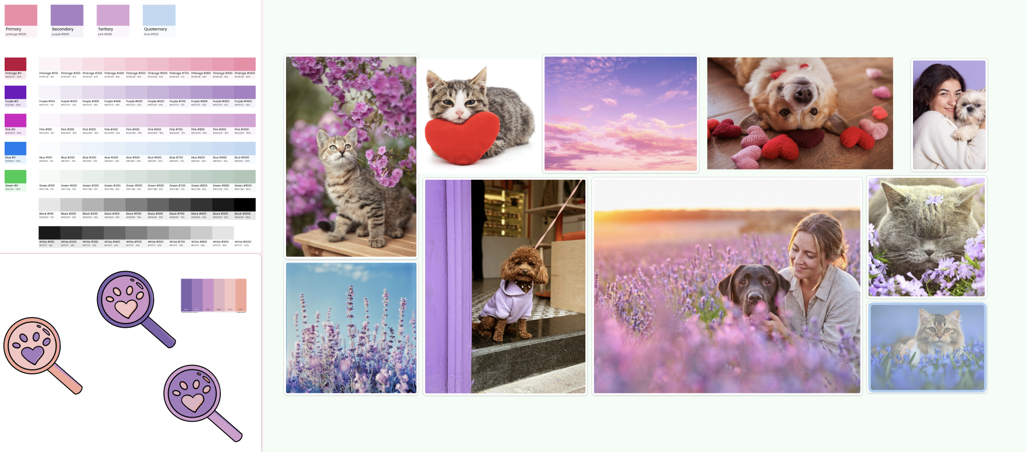
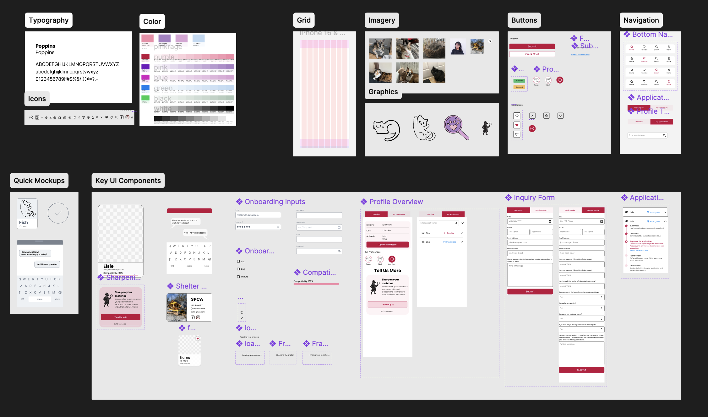
When considering our branding for the Purrfect Match application, we aimed to create a bright ambience to promote comfort. Adopting a pet and going through that process can already be quite stressful, so promoting a positive environment was essential. We created a mood board and logo to test out which shades would most promote this type of feeling. We finally centered our branding around colors such as pinks, purples, greens and blues. Our typography was also chosen with this concept in mind, and we settled on Poppins due to it being known for its circular shapes and approachable atmosphere. We then created a style guide which included our icons, grids and imagery. This was made to ensure the team stayed on the same page and used the same essential elements as we dived into creating our high fidelity interfaces. Our imagery, however, came from our interviews and involved pets that our users currently own or have owned in the past. Our graphics were drawn by Xin and me due to both of us enjoying drawing and having artistic skills.
The First High Fidelity Attempt:
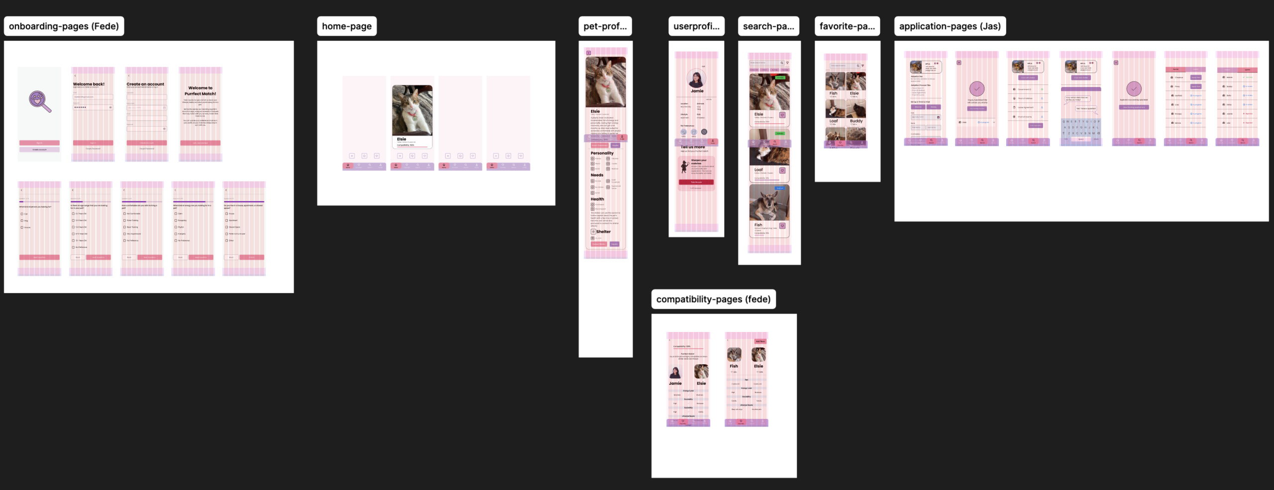
Our first high fidelity consists of the onboarding pages, a swiping home page, pet profiles, user profiles, search page, favorites page, compatibility pages and the application pages. We included pictures of our interviewees’ pets, put in a logo and added colors from our mood board within the designs.
Moderated User Testing: Application Flow Confusion
The User Testing Plan: Onboarding, Finding a Pet and the Application Process
- Onboarding Flow
Testing this flow would give us a good picture of the type of questions that users expect to be presented to them, and what questions we’re missing from the current questionnaire. Furthermore, we can discover what is the limit of questions users are willing to answer before determining that the questionnaire is too long.
- “Finding a Pet” Flow
Testing this flow would allow us to learn whether the left and right swiping, similar to dating apps, is intuitive and recognizable to users as they interact with the prototype. We would also test for the search and favorite processes, making sure users understand the compatibility system and how it works.
- “Applying for a Pet” Flow
Testing the application part of the flow would be valuable as we need to see how understandable the process is within our app. We need to learn if splitting the screen between an “Inquired” and an “Applied” adoption process makes sense to users and if they can understand how to complete both flows. We particularly want to make sure users do not assume the adoption process is over after only inquiring and want to make sure they know that there is another step to adoption after the original inquiry. User testing this flow would allow us to see if users know or are confused that both parts of the adoption process are needed to fully adopt a pet.
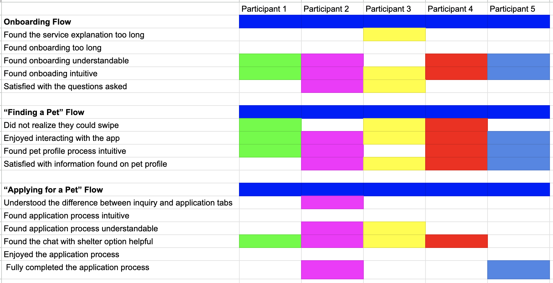
Testing Results: Major Inquiry & Application Confusion
From our methodology, we tested our three main tasks. This included the onboarding process, finding a pet and the application process. We also then asked the follow up questions for each task to get further insight from each user. We tested users in person as well as remotely through Zoom, by giving them control of the screen we were sharing. We got existing pet owners and aspiring pet adopters to test our high-fidelity Purrfect Match Application.
Task 1 : Onboarding
Task 1 went well for most users. 4 out 5 of our users found the onboarding process easy to navigate and even though many originally were dreading doing the onboarding at first, most finished the task with no issues. Additionally, only 2 out of 5 users were satisfied by the end of the process. Many of them offered suggestions for new or additional questions, such as adding the gender of animals or letting the app know if they already own animals.
Task 2: Find a Pet
Users navigated Task 2, with ease and happily interacted with the app. Many users positively commented on the compatibility component. Others were intrigued by it and often scanned it for quite some time. Users also enjoyed the specific pet profile page and found it easy to understand with 4 out 5 of the users being satisfied with the information found on it. The only common issue was when users first entered the app, as they often did not realize that they could swipe through the potential pet profiles. 3 out of 5 users had this issue.
Task 3: Applying for a Pet
Users were able to navigate to the inquire button easily. However, 4 out of 5 testers were confused by the application process in some shape or form. 3 users were confused by the “Meeting” button and many asked if this was a virtual meeting or an in person one. 4 users were also confused about the difference between the Inquiry and Application tabs as they did not understand the difference. Many also felt they had not fully completed the application process, even though they had. This revealed an issue with the way we displayed the adoption process within our interface. 2 users also suggested putting the applications within the profile page instead of it being on its own page within the mobile app.
Fixing The Issues: Accessibility & Application Understandibility
Accessibility Color & Navigation Bar Tune Up
Through user testing, we knew we needed to fix the navigation bar’s transparency and the color palette to further meet accessibility guidelines. We changed our soft purples to a more contrasted, distinguished dark and light pink. We also removed transparency from our bottom navigation component to improve visibility.
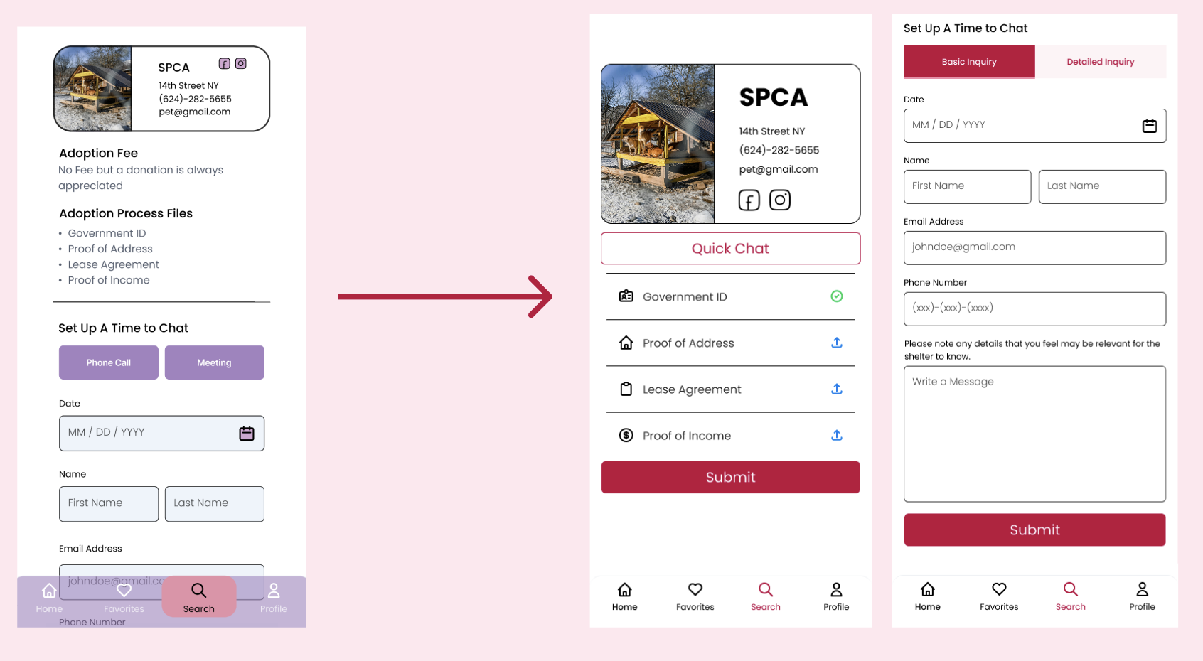
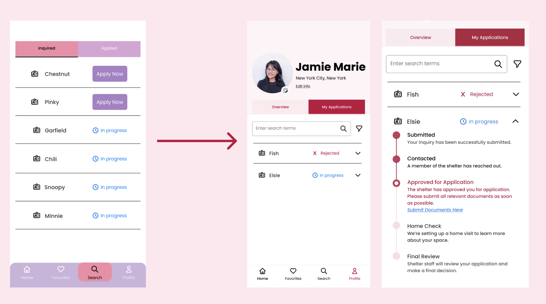
Clarifying and Combining the Application and Profile Pages
Our application flow still needed much improvement to address the confusion and lack of understandability between the inquired and applied tabs. We resolved this issue by first adding the application to the user profile page. We added this feature to the page by creating an “Overview” and “My Applications” tabs instead. The Overview tab contains the user profiles’ original design, while the applications tab consists of drop-downs that open to reveal a progress bar of each step of the adoption process. This allows users to quickly scan the interface and see their progress for each separate pet application.
Final Iteration Alterations
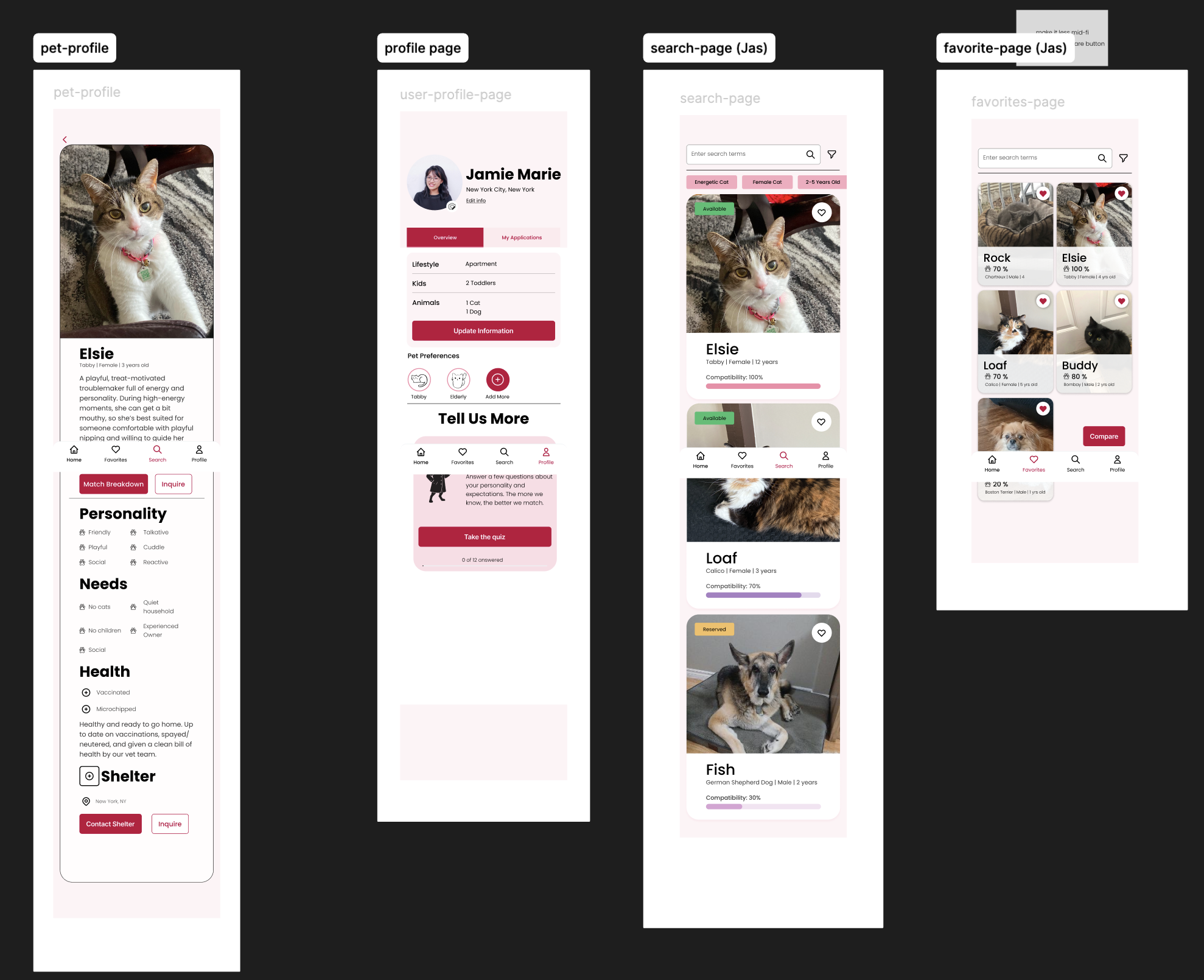
Final High Fidelity Alterations: Colors Improvements, Card Restructuring & Page Reorganization
The final high fidelity designs reflect the color changes to dark pink, provides a new application flow and pet cards with labels and icons that stand out from the background more vividly.
Outcomes: Presenting Our Final Results to Experienced Professionals
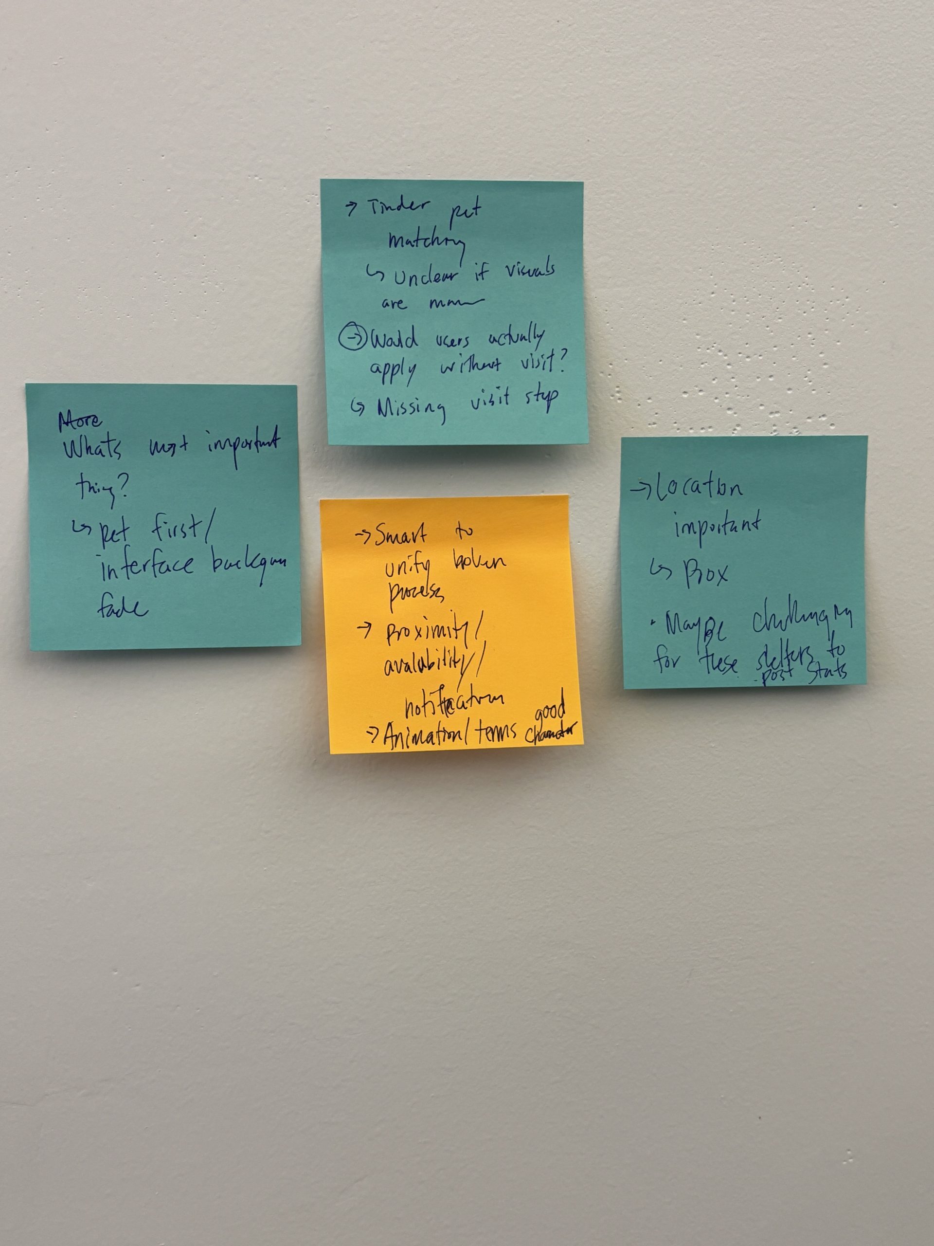
Feedback: Research, Locations and Pet Meetings
After presenting our results, the experienced professionals provided feedback and wrote their feedback on sticky notes. Feedback included:
- More extensive explanations about competitive research
- Geographical locations & mapping of shelters
- Questions about users setting up meetings with pets
- More accessibility tests
Next Steps for Expanding Purrfect Match’s Matches
1. More Shelter Interactivity
Purrfect Match would expand and grow with more shelter partnerships over time. These relationships are imperative to getting more pets featured on the application and helping more pets get adopted.
2. Post Adoption Support for Users
Users who adopt a pet for the first time are undertaking a huge change to their everyday life. Post adoption support would increase the chance of successful adoptions by providing a safe space for owners to ask questions, gain more knowledge or simply have someone to converse with.
3. Helping Overlooked Pets
Purrfect Match started with wanting to help elderly pets, pets with medical needs or pets who are constantly overlooked. This is still a goal Purrfect Match aims to achieve as it expands, since promoting pets with more extensive needs would give pets more of a chance to be seen by users who can properly take care of them.