PawPrint is a UI design kit built by a four-person student team for adoptapet.com. Every sprint, the team was rebuilding things that already existed. We set out to fix that. This is my individual account of how we built it, what I contributed, and what I learned along the way.
Every sprint, the team was rebuilding things that already existed.
My role: Administrator
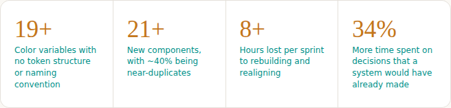
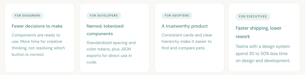
Our team was tasked with creating a design system for Adopt a Pet, one of North America’s largest pet adoption platforms. The product team had 28 members and no shared way of working. In four months they had accumulated 19+ unstructured color variables, 21+ near-duplicate components, and were losing 8+ hours per sprint to decisions a system would have already made. That is 8.5 weeks a year, per designer.
1.) We deconstructed the interface by cataloguing every component and auditing it against usability heuristics.
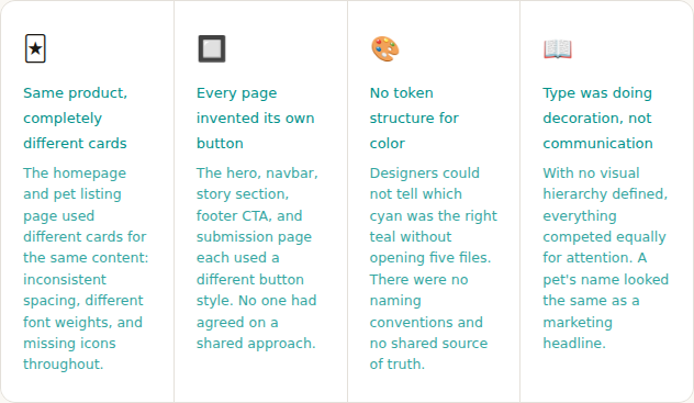
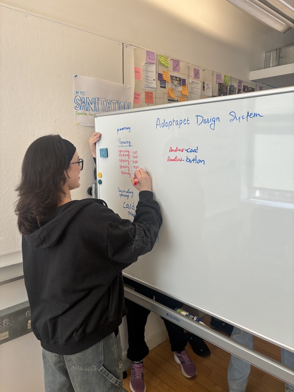
We screen-shotted and catalogued every button variant, card style, and navigation pattern across the site, then annotated each page against usability heuristics. As administrator, I documented all findings from group sessions, turning discussion into a written record everyone could return to. This became our shared definition of the problem and the basis for every design decision that followed.
What I learned: You cannot build a design system without understanding what you are replacing. Seeing 21+ component variants side by side made the problem undeniable and immediately clarified priorities. Documented evidence also kept the team aligned when opinions diverged.
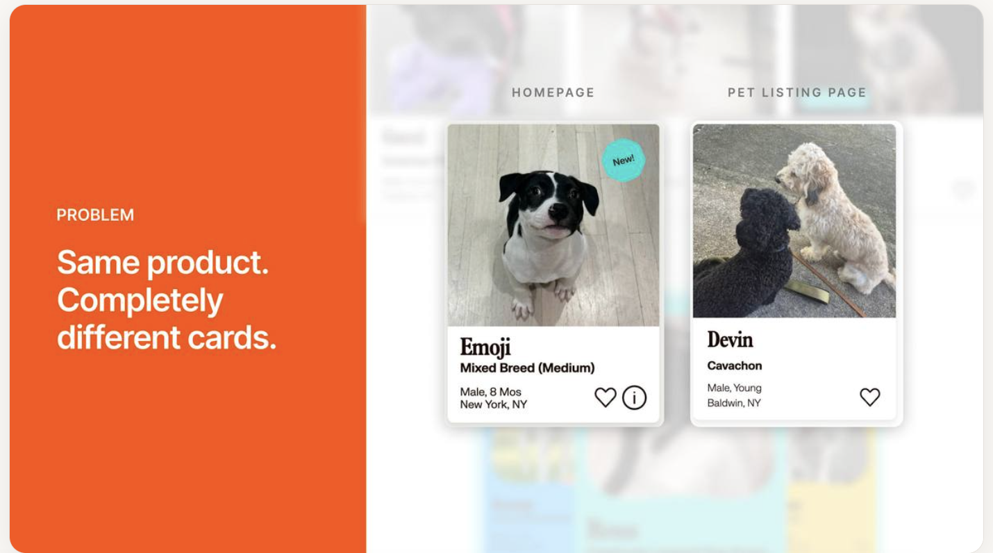
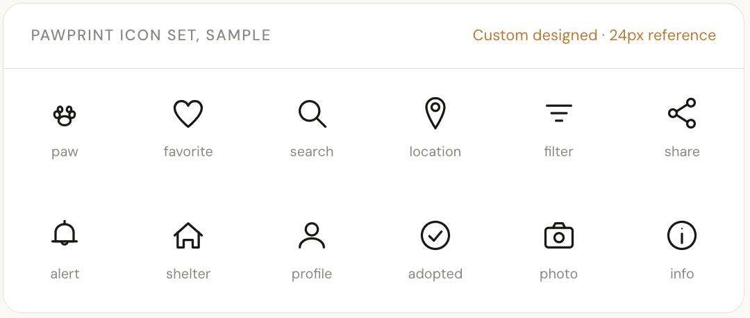
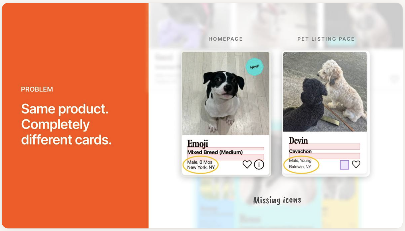
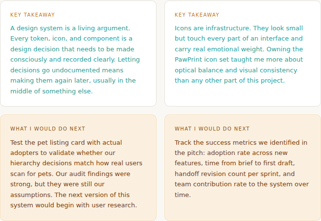
2.) I assisted with our pitch by translating every finding into a story, and documented icons that brought the system to life.
I contributed to the pitch deck that framed PawPrint for the class, mapping each audit finding to a concrete system solution. I also invested most of my time into the icon set. The audit had surfaced missing icons as a real problem on the pet listing page. My solution: 1.5px stroke weight, rounded end caps, consistent optical weight at 16px, 24px, and 32px, and a deliberate warmth that matched the emotional tone of pet adoption.
What I learned: Icons are infrastructure. A design system lives or dies by its details, including the ones most users never consciously notice.
3.) I kept the team’s decisions alive by writing them down, every time, without exception.
Throughout the project I served as the team’s memory card: documenting decisions and rationale after every session, managing status updates, and surfacing open questions before each meeting. When disagreements arose, written records meant we returned to what we actually decided, not what each person remembered.
What I learned: Good documentation is itself a design tool. A decision not written down is a decision waiting to be re-argued. The process of building a design system matters as much as the system itself, and someone has to tend to it deliberately.
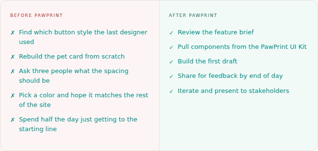
PawPrint replaced guesswork with a shared language everyone could use.
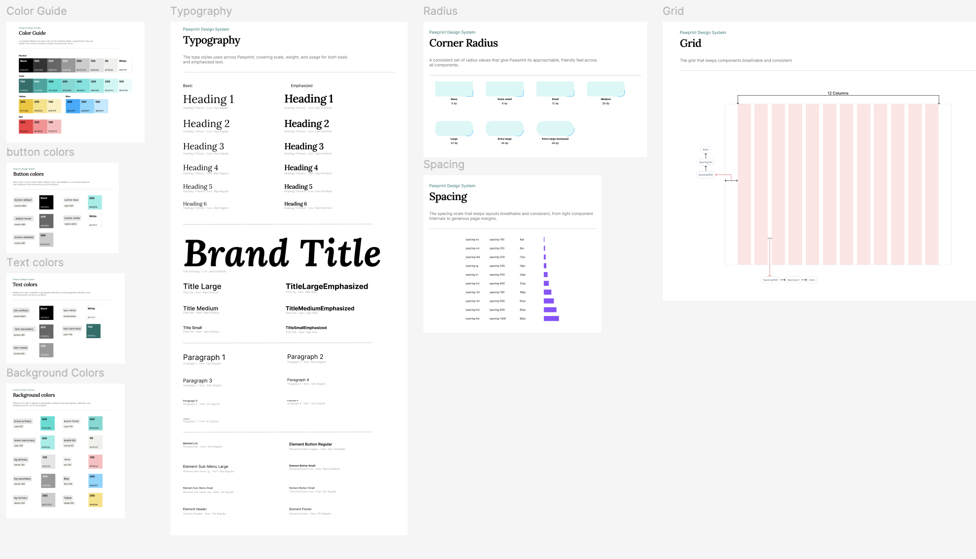
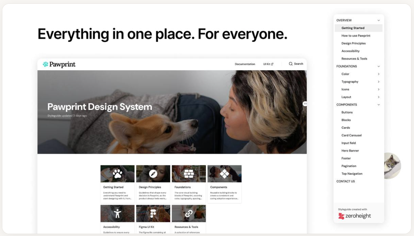
The full system is at pawprintds.zeroheight.com. Below are the decisions that mattered most.
We built something real, and I left with lessons I could not have learned any other way.
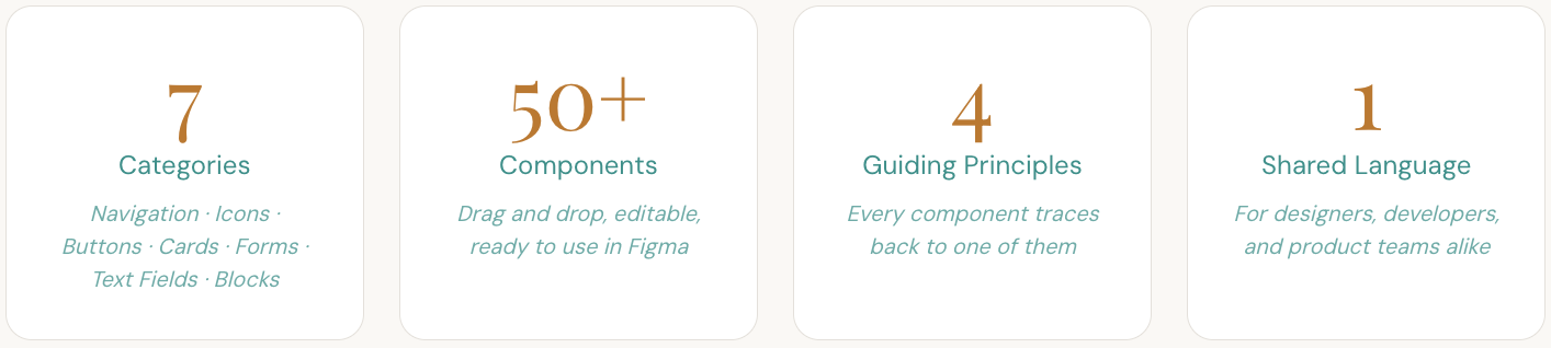
PawPrint delivered a token-based foundation, 50+ components across 7 categories, a custom icon set, JSON token exports, and a published ZeroHeight documentation site. More than the deliverable, the project changed how I think about what makes design systems work.
The invisible work is what makes the visible work possible. Someone has to tend to the process, or the process collapses. I am glad it was my team and I.