Adobe acrobat is a widely used application for creating, viewing, and editing PDF files. It’s the tool many professionals rely on to produce a final, polished version of a document, from students submitting assignments to teams finalizing contracts.
Because so many people depend on Acrobat to get documents in before a deadline, its usability problems become more than just minor annoyances, as they cost time when users can least afford it. In my experience using Acrobat for work contracts, visa documents, and school assignments, it has been a mix of useful tools and frustrating confusion.
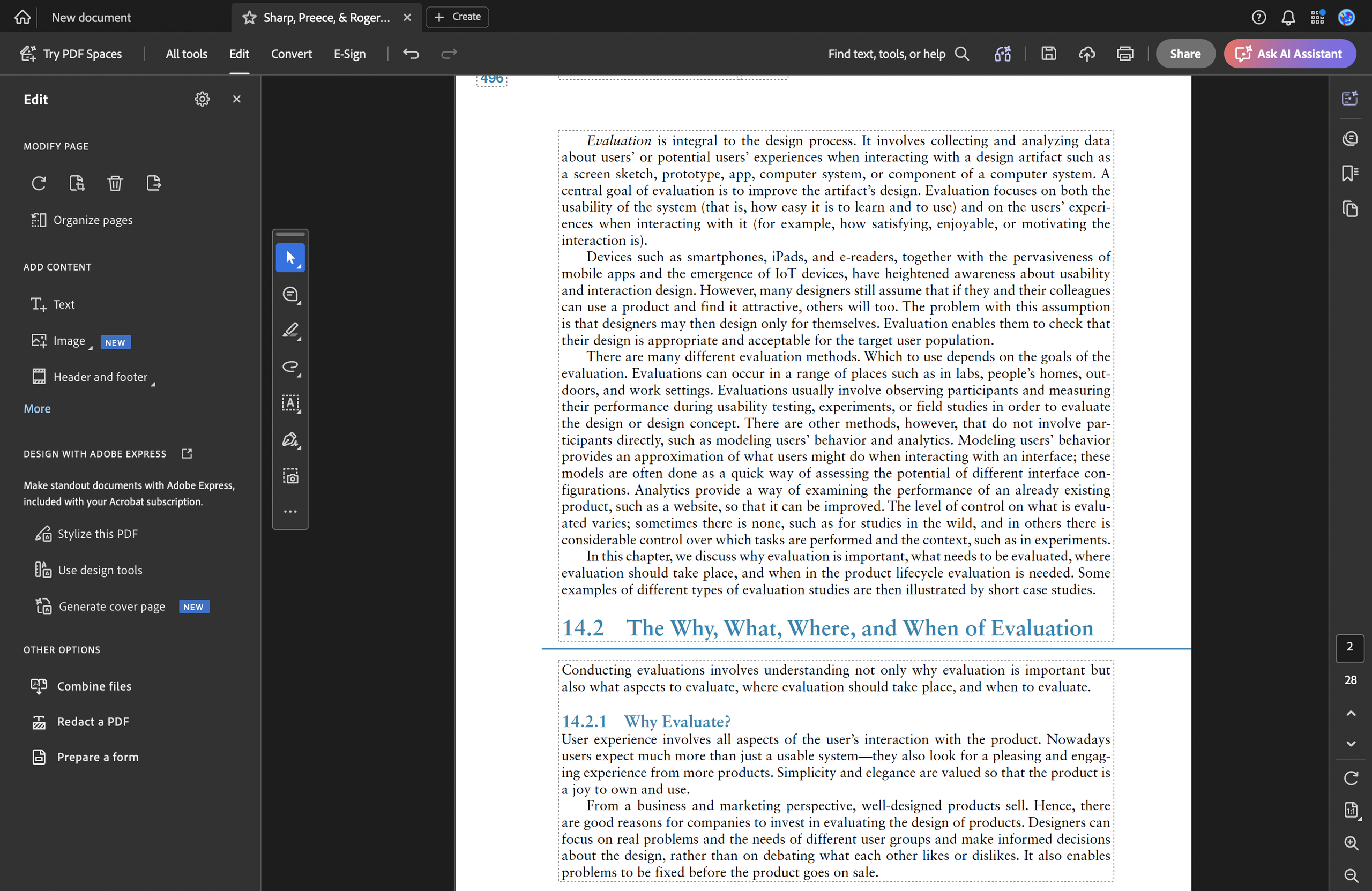
When a PDF file is opened, the Edit panel is the easiest to navigate, as each group of tools falls under clear category headers like Modify Page, Add Content, Design with Adobe Express, and Other Options. Even though some tool icons only reveal their name on hover, they are still easy to identify, since users already know which category they are in and can narrow down what each icon likely does before ever clicking it. This layered structure, pairing category headers with mostly-visible labels, is a strong example of signifiers: the perceptible cues that tell a user what an element does before they click it.
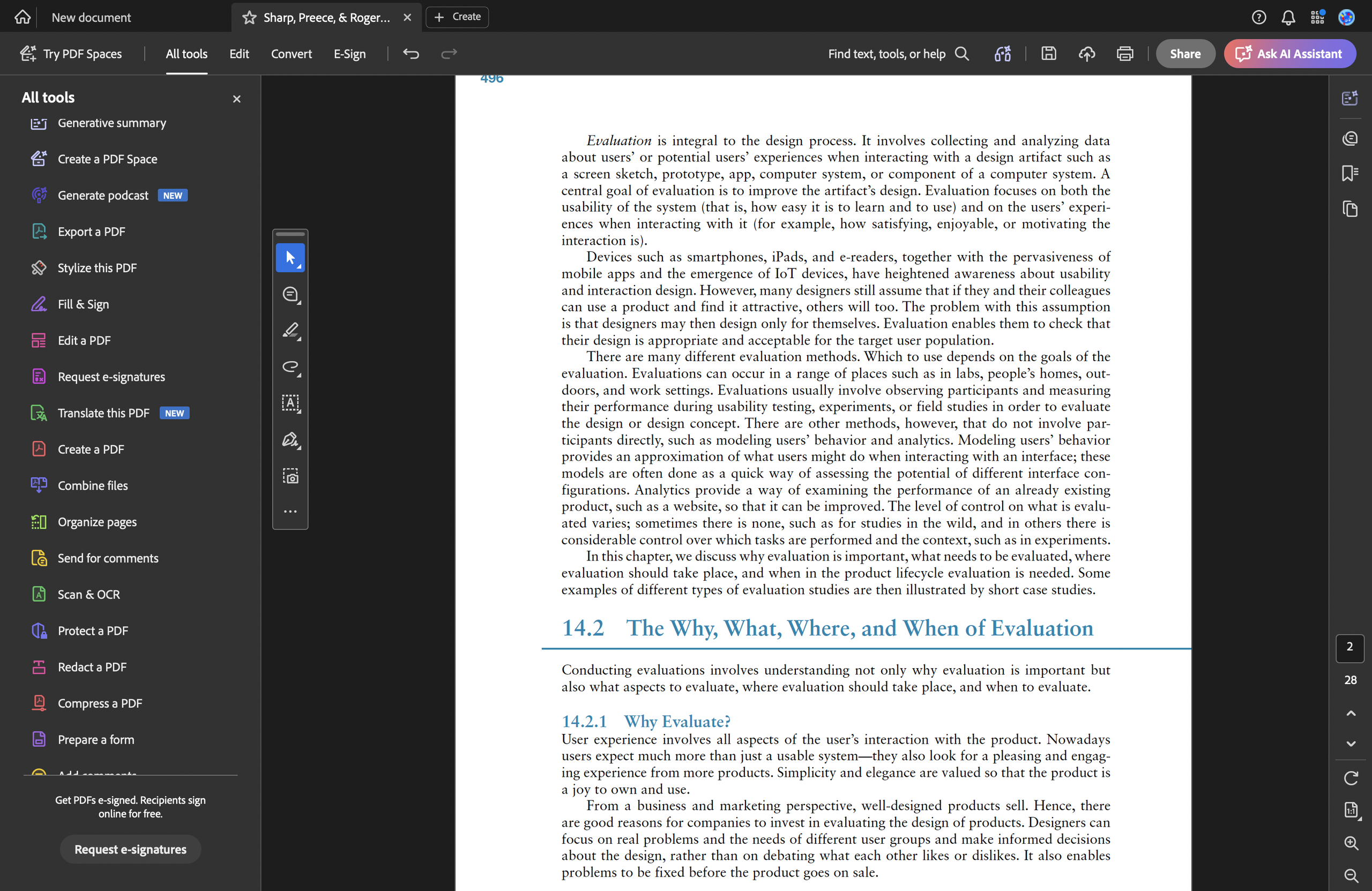
Comparing the edit panel to the all tools panel, we can see a clear disconnection in information hierarchy. The All Tools panel consists of a long list of overwhelming icons with no categories or headers, this causes users to look through the icons and text one by one until they find the right function, creating a gulf of execution: the users knows their goal but has no clear path from that goal to a specific icon.
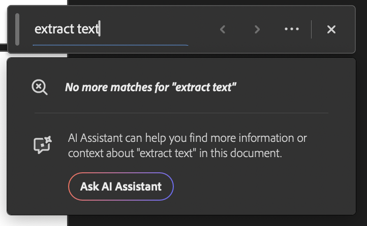
To be fair, Acrobat does include a search bar within the All Tools panel, which on the surface does solve the problem.

But searching for a tool only helps if you know its exact name, and I’ve encountered this frustration many times: knowing exactly what a tool does but not what Acrobat calls it, which takes far longer to resolve than simply browsing a labeled list. This shifts the burden from recognition to recall. This problem matters especially since most Acrobat users, as I mentioned earlier, are working against a deadline and just don’t have the bandwidth to recall the precise terminology on the spot.
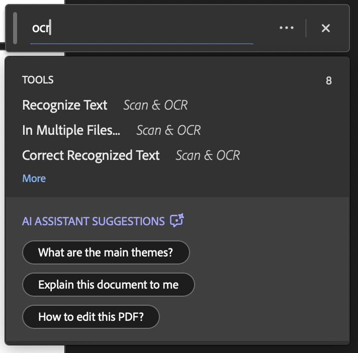
The fix is right there in Acrobat’s own interface: instead of having a long list of tools for users to scroll and navigate through, apply the same category/header structure the Edit panel already uses. This is an example of a violation of consistency: the use of the same design solution for similar problems throughout the interface.
This inconsistency shows up elsewhere as well. On both sides of the interface (the navigation rail on the left and the tool icons on the right), all icons appear without labels, only revealing their name when hovered.
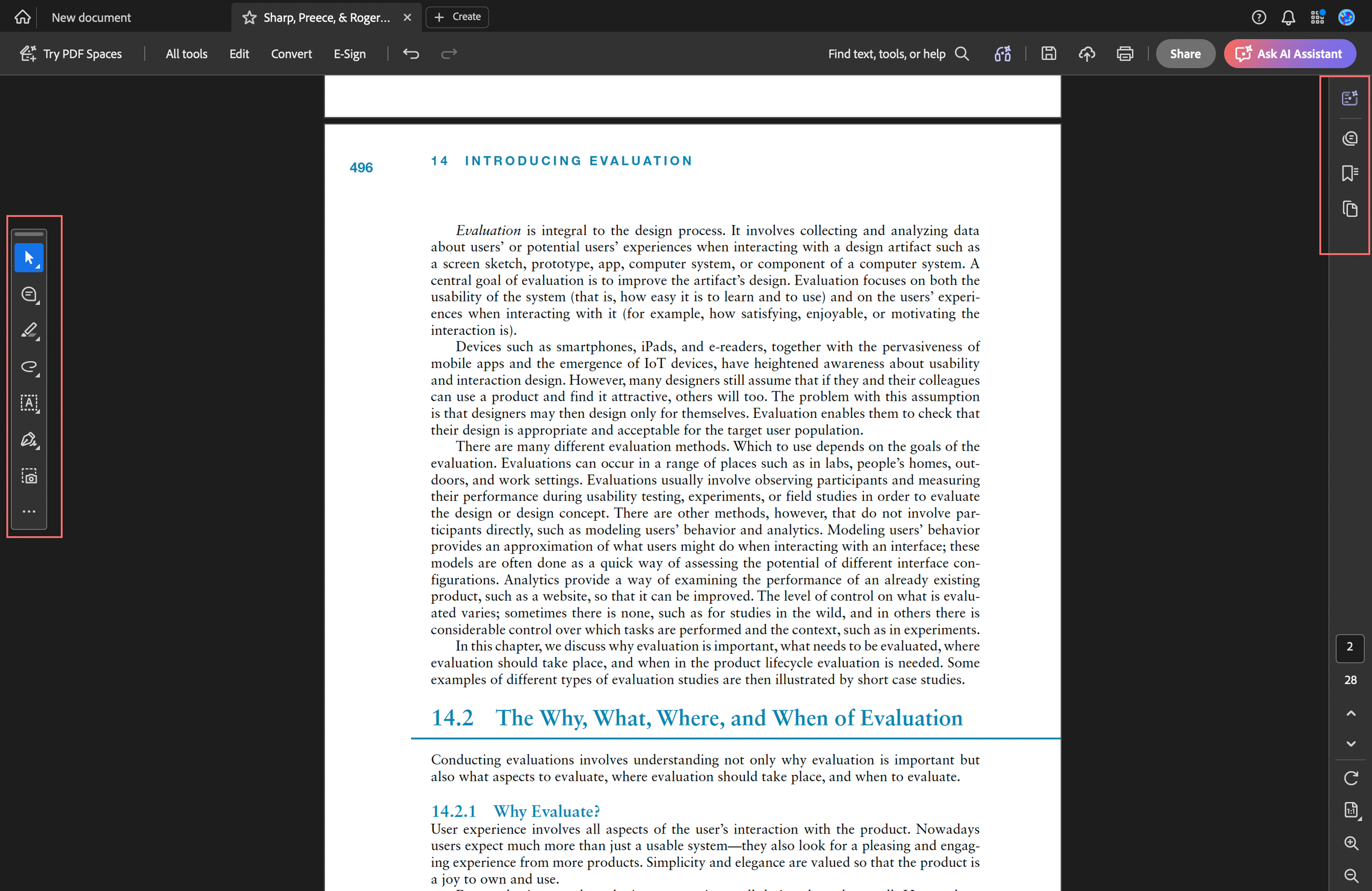
In practice, I almost never use these tools, or I have never used them by clicking into to icons, because when I’m in the middle of a task with a looming deadline, I don’t take my time and stop to hover and explore, I go straight into navigation mode, searching for the specific tool I already know I need. This is an issue of visibility: the information needed to use a tool should be visible upfront, especially since it’s present on both sides of the main interface, it should not have to require an extra interaction just to reveal it.
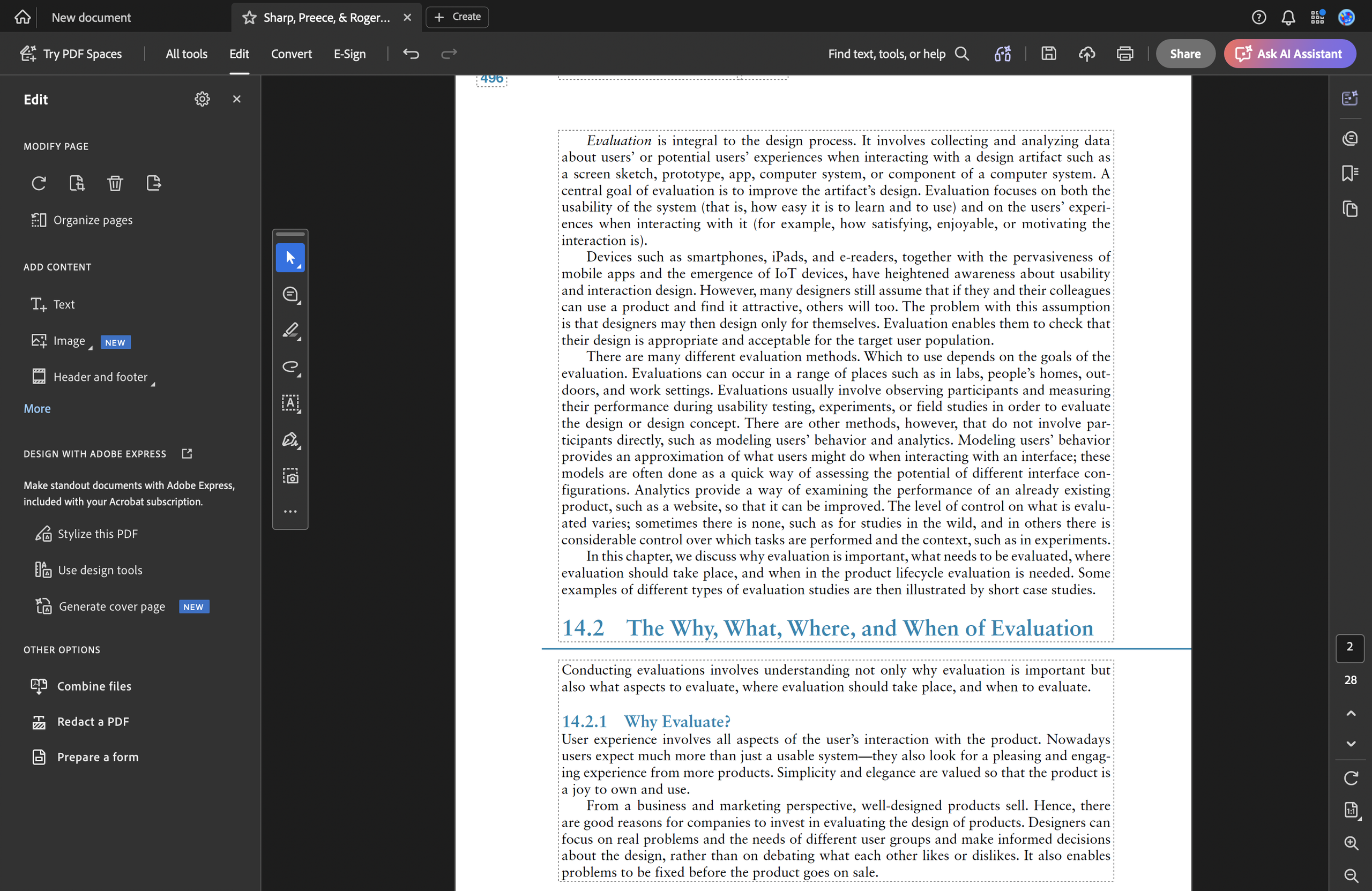
Especially under time pressure, an icon that requires hovering to identify might as well not exist. The fix is consistency; pair every icon with a persistent visible label or header.
Acrobat is capable of many features for modifying and exporting files, but it lacks consistency. The sheer number of different icons, organized inconsistently across different panels results in ongoing user confusion. Even someone who has used Adobe Acrobat many times would still struggle to get fully used to the system, simply because of how inconsistent its design is.