
Apple Music is a music streaming app for Apple users. Users can search for music by mood, genre, artist, decade, and more. Apple Music also features various exclusive and global radio shows, playlist options, personalized radio stations, and an Apple Yearly Wrapped. For the purpose of this critique, I will evaluate Apple Music from the perspective of a new user with no prior experience of the app using design concepts from Don Norman’s The Design of Everyday Things.
The menu bar
On the bottom of the screen, users will find the menu bar for the main Apple Music sections: the home section, the new section, the radio section, and the library section. Users know which section they are on based on the signifiers — the icon will change from black to red, and the background surrounding each icon will also change color to a light gray. If users want to travel between each section quickly, they can press and hold an icon, and simply slide between each page. This option provides similar signifiers, including a larger button effect when the user presses and holds to show which section the user has landed on. However, the discoverability of this option is not clear for new users, who would likely tap the icons based on knowledge in the world. The option to scroll between pages is not obvious, and users would only discover the option by accidentally holding down on the icon, whereas most apps only require tapping between pages.
The “open more” button
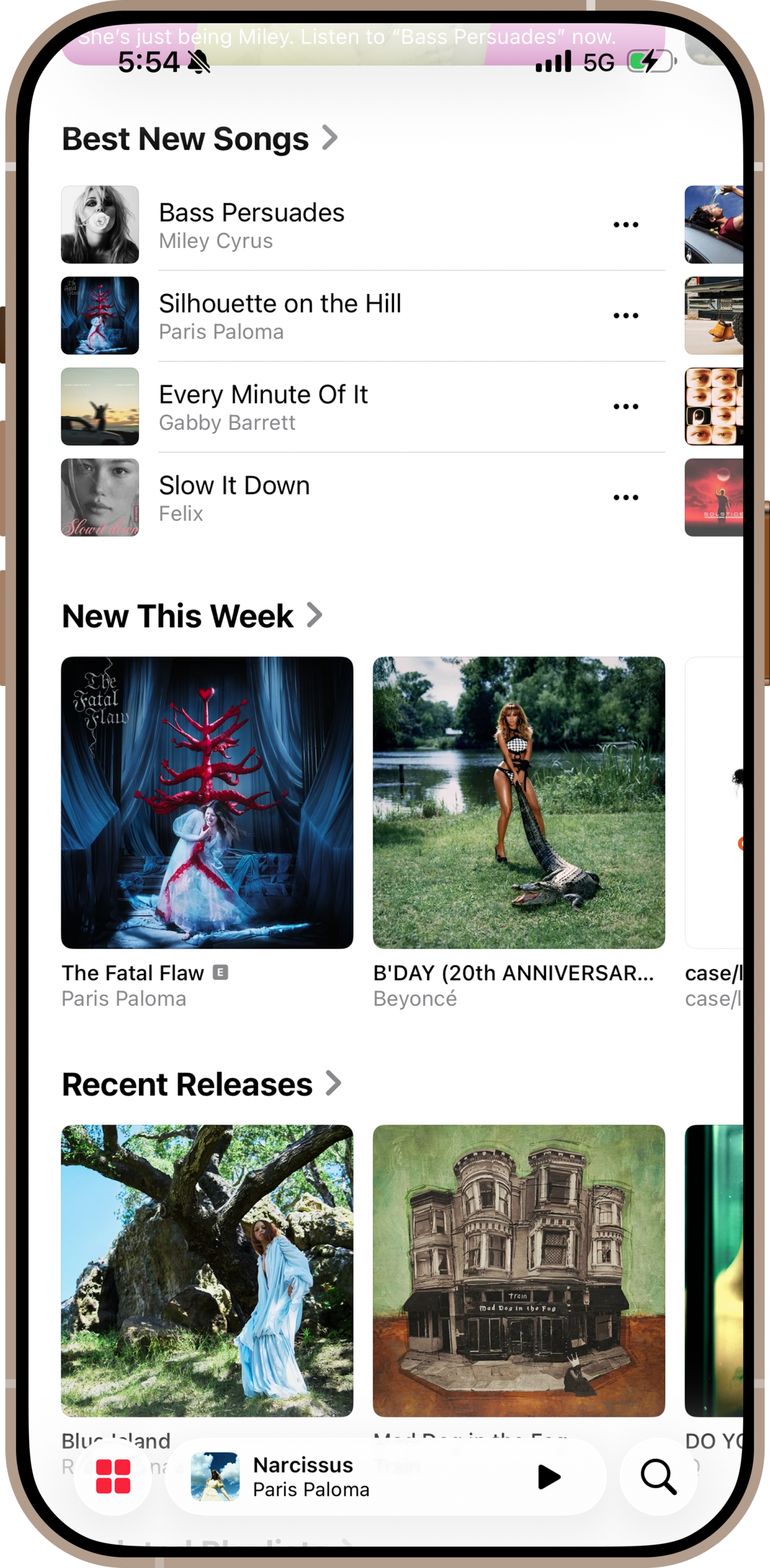
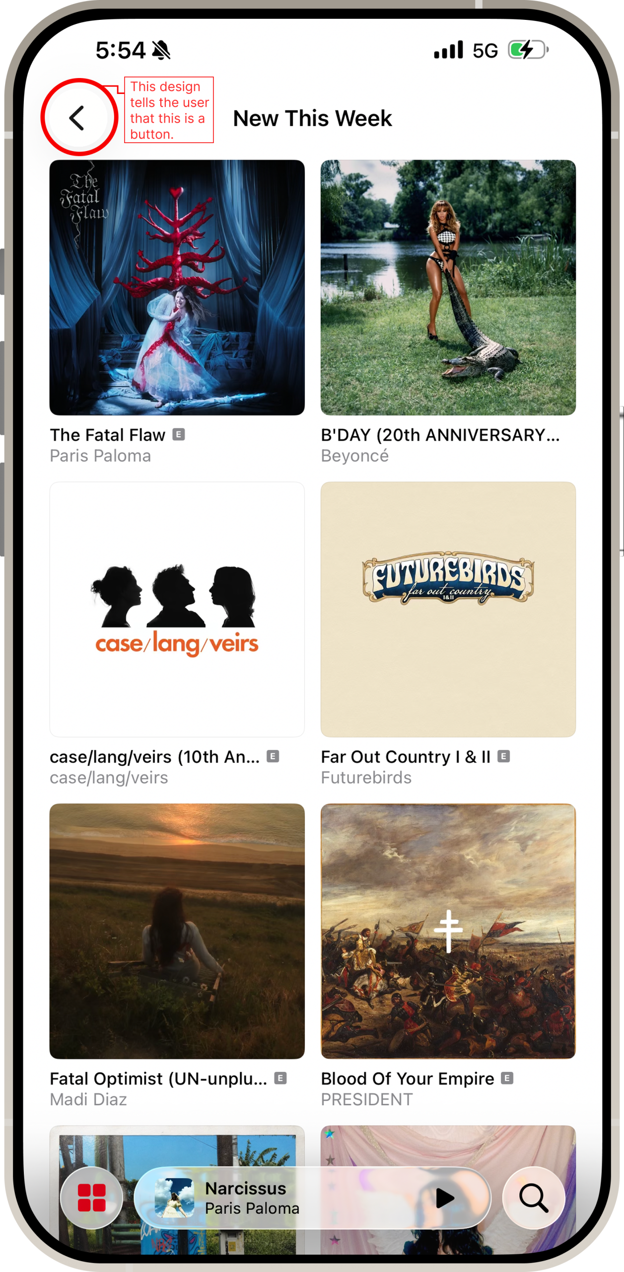
On every section of Apple Music, particularly the new page, the user can scroll through radio stations, songs, albums, and playlists. Some of these sections have an arrow. Since users operate Apple Music by scrolling up, down, left, and right, the arrow seems to signify to scroll. However, it actually functions as an “open more” button. This is not intuitive for a new user, especially since there is no obvious text that tells the user what the arrow does. The user must rely on knowledge in the world to interpret the arrow’s function. The new and radio pages both have arrows on every individual section, so new users could be missing out on much of what Apple music has to offer if they do not have the prior knowledge to recognize the purpose of the arrow. For better clarity, the arrow should be redesigned to look like a button. For example, the “go back” button is displayed with a border around it to show that it is a button.
Adding music to your library
When users open an album, they see a mini menu bar in the top right corner, consisting of a share button and three dots. Clicking the three dots will provide the users more options, including an “add” button to add the album to the user’s library. The dotted lines are a common affordance that there are more options available. The “add” button is also clearly labeled and distinctive from the “add to playlist” button, so users will immediately recognize its function. However, there is another option to add music. Next to the play button, there is a button with a plus sign. The plus sign signifies to users that they can add music, and is more obvious than the mini menu bar.
Adding to a playlist
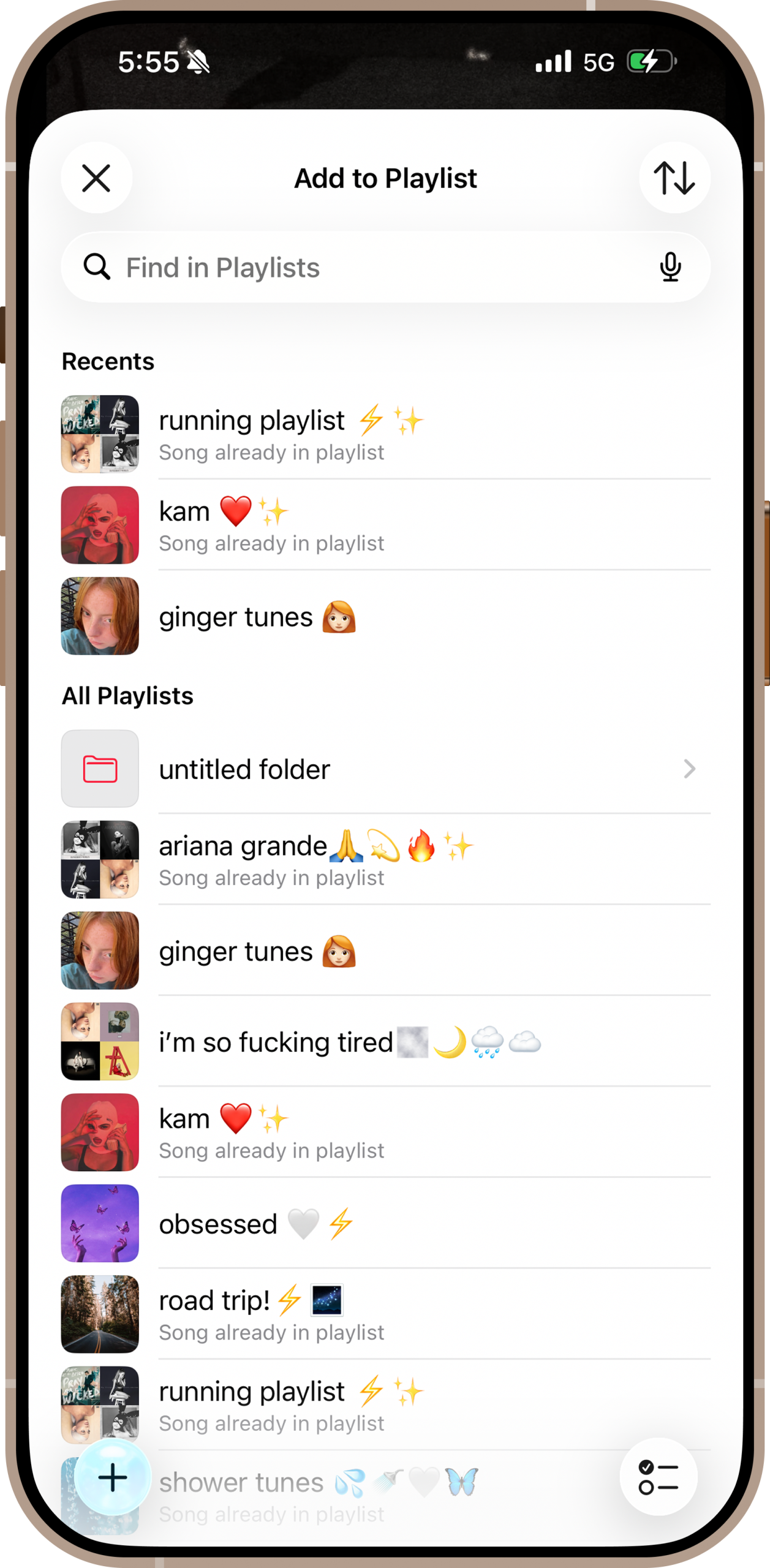
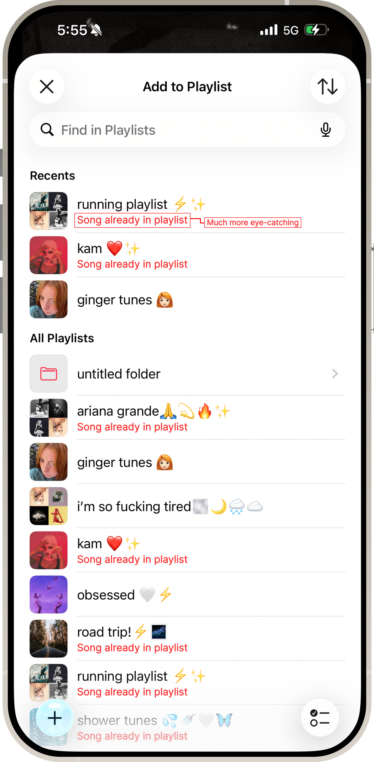
If a user attempts to add a song to a playlist a second time, Apple Music provides a warning. The first warning is small and displayed in gray text, so it is easy to miss. If the user tries to add the song, they will get a physical constraint— a pop up warning with an “add again” and “skip” buttons. Users must confirm if they want to proceed with adding the song, and cannot simply tap the screen to get rid of the message. This physical constraint prevents users from unintentionally adding songs multiple times and having to spend time fixing playlists. To make it clearer, the first warning should be displayed in the same red color as the skip button so users will be less likely to miss it.
Good mapping
Adding music is one of the best examples of good mapping on Apple Music. Users click the add button, and are immediately presented with a clear notification that the music has been added to their library. Once everything is downloaded, there are downloaded symbols next to each song, and the “add” button has been changed to a check mark to let users know that the process is complete. There is a clear visual guide between the user’s action (clicking the “add” button) and the result (the music being added to the library).
The home page
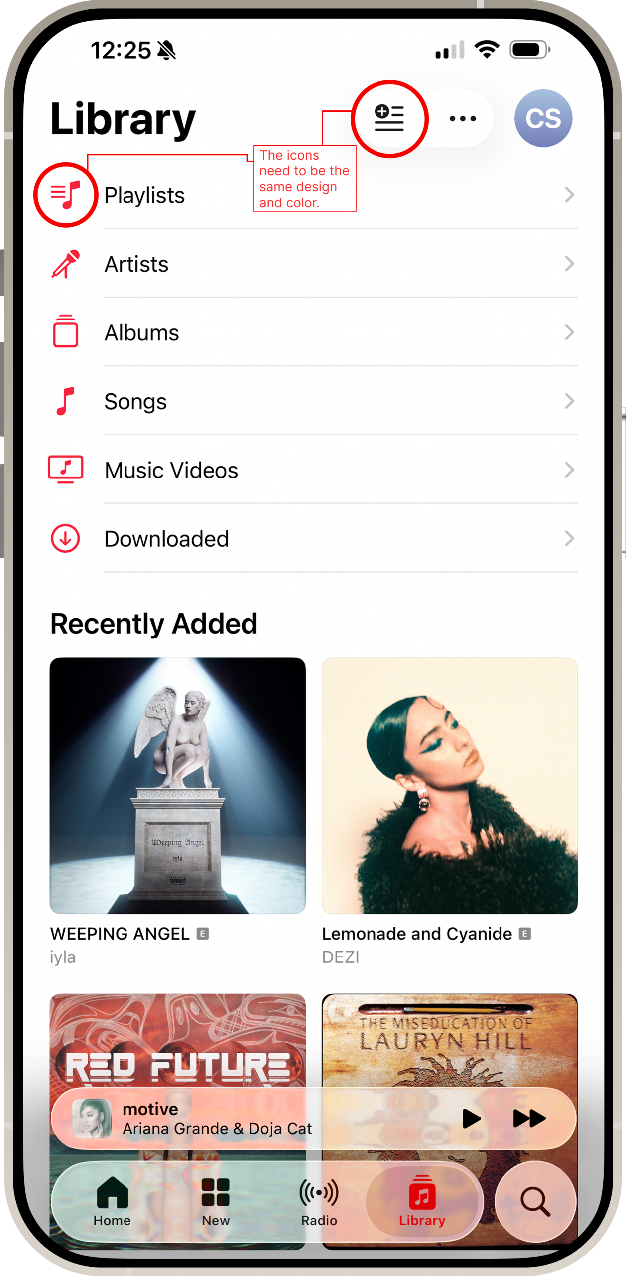
The home page also features a mini menu bar with an “add playlist” feature. This button is incredibly unclear, and has bad discoverability for new users because the icon is completely different from the one on the main, clearly labeled Playlist tab. When users open this section, there is a much clearer “add” button for a user to create a new playlist, which is also the design consistently used across Apple Music. Because this button’s function is so unclear, it also creates a gulf of execution for the user. To make its purpose more obvious, the button should be clearly labeled “add playlist.” The icon should also be both the same red as the other icons on the page, and should be the same as the one featured on the playlist tab.
Conclusion
Apple Music is largely well designed, and the user interface has improved drastically since it was launched in 2015. The design is clean, clearly labeled, and intuitive for new users. The consistent button design is a standout feature, but there are still improvements that can be made.
Suggested Improvements
The “open more” button: the arrow should be redesigned as an actual button, with a clear border and a different color. There is currently no obvious signifier that the arrow indicates any function other than scrolling.
The first “add to a playlist” warning: The text should be red, not gray. Small gray text is very easy for the user to miss, and red would cut down on the need for the second warning.
The “add playlist” button: The button should be clearly labeled “add playlist,” and the icon should be changed to match the design and color of the main Playlist one.