
Facebook Marketplace is a popular digital interface built within the Facebook ecosystem that allows users to buy, sell, and trade items locally. This critique analyzes the iOS mobile app interface from a buyer’s perspective, focusing on how its search, browse, and interaction features impact the user experience.
Recent & Saved Searches
When initiating a search for specific items or brands, users can easily locate the search icon as a signifier in the top corner thanks to its excellent discoverability. Tapping it directs users to a search page divided into two helpful sections: Recent and Saved searches.

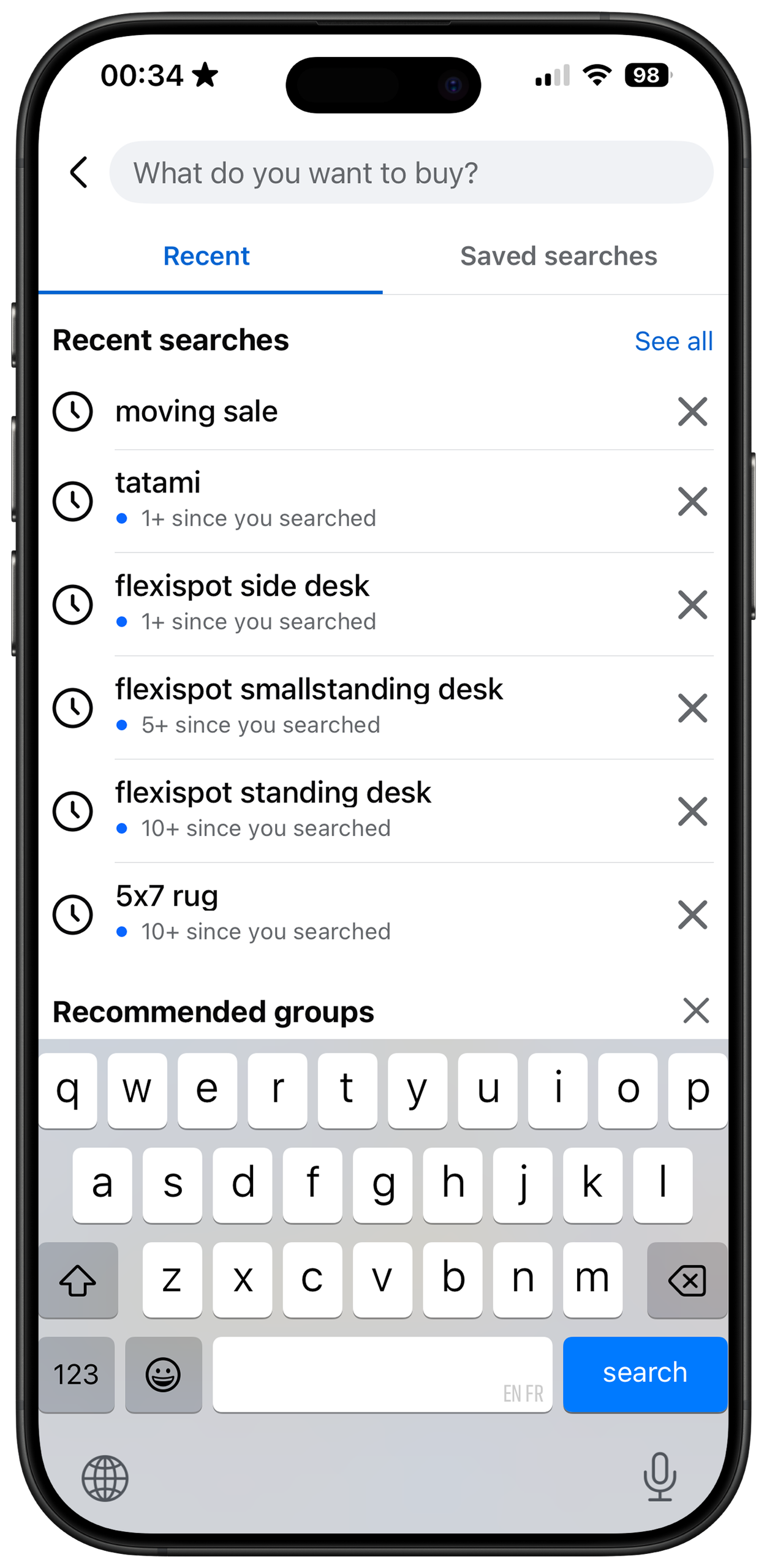
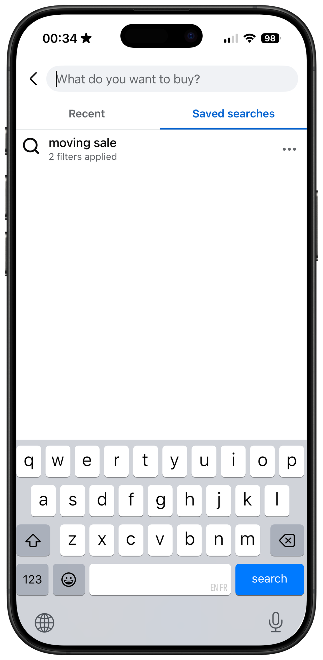
The ‘Recent’ section automatically preserves previously entered keywords, effectively reducing the user’s short-term memory load. This spares users from repeatedly trying to recall complicated brand names or previous queries. Furthermore, the ‘Saved’ function gives users the freedom to customize and store specific search parameters using applied filters (price, distance, etc.).
By presenting these shortcuts directly on the screen, the interface successfully shifts knowledge in the head (memorizing exact keywords and filter conditions) to knowledge in the world. This design choice significantly narrows the Gulf of Execution, allowing buyers to skip retyping the same words and experience a much smoother, frictionless search process.
Missing Filters in Explore
However, when browsing listings on the Explore and Local pages without a specific goal, the filter and sort functions are missing. Currently, the only adjustment users can make on the Local page is modifying the “distance” radius. This directly violates the user’s conceptual model of online shopping. Most platforms—and even Marketplace’s own ‘Saved search’ section—give users the freedom to customize and narrow down their own searches.

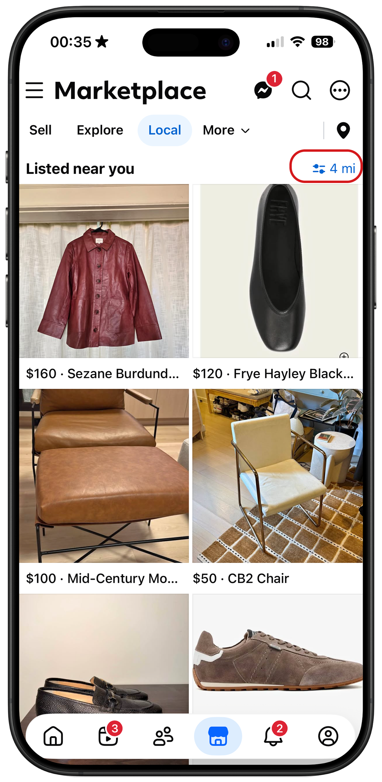
Without these functions, the app fails to support the user’s established conceptual model of e-commerce. Because the interface’s system image does not provide the expected tools for sorting and refining data, users are passively fed information and lose control over how they browse.
To solve this problem, Facebook should add a filter and sort dropdown menu at the top of the page, ensuring this dropdown provides the exact same functions as those offered on the search page. This menu would act as a clear signifier, returning control to the user and keeping the experience consistent with their existing conceptual model.
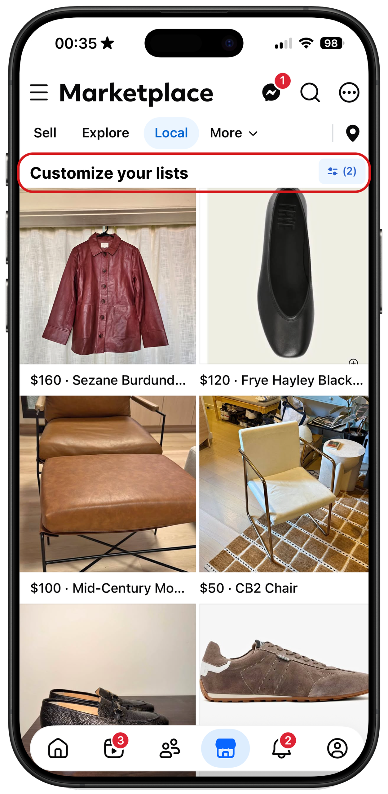
Add a filter and sort dropdown menu
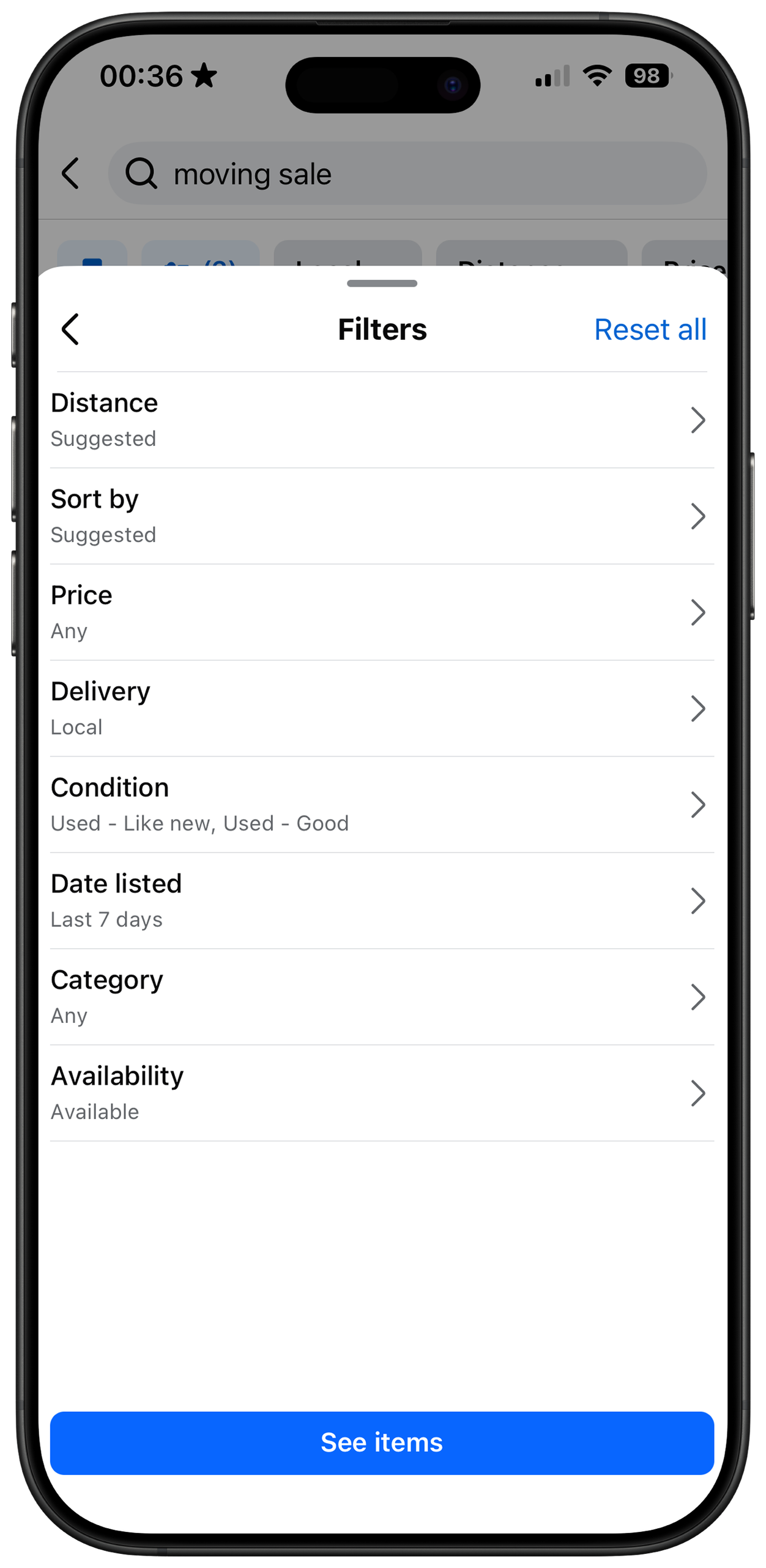
Align with the filter and sort menu on the Search Page
Outdated Listings
When browsing time-sensitive listings like a “moving sale,” buyers frequently encounter posts that are months past their deadline (e.g., “must go by 6/30”). This happens because sellers often make a memory-lapse slip—they finish moving but forget to delete their post.
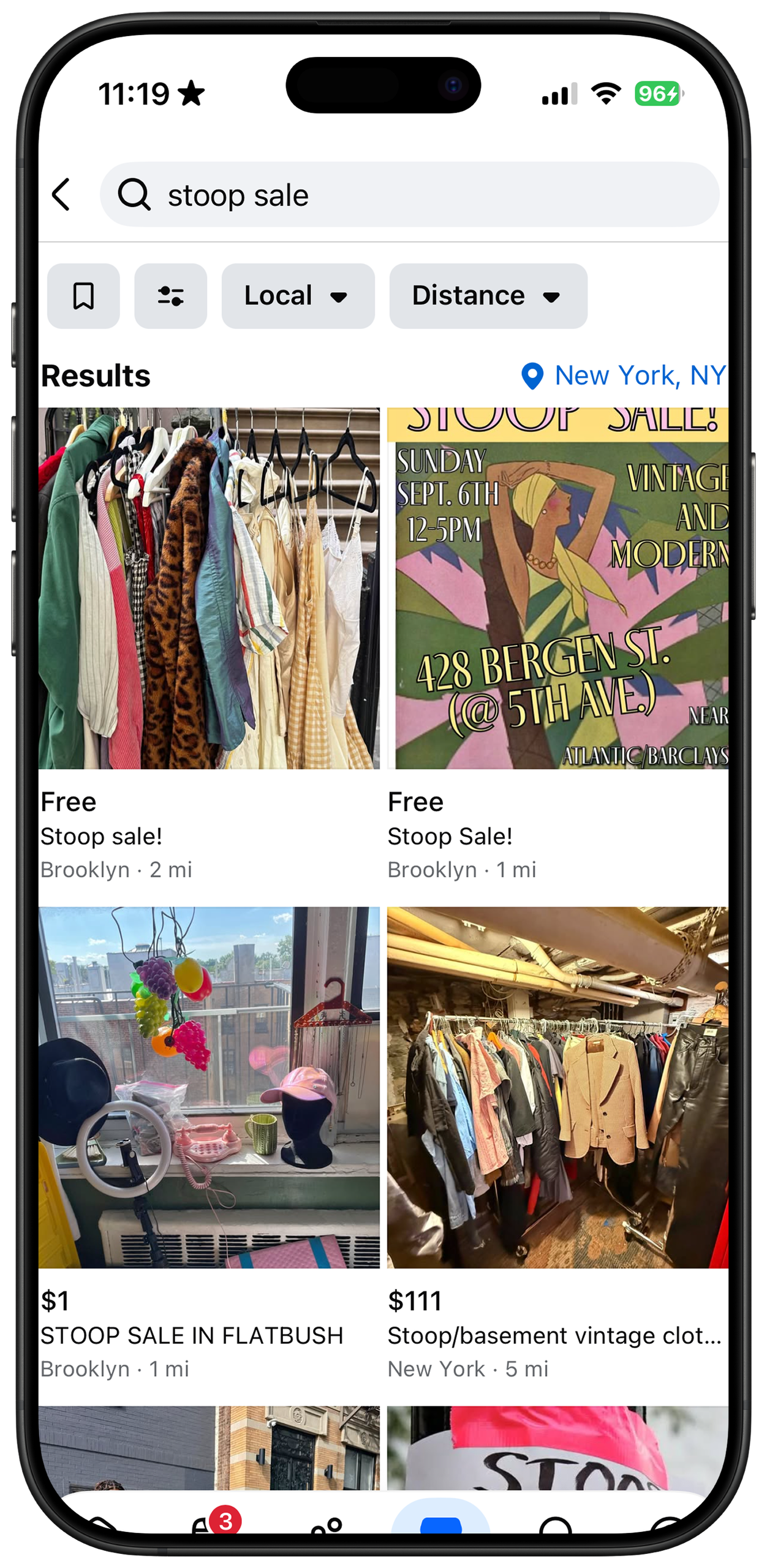
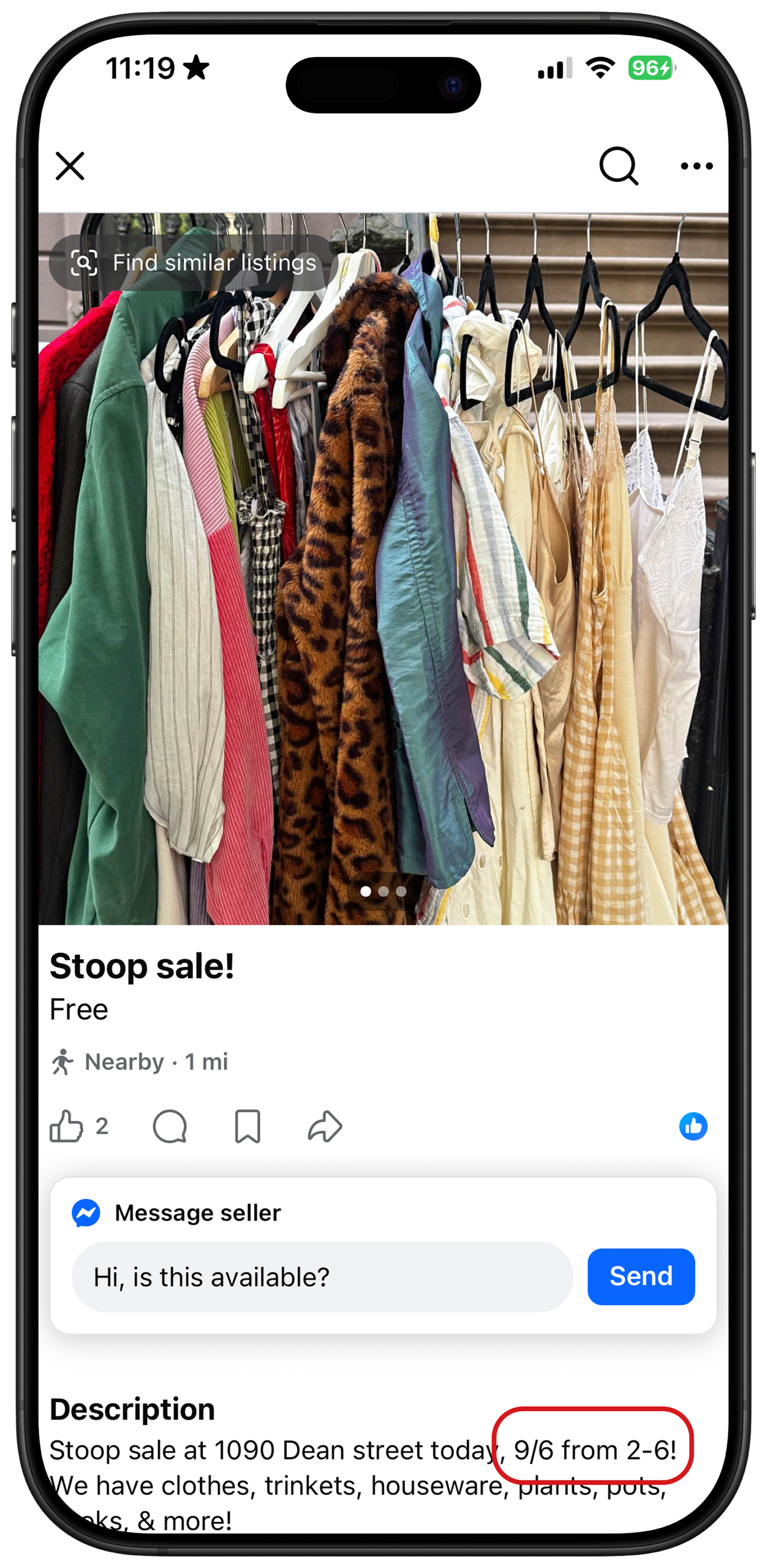
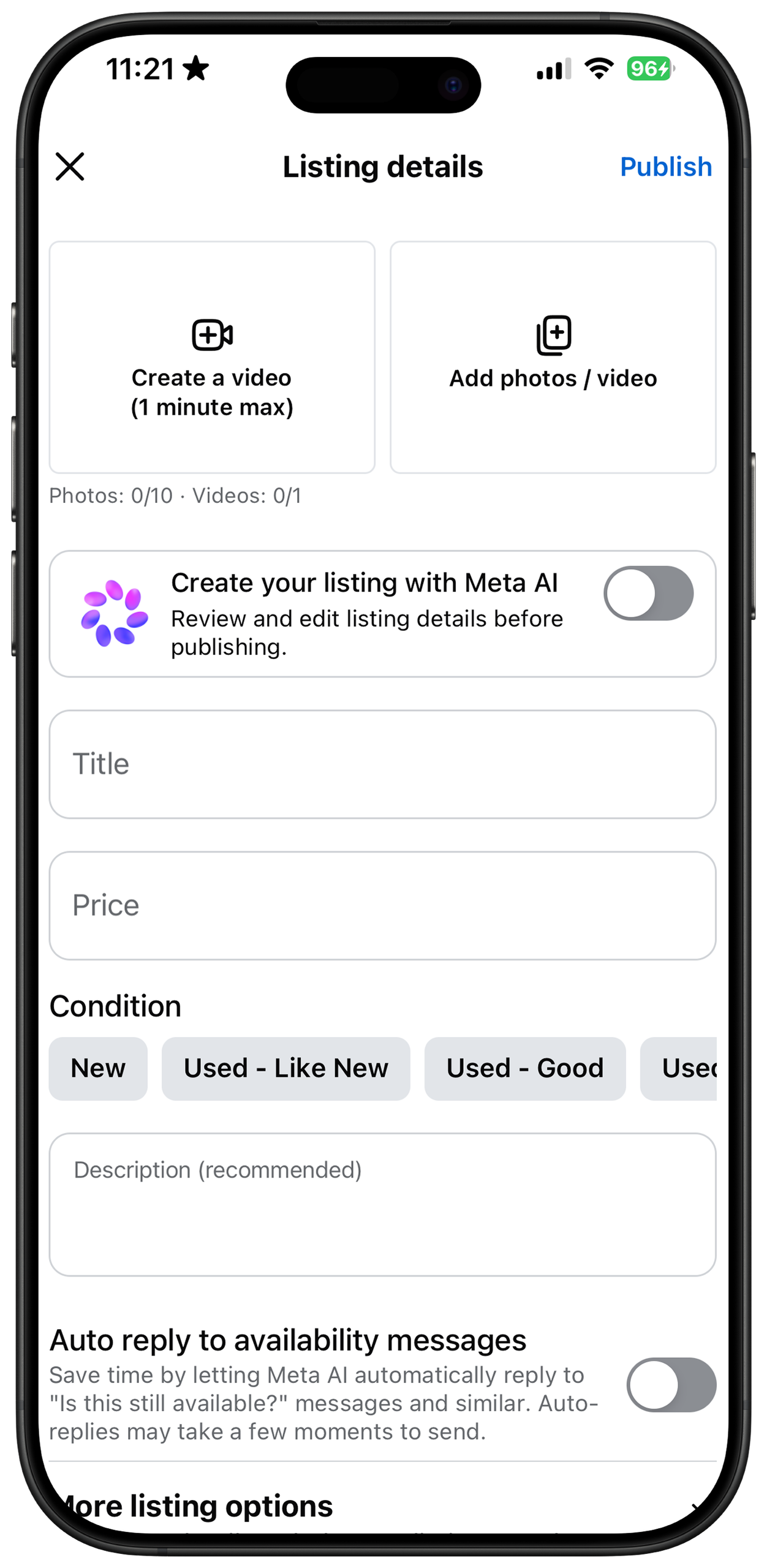
Because Facebook Marketplace does not allow sellers to set an expiration date when creating a listing, the platform lacks a crucial forcing function to automatically remove expired items. Consequently, buyers face a frustrating Gulf of Evaluation. The system image on the feed suggests the item is available, but the delayed feedback hidden in the description proves otherwise. When buyers inevitably miss these hidden details and message an inactive seller, the lack of response causes intense frustration at the visceral level.
To fix this, the interface should introduce a mandatory “Expiration Date” field as a forcing function for temporary sales. When creating a listing, sellers would be required to select an expiration status, choosing either “no expiration” for standard items or inputting a specific date (e.g., mm/dd/yy) for time-sensitive ones. This would automatically hide outdated posts, bridging the evaluation gulf and keeping the buyer’s feed relevant. Simultaneously, it spares sellers the cognitive burden of manually removing expired listings and replying to inquiries for unavailable items.
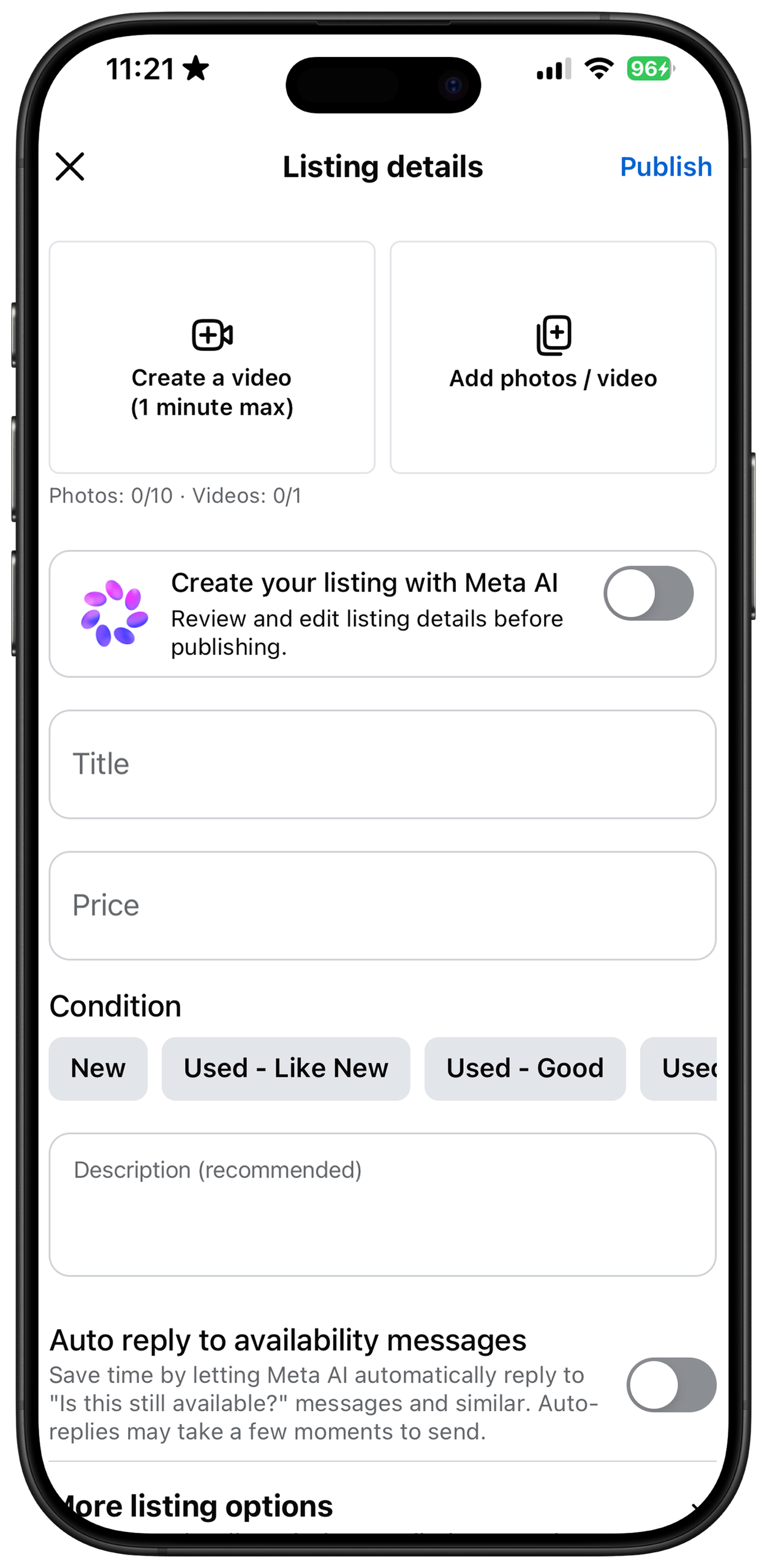
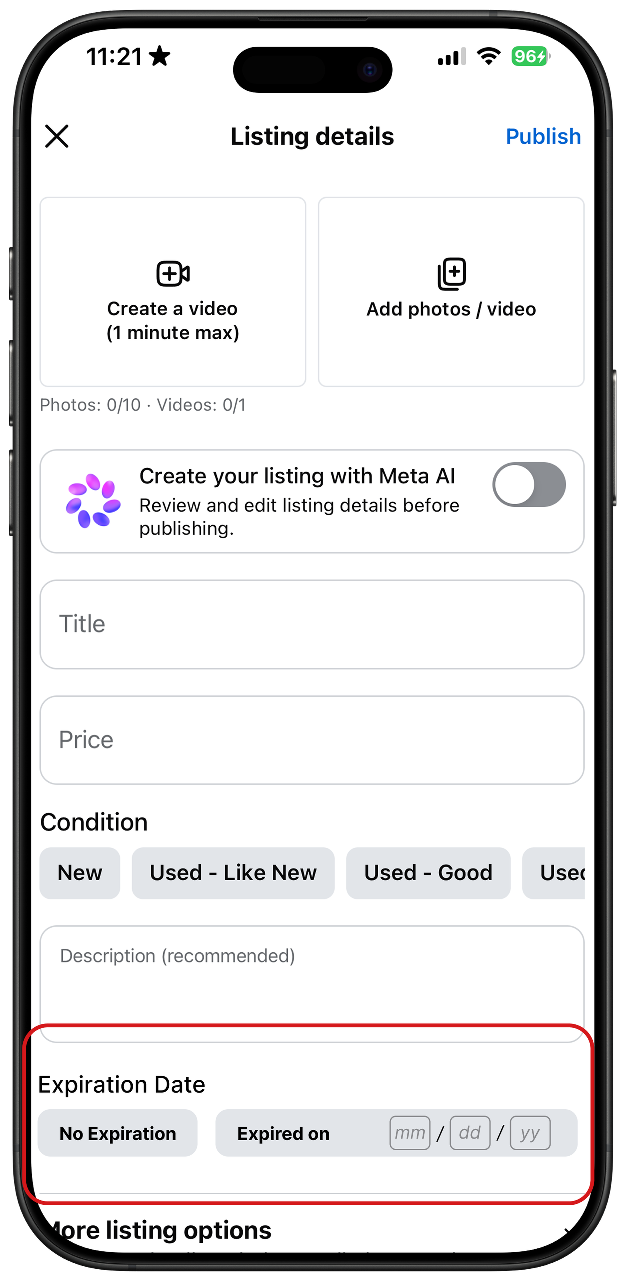
Introduce a mandatory “Expiration Date” field
Saved Items
Lastly, when a user is interested in an item but is not ready to purchase, Facebook Marketplace provides a straightforward “Save” option. The bookmark icon under the item’s name acts as a clear signifier. In modern digital interfaces, the bookmark has become a strong convention, requiring no additional explanation for the user.
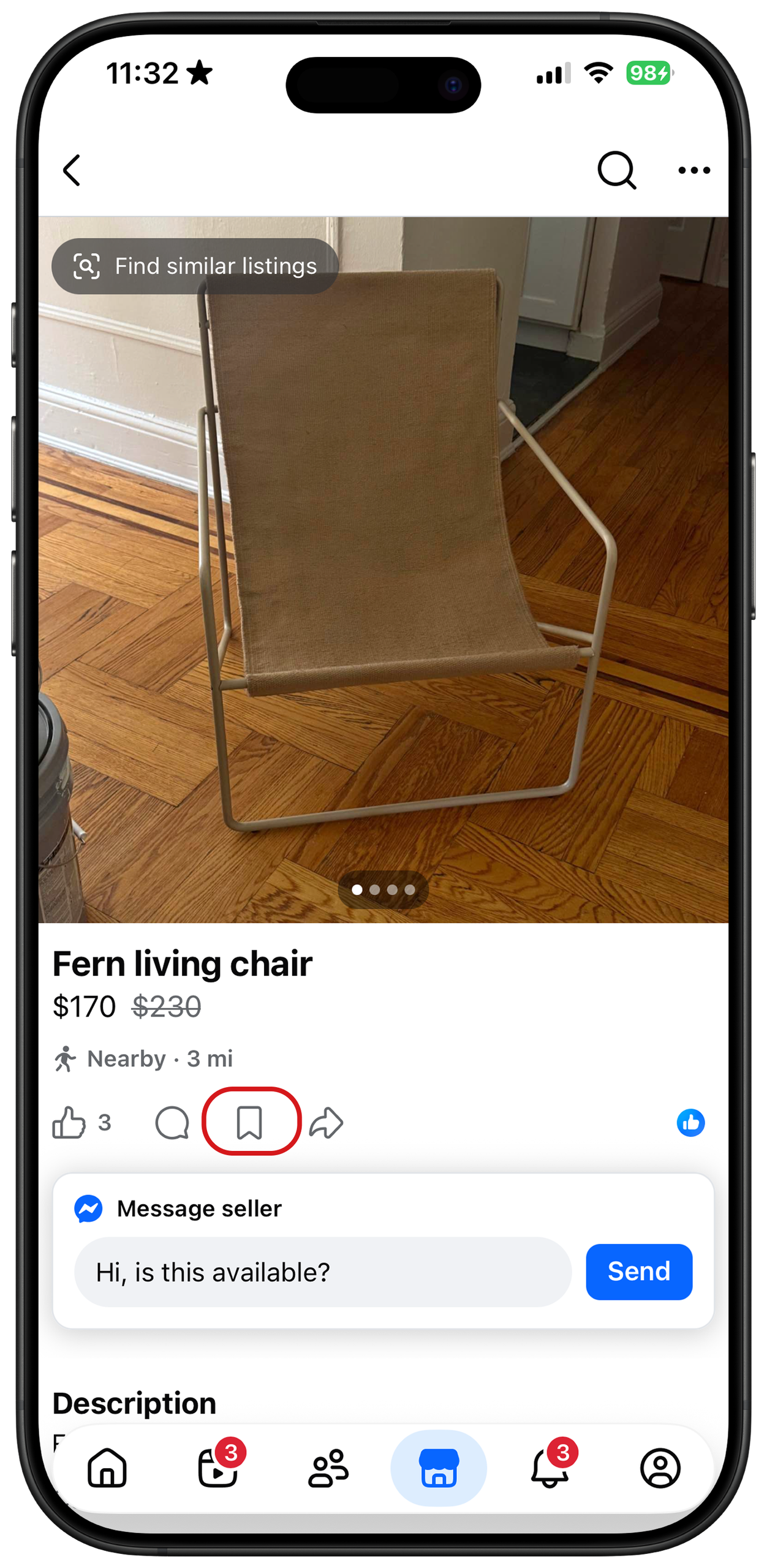
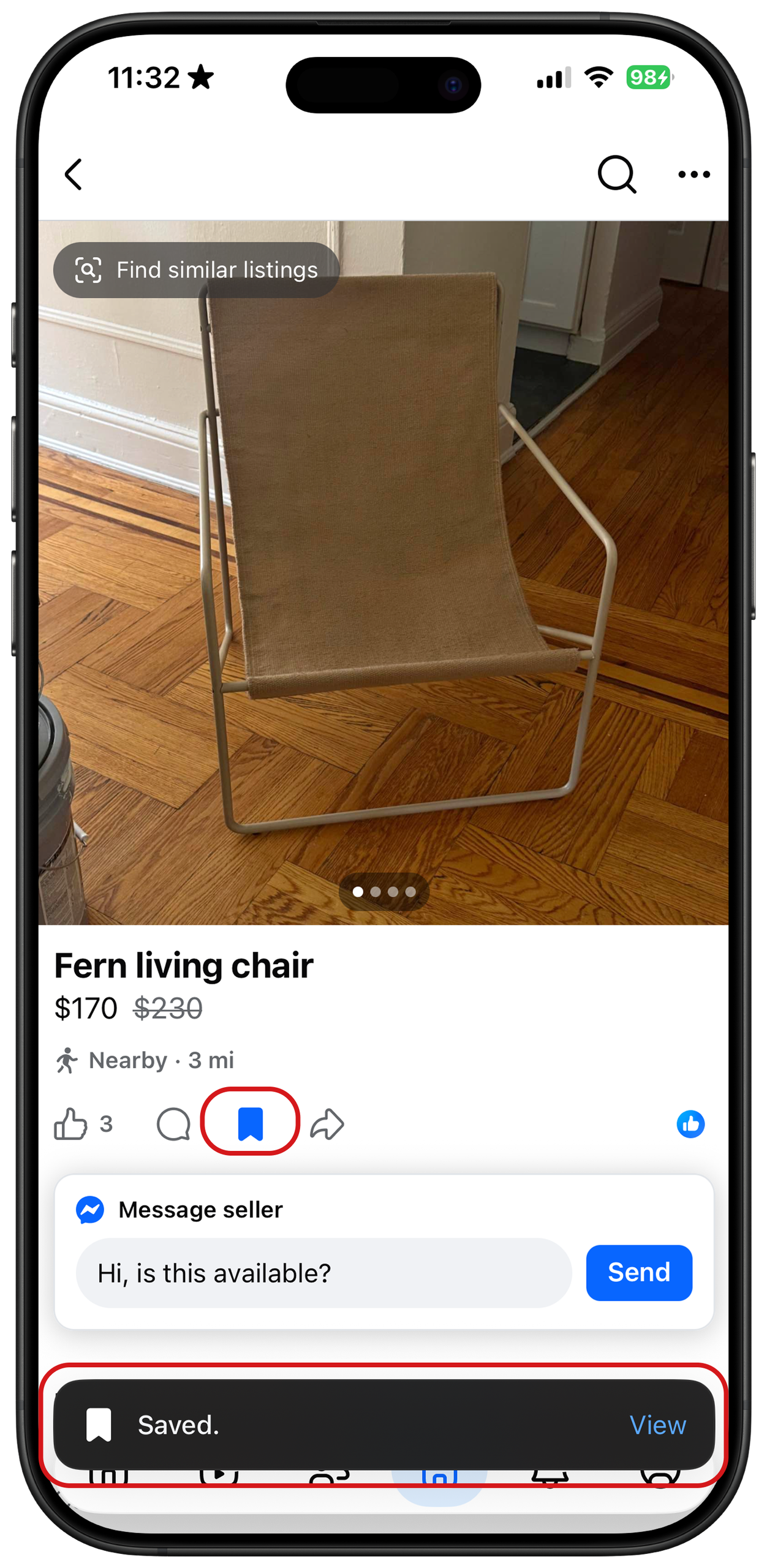
Furthermore, the system provides instant, multi-sensory feedback. When tapped, the icon turns blue and a pop-up confirmation appears at the bottom of the screen. Additionally, the interface provides physical feedback through a subtle haptic vibration, confirming that the action was successful.This seamless interaction perfectly matches the user’s conceptual model of how saving content should work, creating a clear and satisfying action chain.
Conclusion
Overall, Facebook Marketplace provides a simple but effective platform for peer-to-peer buying and selling. However, as an interface that functions much like a traditional e-commerce site, it lacks crucial sorting tools for buyers and misses essential forcing functions to manage inactive sellers. By addressing these usability gaps, Facebook could significantly deliver a much smoother transaction experience.